
How many chart types does Excel offer?
 By
SpreadCheaters
By
SpreadCheaters
Excel, Microsoft’s essential spreadsheet software, has been important in revolutionizing data administration and analysis. It’s simple layout and powerful capabilities have made it a favorite among experts across industries. Graphs are vital tools in data visualization because they allow users to show complex information in a visually appealing and easily accessible fashion.
Excel provides a wide variety of chart formats that allow users to effectively express trends, patterns, and comparisons within their data, supporting better decision-making and comprehension. Excel has a variety of chart kinds, including column, line, pie, bar, area, scatter, and histogram charts, giving users a variety of options for efficiently visualizing and analyzing their data. This variety allows professionals to select the best chart format for their individual data and communication requirements, boosting the entire data visualization experience in Excel.
Consider a sample data set that tracks a retail store’s monthly sales performance. The dataset contains columns for the months as well as the related sales values. This data collection will be our starting point for the variety of chart kinds available in Excel.
Column Chart:
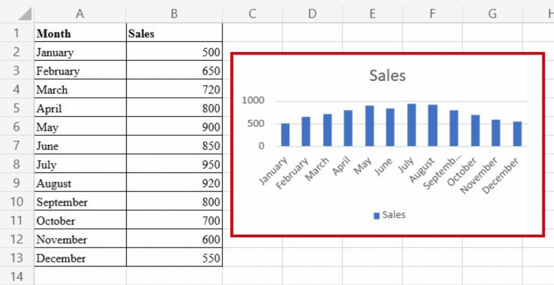
A column chart uses vertical bars to represent data, with each bar representing a category or data point. It’s great for comparing values across categories and tracking changes over time. A column chart has the advantage of providing a clear visual comparison between data points, making it simple to identify trends, spot outliers, and analyse relative performance. It is commonly used for sales analysis, comparing market shares, and budget tracking. In order to compare the sales performance of each month, we can plot the months on the horizontal axis and the sales figures on the vertical axis in a column chart. Following is the column chart for our sample data.
Line Chart:
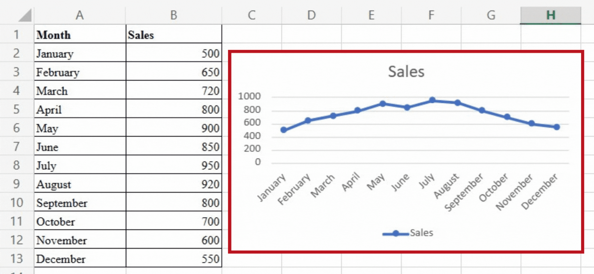
A line chart uses lines to connect data points, emphasising trends and patterns over time. It is useful for displaying continuous data and the overall progression of a variable. Line charts can help you identify trends, track growth or decline, and analyse seasonal variations. We can plot the months on the horizontal axis and the sales figures on the vertical axis with our dataset, resulting in a line connecting the data points. We can use this visualisation to understand sales performance over time and identify any significant changes or patterns. Following is the line chart for our sample data.
Pie Chart:
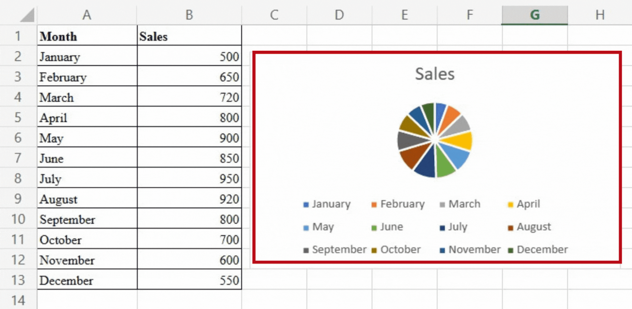
A pie chart represents data as circle slices, with each slice representing a category or portion of the total. It is used to display the percentage or composition of various categories within a dataset. Pie charts can be used to show relative distribution or percentages. In our case, we can visualize the distribution of sales across different product categories using a pie chart. Each category will be represented by a slice, with the size of each slice proportional to sales. This chart type allows us to quickly understand how each category contributes to overall sales.
Bar Chart:
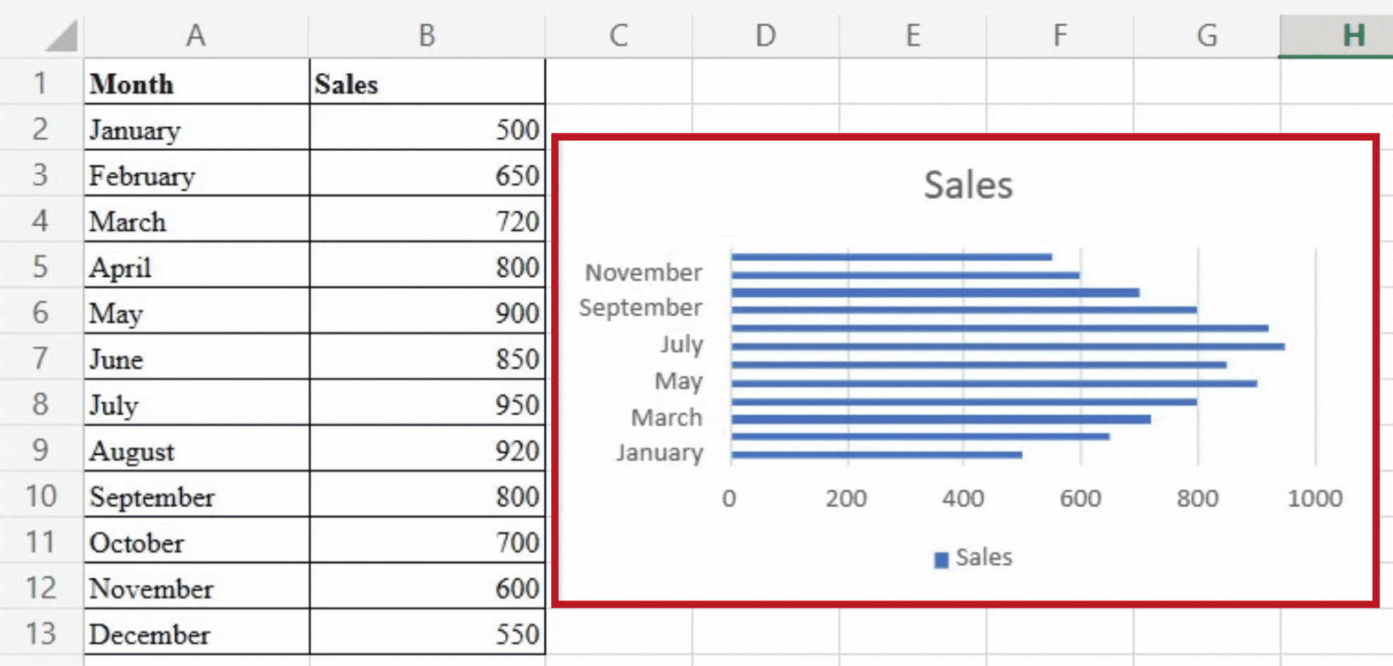
A Bar Chart uses horizontal bars to display data, making it ideal for comparing values across different series or dealing with long category names. It enables clear visual comparisons between data points, making it useful for data analysis with multiple variables or categories. We can use our dataset and a bar chart to compare the sales figures of different products over the course of a month. Each product will be represented by a bar, with the length of the bar proportional to the sales value. This chart type aids in decision-making and resource allocation by identifying top-performing and underperforming products.
Area Chart:
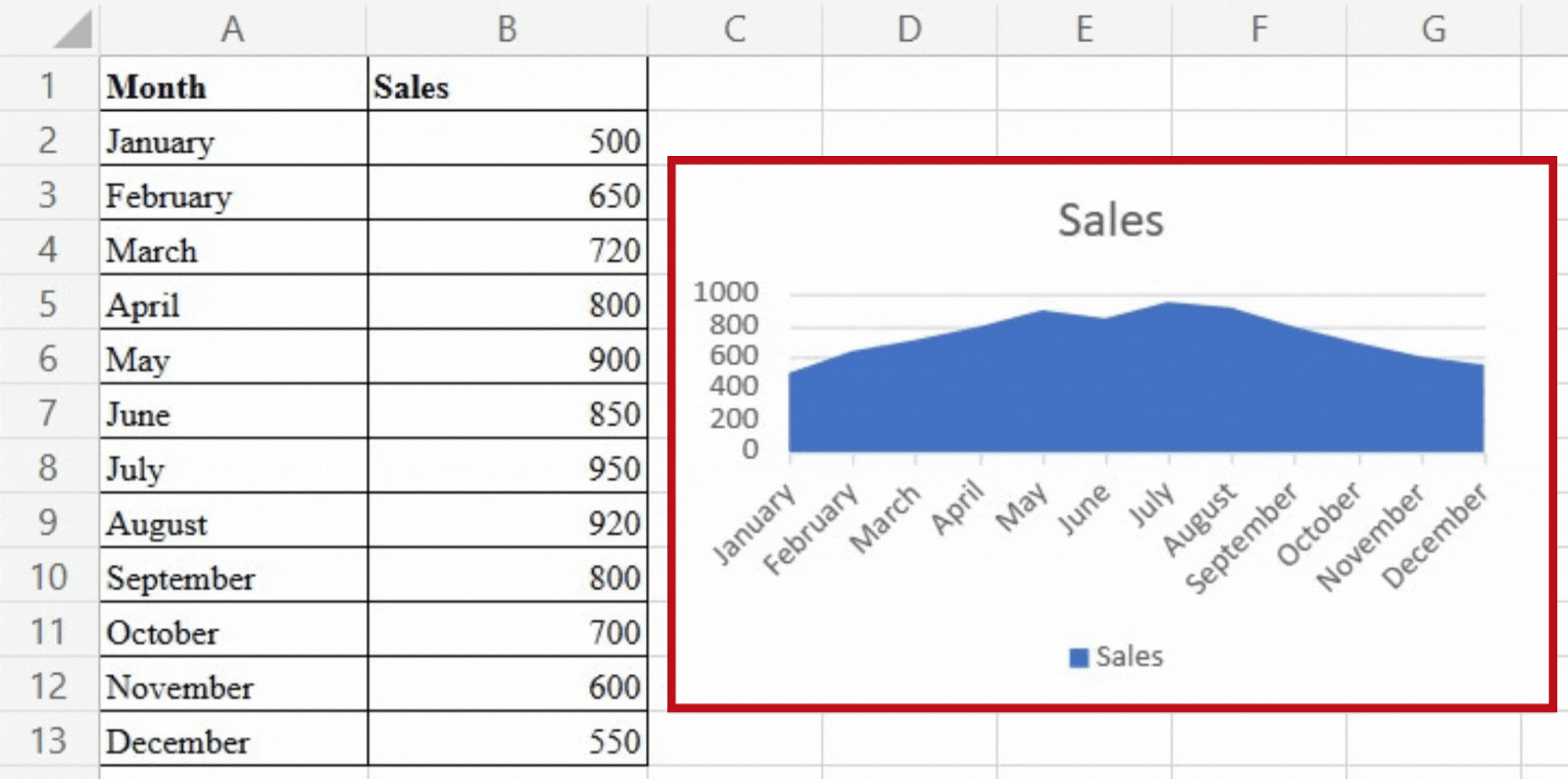
By displaying filled areas beneath a line, an Area Chart illustrates the cumulative effect of data. It’s useful for showing the overall trend while also looking at individual series. We can visualise cumulative sales performance over time using an area chart, highlighting growth or decline. The filled area below the line represents cumulative sales, which provides information about the overall sales trajectory. This chart type allows us to examine each month’s contribution to the overall performance and identify any significant variations or patterns.
Scatter Chart:
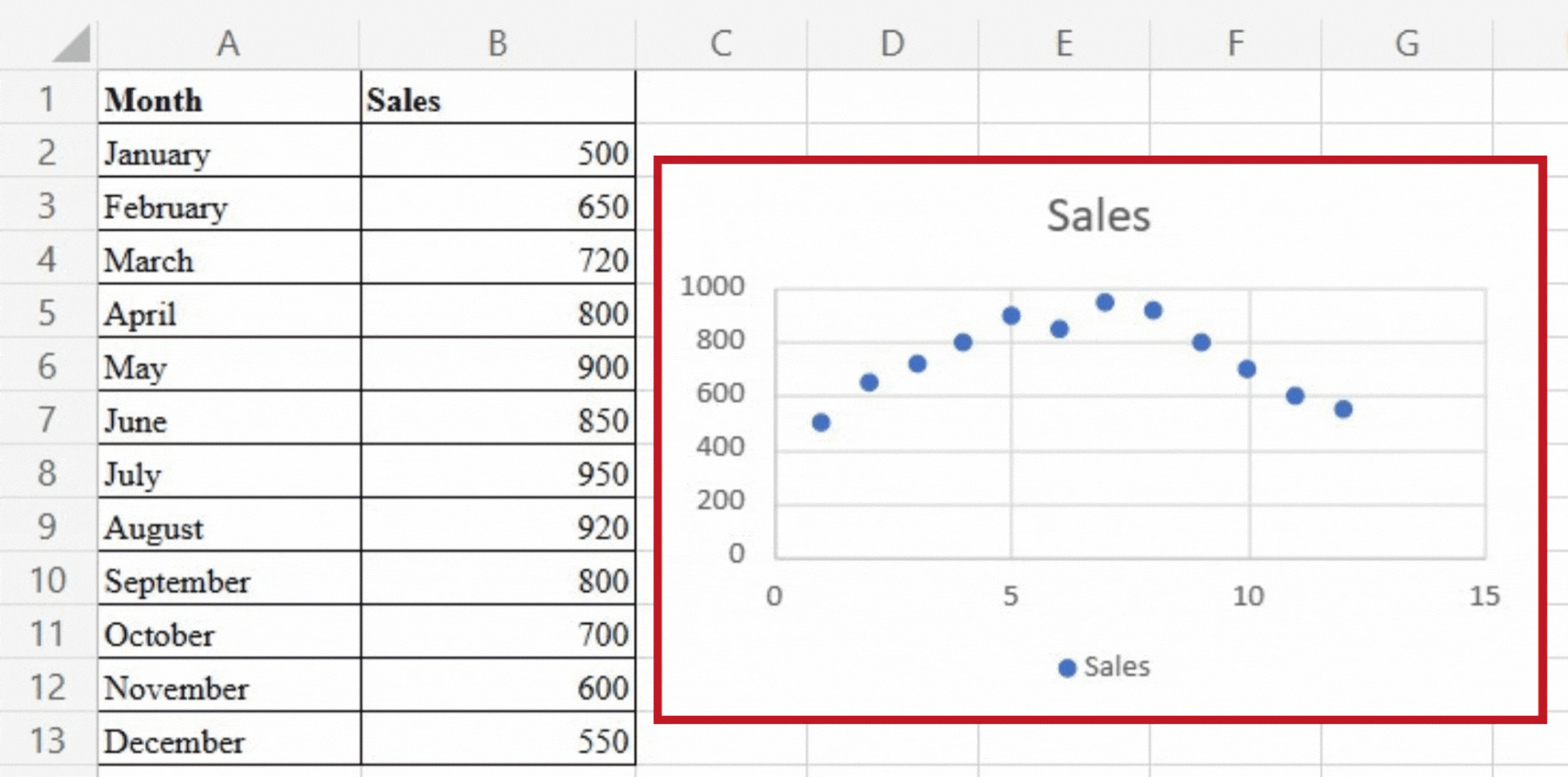
A scatter chart uses markers on a two-dimensional grid to depict the relationship between two numerical variables. It is ideal for determining variable correlations or dependencies. In our case, we can visualise the relationship between advertising expenditure and sales figures using a scatter chart. Each data point represents a different month, with the x-axis representing advertising spend and the y-axis representing sales. This chart type allows us to evaluate the relationship between the two variables and identify any trends or patterns, allowing us to make data-driven decisions in marketing strategies.
Histogram:
A histogram depicts numerical data distribution by dividing it into intervals or bins. It depicts the frequency of values falling within each bin, revealing information about the overall data distribution. A histogram can help us visualise the distribution of sales figures in our dataset. The x-axis depicts the sales range, which is divided into intervals, and the y-axis depicts the frequency with which sales fall within each interval. This chart type enables us to comprehend the distribution of sales values.
Conclusion:
Excel’s chart types enable users to convert raw data into meaningful visual representations. Excel provides a wide range of charting capabilities to cater to diverse data visualisation needs, whether it’s comparing values, tracking trends, analysing correlations, or understanding distributions. By utilising the power of these chart types, professionals can gain insights, effectively communicate information, and make informed decisions based on their data.


