
How to create Excel Scatter Plot with Labels.
 By
SpreadCheaters
By
SpreadCheaters

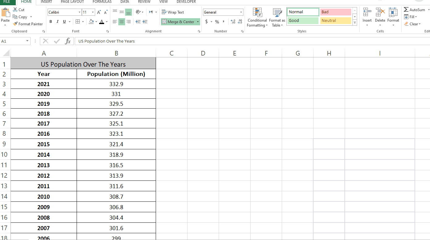
Excel is a powerful tool that can be used for many different tasks, including creating plots and charts. Plots are a visual representation of data, and they can be used to help people understand complex information more easily. In this tutorial we will learn how to create scatter plots with labels in Excel. Here we have a dataset which contains the US population from the year 2000 – 2021.
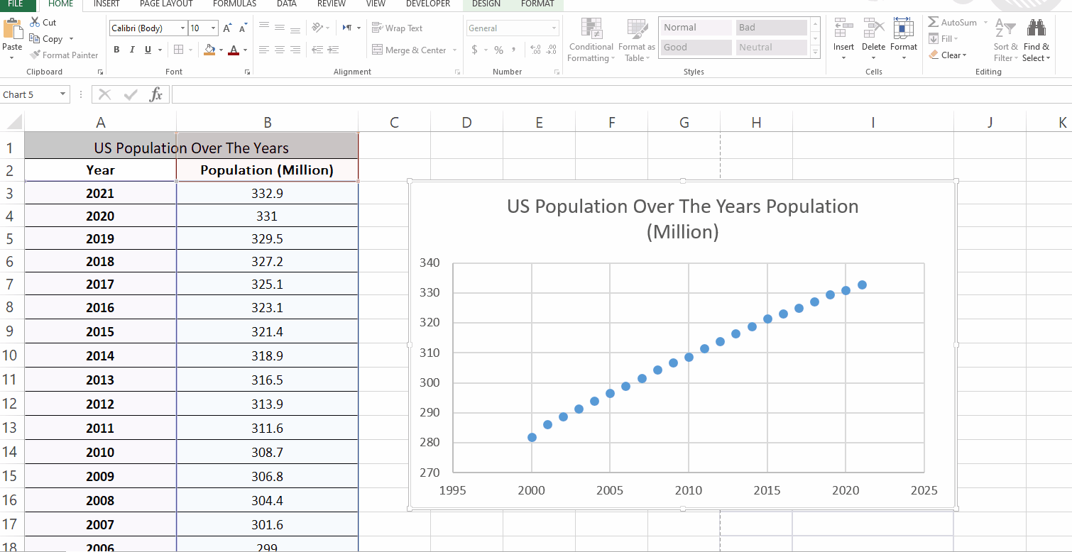
Step 1 – Add the Scatter Plot
– Select the data for which you want a scatter plot.
– Go to the Insert tab, in the Charts group open the drop down menu of the scatter plot
– Click on the scatter plot you want to create.
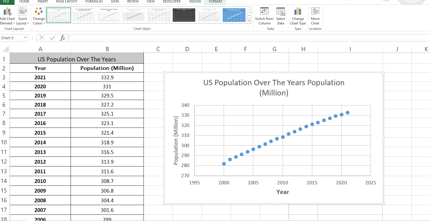
Step 2 – Add Axes Label to the plot
– Click on the plot.
– Click on ‘+’ then choose Axis Titles.
– You can choose different types of labels by opening the drop down menu of Axis Titles.
– Type the title in the given text Area.
Step 3 – Add label to the plot
– Click on the plot.
– Click on ‘+’ then choose Data Labels.
– You can choose different types of Data labels by opening the drop down menu of Data labels.


