
How to plot a histogram in Excel
 By
SpreadCheaters
By
SpreadCheaters
You can watch a video tutorial here.
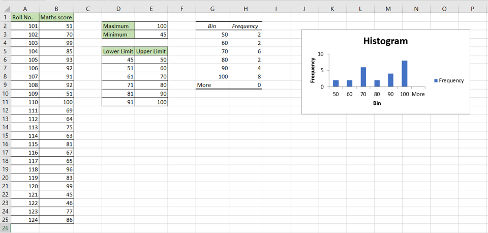
Histograms are used to organize data in a way that is easy to understand. A histogram is built from a frequency table that tells you the frequency or how often an event occurs. For example, you could have a list of scores in a maths exam. From this, you could build a Histogram to understand in what range most of the students have scored. In Excel, you can use the Data Analysis tool to create a frequency table and a Histogram. This tool requires the bins as an input so the approach we will follow is:
1. Find the maximum and minimum values of the data range
2. Define the lower and upper limits of the bins based on the maximum and minimum values
3. Create the Histogram using the Data Analysis tool
Note: If the Data Analysis button is present under Data > Analyze, then skip steps 1 to 3
Step 1 – Open the Excel Options window
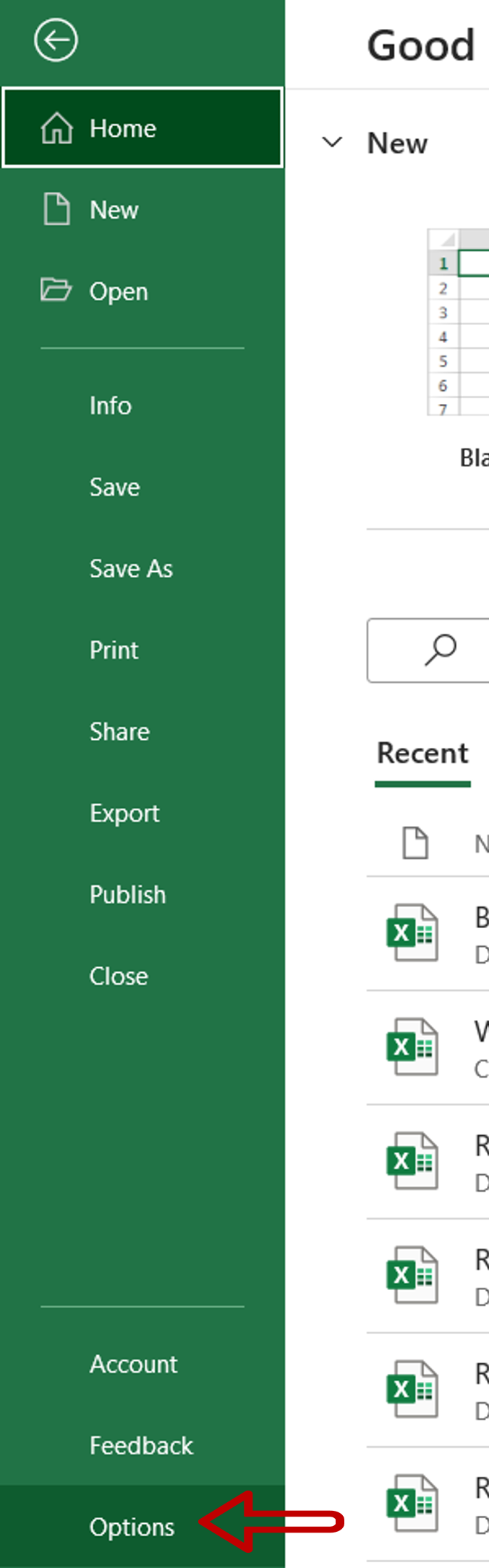
– Go to File > Options
Step 2 – Manage the Add-ins
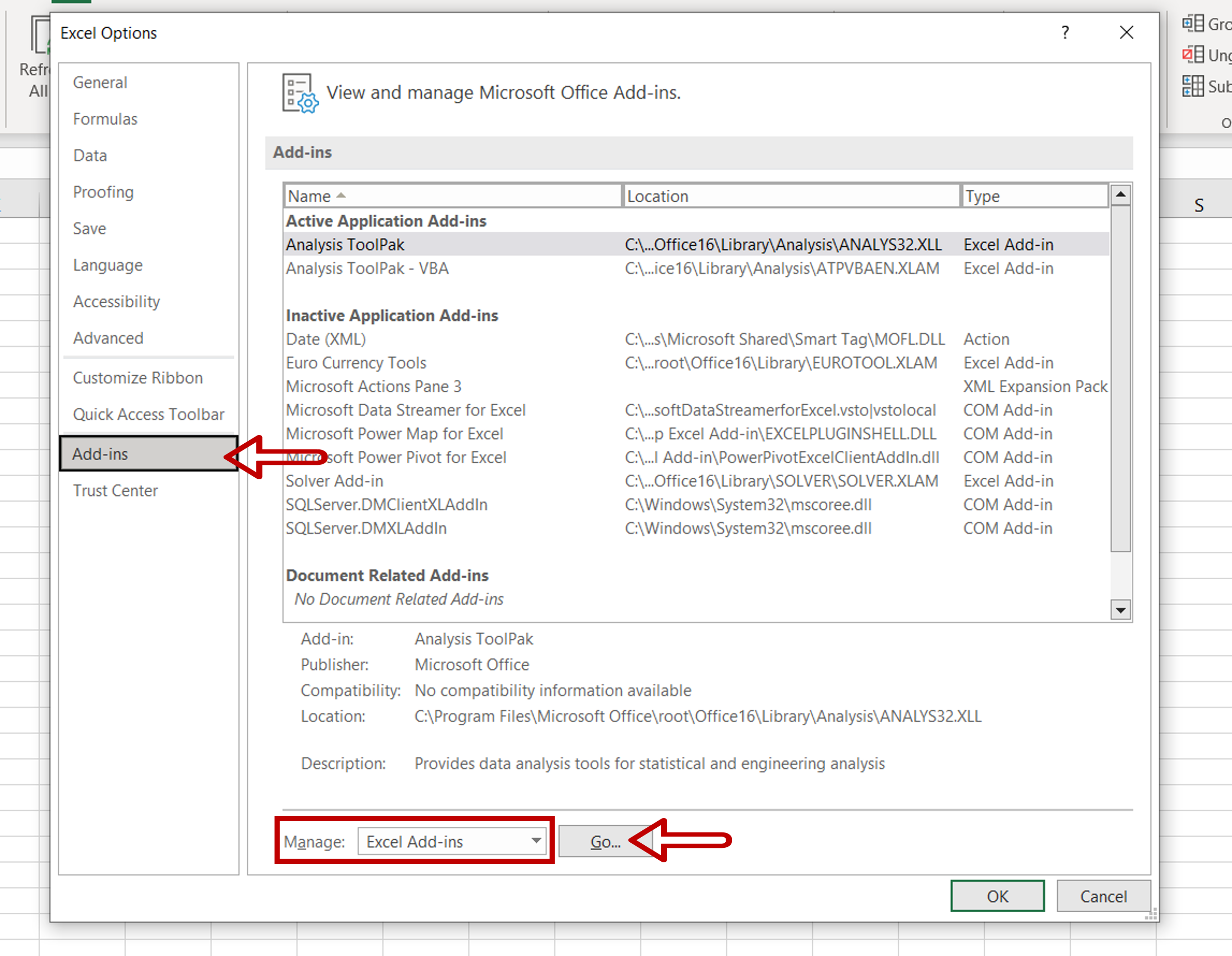
a. Go to Add-ins
b. Select Excel Add-ins from the Manage drop-down
c. Click Go
Step 3 – Load the Analysis ToolPak add-in
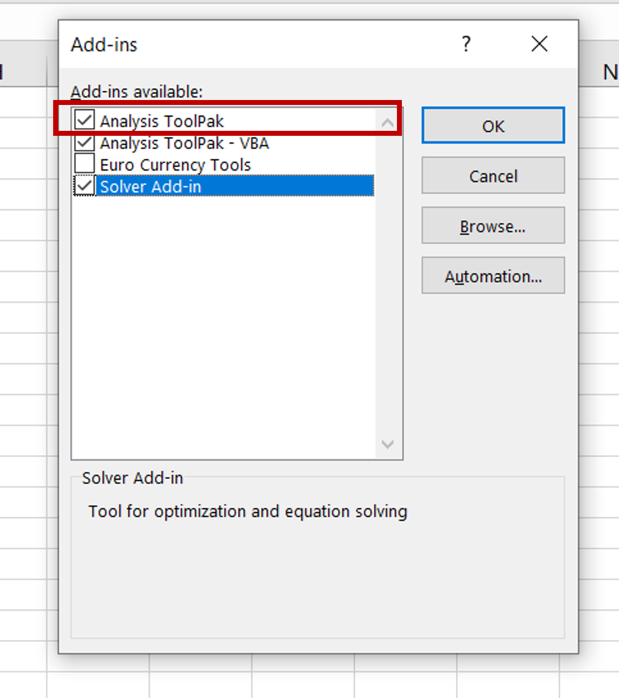
d. Select Analysis ToolPak
e. Click OK
Step 4 – Find the maximum value of the data range
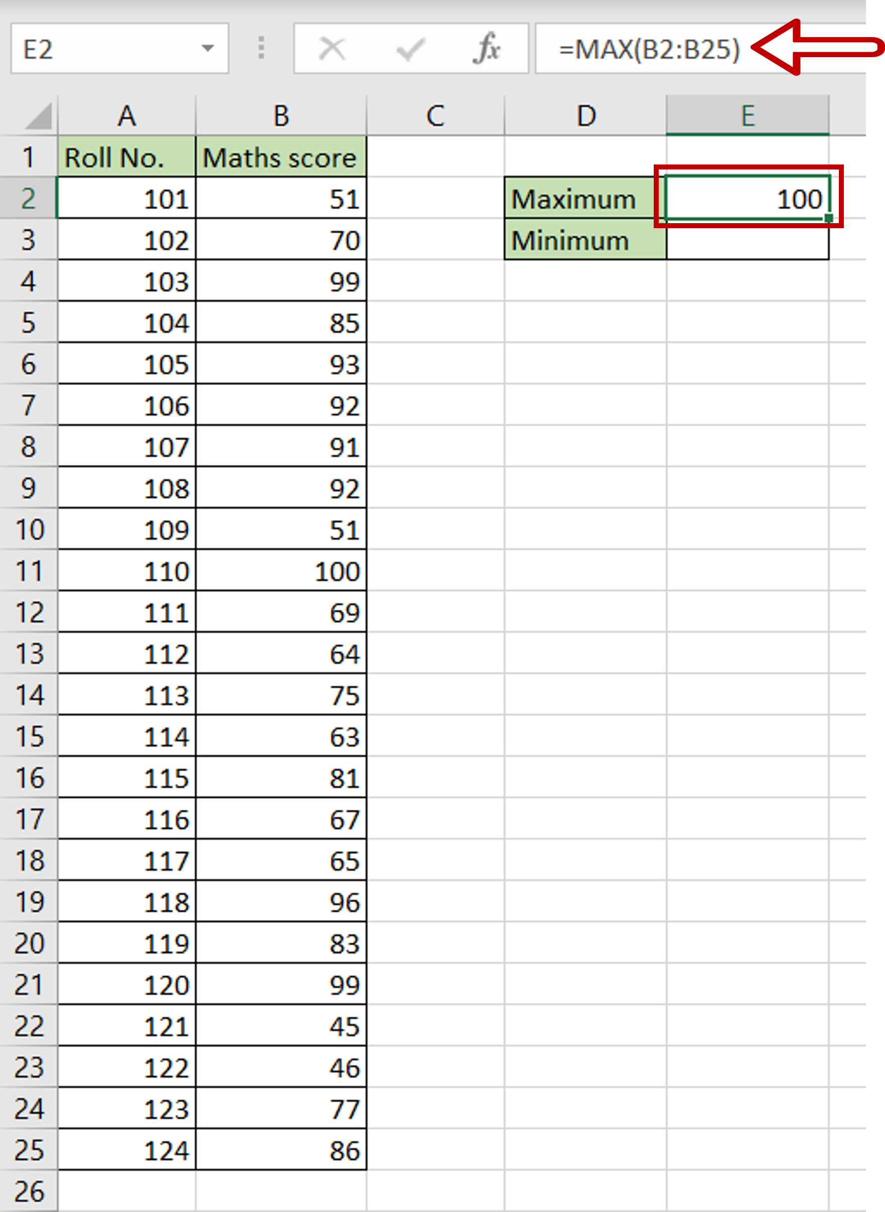
– Select the cell where the maximum number is to be displayed
– Type the formula using cell references:
=MAX(range of Maths score)
– Press Enter
Step 5 – Find the minimum value of the data range
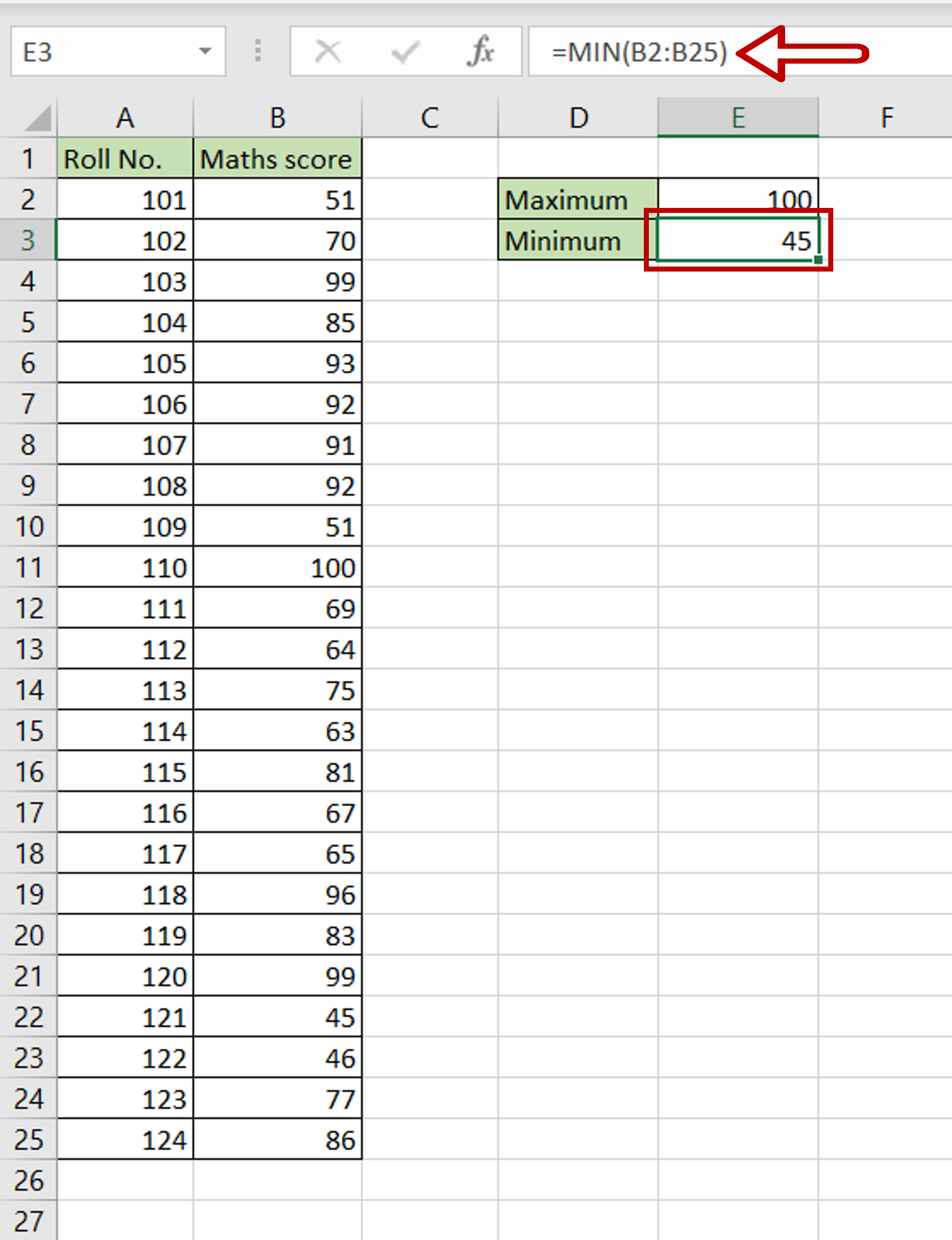
– Select the cell where the minimum number is to be displayed
– Type the formula using cell references:
=MIN(range of Maths score)
– Press Enter
Step 6 – Create the bins
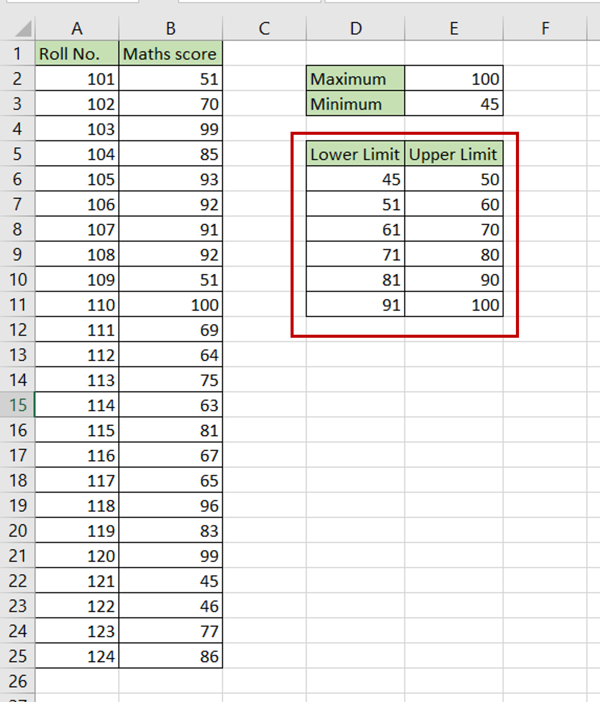
– Including the minimum and maximum values, define the lower and upper limit for each bin
– The upper limit for the last bin should be equal to or greater than the maximum value
– All bins should have equal ranges
Step 7 – Open the Data Analysis box
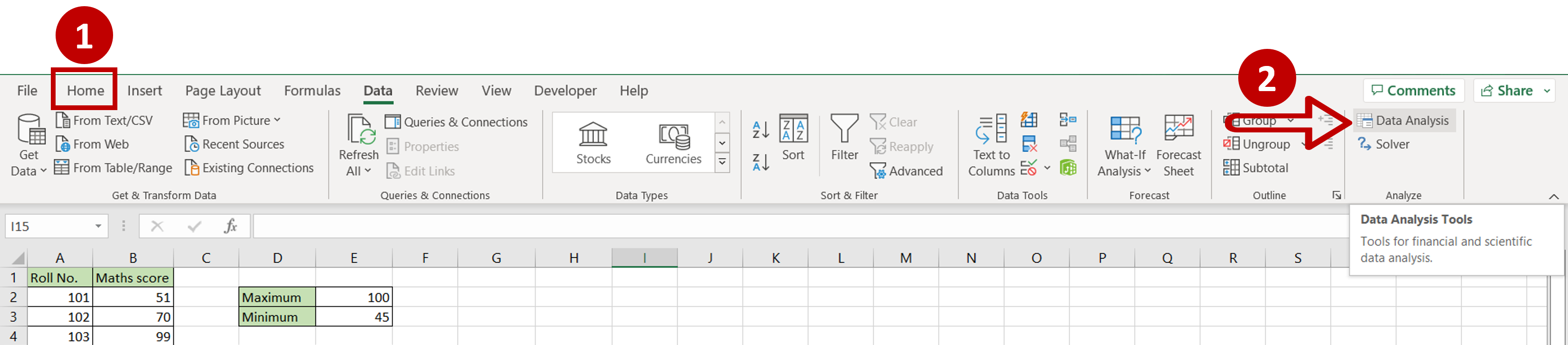
– Go to Data > Analyze
– Click on the Data Analysis option
Step 8 – Open the Histogram definition box
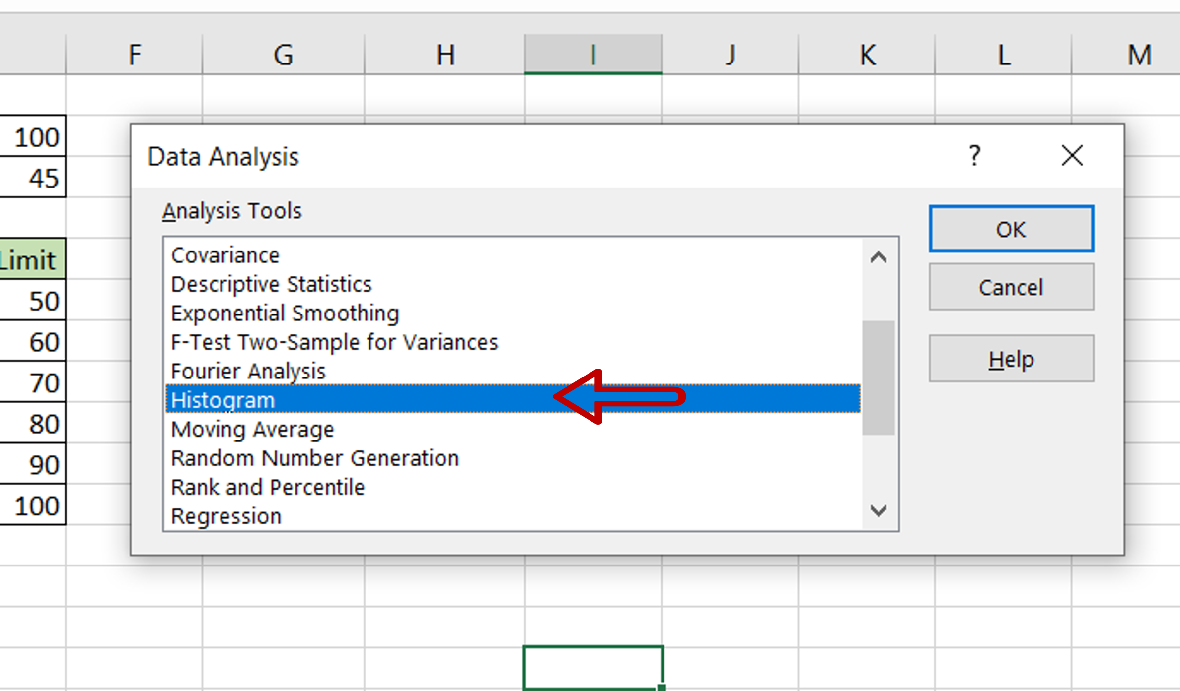
– Select Histogram
– Click OK
Step 9 – Define the parameters
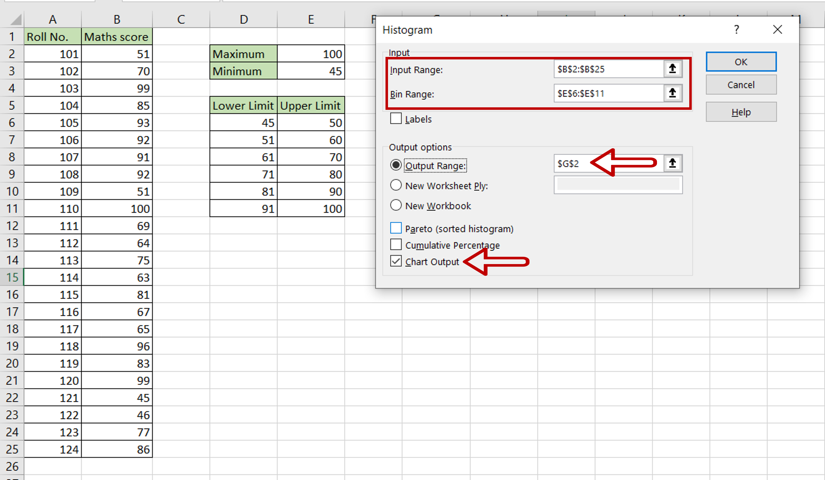
– Enter the parameters using the cell references:
>Input range: the range of ‘Maths score’
>Bin range: the range of ‘Upper Limit’
>Output range: select where the result is to be displayed
– Tick the Chart output box to display the histogram
– Click OK
Step 10 – Check the result
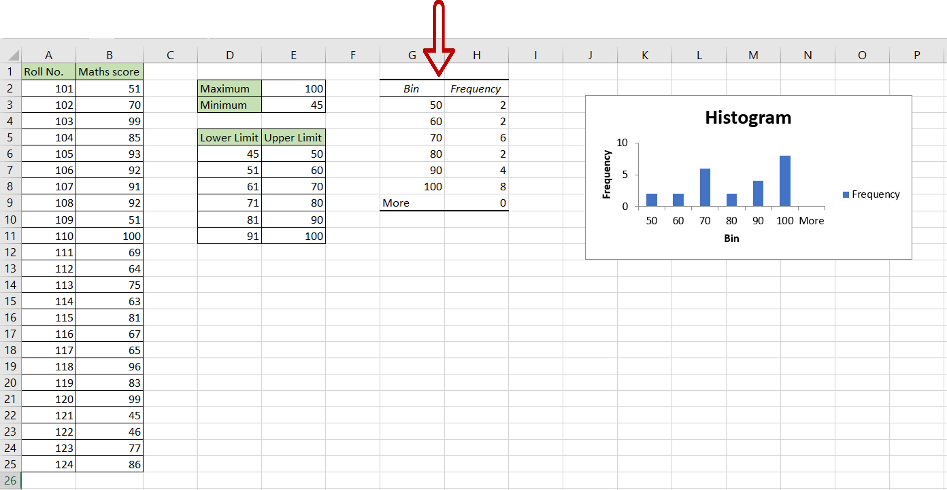
– The frequency table is displayed along with a Histogram


