
How to create a clustered column pivot chart in Excel
 By
SpreadCheaters
By
SpreadCheaters
In this tutorial we will learn how to create a clustered column pivot. To create it we will use the Pivot chart option from the Insert tab. Using the Pivot Chart option we can add different colors to charts and we can add information to the graph. Following are the steps that guide how to use the Pivot Chart option.
A PivotTable is a feature in Microsoft Excel that allows you to summarize and analyze large amounts of data. It allows you to arrange and rearrange the data to show different views of the same data. A PivotChart is a graphical representation of a PivotTab. Clustered column pivot chart is a type of chart that allows you to visualize data in a PivotTable in a column format. The chart is divided into vertical columns, each representing a different category or series of data. The columns are grouped side-by-side to help compare the values between different categories or series.
Step 1 – Select the Data

– Select the data on which you want to form chart
Step 2 – Click on Pivot Chart option
– Click on Pivot Chart option in Insert tab and a dropdown menu will appear
Step 3 – Select Existing Worksheet
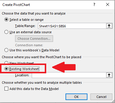
– Click on Existing Worksheet in the dialog box
Step 4 – Select the Location
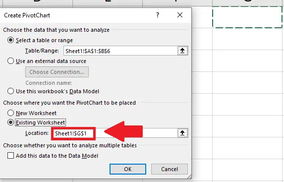
– In the dialog box Select the location (where to show the table) in the box to the right side of Location option of dialog box
Step 5 – Click on OK
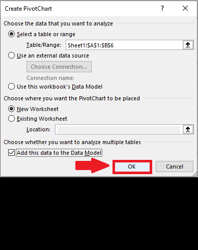
– At the end of dialog box click on OK and a dialog box will appear
Step 6 – Select the Field
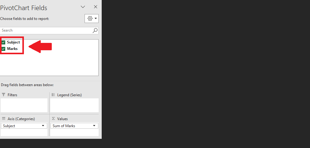
– In the dialog box, select the data that you want to show on graph and the table will appear on the selected cell
Step 7 – Select the Row Labels
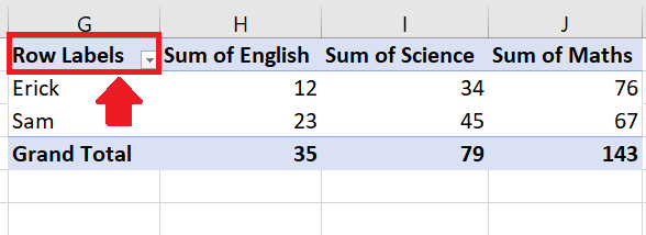
– In the table select the first cell (Row Labels)
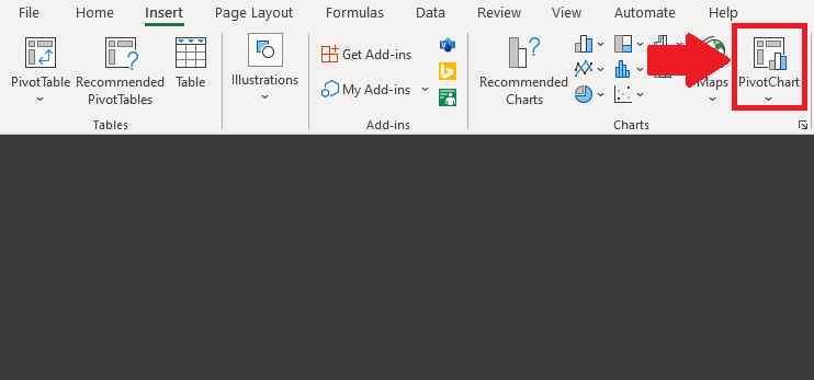
Step 8 – Click on Pivot Chart
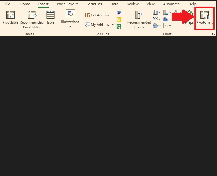
– Click on Pivot Chart option in Insert tab and a dropdown menu will appear
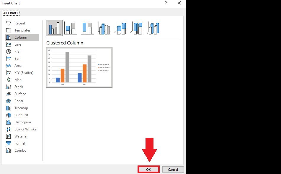
Step 9 – Select Clustered Column
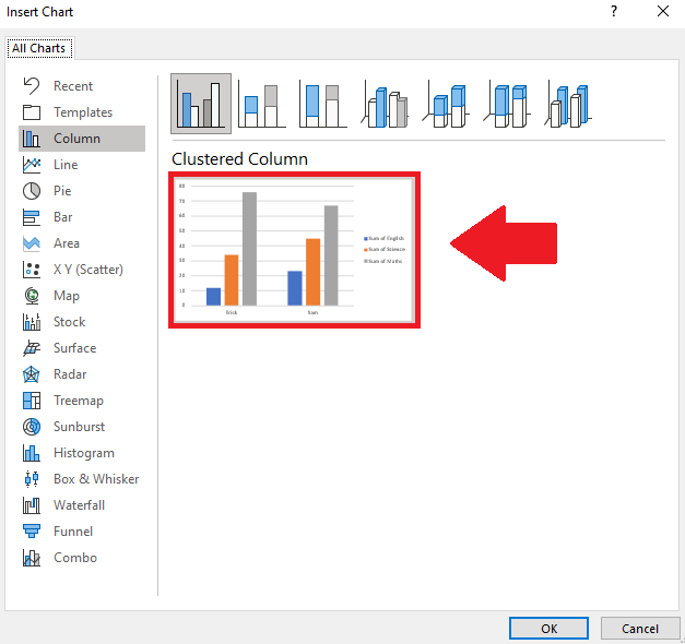
– In the drop down menu Select Column
– Select the Clustered Column chart
Step 10 – Click on OK

– In the dropdown menu click on OK to get the required result


