
How to plot two lines in Excel
 By
SpreadCheaters
By
SpreadCheaters
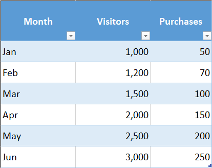
For this purpose, we can draw more than one line on the same chart. In this tutorial, we’ll learn how to plot two lines on the same chart in Excel. Let’s understand this with an example. Suppose we have a dataset of visitors & purchases to your website in different months. Enter the data in separate columns, with the months in one column and the number of visitors & purchases in the other two columns. Your data should look something like the above:
Excel is a powerful data visualization and data management tool which can be used to store, analyze, and create reports on large data. It can be used to plot different kinds of graphs like line graphs, bar graphs, etc. A line plot or a line chart are other names for the line graph. It shows quantitative data for a given time period. Line charts are particularly helpful for displaying trends that develop gradually over time and for seeing patterns or discrepancies in the data that would be challenging to spot in other types of charts. In order to compare different data sets on the same chart or to show changes in data over time, line charts are frequently used.
Step 1 – Select Data
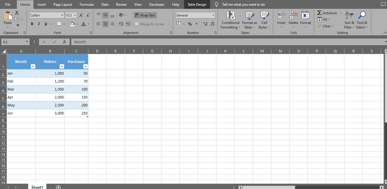
– With the help of a selection handle, select your data.
Step 2 – Go To Insert Tab
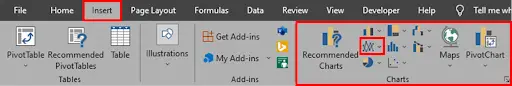
– Go to the insert tab & select “Line” from the “Charts” section of the ribbon.
Step 3 – Select The Chart Type
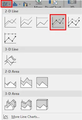
– Choose the type of line chart you want to use from the dropdown menu. For this example, let’s use the “2D Line” chart with markers.
Step 4 – Create Two Line Chart
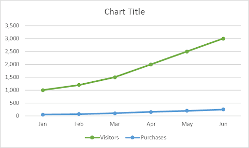
– Based on the selected data, Excel should automatically generate a basic line chart showing the No. of purchases against per visit during six months. The chart may, however, be difficult to read, and some adjustments might be necessary.
Step 5 – Make Few Adjustments As Required

– You can make adjustments to your chart by clicking on the “chart design” tab.
– Depending on your requirement change layout, style & colour under sub sections of chart design tab.
– Change chart title & resize chart area if required.
– Rearrange Legends & Data Labels.
– You can either save the chart as a separate file or copy and paste it into another document when you are satisfied with its appearance.


