How to make a semi-log graph in Google Sheets
 By
SpreadCheaters
By
SpreadCheaters
In this tutorial, we’ll discuss how to insert a semi-log chart in Google Sheets.
METHOD – Insert a semi-log chart by using a line chart
In this method, we’ll create a graph through the Insert menu and then we’ll customize it to a semi-log diagram.
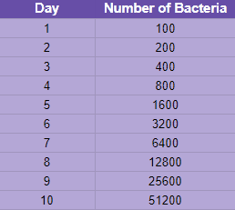
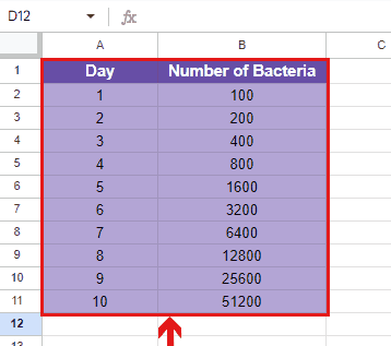
Consider the given below data set containing the record of the exponential growth of a particular bacteria in ten days:
In Google Sheets, by creating a semi-log graph, you can visually demonstrate the trend or pattern of a dataset. It is advantageous to use while analyzing data in exponential form. They allow us to envisage and understand the exponential growth and decay of variables, making it easier to recognize patterns. It should be noted that creating a semi-log graph is not a built-in feature in Google Sheets. However, we can create one by altering the chart settings.
STEP 1 – Select the data set
– Move your cursor to the top cell of the data set.
– Select the cell and drag your cursor to the end of the data set.
– The whole data set will be selected.
STEP 2 – Generate a scatter or line graph
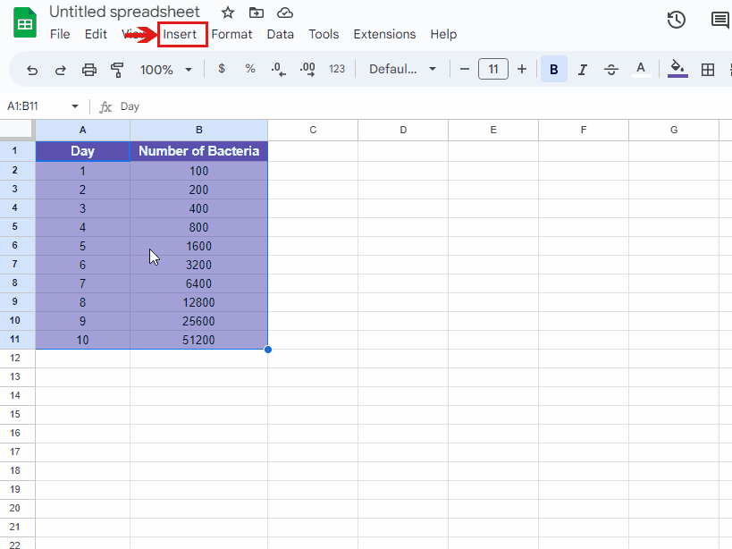
– Select the two columns that contain data.
– Click on the “Insert” menu.
– Select the “Chart” option.
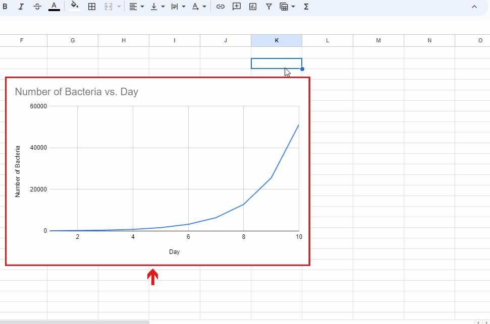
– A line graph will be created.
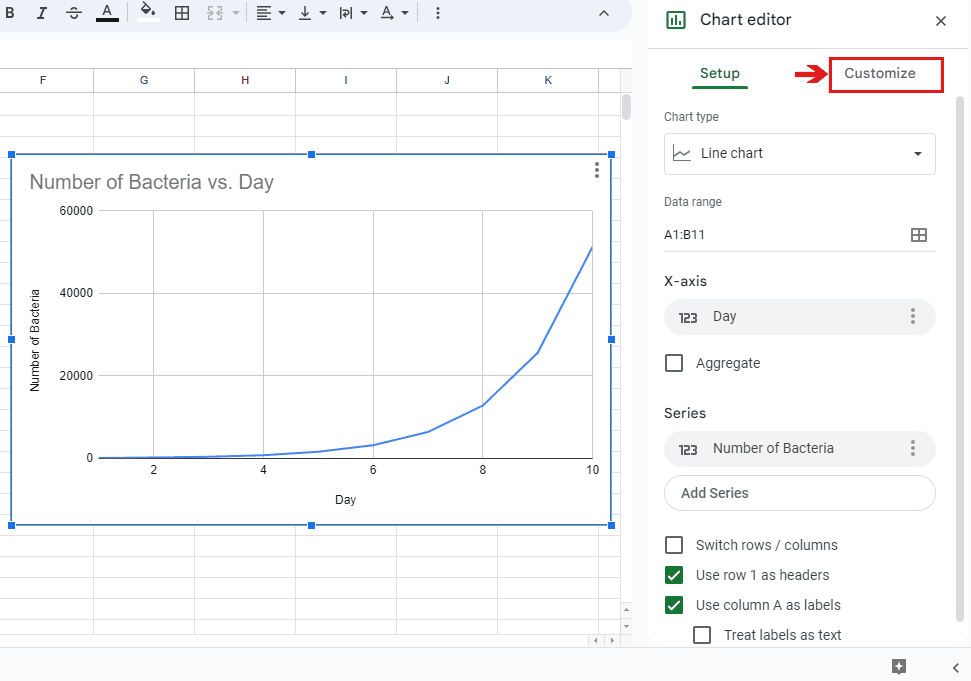
STEP 3 – Locate the Chart Editor in Google Sheets
– Move your cursor on the created chart and select it.
– Right-click on it.
– A chart editor dialogue box will be visible on the side of the sheet.
STEP 4 – Customize the created graph to a semi-log chart
– Select the Customize command, in the chart editor dialogue box.
– Click on the Vertical Axis option. A drop-down will appear.
– Scroll down and then click on the Log scale option.
– The line graph will be converted to a semi-log graph.