How to make a Pareto chart in Google Sheets
 By
SpreadCheaters
By
SpreadCheaters
In Google Sheets, the Pareto chart is an effective and advantageous tool for analyzing and visualizing data. The primary purpose of the Pareto chart is to identify or highlight the prominent factors that contribute to a problem. Recognition of these elements can provide valuable insights while making decisions. It eventually leads to development and progress.
In this tutorial, we will discuss two ways to create Pareto charts in Google Sheets.
METHOD 1 – Creating the Pareto chart directly from the “Insert” menu
In this method, we’ll insert a Pareto chart in Google Sheets by using the Insert menu. This method is valid only if the provided data is in the correct format.
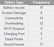
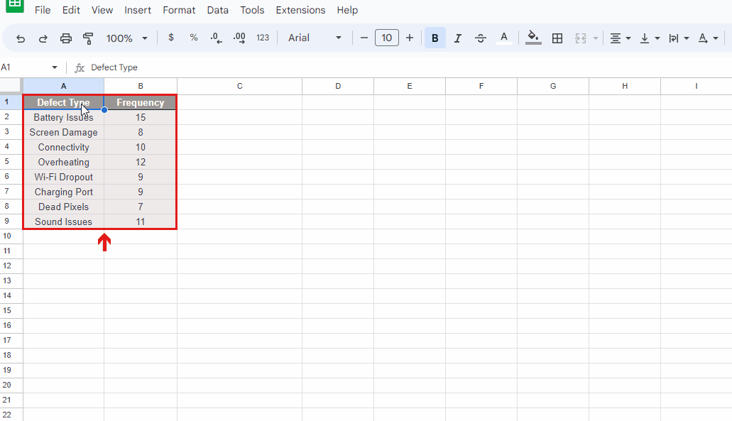
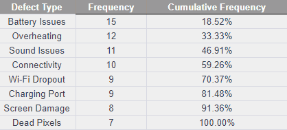
Let’s consider a data set containing a number of defects, detected in the devices of an electronic company:
Following steps should be followed to create a Pareto chart in Google Sheets:
STEP 1 – Sort the data in descending order
- Select both columns that contain data.
- Click on “Data” mentioned in the tool panel.
- Click on the “Sort Range” option.
- Select the “Advanced range sorting options”.
- Adjust the ‘Sort by” column to “Column B”
- Click on the option “Z > A” and then click on “Sort”.
- The data will be sorted.
STEP 2 – Create a column for the calculation of cumulative frequency
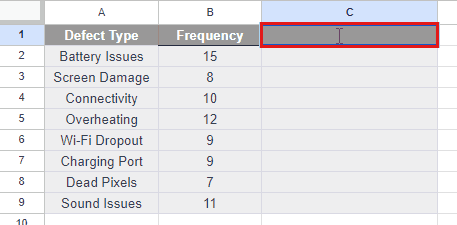
- Move your cursor to the first cell of the column where you want to calculate cumulative frequency.
- Select the cell and give the heading “Cumulative Frequency”.
STEP 3 – Apply the formula to calculate the cumulative frequency
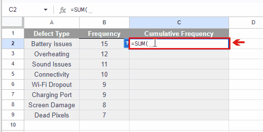
- Move your cursor to the first cell of the column “Cumulative Frequency”
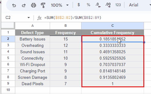
- The formula to calculate cumulative frequency, in this case, is:
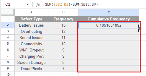
=SUM($B$2:B2)/SUM($B$2:B9)
where “SUM($B$2:B2)” represents the frequency of the first defect i.e. battery issues and “SUM($B$2:B9)” represents the sum of all the frequencies from “B2” to “B9”.
- Write the formula and press Enter key.
- The cumulative frequency of the first defect i.e. “Battery issues” will be calculated.
STEP 4 – Calculate all cumulative frequencies using AutoFill Handle
- Select the cell that contains the cumulative frequency of the first defect.
- Move your cursor to the bottom right corner of the cell.
- Drag the AutoFill Handle till the last cell in which you want to calculate the cumulative frequency.
- The cumulative frequencies of all defects will be calculated.
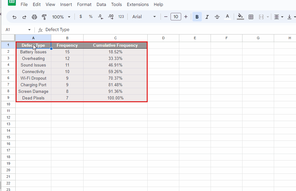
STEP 5 – Convert the decimal form of cumulative frequency into the percentage
- Select the column of “Cumulative Frequency” till the last cell that contains data.
- Click on the percentage “%” icon.
- The decimal form of frequencies will be converted into percentages.
STEP 6 – Plot the Pareto chart
- Select all three columns that contain data.
- Click on the “Insert” menu.
- Select the “Chart” option.
- A Pareto chart will be created
STEP 7 – Change the chart settings to adjust the cumulative frequencies in the chart

- Click on the “Customize” button in the “Chart Editor”.
- Select the “Series” option. A drop-down menu will appear.
- Click on the arrow in the box where “Apply to all series” is written.
- Select the “Cumulative frequency” option.
- In the same drop-down menu, an option of “Axis” is given.
- Click on the arrow in the box and select the “Right-axis” option.
- The line, representing the cumulative frequency in the chart, will be adjusted according to the given data.
METHOD 2 – Creating a Pareto chart from a bar chart
In this method, first we’ll create a bar chart, and then we’ll convert it into a Pareto chart. We will consider the data set the same as in “METHOD 1” along with the cumulative frequencies.
Following are the steps to create a Pareto chart from a bar chart:
STEP 1 – Plot the bar chart
- Select the two columns of “Defect Type” and “Frequency”.
- Click on the “Insert” menu.
- Select the “Chart” option.
- A bar chart will be created.
STEP 2 – Convert bar chart into Pareto chart
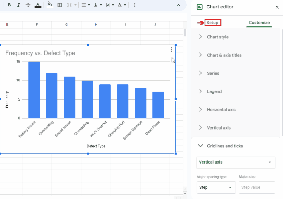
- Select the “Setup” option in the “Chart Editor”.
- Select the “Combo chart” option in the “Chart type” box.
- Click on the arrow, placed beside the “Combo chart”.
- Select the Pareto chart in the “Line” bar.
- Click on the “Add Series” option. A box will appear.
- Write the range of cumulative frequency in the box, from the column. As in this case, the range is “C2:C9”.
- Click on the “OK” button.
- A Pareto chart will be created.
STEP 3 – Change the chart settings to adjust the cumulative frequencies in the chart
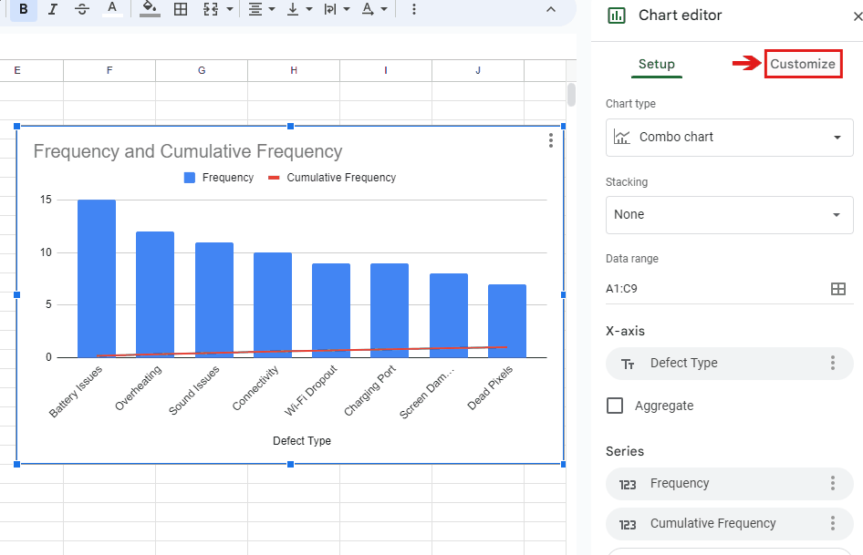
- Click on the “Customize” button in the “Chart Editor”.
- Select the “Series” option. A drop-down menu will appear.
- Click on the arrow in the box where “Apply to all series” is written.
- Select the “Cumulative frequency” option.
- In the same drop-down menu, an option of “Axis” is given.
- Click on the arrow in the box and select the “Right-axis” option.
- The line, representing the cumulative frequency in the chart, will be adjusted according to the given data.