How to add multiple trendlines in Google Sheets
 By
SpreadCheaters
By
SpreadCheaters
Creating trendlines in Google Sheets can be useful for analyzing and visualizing the trend or pattern in data over time. Trendlines are straight lines or curves that provide a best-fit representation of the relationship between two variables, typically an independent variable (such as time) and a dependent variable (such as sales). Trendlines help you identify patterns and trends in your data. By visually representing the relationship between variables, you can determine if there is an upward or downward trend, or if the data is following a specific pattern.
There are many ways to create trendlines in google sheets. Two easy and simple methods to add multiple trendlines in google sheets are discussed below. One method is to use the “Scatter Plot” chart and format the data points as trendlines. The other method is to use a “Smooth Line chart” to create multiple trendlines of data series.
Method 1 – Using the three dots menu
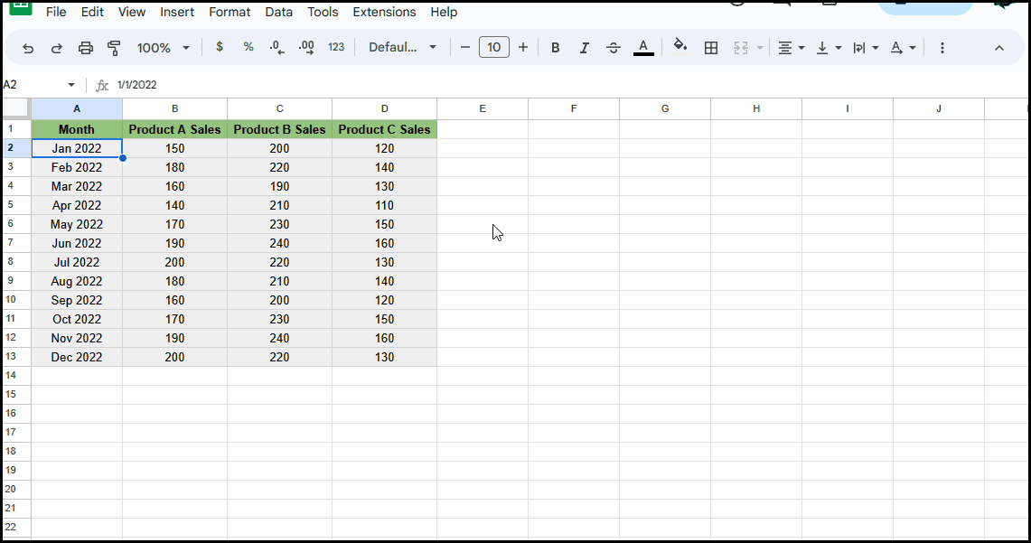
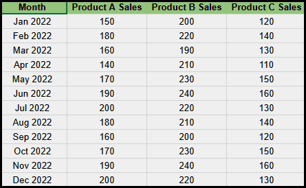
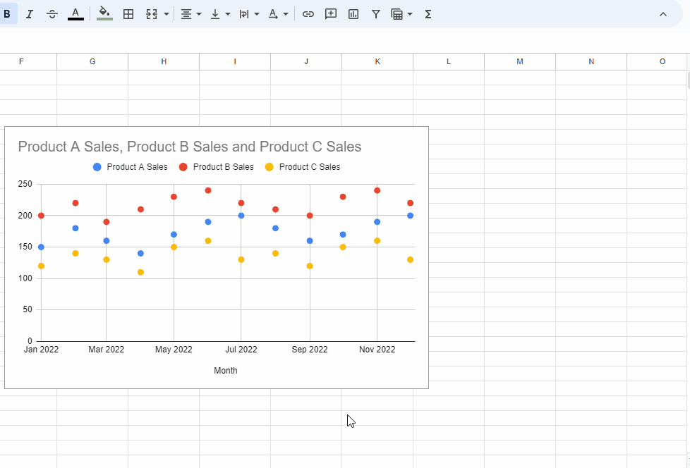
Scatter plots are effective in visually representing relationships between variables. We can add multiple trendlines in google sheets by clicking on the context menu and then adding trendlines for each data series. Consider the following dataset that contains sales of three products over a year. By creating trend lines for each product, we can compare the sales of three products.

Step 1 – Insert a scatter plot chart
- Select the data range for the scatter plot chart.
- Click on “Insert” from the ribbon.
- Click on “Chart”.
- From the given templates, select “Scatter Chart”.
Step 2 – Add a trendline for each data series
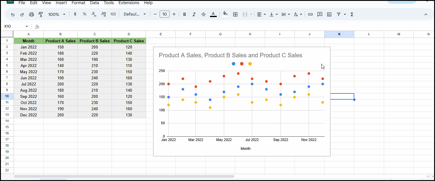
- Click on the three dots in the top right corner of the chart.
- Click on “Edit chart”.
- Go to the “Customize” tab.
- Click on “Series”.
- Scroll down and checkmark “Trendline”.
Step 3 – Format the trendlines
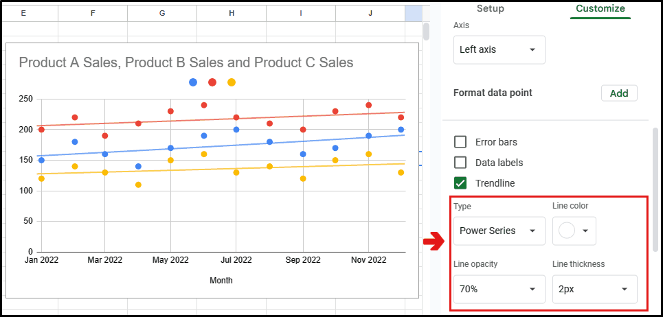
- Adjust the appearance and type of the trendline according to your requirements, such as exponential, linear, polynomial trendlines, etc.
- Here the trendlines are formatted as :
Method 2 – By right-clicking on the chart
We can add multiple trendlines in google sheets by right-clicking the chart, and then adding trendlines for each data series. Consider the same dataset that is used in the above example. We’ll create a curved trendline for each data series.
Step 1 – Insert a scatter plot chart
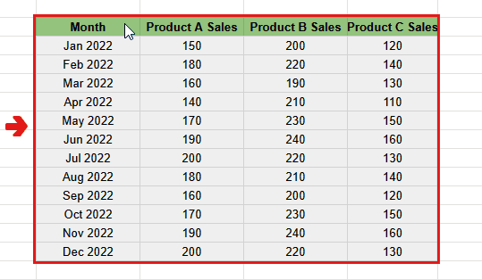
- Select the data range for the scatter plot chart.
- Click on “Insert” from the ribbon.
- Click on “Chart”.
- From the given templates, select “Scatter Chart”.
Step 2 – Add a trendline for each data series
- Right-click on the chart.
- Click on “Series”.
- Click on “Apply to all series”. Scroll down and checkmark “Trendline”.
Step 3 – Format the trendlines

- Adjust the appearance and type of the trendline according to your requirements, such as exponential, linear, polynomial trendlines, etc.
- Here the trendlines are formatted as :