
How to add multiple trendlines in Excel
 By
SpreadCheaters
By
SpreadCheaters
You can watch a video tutorial here.
Charts are a great way to visualize data and perform data analysis. Excel has several options when it comes to creating and formatting charts. One or more trendlines can be added to the chart to better understand the relationship between the data points.
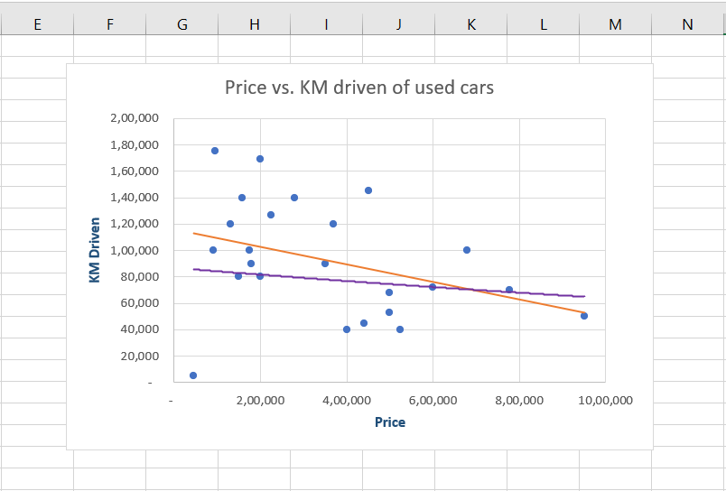
Suppose you have 2 sets of data for used cars. One is the number of kilometers driven and the second is the selling price. To see the relationship between these variables, you create a scatter plot. To better visualize the relationship between the kilometers driven and the selling price, you want to add multiple trendlines. In this example, we will add a linear trendline and an exponential trendline.
Step 1 – Open the Chart Elements quick menu
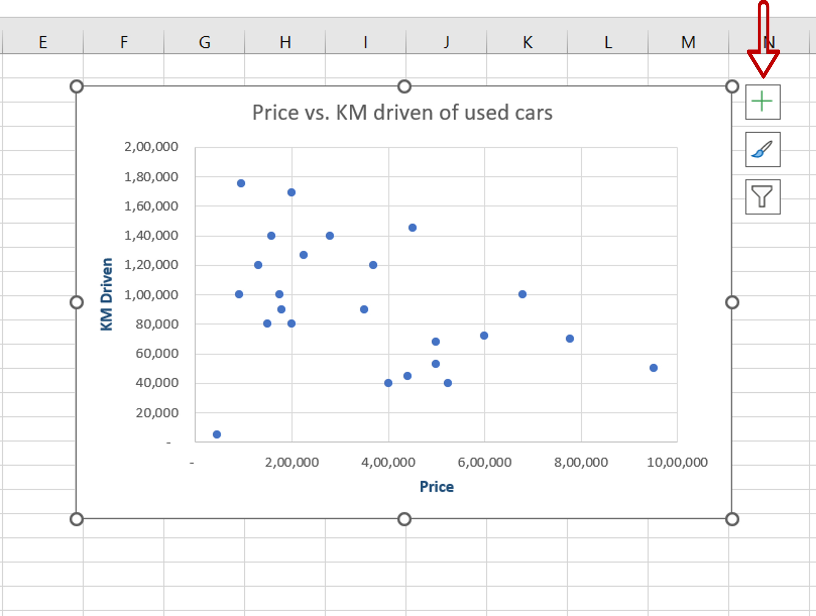
– Select the chart
– Click on the plus sign (+) that appears at the top right corner of the chart
Step 2 – Select the trendlines
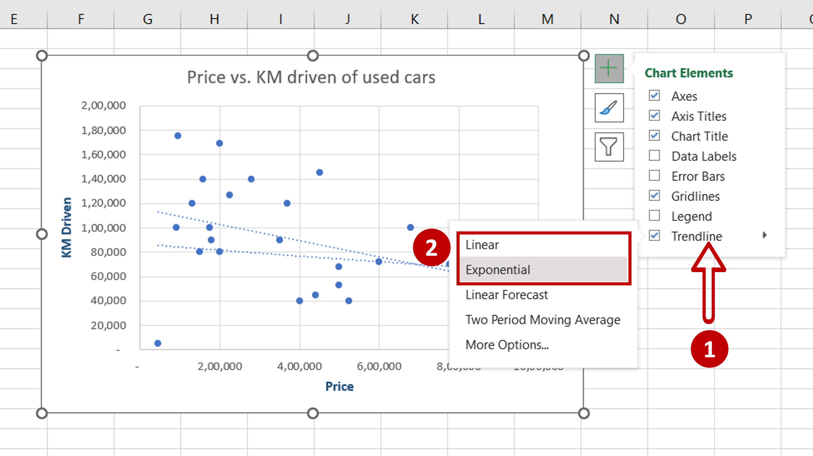
– From the Trendline menu, click Linear and Exponential
OR
Go to Chart Design > Add Chart Element > Trendline > Linear, repeat the steps and add Exponential
Step 3 – Open the Format Trendline pane
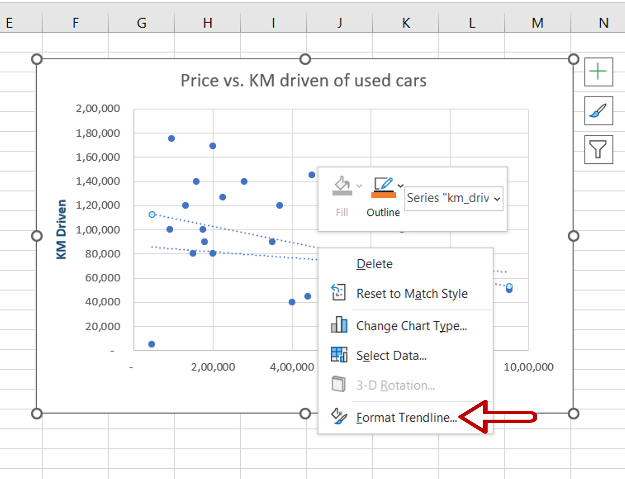
– Select the linear trendline and right-click to open the context menu
– Select Format Trendline
Step 4 – Format the linear trendline
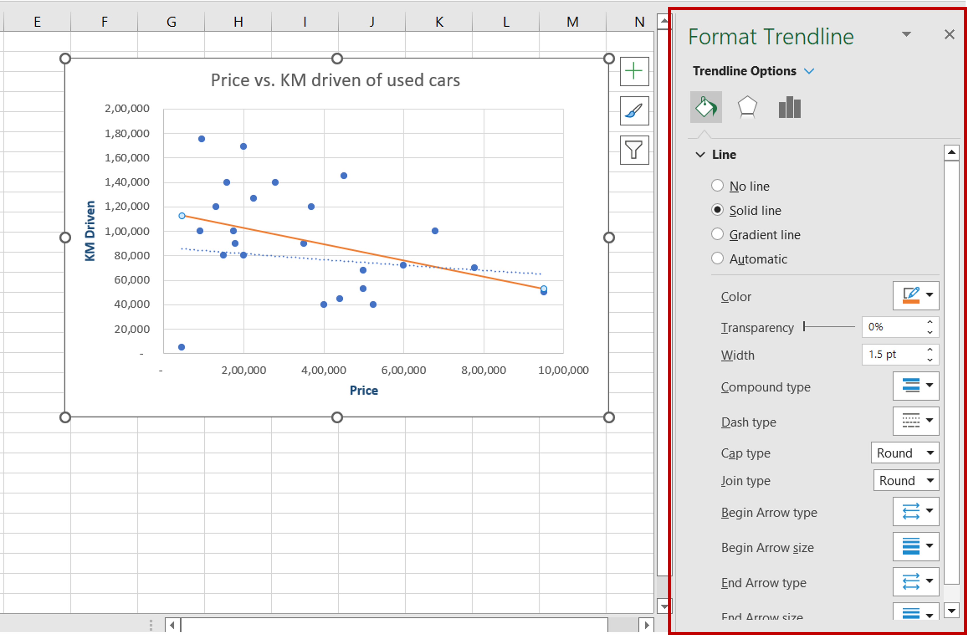
– Use the formatting options in the Format Trendline pane to format the linear trendline
Step 5 – Format the exponential trendline
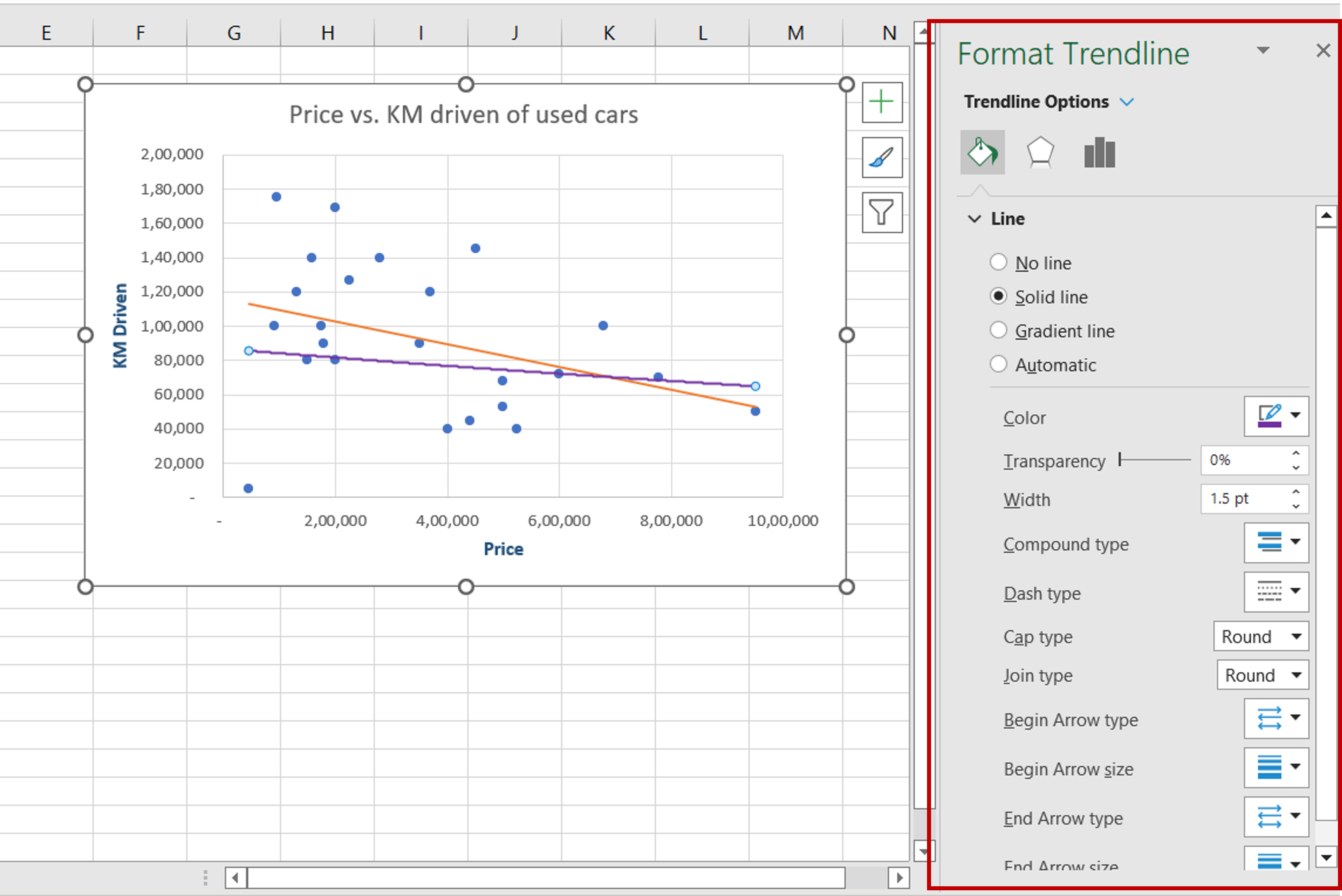
– Select the exponential trendline
– Use the formatting options in the Format Trendline pane to format the exponential trendline


