
How to add a vertical line in Excel
 By
SpreadCheaters
By
SpreadCheaters
In Microsoft Excel, we often need to work with different types of charts. Different kinds of charts are used to represent different kinds of data. Sometimes we need to highlight a specific benchmark or a data point on the chart. We can use a vertical line for this purpose. A vertical line can separate and compare data points before and after a particular occurrence. If you have multiple categories or groups in your chart, a vertical line can help visually separate and distinguish between them. You can use a vertical line as a reference point or benchmark to compare other data points. For example, you might add a vertical line to represent an average or target value.
There are many different ways to add a vertical line in Excel. In this tutorial, we’ll learn how to add a vertical line to scatter charts and bar charts. We can add a vertical line to the scatter chart using error bars, and we can use an additional data series to add a vertical line to a bar chart.
Case 1 – Adding a vertical line to a scatter chart
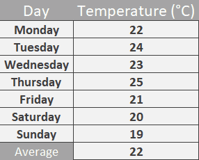
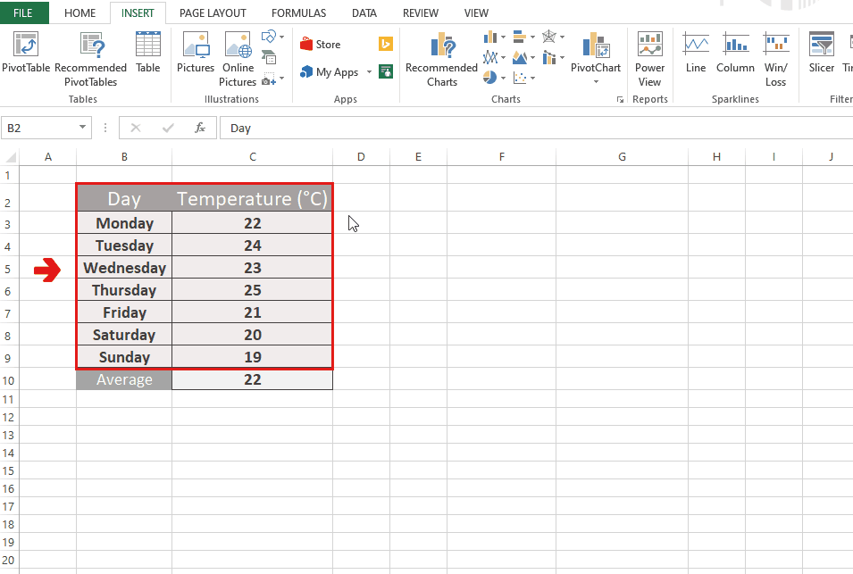
We can add a vertical line to a scatter chart by using error bars. We’ll create a data point on the chart and then we’ll create error bars. Then we can create a vertical line using error bars by formatting them. Consider the following dataset that contains the temperatures of all seven days of a week. We’ll mark the average temperature using a vertical line.
Step 1 – Insert a scatter chart
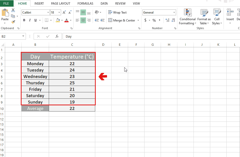
- Select the data for which you want to create the scatter chart.
- Go to the “Charts” group of the “Insert” tab.
- Click on “More Charts”.
- From the drop-down list, choose the “Scatter” chart.
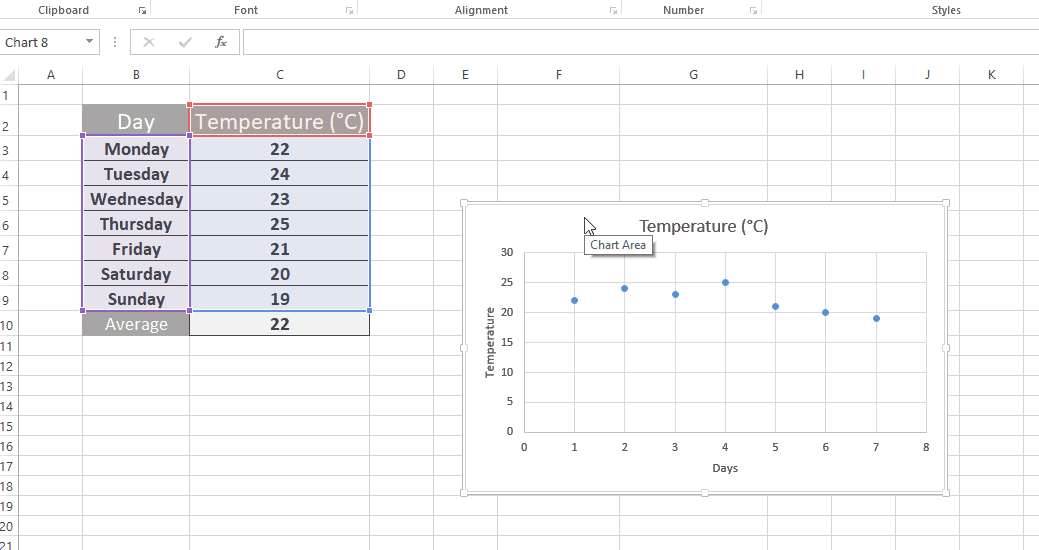
Step 2 – Add a data series
- Right-click on the chart.
- Click on “Select Data”.
- Click on “Add”.
- Adjust the values so that the data point appears at the average temperature.
- In this case, values for Series X are ={3.5,3.5} and for Series, Y is ={22,22}.
- Click on OK.
Step 3 – Add error bars
- Select the data point.
- Click on + on the top right of the chart.
- Tickmark the “Error bars” option.
- Click on the arrow in front of the “Error bars” option.
- Click on “Percentage”.
Step 4 – Format the error bars
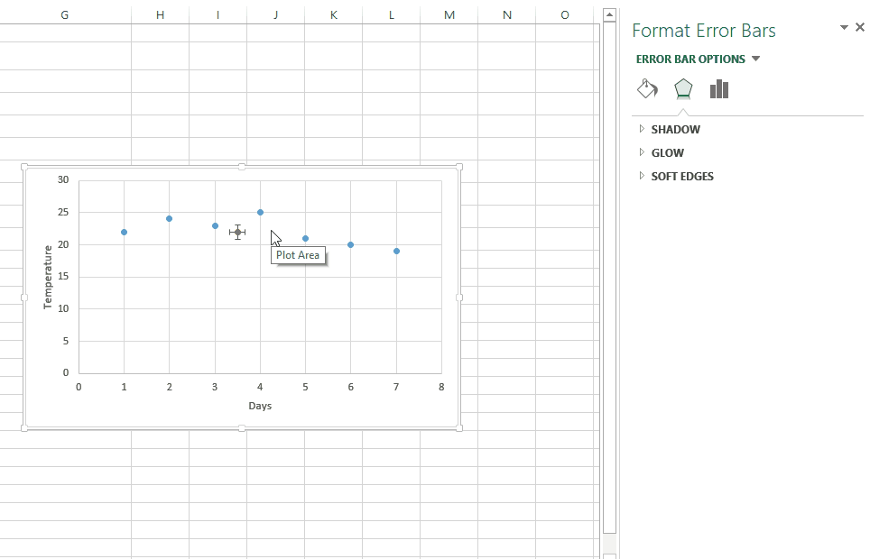
- Click on the horizontal error bars.
- Change the error amount to 0%.
- Now, click on the vertical error bars.
- Change the error amount to 100%.
- Change the direction of error bars to “Minus”.
- Change the color and width of the vertical line according to desire.
Case 2 – Adding a vertical line to a bar chart
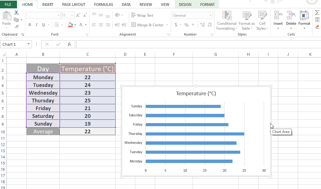
We can add a vertical line to a bar chart by adding a data series that is represented by a vertical line. We’ll adjust the series x and y values such that the result turns out to be a vertical line. Consider the same dataset that is discussed above. We’ll create a bar chart for it first and then we’ll add a vertical line to it.

Step 1 – Insert a bar chart
- Select the data for which you want to create a bar chart.
- Go to the “Clipboard” group of the “Insert” tab.
- Click on “Clustered bar chart”.
Step 2 – Add a data series
- Right-click on the chart.
- Click on “Select Data”.
- Click on “Add”.
- Set the series value equal to the maximum value of the Y-axis.
Step 3 – Change the series chart type and edit the series
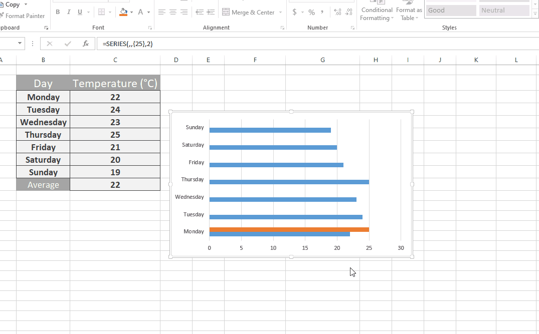
- Select the added data series.
- Right-click on it.
- Click on “Change series chart type”.
- Change the chart type of the added series to “Scatter with straight lines and markers”.
- Right-click on the chart.
- Click on “Select data”.
- Edit the added series.
- Change the Series X values to ={22,22} and Series Y to ={0,25}.
- Click on OK.


