
How to change the color of a scatter plot in Microsoft Excel
 By
SpreadCheaters
By
SpreadCheaters
Page last updated:
11/04/2023 |
Next review date:
11/04/2025
In Excel, a scatter plot is a type of chart that displays the relationship between two data sets. By default, Excel uses a single color for all data points in a scatter plot. However, you may want to use different colors to distinguish between other groups or categories in the data.
In this tutorial, we will learn how to change the color of a scatter plot in Microsoft Excel. In Excel, the color of the scatter plot can be changed by simply using the Format tab. The Format Data Series pane can also be utilized.
Method 1: Using the Format Tab
Step 1 – Select the Series

- Select the Series of the Scatter plot whose color you want to change.
- For this, you can click on any data point of the series once. All the data points of that series will automatically be selected.
Step 2 – Go to the Format Tab
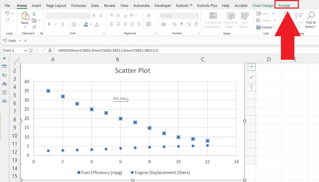
- Go to the Format tab of the Scatter plot in the menu bar.
Step 3 – Click on the Shape Fill Option
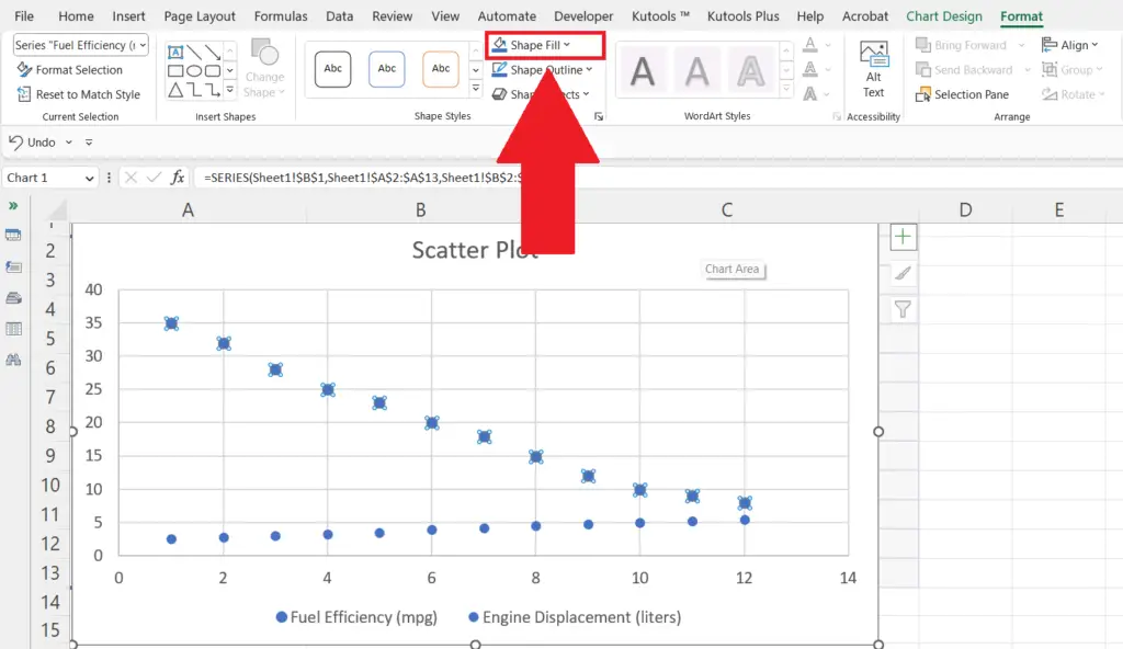
- Click on the Shape Fill option in the Shape Styles section.
- A drop-down menu will appear.
Step 4 – Select the New Color
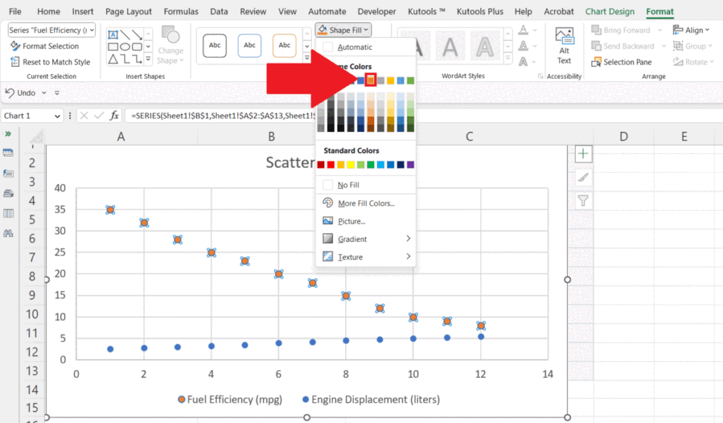
- Select the new color for the Scatter plot.
- The color will be changed.
Method 2: Using the Format Data Series Pane
Step 1 – Select the Series
- Select the Series of the Scatter plot whose color you want to change.
- For this, you can click on any data point of the series once. All the data points of that series will automatically be selected.
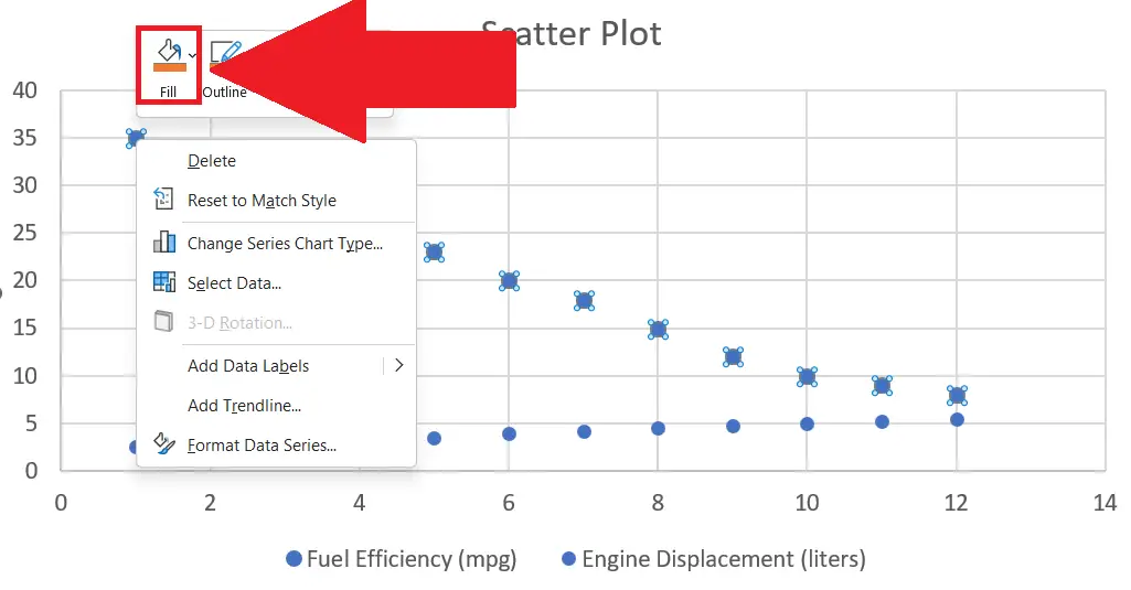
Step 2 – Right-Click on the Data Series
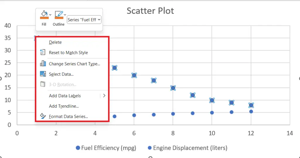
- Right-click on the data series.
- A context menu will appear.
Step 3 – Click on the Format Data Series Option
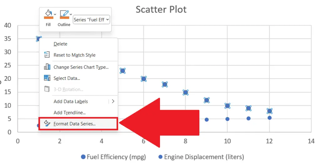
- Click on the Format Data Series option in the context menu.
- The Format Data Series pane will open on the right side of the window.
Step 4 – Click on the Fill & Line Icon
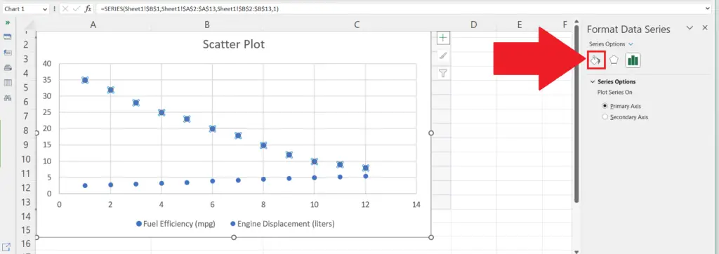
- Click on the Fill & Line icon in the pane.
Step 5 – Click on the Marker Section
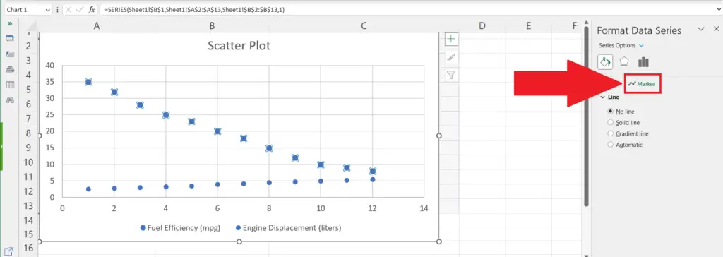
- Go to the Marker section.
- You may go to the Line section if required.
Step 6 – Change the Color under Fill Options
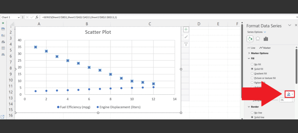
- Click on the Fill Color icon in the Fill options.
- Choose the new color.
- The color of the scatter plot will be changed.
Method 3: Using the Fill Colour Shortcut in the Context Menu
Step 1 – Select the Series

- Select the Series of the Scatter plot whose color you want to change.
- For this, you can click on any data point of the series once. All the data points of that series will automatically be selected.
Step 2 – Right-Click on the Data Series

- Right-click on the data series.
- A context menu will appear.
Step 3 – Click on the Fill Color Icon
- Click on the Fill Color icon at the top of the context menu.
Step 4 – Select the New Color
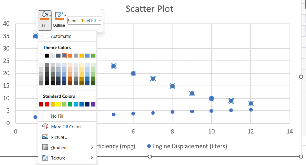
- Select the new color.
- The color will be changed.


