
How to sort bar charts in Excel without sorting data
 By
SpreadCheaters
By
SpreadCheaters
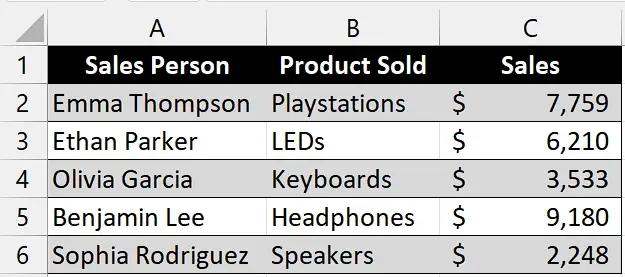
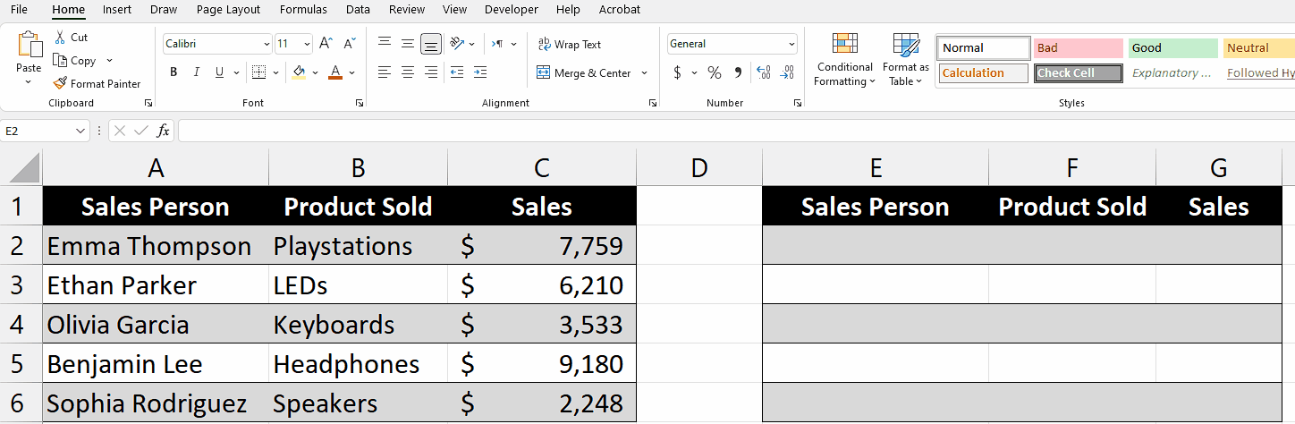
The dataset below represents the sales performance of five salespeople in a company. Each row contains information about a specific salesperson, the product they sold, and the corresponding sales revenue. Currently, our data is unsorted and in today’s tutorial, we will learn how to plot a sorted bar graph of this dataset without sorting the original dataset.
Understanding the Function and its Syntax
The SORTBY function is a powerful feature introduced in newer versions of Excel (starting with Excel 365) that allows you to sort a range of data based on the values in another range or column. It dynamically reorders the data based on the sorting criteria you provide.
The syntax for the SORTBY function is as follows:
=SORTBY(array, by_array1, [sort_order1], [by_array2, sort_order2],…)
array: This is the range or array of data that you want to sort.
by_array1: This is the range or array of values that will be used to determine the sort order of the array.
sort_order1 (optional): This specifies the sort order for by_array1. It can be 1 (ascending) or -1 (descending). If omitted, the default sort order is ascending.by_array2, sort_order2 (optional): You can include additional pairs of by_array and sort_order to further refine the sort order.
Sorting a bar chart in Excel without sorting the underlying data can be useful for presenting the data in a specific order or for emphasizing particular data points. By sorting the bars in a specific order, you can highlight certain data points or patterns to make them more visually prominent. Sorting a bar chart in Excel without sorting the original data is helpful when we need to keep the original data aside and plot a sorted bar graph.
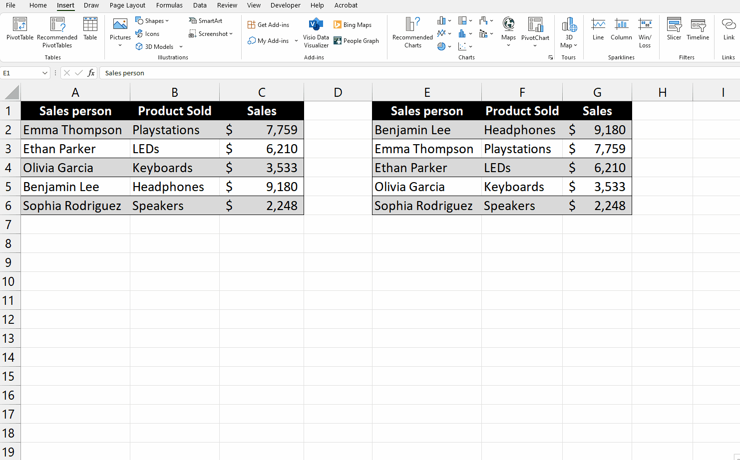
Step 1 – Copying the Column Headers
– Copy the column headers of the original dataset which is not sorted.
– Then, paste it anywhere in the sheet according to your preference.
Step 2 – Select the cell
– Select the cell under the first copied column header.
– We will use the “SORTBY” function in this cell to generate sorted data, which will serve as the basis for creating a sorted bar graph.
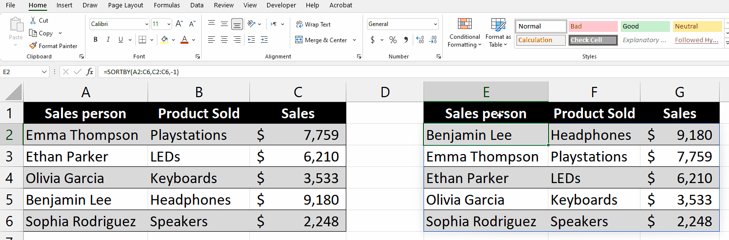
Step 3 – Write and implement the formula
– Write the following formula in the selected cell.
=SORTBY(A2:C6,C2:C6,-1)
Where,
A2:C6: This specifies the range of data to be sorted. In this case, it includes cells A2 to C6, which likely contain the salesperson’s name, the product sold, and the corresponding sales data.
C2:C6: This indicates the range or column that will be used as the basis for sorting. In this example, it refers to cells C2 to C6, which contain the sales revenue data. The sorting will be performed based on the values in this column.
-1: This parameter determines the sort order. In this case, “-1” indicates descending order. It means that the data will be sorted in decreasing order of sales revenue. The highest sales revenue will be listed first, while the lowest will be at the bottom.
– After writing the formula, press Enter and your data will be sorted.
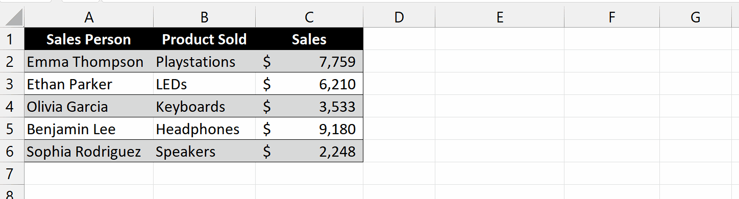
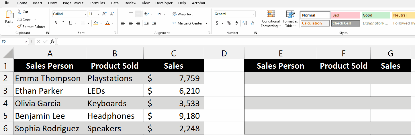
Step 4 – Select the cell range
– After creating the sorted data, select the range of cells containing the sorted data.
– We will use this data to plot a sorted Bar Graph.
Step 5 – Plot the Bar Graph
– Go to the “Insert” tab in the Excel ribbon at the top of the screen.
– Look for the “Charts” group and click on the “Bar” button.
– This will display a dropdown menu with various bar graph options.
– From the dropdown menu, select the type of bar graph you want to create. Excel offers different types such as clustered columns, stacked columns, 3-D columns, etc. Choose the one that suits your data visualization needs.
– Then, click on the desired Bar Graph and Excel will plot a sorted data Bar Graph.


