
How to show overlapping data in Excel
 By
SpreadCheaters
By
SpreadCheaters
In Excel, overlapping data helps provide a comprehensive context. It allows you to view the relationships between different variables or categories within the same chart. This context is valuable for making informed decisions and drawing meaningful insights. By visualizing the data together, you can identify correlations, dependencies, or divergences that may not be apparent when viewing the datasets separately.
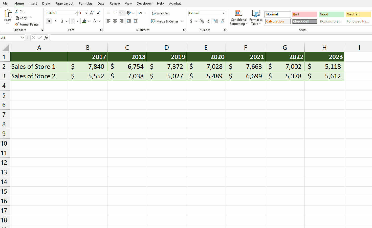
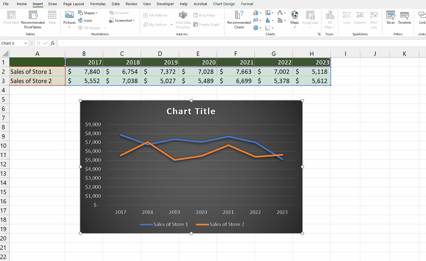
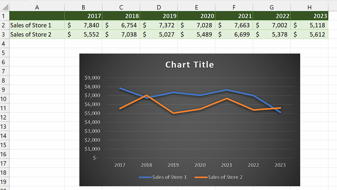
The provided dataset represents the sales data for two stores, Store 1 and Store 2, over a period of seven years from 2017 to 2023. Each row corresponds to a specific store, and each column represents a specific year. Overall, this dataset presents a comparison of the sales performance between Store 1 and Store 2 over a seven-year period, highlighting the yearly fluctuations in sales for each store. In today’s tutorial, we will learn how to make the provided data overlap each other.
Method 1 – By using Excel’s built-in overlapping Bar Graph
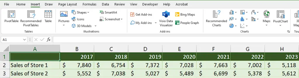
Step 1 – Select the cell range
- Firstly, select the range of cells that we want to show as overlapping data.
- This range should include both the category labels and the data values.
Step 2 – Insert a Stacked Bar chart
- Go to the “Insert” tab in the Excel ribbon at the top of the screen.
- In the “Charts” group click on the “Bar” button.
- A drop-down menu will appear with various types of bar charts.
- Select the stacked 2D or 3D chart and you will see that the data is shown in the form of overlapping data.
Step 3 – Customize the Bar Chart
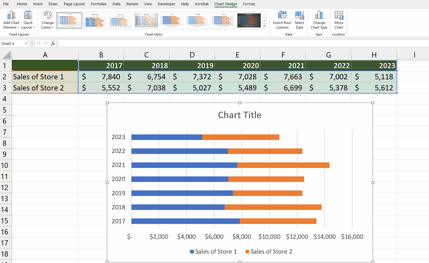
- Click anywhere inside the Bar Chart to select it.
- Then, select any style from “Chart styles” group that gives you better appearance for overlapping data.
Method 2 – By using “Change Chart Type” tool
Step 1 – Open the “Change Chart Type” tool
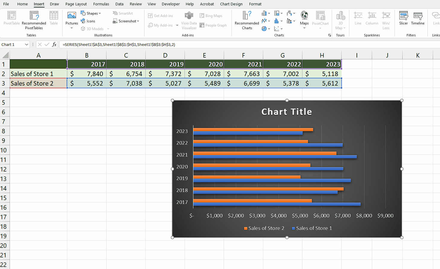
- Click on the bars of Bar Chart to select them.
- Then, Right click on it to open the context menu.
- From the context menu, click on “Change series Chart Type”.
- A dialogue box would open and appear on your screen.
Step 2 – Change Chart type to make it overlap
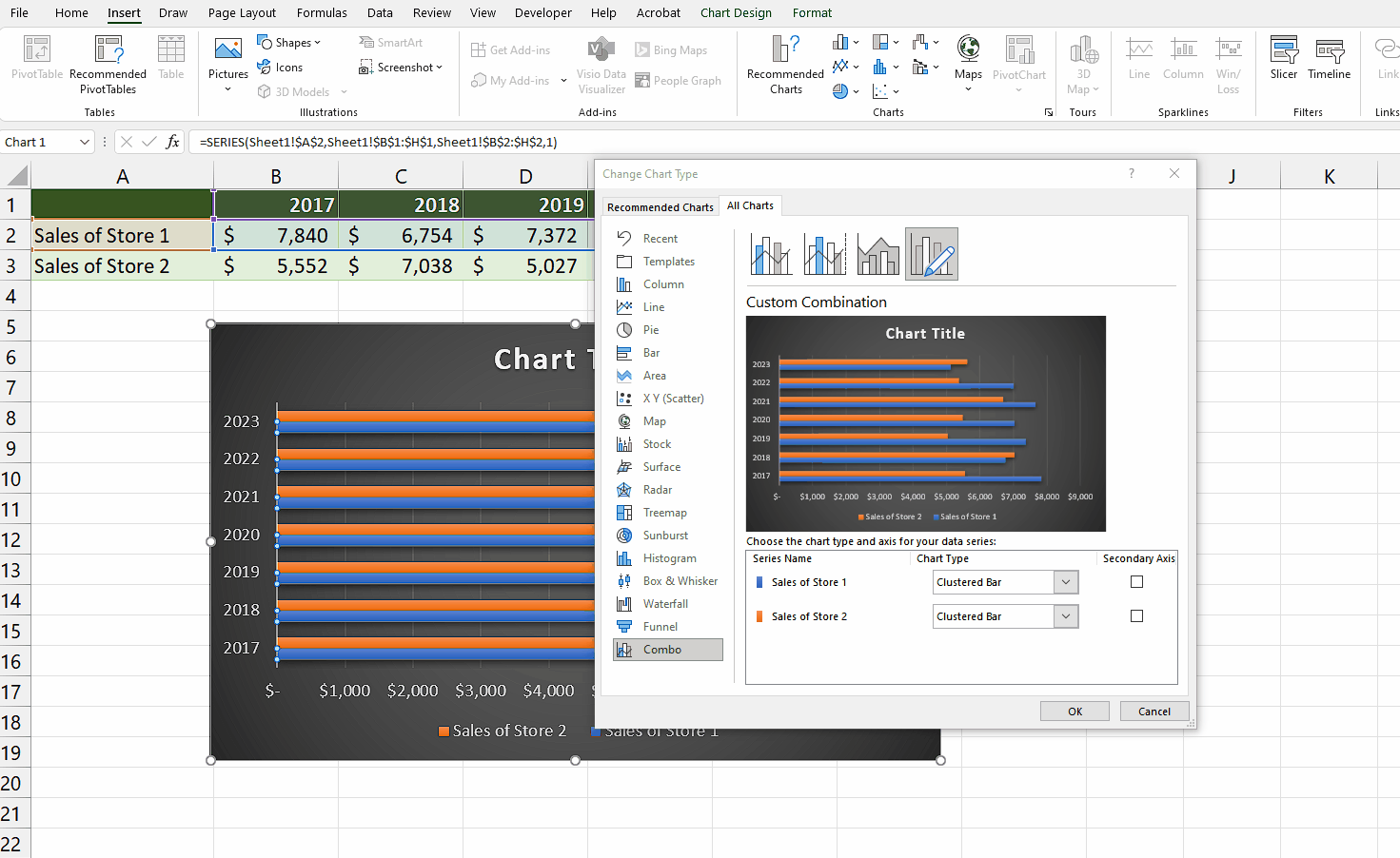
- After the dialogue box has opened, you will be given some options regarding Series Name, Chart type and Secondary Axis.
- Under the Secondary Axis option, click on any of the two boxes to make the data overlap each other.
- Then, press “OK” and your data will appear as overlapping data.
Method 3 – By using VBA code
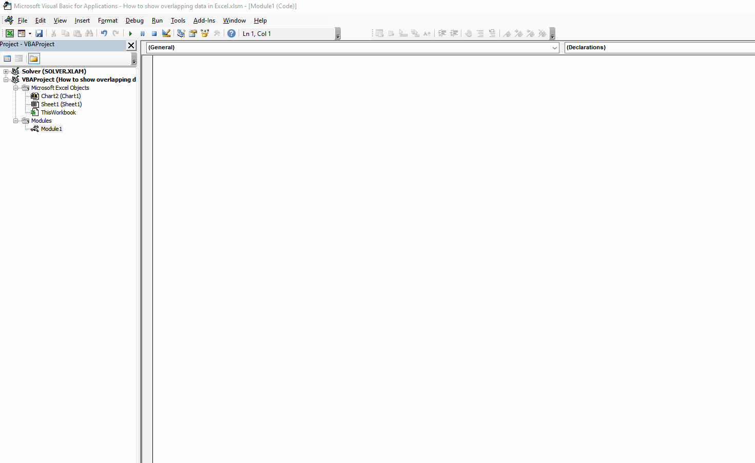
Step 1 – Add a module
- Go to the Developer tab.
- Click on the Visual Basic option.
- A new window will appear, which can also be opened using the shortcut key (Alt+F11).
- In the new window, click on the Insert tab.
- Select the Module option.
- A new module will open.
Step 2 – Writing the code
- After you’ve opened the module, copy and paste the following code:
Sub ConvertOverlapGraph()
Dim selectedChart As ChartObject
Dim chartType As XlChartType
‘ Check if a chart is selected
If Not ActiveChart Is Nothing Then
‘ Store the selected chart
Set selectedChart = ActiveChart.Parent
‘ Set the chart type to stacked bar
chartType = xlColumnStacked
‘ Convert the selected chart to stacked bar graph
With selectedChart
.Chart.chartType = chartType
End With
‘ Cleanup
Set selectedChart = Nothing
‘ Inform the user about the conversion
MsgBox “Chart converted to Stacked Bar Graph.”, vbInformation
Else
‘ No chart selected, show an error message
MsgBox “Please select a chart before running this macro.”, vbExclamation
End If
End Sub
- Then, close the VBA Editor by using shortkey “Alt+Q”.
Step 3 – Select the Chart
- Select the chart in which you want to have the overlapping data.
- If you don’t select the chart and run the macro, a dialogue box will appear which will ask you to select the Chart before running the macro.
Step 4 – Running the Macro
- Click on the Developer tab.
- In the Code group, click on the “Macros” button.
- The “Macro” dialog box will appear, displaying a list of available macros in the workbook.
- Alternatively, you can open it by using shortcut key “Alt+F8”.
- Select the macro named “ConvertOverlapGraph”.
- Click on the “Run” button.
- The selected macro will now be executed, performing its designated action which is converting the Chart into Stacked Bar Graph to show overlapping data.
Explanation of code used in Method 3:
This VBA code performs the simple task of converting a selected chart in an Excel worksheet to a stacked bar graph. It first checks if a chart is currently selected. If a chart is selected, it stores the reference to the selected chart and sets the desired chart type to “stacked bar.” It then converts the selected chart to the specified chart type. Finally, it cleans up by releasing the stored chart reference. If no chart is selected, an error message is displayed. Overall, this code provides a quick and efficient way to convert a selected chart to a stacked bar graph in Excel with a user-friendly notification.


