
How to make a pie chart in Excel with one column of data
 By
SpreadCheaters
By
SpreadCheaters
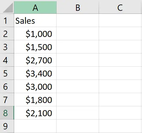
We have a dataset that includes a column representing the weekly sales of a store, and we would like to create a pie chart to visually represent the distribution of these sales. To achieve this, we will first need to create a pivot table using this column, and then use the pivot table to create a pie chart.

A pie chart created using a single column of data represents the distribution of different categories or values within that column as slices of a circle, where the size of each slice is proportional to the value it represents. The importance of creating a pie chart in Excel with one column of data is that it provides an easy-to-understand visual representation of data that can help you quickly identify the most significant categories or values.
Step 1 – select the range of cells
– Select the range of cells, for which you want to form the chart
Step 2 – Click on the Pivot Table option
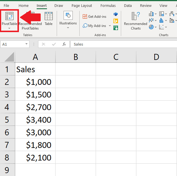
– After selecting the range of cells, click on the Pivot Table option in the Tables group of the insert tab and a dialog box will appear
Step 3 – Click on OK

– Click on OK if you want a pivot table in the new sheet and a pivot table will appear on a new sheet
– If you want the pivot table on the same sheet, click on the Existing sheet option and type the location where you want to show the table on the existing sheet, and then click on Ok
– Here we want to show the table on a new sheet
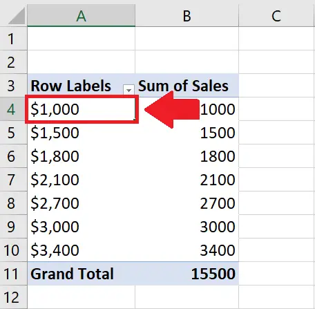
Step 4 – drag the Field to the Rows
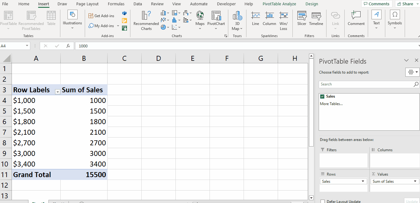
– Click on the Field appearing in the dialog box on the right slide of the new sheet
– And drag t to the Rows option, and 21 columns will appear on the sheet
Step 5 – Click on the Cell
– Click on any cell of the field
– Here we selected the first cell
Step 6 – Click on the Insert Pie or Doughnut Chart option
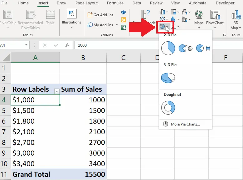
– After selecting the cell, click on the Insert Pie or Doughnut Chart option and a drop-down menu will appear
Step 7 – Select the Chart
– From the dropdown menu, click on the Pie Chart to get the required result


