
How to change the color of a pie chart in Excel
 By
SpreadCheaters
By
SpreadCheaters
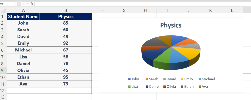
In this tutorial, we’ll show you how to change the colors of a pie chart in Excel. So let’s look at the dataset above in which we have the marks of various students for the subject of Physics. We’ve already drawn a pie chart in Excel and we’ll change the colors of the pie chart. We have plotted a 3D pie chart but the same steps can be followed on a 2D pie chart.

A pie chart is a type of chart in Excel that displays data as a circular graph divided into slices to represent the proportion of each category in the data set. The size of each slice is proportional to the quantity it represents, and the total area of the chart is equal to 100%. Pie charts are commonly used to display data that can be divided into categories, such as market share, budget allocation, or survey results. They are particularly useful for showing the relative sizes of different categories and the percentage of the whole that each category represents. In a pie chart, there is an option to change colors to give the chart a better look.
Step 1 – Click on the pie chart to enable options
– We already have a pie chart in the sheet, so, just click anywhere on the chart to enable chart options as shown above.
Step 2 – Click on chart styles option
– A newly opened side menu will appear, click on the color option from that menu.
Step 3 – Now choose any color from the color menu.
– Now choose any color theme from the colorful menu or monochromatic menu. If you choose a color theme from the colorful menu, Excel will assign each data sector a different color but if you choose monochromatic, it will assign different shades of a color as shown above.


