
How to make a percentage chart in Excel
 By
SpreadCheaters
By
SpreadCheaters
Page last updated:
30/06/2023 |
Next review date:
30/06/2025
To create a percentage chart in Excel, you can use various chart types such as pie charts, column charts, or bar charts. The purpose of a percentage chart is to visually represent the relative proportions or distribution of different categories or data points in a dataset. The chart displays each category as a portion of the whole, represented by percentages.
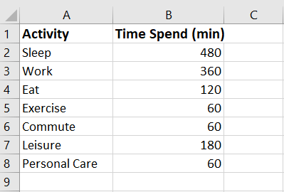
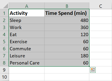
In this tutorial, we will learn to make a percentage chart in Excel. We have a dataset that includes activities of the day along with the corresponding time spent on each activity. Now, we want to create a percentage graph that illustrates the proportion of time spent on each activity. To achieve this, we can use two methods.
Method 1: Make a percentage chart using the Data Callout option
Step 1 – Select the range of cells

- Select the range of cells for which you want to make the chart
Step 2 – Click on the Insert Pie or Doughnut chart
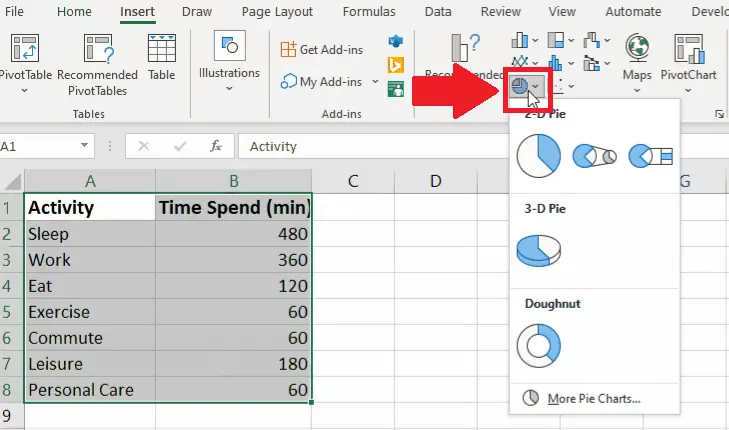
- After selecting the range of cells, click on the Insert Pie or Doughnut chart and a drop-down menu will appear
Step 3 – Select the Type of chart

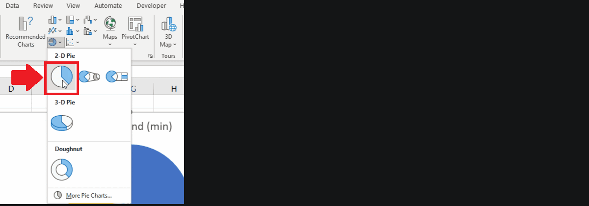
- Click on the chart type you want to insert from the drop-down menu
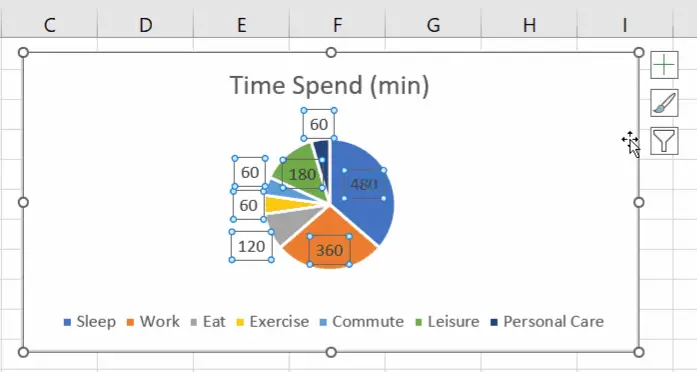
- Here we selected the 2D pie chart, you may choose any other type of graph and the graph will appear on the sheet
Step 4 – Click on the chart area

- After the chart appear on the sheet, click on any site of the chart
Step 5 – Click on the Chart Element option
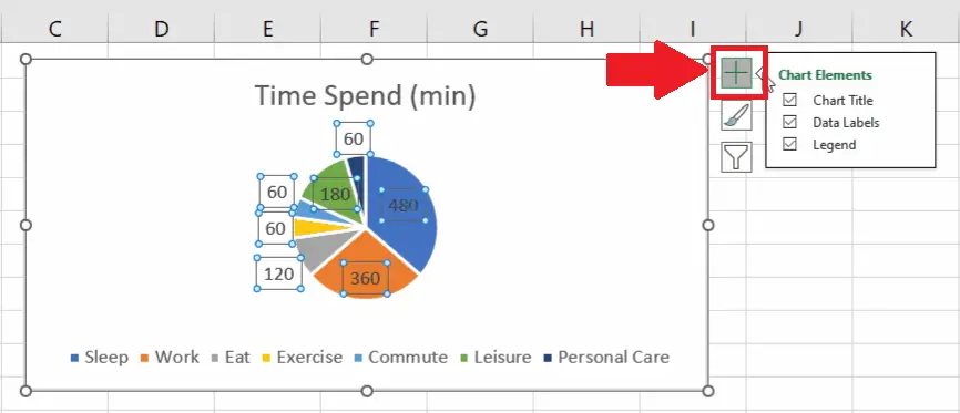
- After selecting the chart, click on the Chart Element option and a drop-down menu will appear
Step 6 – Click on the Data label option
- Click on the arrow next to the Data Label option and a right-side menu will appear
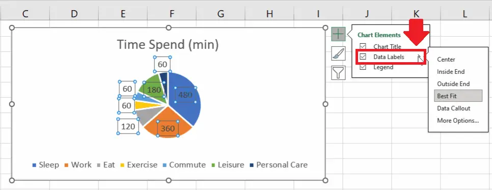
Step 7 – Click on the Data Callout option
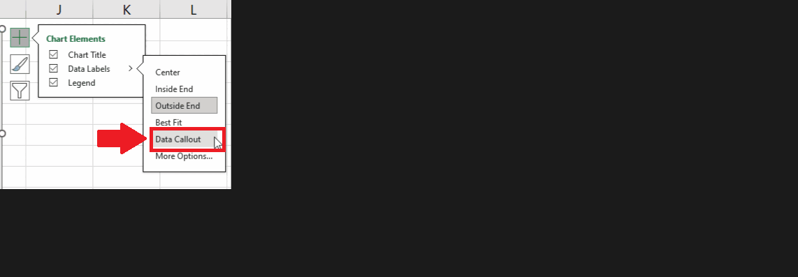
- Click on the Data Callout option from the right-side menu to get the required result
Method 2: Make a percentage chart using the Format Data Label option
Step 1 – Select the range of cells
- Select the range of cells for which you want to make the chart
Step 2 – Click on the Insert Pie or Doughnut chart

- After selecting the range of cells, click on the Insert Pie or Doughnut chart, and a drop-down menu will appear.
Step 3 – Select the Type of chart
- Click on the chart type you want to insert from the drop-down menu
- Here we selected the 2D pie chart, you may choose any other type of graph and the graph will appear on the sheet
Step 4 – Click on the chart area
- After the chart appear on the sheet, click on any site of the chart
Step 5 – Open the Context menu
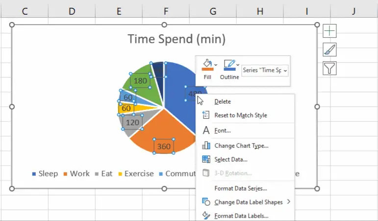
- After selecting the chart areas, right-click anywhere on the chart and a context menu will appear
Step 6 – Click on the Format Data Label option
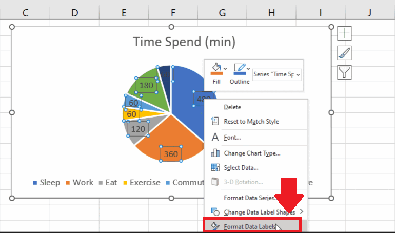
- From the context menu, click on the Format Data Label option, and a dialog box will appear on the right side of the sheet
Step 7 – Click on the percentage option
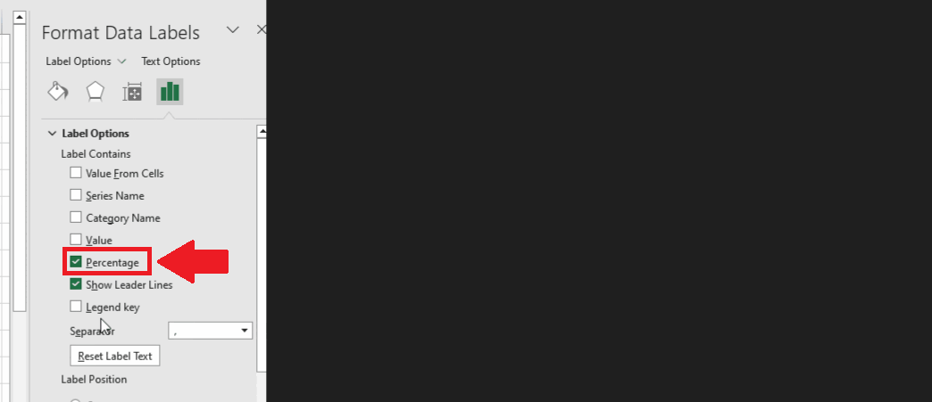
- Click on the checkbox of the Percentage option
- And untick the Number option to get the required result


