How to make a histogram with non-numeric data
While histograms are commonly used for numeric data, they can still be useful for non-numeric data to gain insights and understand the distribution of categorical information.
In this tutorial, we’ll discuss the easiest way to create histograms in Google Sheets.
METHOD – By changing the chart type using Chart Editor in Google Sheets
In this method, first, we’ll create a column chart between unique entries among the data set and their frequencies. After that, we’ll convert the created column chart into a histogram.
Consider the following data set containing the names of top scorers on the basis of monthly tests of a class:
A histogram can visually represent the distribution of non-numeric data, such as categories or labels. It allows you to see the frequency or count of each class and identify any patterns or imbalances in the data. It can track the frequency of events or occurrences within different non-numeric categories.
STEP 1 – Create a column to figure out the unique entries in the data set
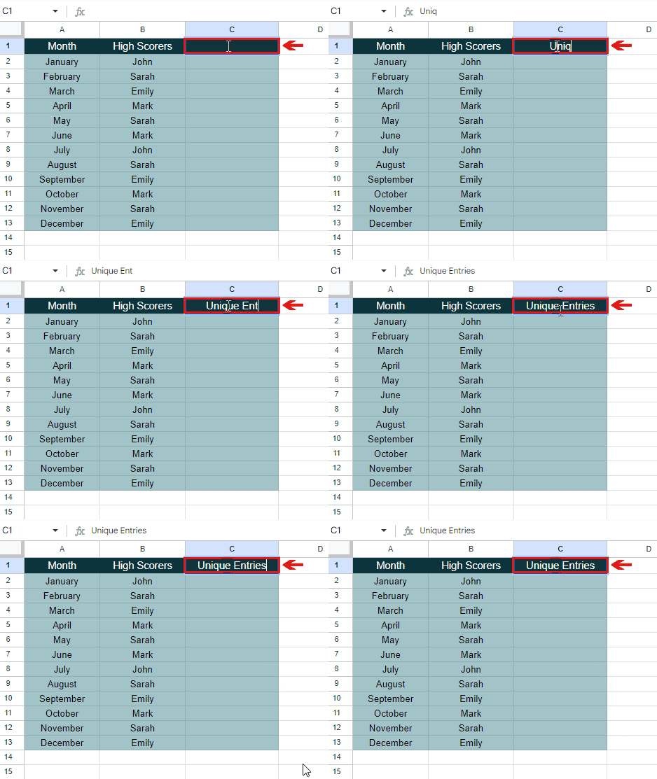
– Move your cursor to the first cell of the column beside High Scorers.
– Select the cell and type the heading Unique Entries.
– A new column will be created to evaluate the unique entries among the data set
STEP 2 – Use the UNIQUE function to determine the unique entries
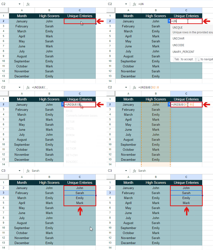
– Move your pointer to the first cell beneath the heading of the created column.
– Select the cell and type the required formula.
– In this case, the required formula is:
=UNIQUE(B2:B13)
– All the unique entries will be determined automatically from the data set.
STEP 3 – Create a new column to calculate the frequencies of unique entries
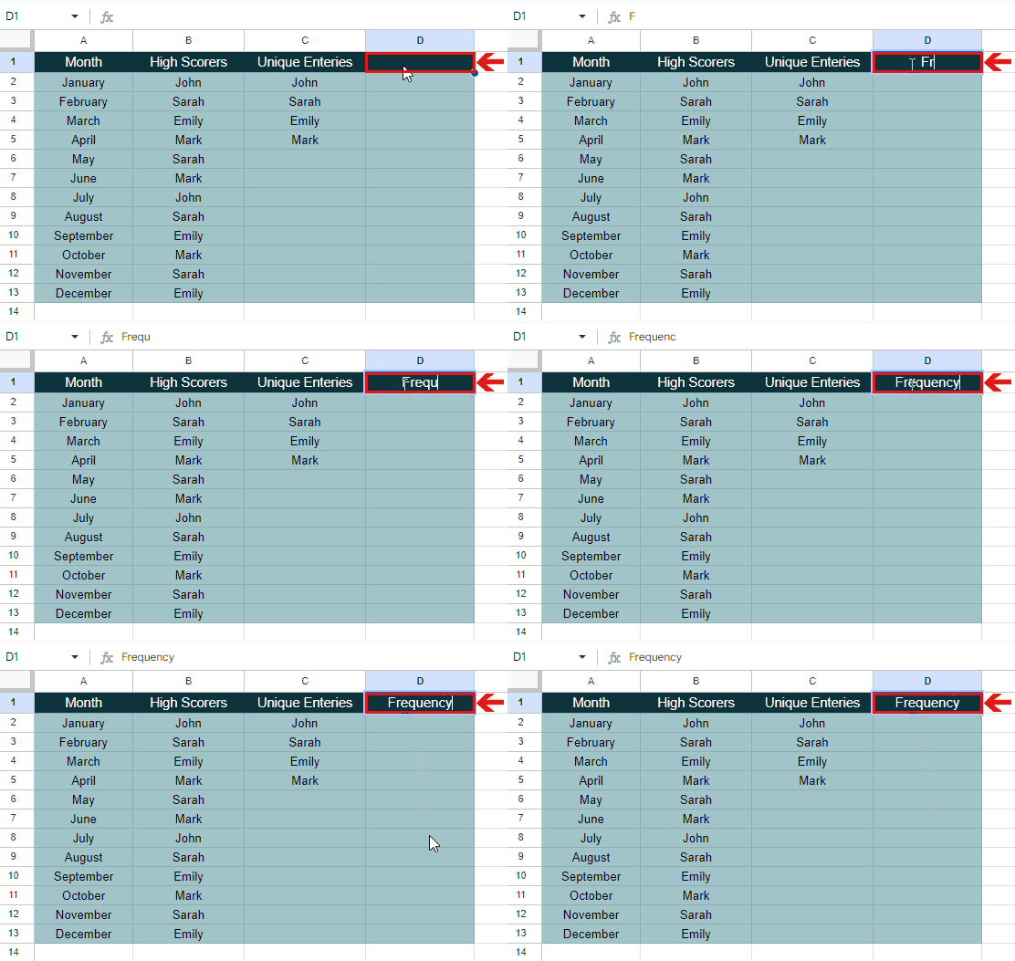
– Move your cursor to the first cell of the column beside Unique Entries.
– Select the cell and type the heading Fequency.
– A new column will be created to evaluate the frequencies of unique entries among the data set.
STEP 4 – Use the COUNT IF function to calculate the frequencies of unique entries
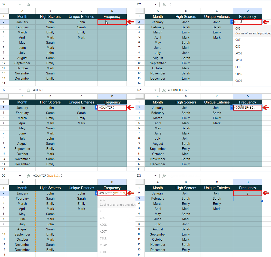
– Move your pointer to the first cell beneath the heading of the created column.
– Select the cell and type the required formula.
– In this case, the required formula is:
=COUNTIF(B2:B13,C2)
– The frequency of the first unique entry will be calculated.
STEP 5 – Use AutoFill Handle to calculate frequencies of all unique entries
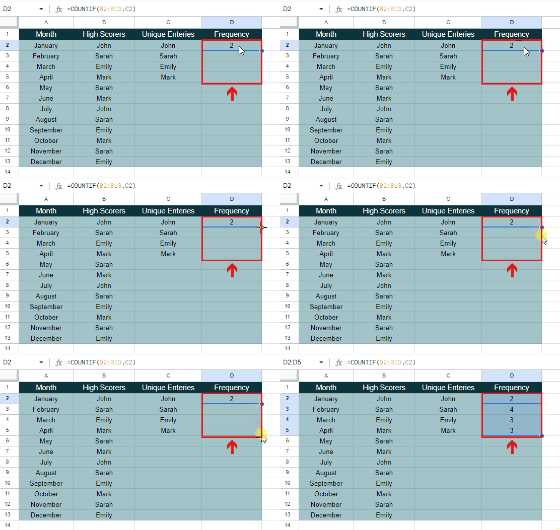
– Select the cell containing the frequency of the first unique entry.
– Put your cursor on the bottom right corner of the cell.
– Drag the AutoFill Handle to the cell till which you want to calculate the frequency.
– The frequencies of all the unique entries will be evaluated.
STEP 6 – Insert a column chart
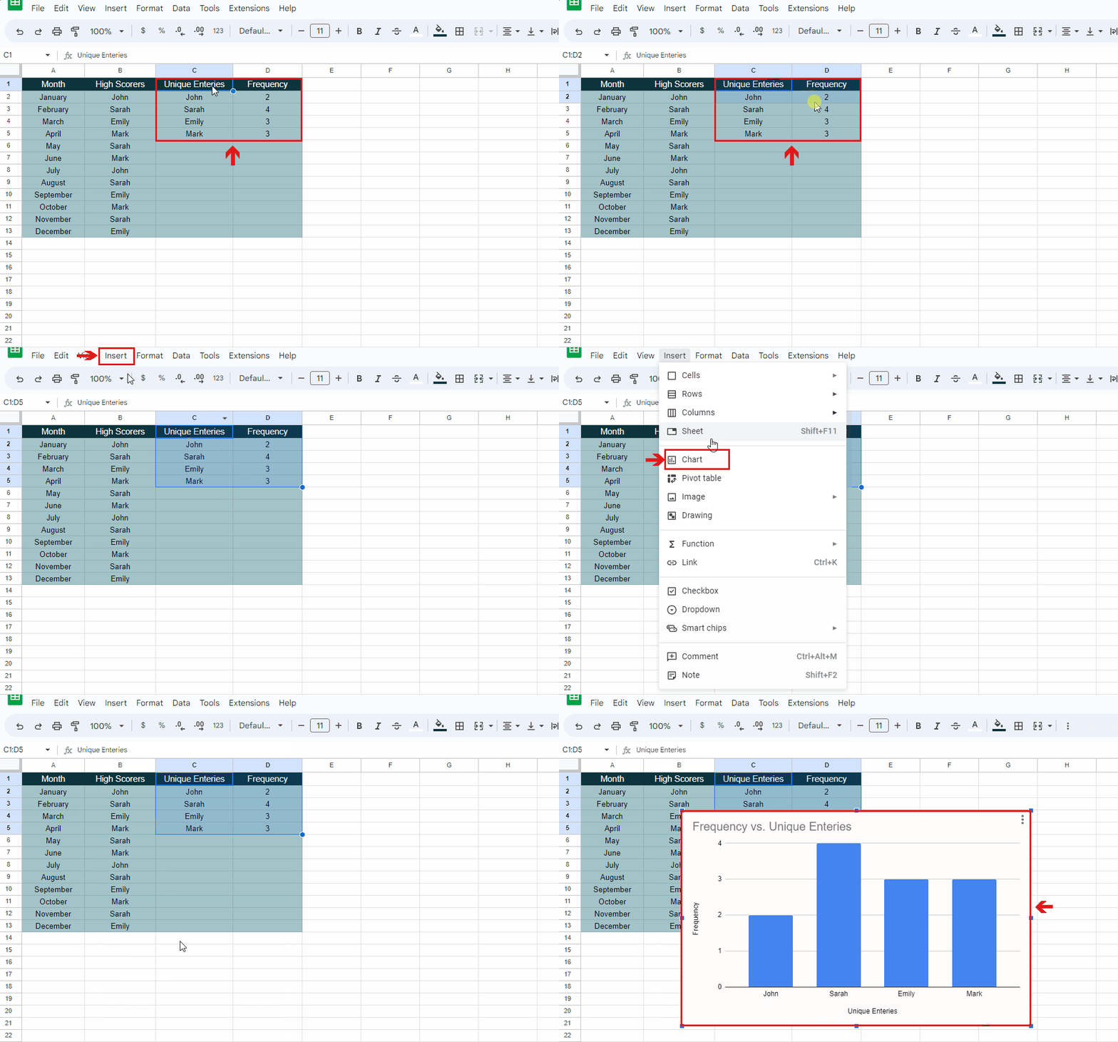
– Select all the data in the columns of Unique entries and Frequency.
– Go to the Insert tab. A drop-down menu will appear.
– Select the Chart option.
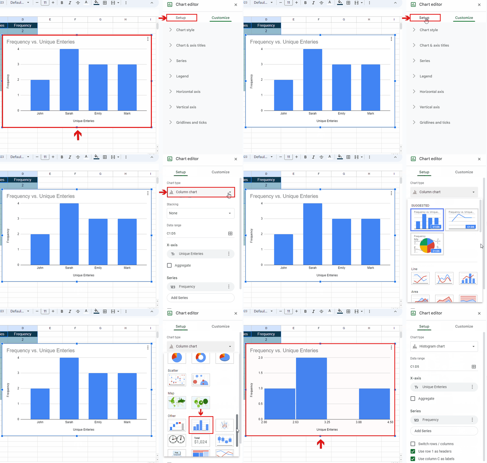
– A column chart will be created automatically.
STEP 7 – Customize the column chart to create a Histogram

– Select the created column chart. A Chart Editor will appear on the side of the spreadsheet.
– Click on the Setup option.
– Click on the arrow in the Chart type box.
– Now select the Histogram chart among the given options.
– The column chart will be converted into a histogram.

