
How to make a graph in Excel comparing two sets of data
 By
SpreadCheaters
By
SpreadCheaters
To make a graph in Excel comparing two sets of data, you would typically use a chart type that displays both data sets in a visually appealing and easy-to-understand manner. The overall importance of creating a graph in Excel to compare two sets of data is that it provides a quick and easy way to visualize the similarities and differences between the two data sets.
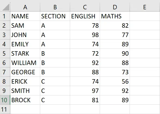
We have a dataset that includes the results of the top students in a class based on their English and Math marks, which is further divided into three sections. We want to compare this data using a graph, which will allow us to visually identify any patterns or differences between the results of each section. To create the graph, we will first select the data and then insert a chart using one of the four chart types available in Excel that can be used for this purpose.
Method 1: Comparing two sets of data using the Combo Chart
Step 1 – Select the range of cells
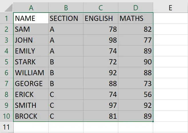
- Select the range of cells, using which you want to form the Chart
Step 2 – Click on the Insert Combo Chart option
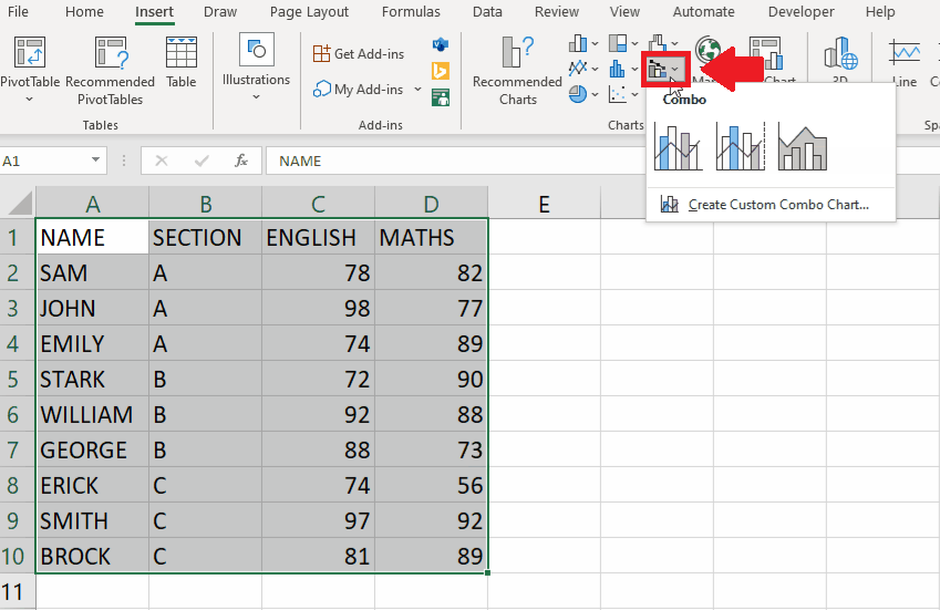
- After selecting the range of cells, click on the Insert Combo Chart option in the Charts group of the Insert tab and a drop-down menu will appear
Step 3 – Select the Type of chart

- From the drop-down menu, click on the type of chart you want
- Here we selected Clustered Column – Line chart to get the required result
Method 2: Comparing two sets of data using the Column Chart
Step 1 – Select the range of cells
- Select the range of cells, using which you want to form the Chart
Step 2 – Click on the Insert Column or Bar Chart option
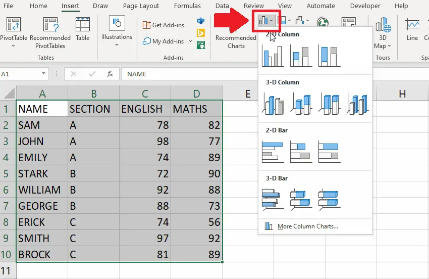
- After selecting the range of cells, click on the Insert Como Chart option in the Charts group of the Insert tab and a drop-down menu will appear
Step 3 – Select the Type of chart

- From the drop-down menu, click on the type of chart you want
- Here we selected a 2D Column chart to get the required result
Method 3: Comparing two sets of data using the Bar Chart
Step 1 – Select the range of cells

- Select the range of cells, using which you want to form the Chart
Step 2 – Click on the Insert Column or Bar Chart option
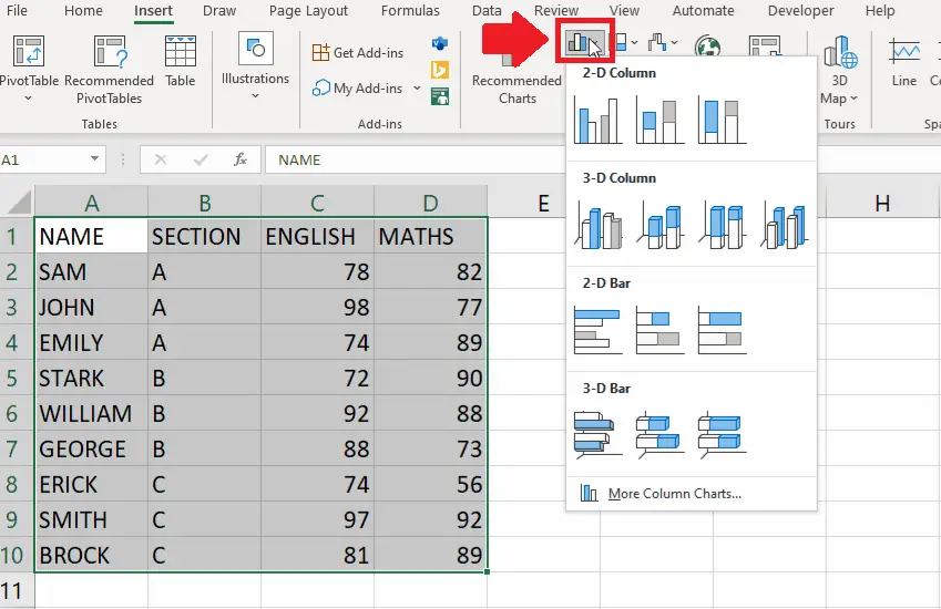
- After selecting the range of cells, click on the Insert Column or Bar Chart option in the Charts group of the Insert tab and a drop-down menu will appear
Step 3 – Select the Type of chart

- From the drop-down menu, click on the type of chart you want
- Here we selected a 2 D Bar chart to get the required result
Method 4: Comparing two sets of data using the Line Chart
Step 1 – Select the range of cells

- Select the range of cells, using which you want to form the Chart
Step 2 – Click on the Insert Line and Area Chart option
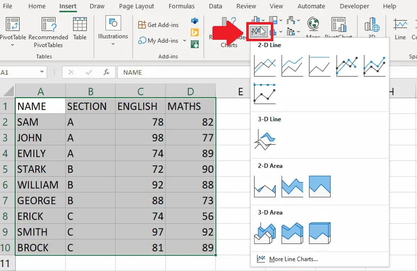
- After selecting the range of cells, click on the Insert line and Area Chart option in the Charts group of the Insert tab and a drop-
- menu will appear
Step 3 – Select the Type of chart

- From the drop-down menu, click on the type of chart you want
- Here we selected a Line chart to get the required result


