
How to make a football field in Excel
 By
SpreadCheaters
By
SpreadCheaters
This tutorial will guide you through the process of creating a versatile Excel football field valuation Graph. The graph will incorporate a dynamic line representing the company’s current share price, which will automatically update whenever there is a change in the share price. This is particularly useful when you have scraped stock market data from online sources, as the current share price line dynamically adjusts in response to market conditions continuously after a defined interval of time.
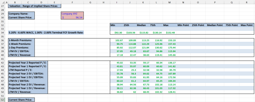
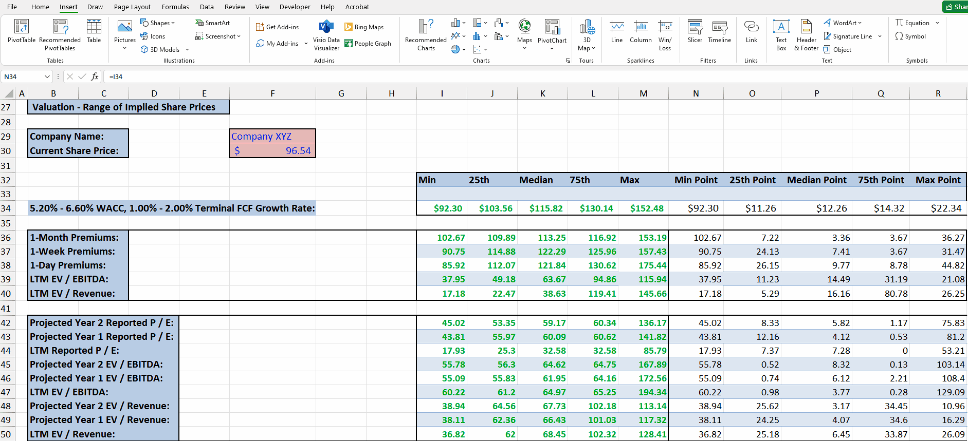
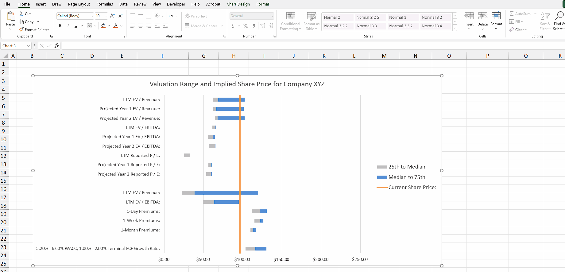
A football field valuation in the context of Excel refers to a visual representation of multiple valuation analyses placed next to each other. This method provides clients with a comprehensive view of a company’s value using different methodologies and assumptions. In a typical football field valuation matrix, you would find company values based on various approaches such as discounted cash flow (DCF) valuation and leveraged buyout (LBO) analysis.
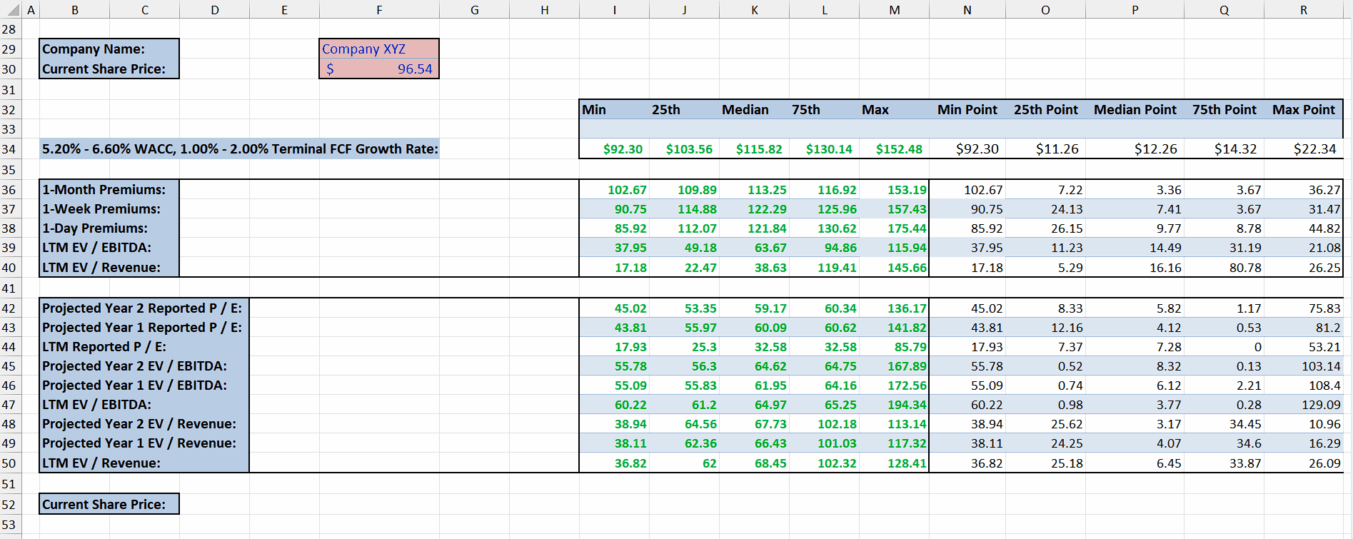
Step 1 – Calculate the results of various Valuation Terminologies
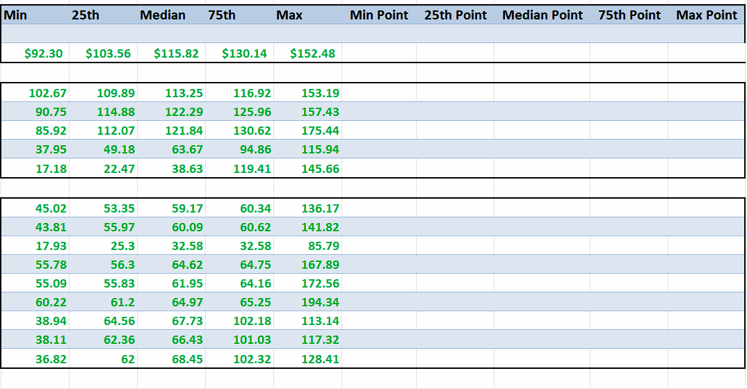
– Select the cell under the “Min Point” column.
– Press the (equal sign) button on your keyboard and simply select the cell containing the Min value. For instance, it is “cell I34”.
– To calculate the “25th Point”, subtract the “25th Percentile” value from the “Min value”.
– Choose the cell corresponding to the “25th Point” and extend the formula horizontally by dragging the fill handle to calculate the values for the “Median Point”, “75th Point”, and “Max Point”.
– Afterward, choose the cells that hold the calculated results and paste them into the cells below.
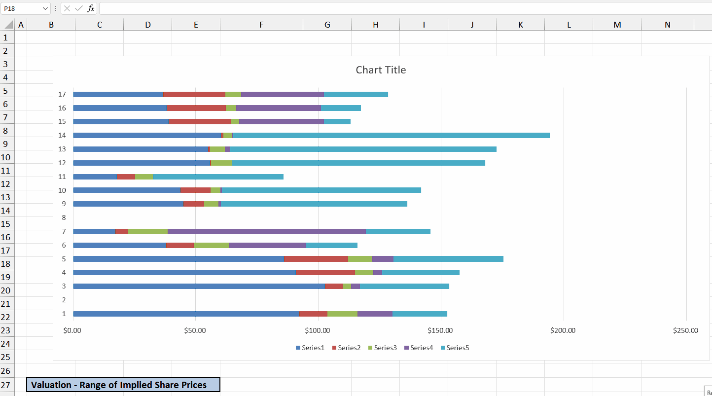
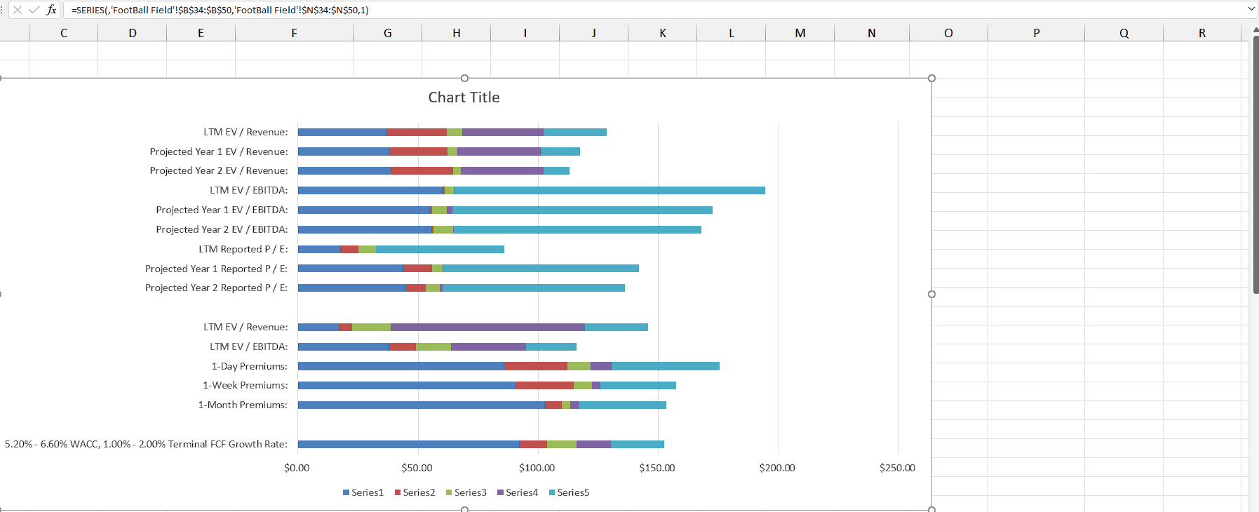
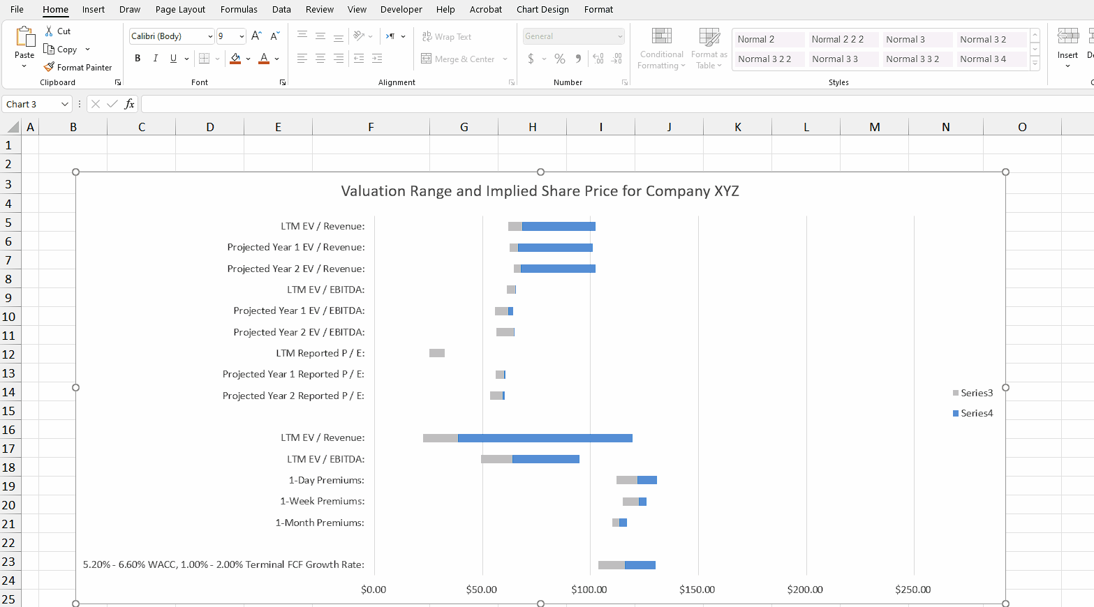
Step 2 – Generate a Stacked Bar Chart
– Select the range of cells from “Min Point” to “Max Point”.
– Then, navigate to “Insert Tab” and locate “Bar chart” in the “Charts” group.
– After that, click on the “Bar chart” and insert a Stacked Bar Chart by clicking on it.
– Then Position the Bar Chart anywhere you like.
Step 3 – Modify Horizontal Axis Labels
– Click inside the chart area to select it.
– Then, right-click on the chart and a context menu will appear.
– After that, click on “Select Data” and it will open a dialogue box called “Select Data Source”.
– Click on the “Edit” option under “Horizontal (Category) Axis Labels”.
– Then, select the range containing all valuation metrics.
– Now, click on “OK” and these valuation metrics will appear in the Chart.
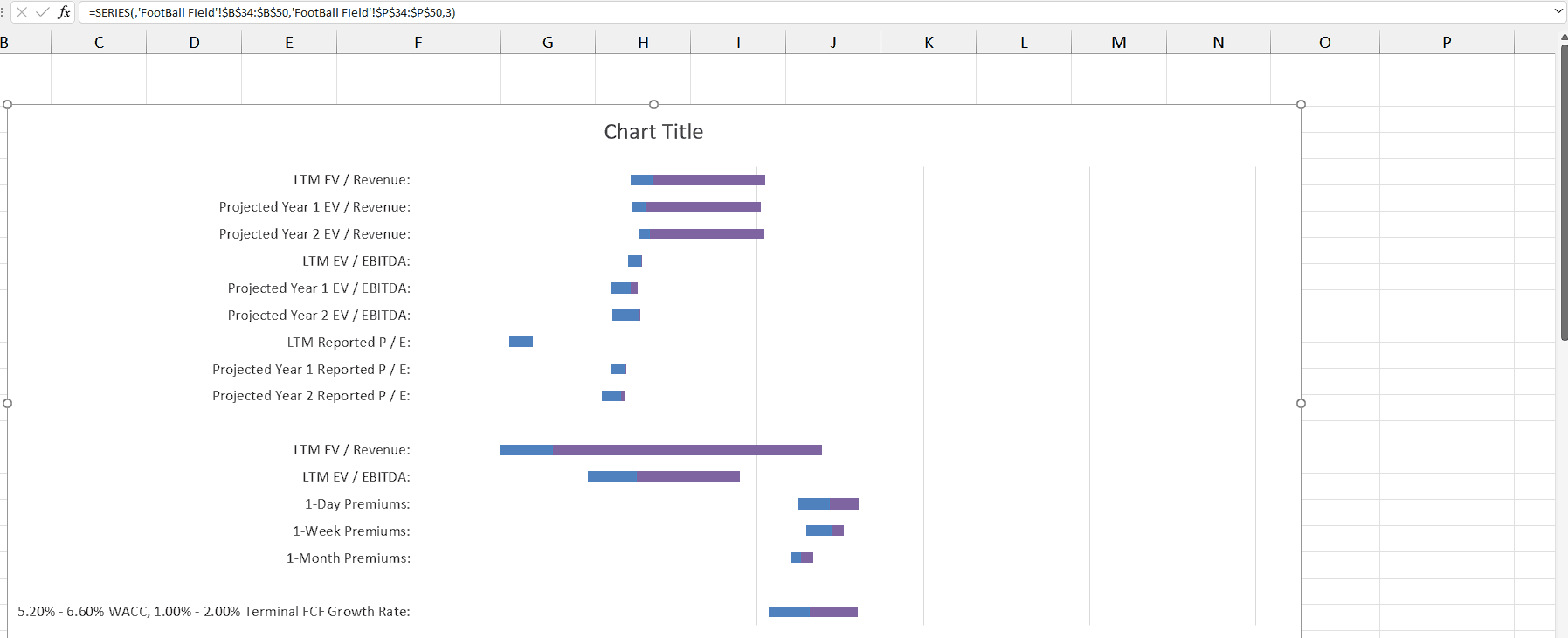
Step 4 – Hide the unwanted Bars
– Click on the Bar to select it.
– Right-click on it and a context menu will appear.
– After that, click on “Format Data Series” and it will open a sidebar.
– Go to the fill options and select the “No Fill” option.
– We have hidden the bars the bars except the Bars showing data from 25th Point to 75th Point but we didn’t include the bar of column “25th Point” here because it is actually distance between “Min Point” and “25th Point”.
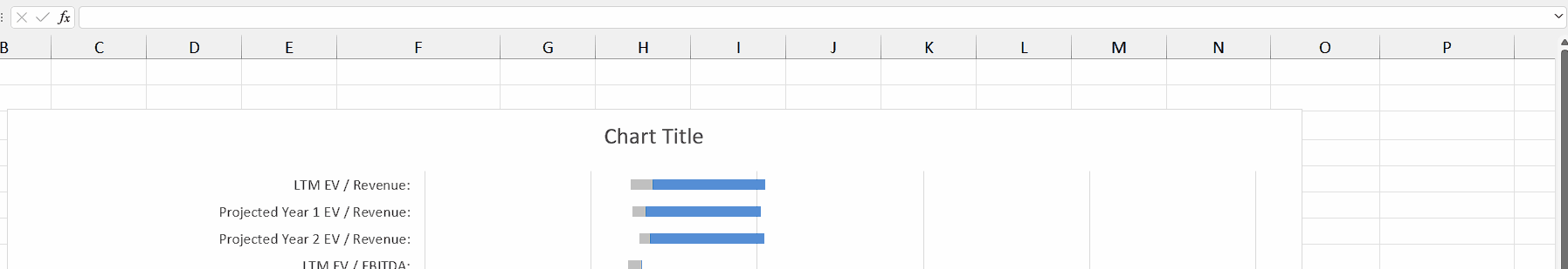
Step 5 – Change Bar colors
– Click on the Bar to select it.
– Right-click on it and a context menu will appear.
– After that, click on “Format Data Series” and it will open a sidebar.
– Go to the fill options and select the “Solid Fill” option.
– Then, fill any color you like.
Step 6 – Link the Chart title to a cell
– Select any empty cell in the sheet and enter the chart title there.
– Now, click on the Chart title to select it.
– Then, go to the formula bar and press the = (equal sign) button on your keyboard.
– After that enter the cell name in which we entered the title for the chart and press Enter to change the Chart title.
– This will update the Chart title and it will benefit you to change the chart title by editing the cell’s text.
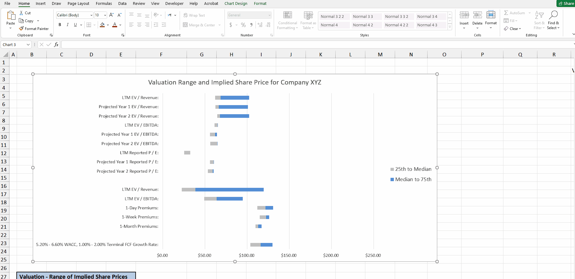
Step 7 – Change the Position of Legend Entries
– Delete the unwanted Legends by clicking on them and pressing the delete button.
– For changing the position of Legend Entries, navigate to the “Chart Design Tab”.
– Then, click on “Add Chart Elements”.
– Hover your mouse over the Legend option and select the position of the Legends on Chart from the drop-down menu.
Step 8 – Modify the Legend Entries
– Click on the Legend Entries and increase their size for better readability.
– Click on the Legends to select them.
– Then, right-click on the chart and a context menu will appear.
– After that, click on “Select Data” and it will open a dialogue box called “Select Data Source.
– Click on the legend that you wish to rename. For instance, we clicked on series 3.
– Then, click on Edit and enter the series name to change it.
– Now, click “OK” and the Legend will be renamed.
– Repeat this process for all legends.
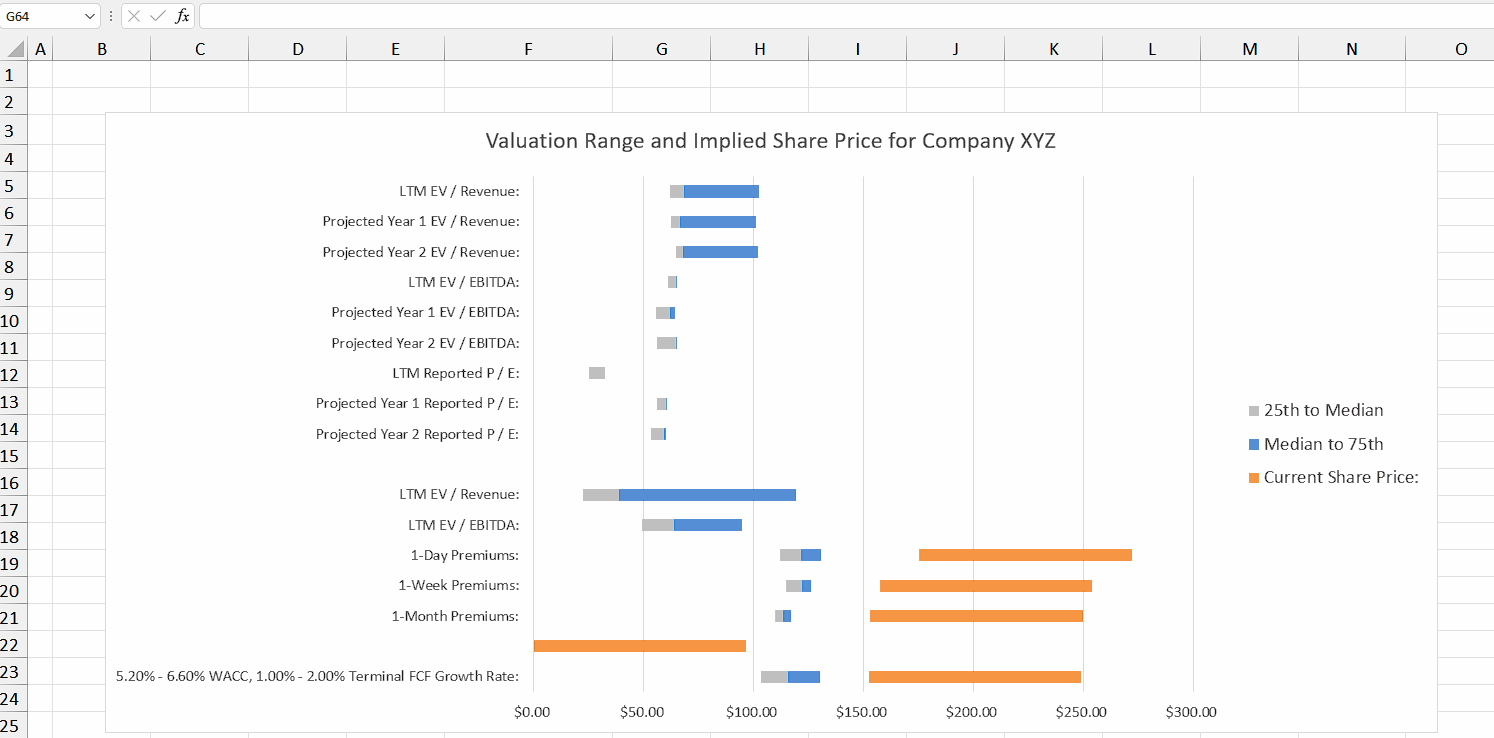
Step 9 – Link the current share price cells
– In the “Current Share Price” row, select the first cell and enter an equal sign there.
– Then, enter the cell address of the cell which contains the current share price value.
– Now, press the F4 button to lock this value when we extend it.
– Use the fill handle and extend this to the adjacent cells under the “Max” column.
– In the cell under the “Min Point” column type 1000 and type dummy values such as zeros in cells afterward till the cell under the “Max Point” column.
Step 10 – Add “Current Share Price” Entry
– Right-click on the Chart and click on the “Select Data” option.
– In the “Select Data Source” Dialogue box, click on Add an option under the “Legend Entries (Series)”.
– It will open another dialogue box.
– Enter the cell containing the text “Current Share Price” in the “Series name” box.
– Enter the range of cells containing Current Share Prices in the “Series value” box.
– Then, click on “OK”.
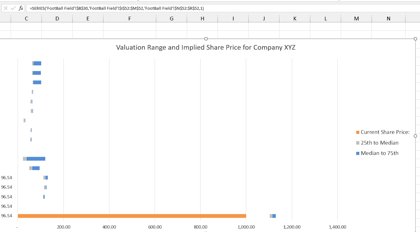
Step 11 – Change series Formula
– Click on the yellow bars that have just appeared in Chart.
– You will see the formula given below in the formula bar.
=SERIES(‘FootBall Field’!$B$30,,’FootBall Field’!$I$52:$M$52,6)
– Now, we have to manually edit the series formula so that it has both “x” and “y” values.
– Remove one comma from double commas (,,) that are present after the first cell reference “$B$30” in the formula.
– Now, remove the parenthesis, 6 from the end of the formula.
– Then, select the dummy values that we entered.
– After that, enter a comma and then type 1.
– After following all the steps, your formula would look like this.
=SERIES(‘FootBall Field’!$B$30,’FootBall Field’!$I$52:$M$52,’FootBall Field’!$N$52:$R$52,1)
– Then, press Enter.
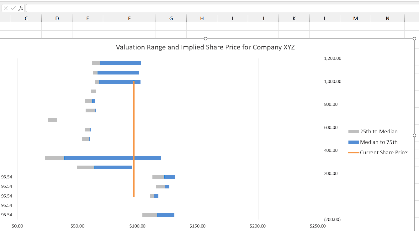
Step 12 – Show the “Current Share Price” line
– Right-click on the yellow bar on the Chart.
– Click on “Change Series Chart Type”.
– Then, change the Chart type of “Current Share Price” to “XY Scatter with smooth lines”.
– Then click on “OK” and a line showing the “Current Share Price” will appear.
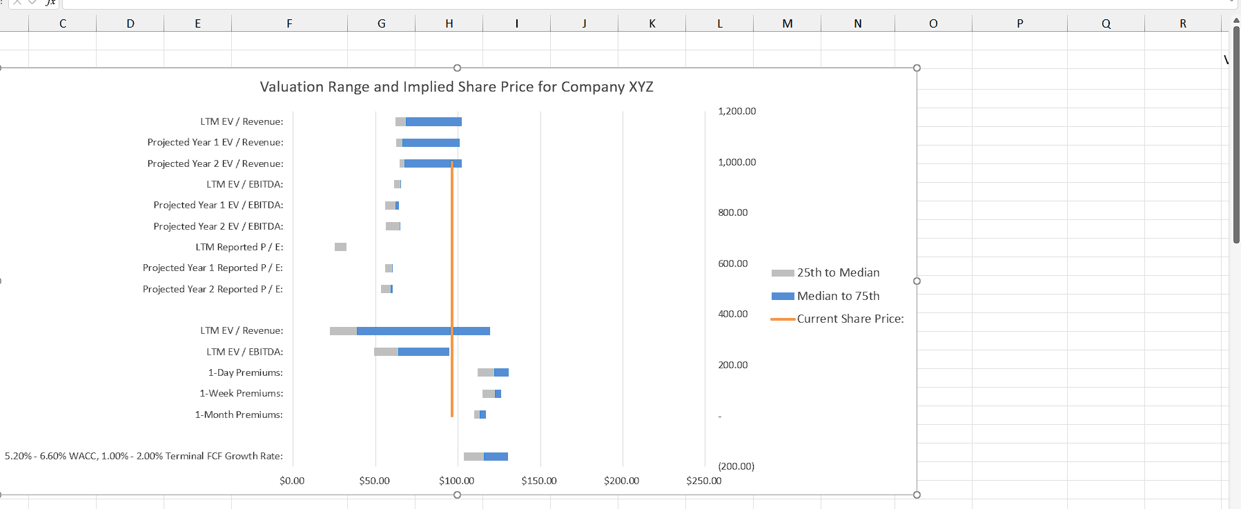
Step 13 – Restore the Horizontal Axis Labels
– By following the above step, the valuation metrics have disappeared by default.
– To restore them, click inside the chart area to select it.
– Then, right-click on the chart and a context menu will appear.
– After that, click on “Select Data” and it will open a dialogue box called “Select Data Source”.
– Click on the “Series 1” under “Legend Entries (Series)”.
– Click on the “Edit” option under “Horizontal (Category) Axis Labels”.
– Then, select the range containing all valuation metrics.
– Now, click on “OK” and these valuation metrics will appear again in the Chart.
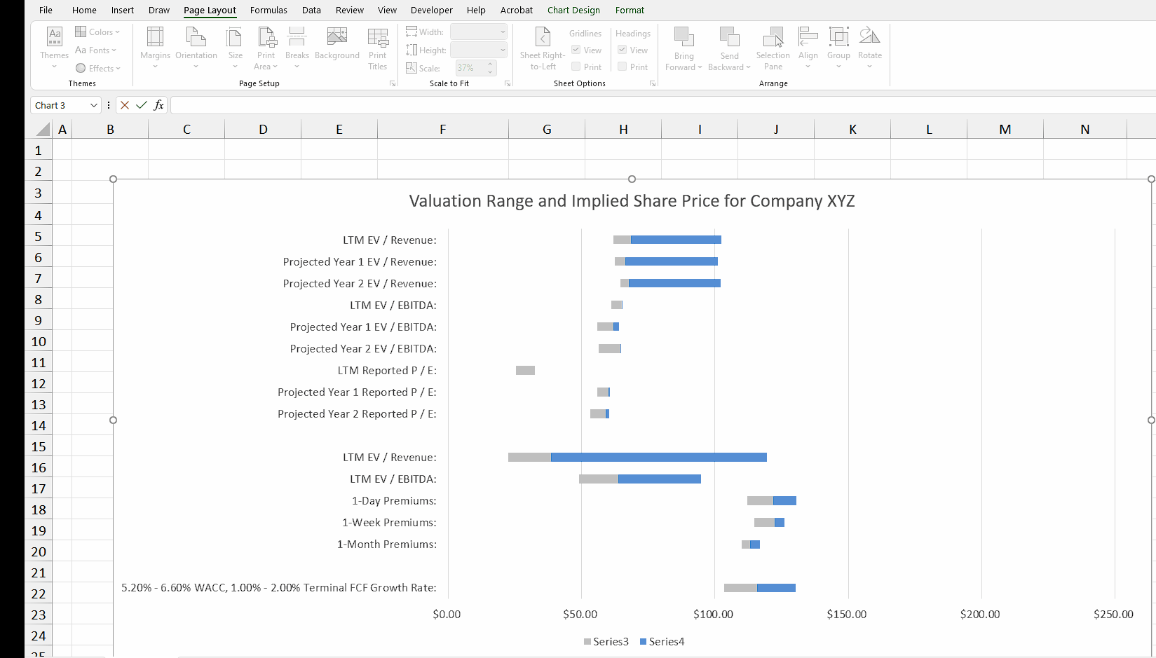
Step 14 – Adjust the length of the “Current Share Price” line
– Right-click on the secondary axis and select the “Format Axis” from the context menu.
– It will open a sidebar on the right side of the screen.
– You will see the “Bounds” option under the “Axis Options”.
– Enter “0” in the minimum value and “1000” in the maximum value.
– Then press Enter button on your keyboard.
– The line will automatically extend to an appropriate length.
Step 15 – Remove the “Secondary Axis”
– For removing the “Secondary Axis”, navigate to the “Chart Design Tab”.
– Then, click on “Add Chart Elements”.
– Hover your mouse over the “Axes” option and click on the “Secondary Vertical” from the drop-down menu.
– This will remove the “Secondary Axis” providing the football chart a cleaner look.
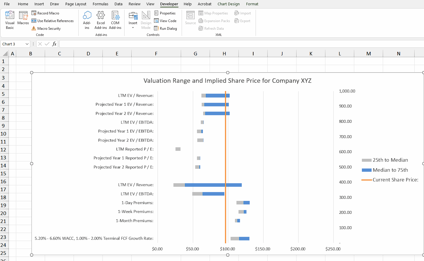
Step 16 – Add Data Labels
– For adding Data Labels for the valuation metrics in the Chart, we would have to insert Text Boxes.
– Navigate to the “Insert” Tab and look for the command button name “Text Box” in the “Text” group.
– Now your cursor will change its shape.
– Click and drag on Chart to make a Text box that will work as Data Label.
– Type the text in your text box according to your requirements.
Step 17 – Test the “Current Share Price” line with the change in Price
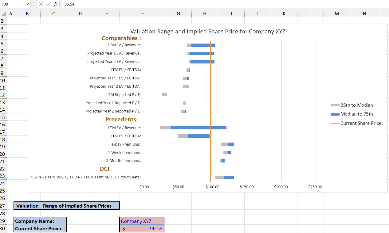
– Change the “Current Share Price” and you will see that the “Current Share Price” line on the Chart changes with the change in “Current Share Price”.
– For example, if the company share price drops from $96.54 to $58.62, the line will also shift its position automatically.


