How to make a dot plot on Google Sheets
 By
SpreadCheaters
By
SpreadCheaters
In this article, we’ll show you step-by-step how to make a dot graph on Google Sheets using sample data. We’ll walk you through the process of selecting your data, choosing a chart type, customizing your chart, and adding it to your spreadsheet. By the end of this article, you’ll be able to create your own dot graphs and use them to analyze your data like a pro.
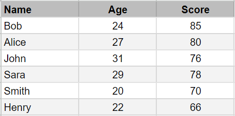
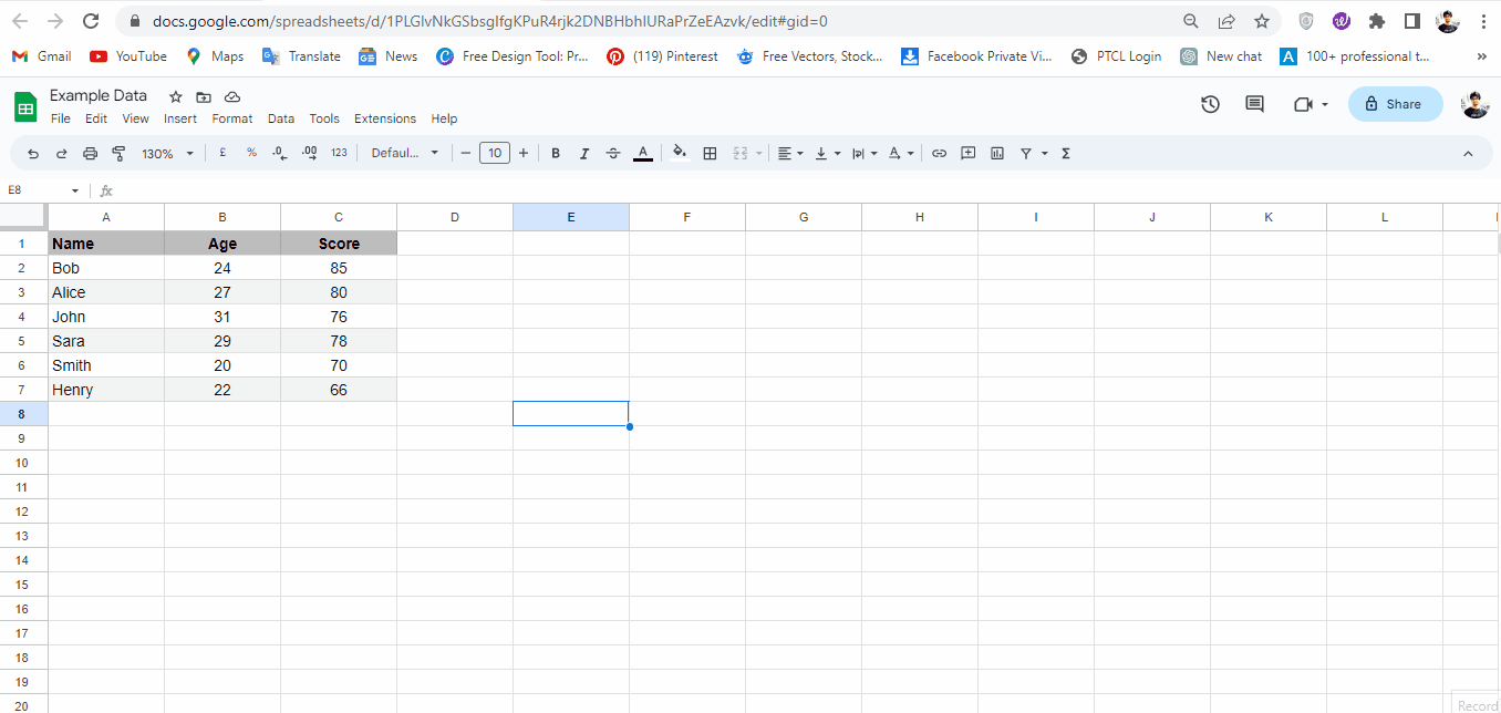
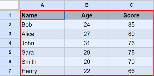
Suppose we want to plot a dot chart of the following data set of students with their age & score shown above.
A dot graph, also known as a scatter plot, is a type of chart that displays individual data points as dots on a two-dimensional grid. This type of graph is useful for showing how two variables are related to each other. By plotting data points on a grid, you can quickly see patterns and trends in your data.
Step 1 – Select Data
– Select data by dragging the selection handle.
Step 2 – Go To Insert Menu
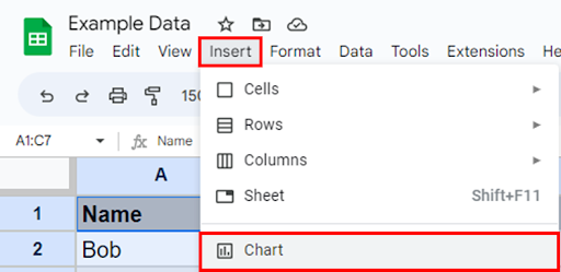
– Go to the insert menu & click on the chart option.
Step 3 – Chart Inserted
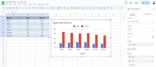
– This will insert column chart (default type) in your sheet & open Chart editor side pane.
Step 4 – Change Chart Type
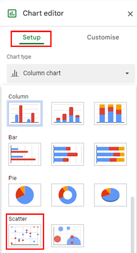
– To convert a column chart into dot chart / scatter chart. Go to the chart editor pane, under Chart Type click the drop down button, scroll down & select Scatter Chart.
– Your chart will be converted into a dot chart.
Step 5 – Customise Chart
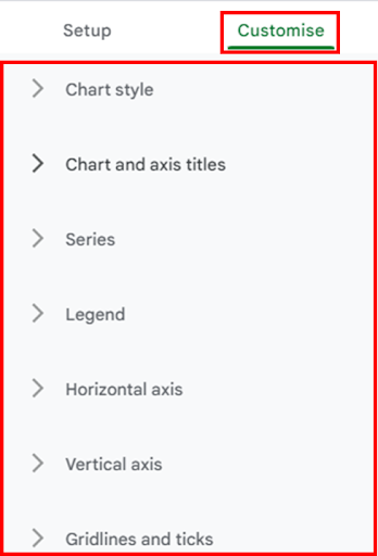
– Click on the Customise Tab, you will see 07 options for chart customisation.
Step 6 – Change Chart Title
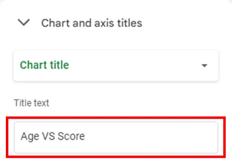
– Click on the Chart And Axis Titles button & change Title Text.
Step 7 – Change Series Data
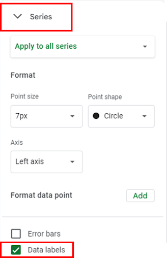
– Click on the Series button, scroll down & check Data labels.
– Similarly, you can edit Point Shape & size, Axis etc.
Step 8 – Dot Plot Created

– By following the above steps you can make a dot plot & customise it as per your requirement in google sheets.