How to create a boxplot in Google Sheets
 By
SpreadCheaters
By
SpreadCheaters
In this tutorial, we will learn how to create a box plot in Google Sheets. To generate a box plot in Google Sheets, we must compute the essential values such as minimum, first quartile, median, third quartile, and maximum values. To accomplish this, we can use functions such as MIN, MEDIAN, QUARTILE, and MAXIMUM.
We have a data set that shows scores of some students ranging from 0-100. We will create a box plot for this data set utilizing the steps mentioned below.
A box plot is a chart type available in Google Sheets that presents a visual summary of a dataset’s distribution. It displays the minimum, first quartile, median, third quartile, and maximum values, as well as any outliers that may exist.
Step 1 – Calculate the Minimum Value
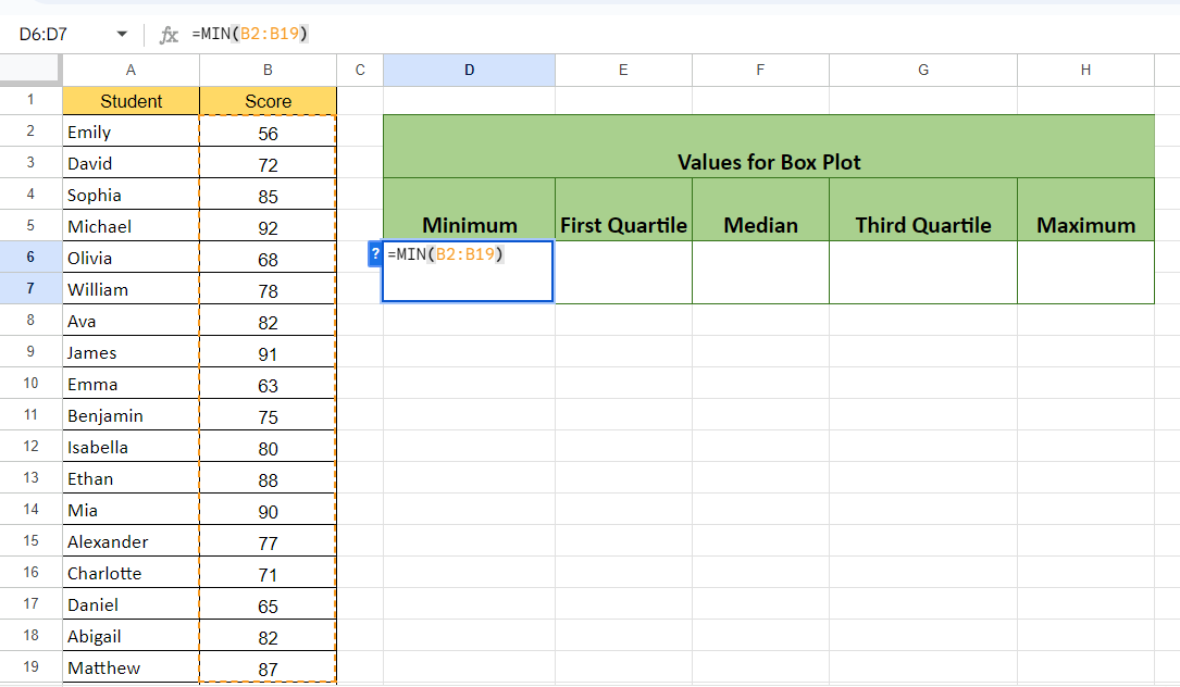
– Calculate the minimum value utilizing the MIN function.
– The structure of the function will be:
MIN(B2:B19)
– Where the range B2:B19 contains the scores of the students.
Step 2 – Calculate the First Quartile
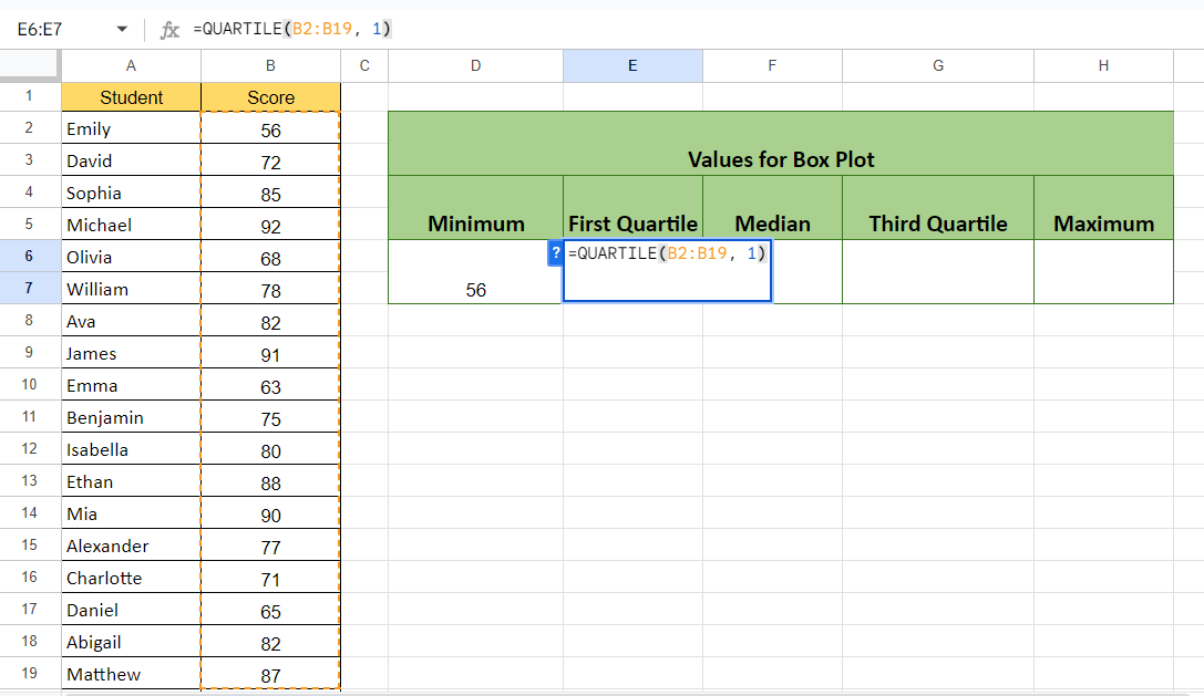
– Calculate the First Quartile.
– For this, we use the QUARTILE function:
QUARTILE(B2:B19, 1)
– The second parameter i.e. 1 specified the function to return the value of the First Quartile.
Step 3 – Calculate the Median
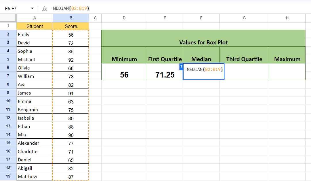
– Calculate the median from the MEDIAN function.
MEDIAN(B2:B19)
Step 4 – Calculate the Third Quartile
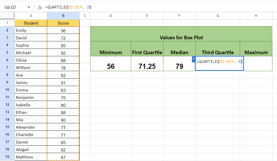
– Calculate the Third Quartile.
– The structure of the formula will be:
QUARTILE(B2:B19, 3)
– Where parameter 3 specifies to return the value of the Third Quartile.
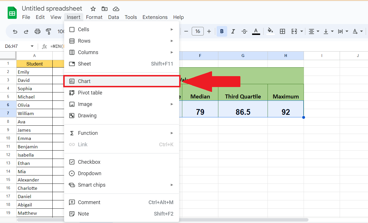
Step 5 – Calculate the Maximum Value
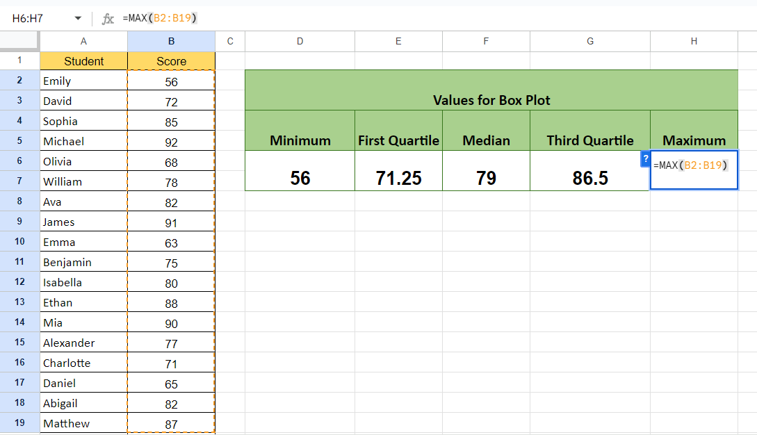
– Calculate the Maximum value using the MAX function.
MAX(B2:B19)
Step 6 – Add a Heading in a Separate Column
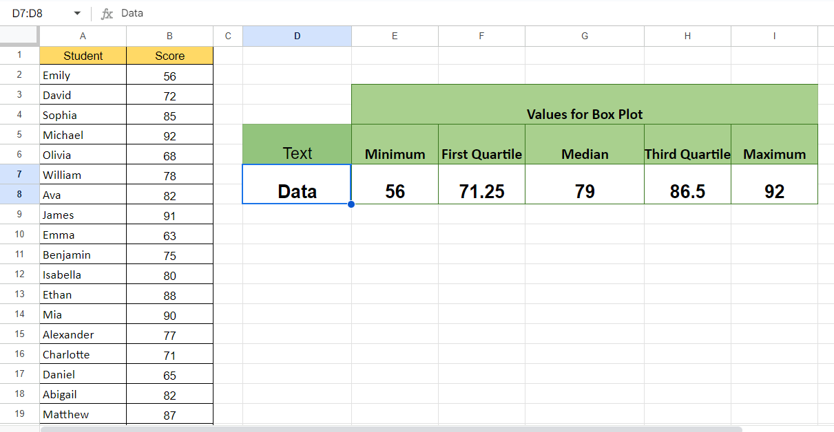
– Add the heading of the boxplot in a separate column prior to the minimum value.
– As for a boxplot, there must be five columns and one column must contain text.
Step 7 – Select the Calculated Values
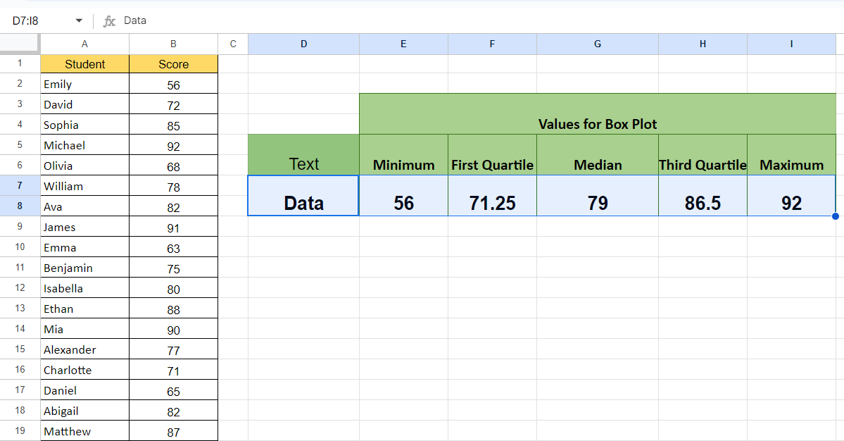
– Select the calculated values.
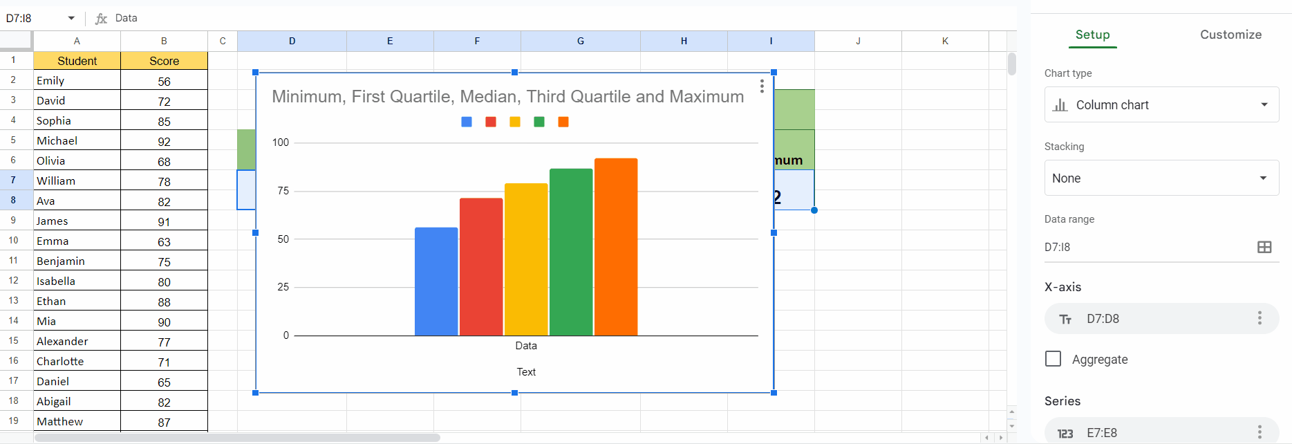
Step 8 – Locate the Insert Menu and Choose the Chart Option

– Locate the Insert menu from the menu bar.
– Choose the Chart option from the Insert menu.
Step 9 – Choose the Candlestick Chart as the Chart Type
– Perform a click on the drop-down arrow of the Chart Type in the Chart Editor window.
– Locate and select the “Candlestick” chart.