
How to combine two scatter plots in Excel
 By
SpreadCheaters
By
SpreadCheaters
We will explore the step-by-step process of merging two scatter plots in Excel, unlocking the potential for more comprehensive data analysis and visualisation.
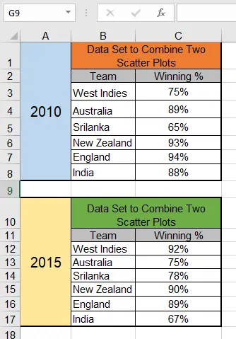
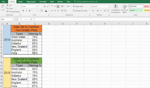
In that case, we have the below data set to use.

Excel is a versatile tool widely used for data analysis and visualisation, and one of its powerful features is the ability to create scatter plots. Scatter plots allow us to examine the relationship between two variables and identify any patterns or trends. However, there may be instances where we want to compare two sets of data on a single scatter plot to draw meaningful insights. In such cases, Excel provides us with a straightforward method to combine two scatter plots into one, enabling us to analyse and compare the data side by side. In this article.
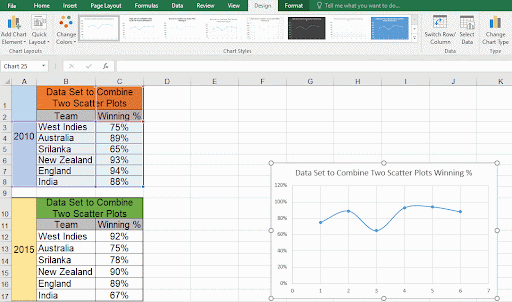
Step – 1 – Go to the Insert Tab
-Select any cell of the dataset.
-Click on the “insert scatter (X,Y) or Bubble chart under the charts group to create the first scatter plot.
Step – 2 – Add Data For First Scatter Plot
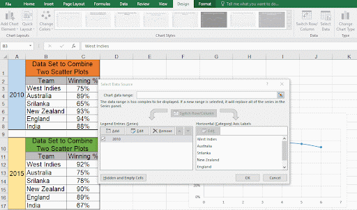
– Go to the design tab, under the data group click on the select data button.
– Click on the Add button from the Select Data Source.
– Locate the Series name box with the cursor.
– To enter the Series name, choose the merged cell ‘2010’.
– Set the cursor to the values in the Series X.
– Choose B3 to B8 range, as the X values.
– Place the cursor on the Series Y value after that.
– Choose the C3 to C8 range for the Y values.
– Click on the OK button.
Step – 3 – Add Data For Second Scatter Plot
– Now we will add data for the second scatter plot.
– To change the Series name, click on the Add button once again.
– Go to the Series Name tab and enter the Series name (choose the merged cell ‘2015’).
– Place the cursor in the Series X tab and choose the cell range from B12 to B17.
– Place the cursor on the Series Y tab and choose the cell range from C12 to C17.
– Click on the OK button.
Step – 4 – Chart Outcome
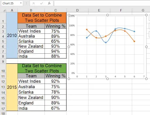
– The two scatter plots will be blended into one frame.


