How to combine graphs in Google Sheets
 By
SpreadCheaters
By
SpreadCheaters
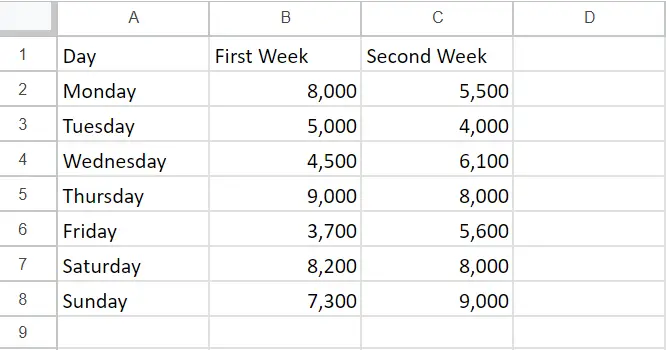
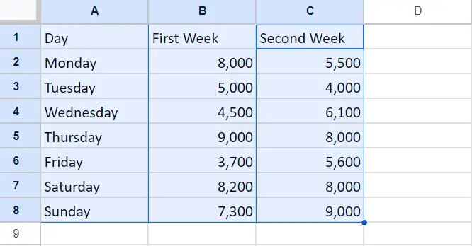
Our dataset includes the sales figures for a store during the first and second weeks of the month, along with the corresponding days. We want to create a graph that shows the combined sales for both weeks. To do this, we can select the relevant data and use the “Chart” option under the “Insert” tab to generate the graph.

Combining graphs in Google Sheets means creating a single graph that displays data from multiple ranges or sheets in your spreadsheet. This can be useful if you have related data that you want to visualize together, or if you want to compare data from different sources.
Step 1- Select the Range of Cells
– Choose the cells in the column that will be displayed in both charts.
– Hold down the CTRL key.
– Select the cells in the column that match the values in the first chart.
– Select the cells in the column that match the values in the second chart.
Step 2 – Click on the Insert Tab
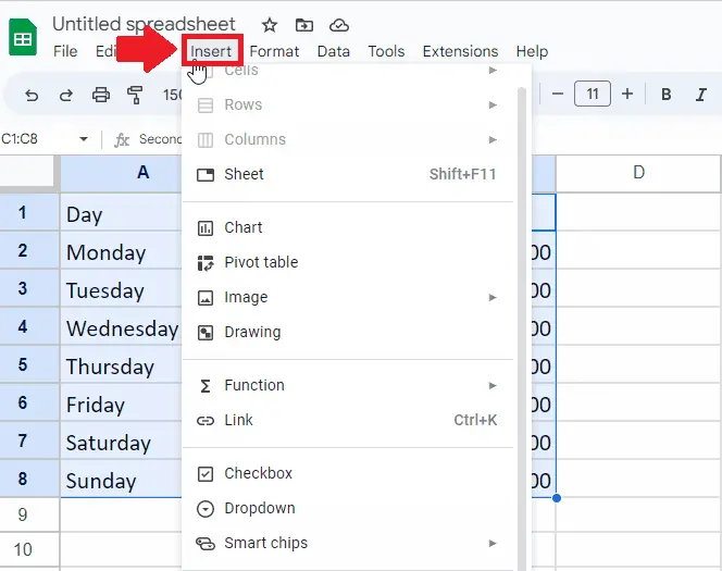
– After selecting the range of cells, click on the Insert tab from the Taskbar, and a dropdown menu will appear
Step 3 – Click on the Chart option
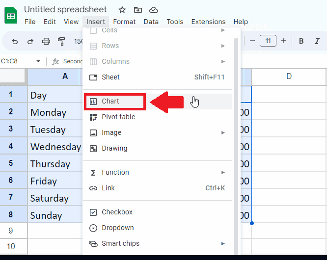
– From the drop-down menu, click on the Chart option and a dialog box will appear on the right side of the sheet
Step 4 – Click on the Combo Chart option

– From the dialog box, Click on the box box below the Chart type option and a list of types of graph will appear
– From this menu, Click on the Combo Chart option to get the required result