
How to change colors in an Excel Pivot chart
 By
SpreadCheaters
By
SpreadCheaters
Page last updated:
16/06/2023 |
Next review date:
16/06/2025
An Excel pivot chart visually represents data from a pivot table in a condensed format. It allows for graphical analysis and presentation. Customizing colors in an Excel pivot chart enables the modification of chart elements’ visual appearance, such as bars, lines, or pie slices, to suit individual preferences or presentation needs.
In this tutorial, we will learn how to change colors in an Excel Pivot chart. To Change colors in a Pivot chart in Microsoft Excel we can utilize the Design tab. The following steps are to be followed in order to change colors in an Excel Pivot chart.
Method 1: Utilizing the Design Tab
Step 1 – Perform a Click Anywhere on the Chart
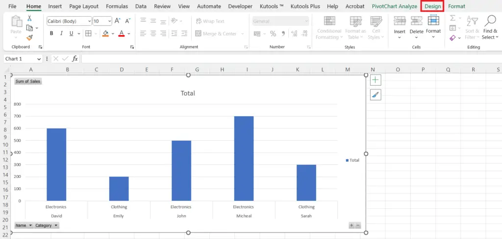
- Perform a click anywhere on the chart to activate the PivotChart’s Design tab.
Step 2 – Locate the Design Tab
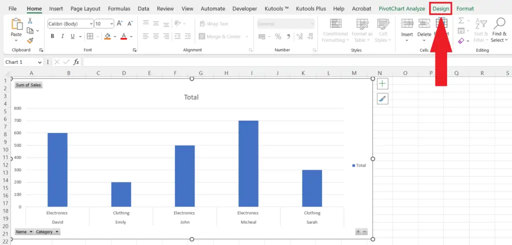
- Locate the Design tab in the menu bar.
Step 3 – Perform a Click on the Change Colors Button
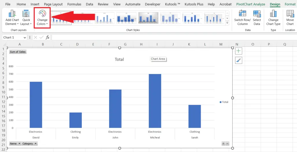
- Perform a click on the “Change Colors” button in the Chart Styles section.
Step 4 – Choose a New Color
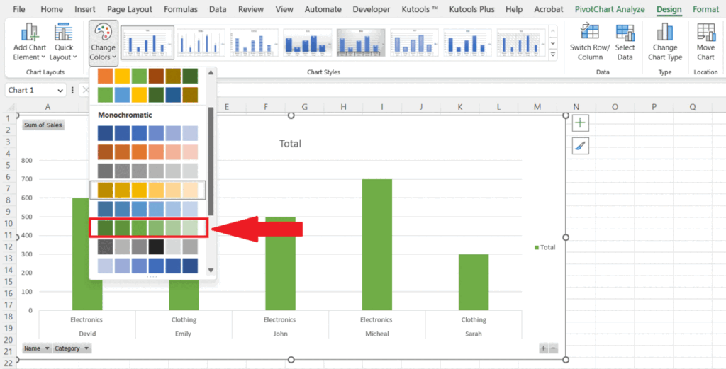
- Choose a new color from the drop-down menu.
- The color of the Pivot chart will be changed.
Method 2: Utilizing the Chart Styles Shortcut
Step 1 – Select the Pivot Chart
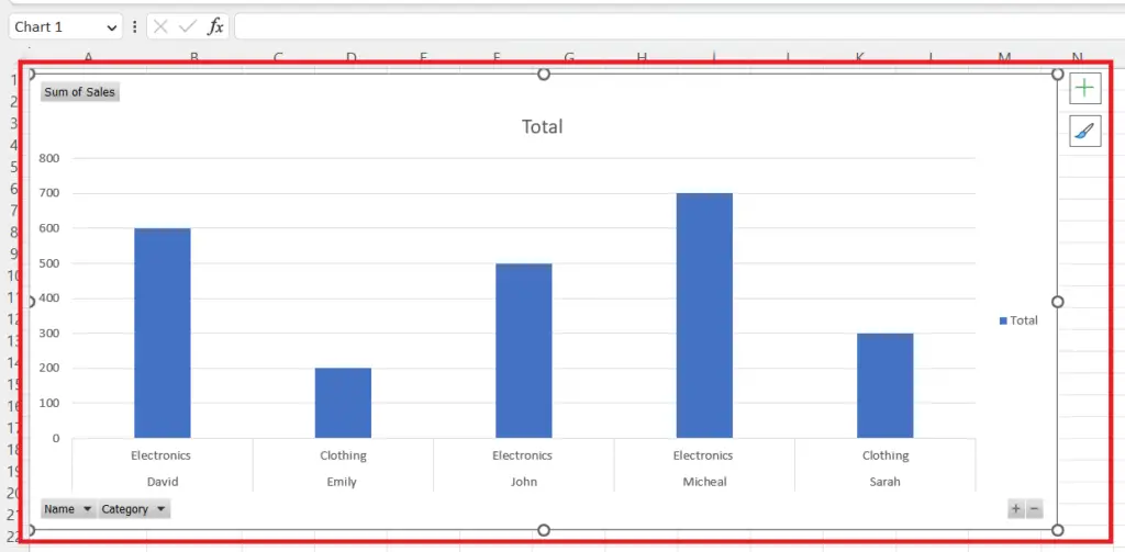
- Perform a click anywhere on the chart.
Step 2 – Perform a Click on the “Chart Styles” Box
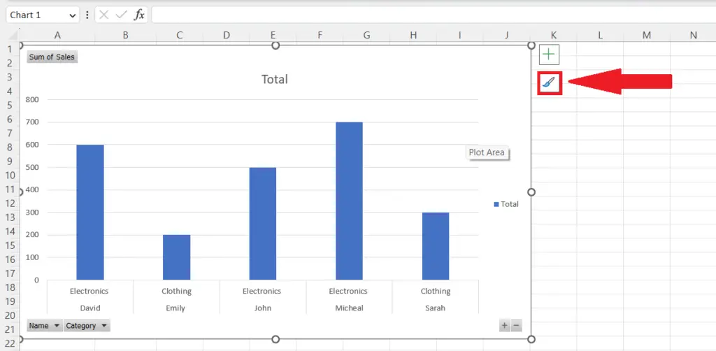
- Perform a click on the Chart Styles box that appears in the upper-right corner of the chart.
Step 3 – Navigate to the Color Section
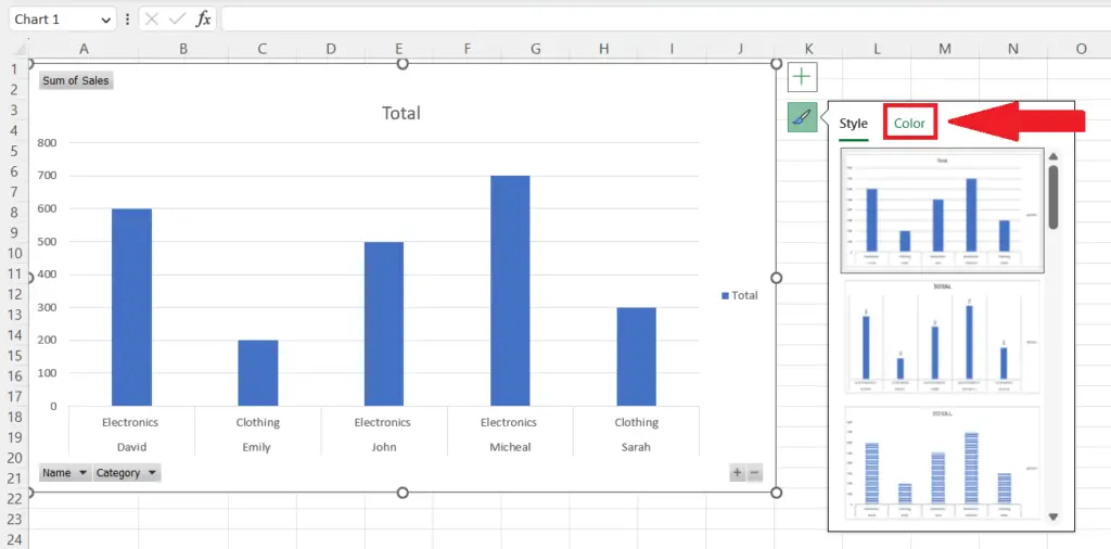
- Navigate to the Color section in the menu that appears.
Step 4 – Choose a New Color
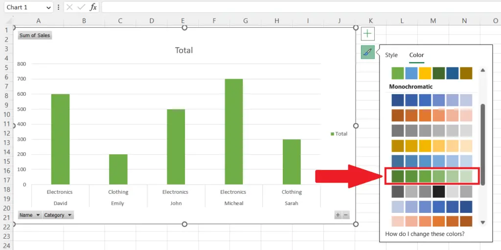
- Choose a new color from the drop-down menu.
- The color of the Pivot chart will be changed.


