
How to center a chart in Excel
 By
SpreadCheaters
By
SpreadCheaters
Centering a chart in Excel is essential to achieve visual balance, maintaining a clear presentation, and enhancing overall professionalism. By aligning the chart with other elements on the worksheet, it creates a visually appealing and organized layout, making it easier for viewers to interpret the data.
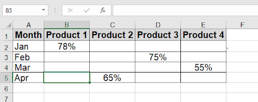
There are several options for centering charts in Excel. First, we have created a dataset titled “Monthly Products sales” to demonstrate this. This is how the dataset looks.
Method 1 – By using format data series.
Step – 1 – Go to the Insert tab (2D Clustered Column)
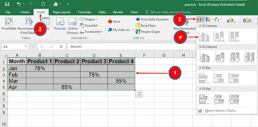
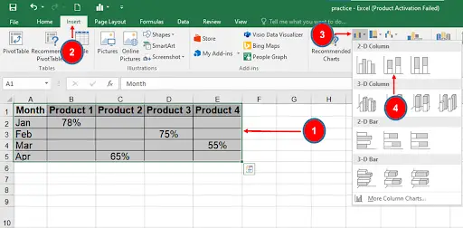
- The chart needs to be made first.
- First, select the entire dataset, then select the 2-D Clustered Column chart option under the Insert tab, as shown with arrows in the image.
Step – 2 – Double click the bar
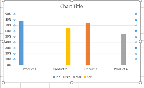
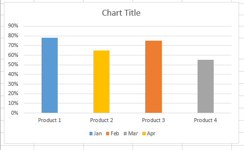
- The bar titles and chart bars are not centered.
- Click 2 times on any bar, then in this instance, we double-clicked the Product 1 bar.
Step – 3 – Go to the Format Data Series
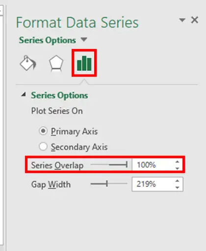
- A Format Data Point window will consequently show up.
- Set the Series Overlap to 100% and press ENTER.
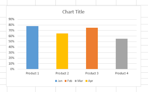
Step – 4 – The Chart Centered
- we can see that the bars are now wider and that the titles of each bar are now in the center of each bar.
Method 2 – Using 2D Stacked Column Chart
We’ll use the same dataset as before to explain the use of 2D stacked column chart centering.
Step – 1 – Go to the Insert tab
- First, choose the entire dataset, then select the 2-D Stacked Column chart option under the Insert tab’s Insert Column or Bar Chart dropdown menu.
Step – 2 – Select 2D Stacked Column
- The below results will come out as an already centered chart.
Conclusion:
Centering the charts demonstrates attention to detail and a professional approach. It adds a touch of polish to your Excel worksheets or reports, presenting your data in an organized and visually appealing manner. However, we should keep the following things in mind while using the above-explained methods.
In the first method, we must double-click the bar while choosing the bars to open a Format Data Point window. If not, this window won’t open.
The Series Overlap setting in the Format Data Point box will automatically shift to 100% in the second method when you select the 2-D Stacked Column bar, so you don’t need to make any manual adjustments.


