How to add labels to a chart in Google Sheets
 By
SpreadCheaters
By
SpreadCheaters
In this tutorial, we will learn how to add labels to a chart in Google Sheets. Adding labels to a chart in Google Sheets is a simple process that can be achieved by utilizing the Chart Editor panel.
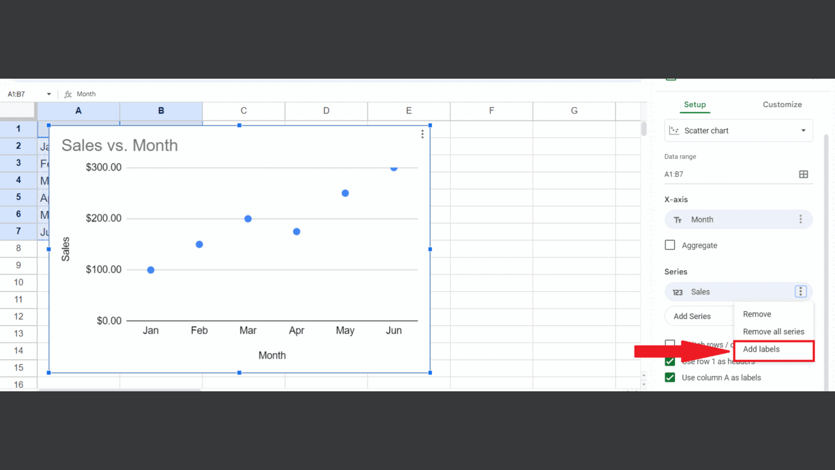
Right now, we have a chart representing sales for some months. We want to add the labels for each sale.
To add labels to a chart in Google Sheets means to insert textual explanations or titles to its various components, including the axes, data series, and chart title. The purpose of adding labels is to aid the audience in comprehending the information presented in the chart and to facilitate the interpretation of the data.
Step 1 – Perform a Click Anywhere on the Chart
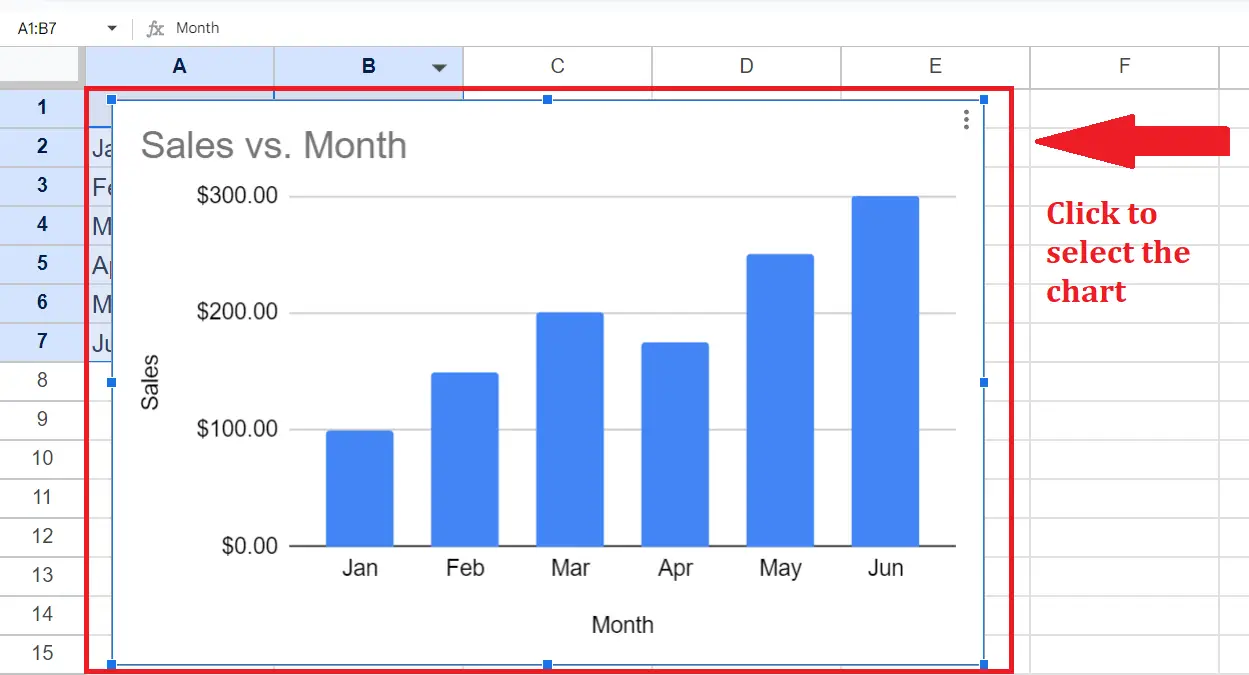
– Perform a click anywhere on the chart.
Step 2 – Perform a Click on the Ellipsis (three dots)
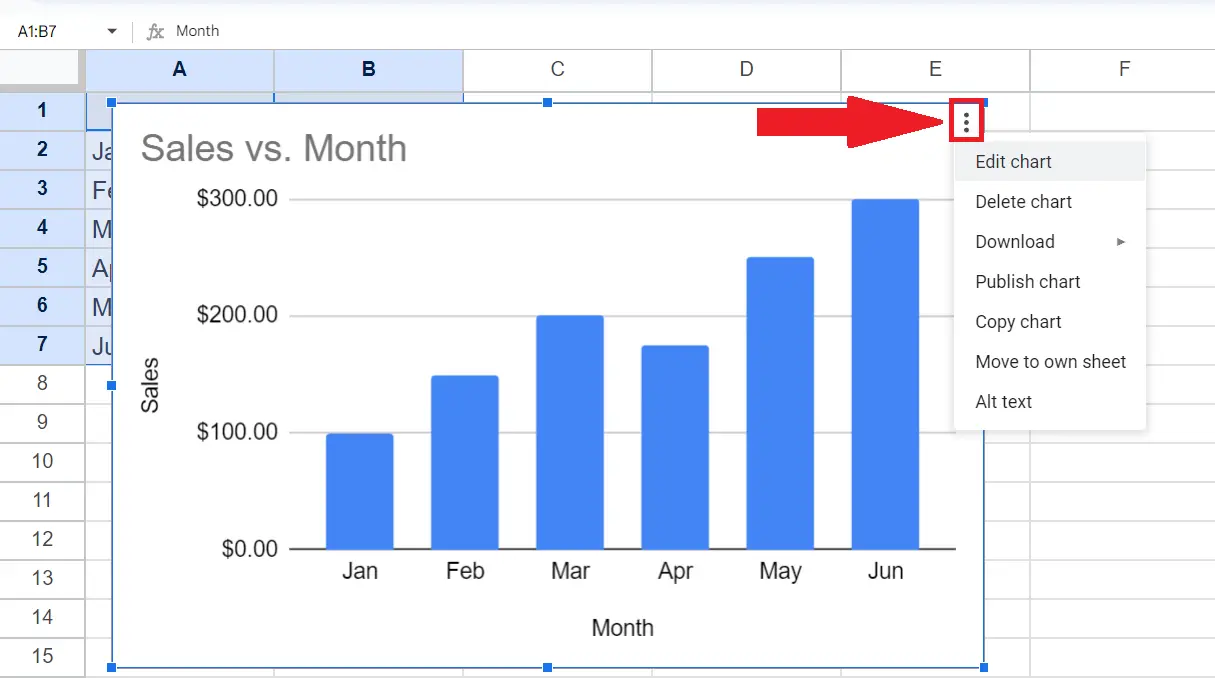
– Perform a click on the Ellipsis(three dots) located at the upper right corner of the chart.
– A menu will appear.
Step 3 – Choose the Edit Chart Option
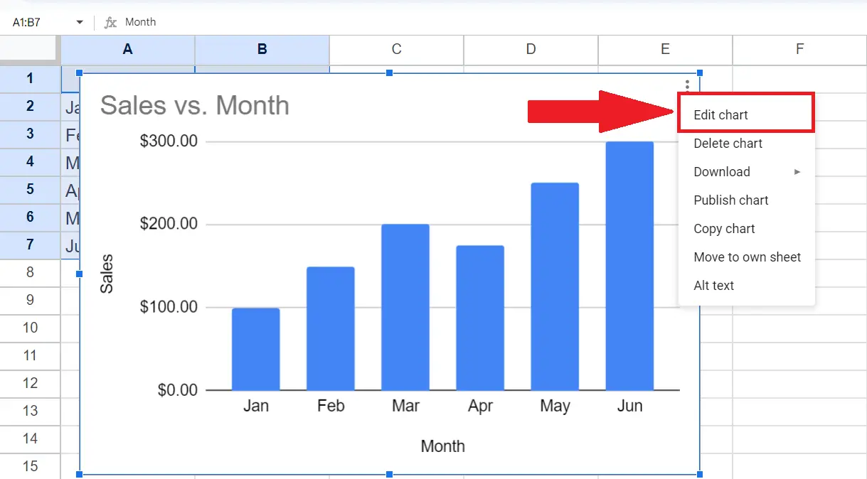
– Choose the Edit Chart option from the menu.
– This will open the Chart Editor panel at the right of the window.
Step 4 – Choose the “Scatter Chart” in the Chart Type Option
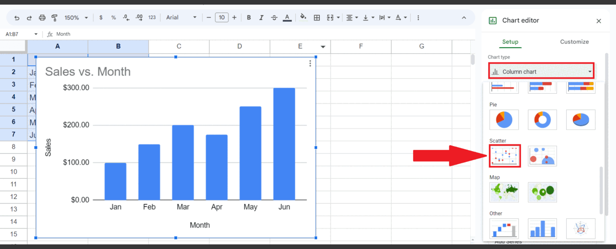
– Choose the “Scatter Chart” in the Chart type option.
– You can add labels to other charts i.e. bar charts as well, the purpose of selecting the scatter chart is to get accurate labels.
Step 5 – Perform a Click on the Ellipsis (three dots) with the Series
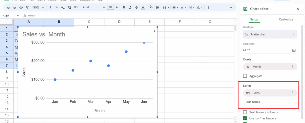
– Locate the Series section in the Chart Editor.
– Perform a click on the ellipsis (three dots) located next to the data series to which you wish to add the labels.
– In this case, we only have one existing series i.e. Sales.
Step 6 – Choose the “Add Labels” Option

– Choose the “Add Labels” option.
– Labels will be added to the chart.