How to add the average line in Google Sheets
 By
SpreadCheaters
By
SpreadCheaters
Google Sheets, a powerful data analysis and visualization tool, empowers users to efficiently organize and manipulate data. When presenting data in a chart, including an average line can significantly aid in representing the overall trend or central tendency. In this blog post, we will provide a step-by-step guide on how to add an average line in Google Sheets, enabling you to enhance your data visualizations and gain deeper insights.
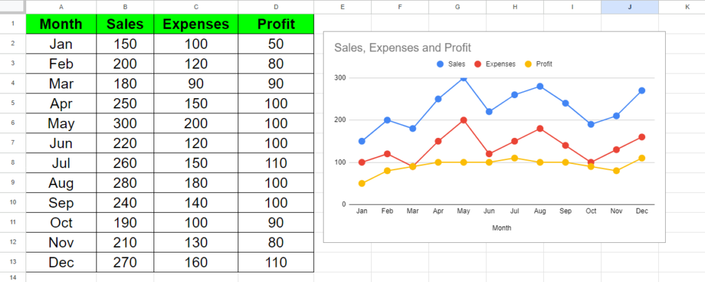
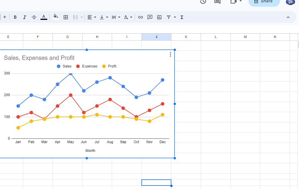
To demonstrate the process, we will work with a dataset that showcases the Sales, Expenses, and Profit figures for each month of the year. By adding an average line to the chart, we can easily examine the average values of Sales, Expenses, and Profit over the course of the year. Before diving into the tutorial, let’s take a closer look at the dataset.
Method – 1 Using Chart Editor.
Chart Editor is a feature of Google Sheets which is used to customize the chart according to your personal needs. We will be using Chart Editor to add the average line to the chart by following the simple steps given below.
Step – 1 Open chart editor.
- Click on the chart, and 3 dots will appear on the top right of the chart.
- Click on the 3 dots and a drop-down menu will appear.
- In the menu click on Edit Chart.
Step – 2 Customize Chart.
- In the Chart editor click on the Customize tab.
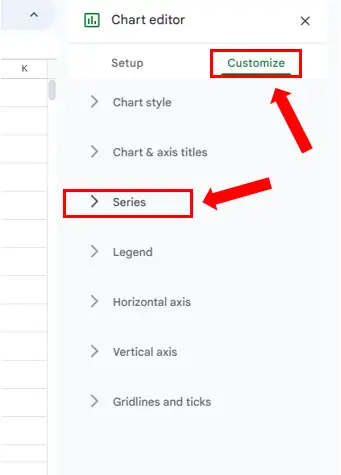
- Click on Series to open the drop-down options.
Step – 3 Add the average line.
- Once the Series drop-down options are open, scroll down.
- Check the checkbox of Trendline.
- The average line will be added to the chart.
Method – 2 Using Average formula.
The average formula can be used to find the average of the values in the dataset and then a chart can be used to represent the average line along with the dataset values.
Step – 1 Insert the column.
- Select the Sales column.
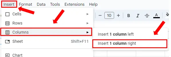
- Click on the Insert tab.
- Open the side menu of Columns.
- Click on Insert 1 column right.
- After Inserting the column name it as Average.
Step – 2 Apply the formula.
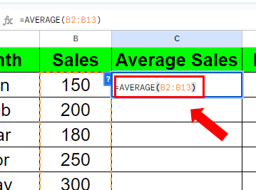
- Select the first cell of the Average column and type the formula
- Syntax of the formula is:
AVERAGE(Range of cells)
- In our case, formula will be:
AVERAGE(B2:B13)
- Hit Enter to apply the formula.
Step – 3 Find the remaining values.
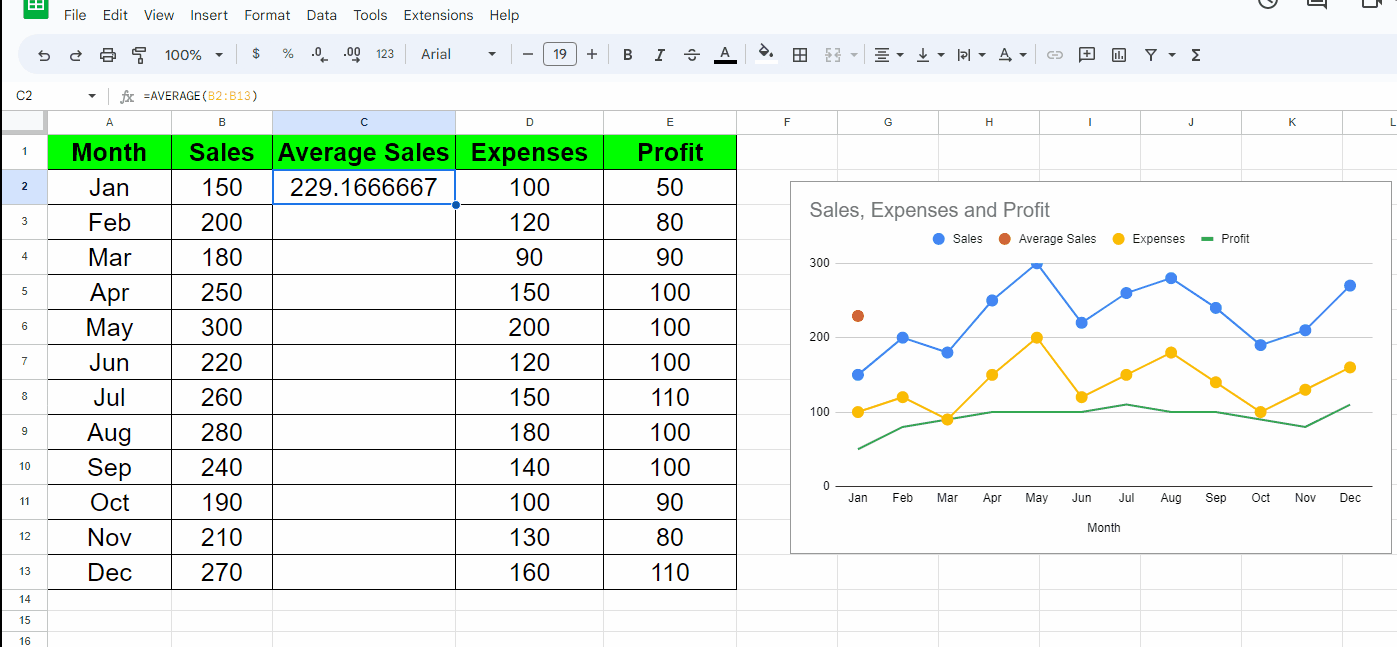
- Select the cell with the formula.
- Drag the cell from the bottom right to the rest of the cells.
- The average line will appear in the chart, as shown below because we have already included this column in the dataset.