How to add Second Y Axis in Google Sheets
 By
SpreadCheaters
By
SpreadCheaters
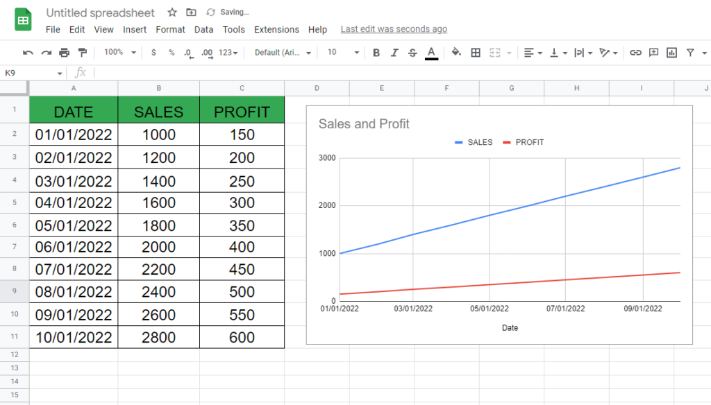
Here we have a dataset which contains data about SALES and PROFITS according to the DATES, a chart related to that data is also given. The chart already contains the X and Y axis but for extra information we will add a second Y axis. Steps are given below to do this but first let’s have a look at the dataset above.
One of the features of Google Sheets is the ability to create charts to visually represent data. One common chart type is the line chart, which can be used to plot changes in data over time. However, if two sets of data have different units of measurement or scales, it can be difficult to compare them on the same chart. This is where a secondary Y axis can be useful. A secondary Y axis allows you to plot two sets of data with different units of measurement on the same chart, with each set of data represented by its own Y axis.
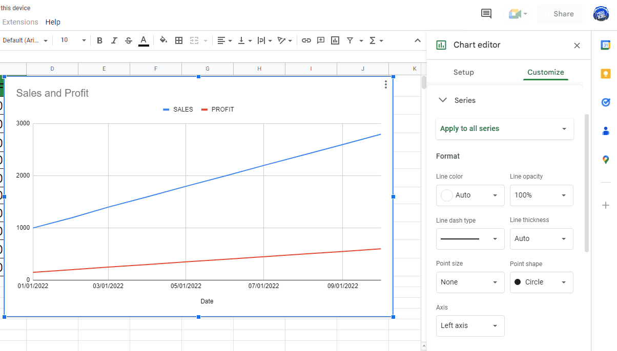
Step 1 – Open Chat settings
– To customize the chart open chart setting by clicking on the chart.
– Then click on the three dots on the top and choose the Edit chart.
– Open the Customize tab.
– Open the Drop down menu of Series.
Step 2 – Add Second Y Axis

– Open drop down menu of “Apply to all series”.
– Choose the option for which you want to add the second Y axis. In our case it will be Profit.
– Then in the axis option below choose “Right axis”.
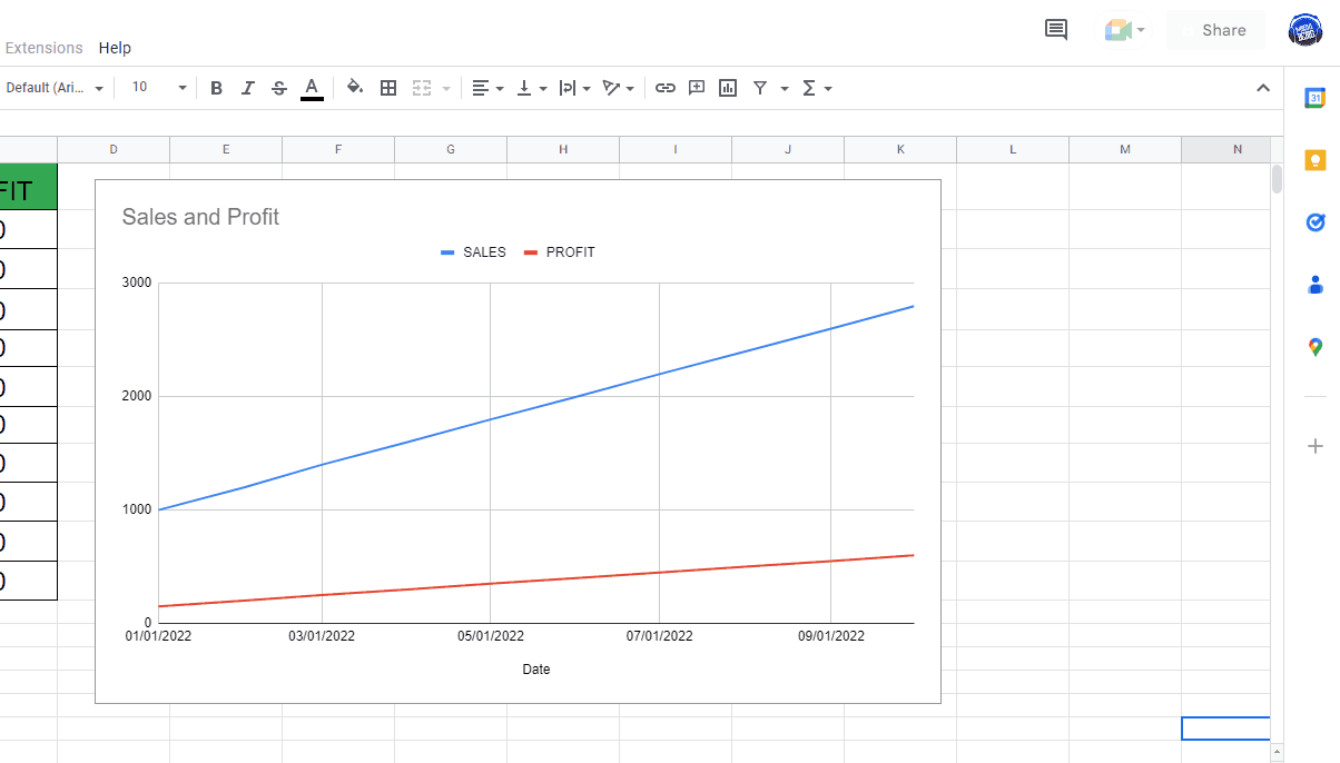
– This will add a second Y-axis on the chart as shown above.