How to add Axis Labels in Google Sheets
 By
SpreadCheaters
By
SpreadCheaters
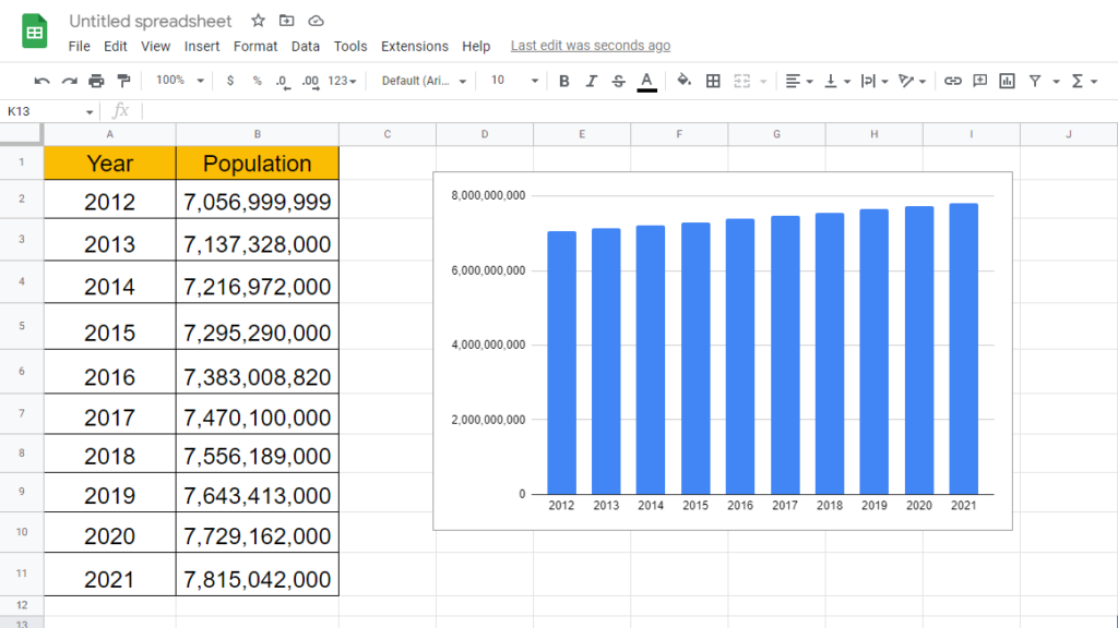
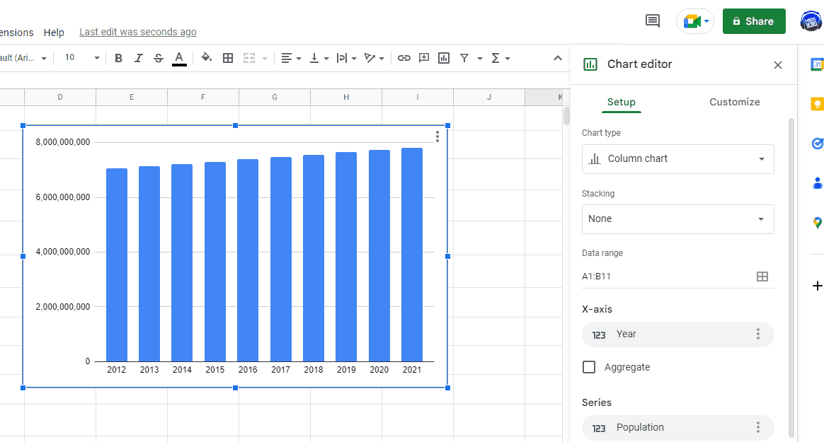
Here we have a dataset which contains Population over the Years, we also have the visual representation of this data in form of Column chart. In this tutorial we will learn how to add Axis labels to this chart but first let’s have a look at the dataset above.
Adding Axis Labels in Google Sheets is a simple and effective way to enhance the visual representation of your data. In this blog post, we will go through the step-by-step process of adding axis labels in Google Sheets.
Step 1 – Open Chart Editor
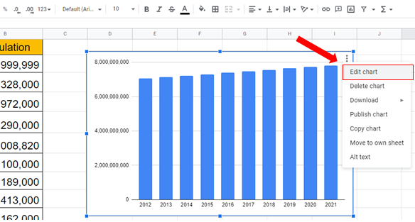
– To add Axis Labels to the chart first open Chart Editor.
– To open Chart Editor, click on the Chart then click on the three dots at top right of the chart.
– Select Edit Chart.
Step 2 – Add Axis labels

– After opening Chart Editor click on Customize tab.
– Open the drop-down menu of Chart & axis titles.
– From the down menu choose the axis you want to label from the options.
– Then in the Title text space enter the name of the label.
– It will be added automatically.