
How to add a third axis in Excel
 By
SpreadCheaters
By
SpreadCheaters
If you have data sets with different units of measurement, such as sales revenue and customer satisfaction scores, adding a third axis, in Excel, can help you out by visualizing and analyzing the relationship between these variables more effectively. It can enhance the clarity and depth of your visualizations, allowing you to convey complex information effectively and enabling better insights and context in your chart.
In this tutorial, we’ll discuss the two most convenient methods to insert a third axis i.e. secondary y-axis in your chart.
METHOD 1 – By using the Format Data Series option
We will add a secondary y-axis by changing the chart settings using “Format Data Series” in this method.
In this case, we will insert a third axis for the “Average Sale of Basketballs” series.
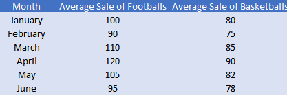
We’ll let the following data set that contains a company’s average sales of footballs in one column and average sales of basketballs in another column in the first six months of the year:
STEP 1 – Create a line chart in an Excel spreadsheet
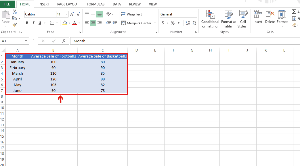
- Select all three columns that contain data.
- Go to the Insert tab.
- Go to the Charts group in the Insert tab.
- Select the line chart of your choice.
STEP 2 – Customize the chart to add a third axis
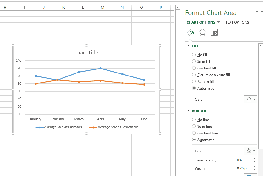
- Select the created chart.
- Move your cursor on any of the data points of the Average Sale of Basketballs series in the chart.
- Right-click on it. A drop-down menu will appear.
- select the Format data series option.
- In the Format Series box, go to the “Series Options” section.
- Click on the Secondary axis option.
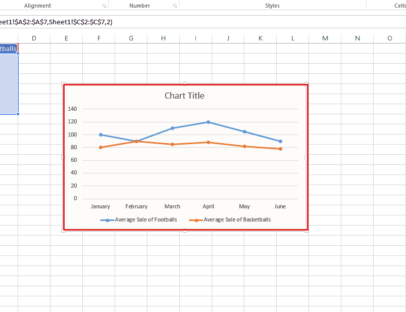
- A third axis will be created for the Average Sale of Basketballs series in the chart.
METHOD 2 – By using the “Changing Chart Type” option
In this method, we’ll add a third axis by using Changing Chart Type option in Excel.
Note that in this case, we’ll add a secondary y-axis for the “Average Sale of Basketballs” series.
Consider the same data set as in the above case:

STEP 1 -Insert a line chart in an Excel spreadsheet

- Select all three columns that contain data.
- Go to the Insert tab.
- Go to the Charts group in the Insert tab.
- Select the line chart of your choice.
STEP 2 – Add the third axis using Changing Chart Type option
- Select the created chart.
- Move your cursor on any of the data points of the Average Sale of Basketballs series in the chart.
- Right-click on it. A drop-down menu will appear.
- Choose the Changing Chart Type option.
- In the “Change Chart Type” dialog box, check the Secondary axis box, beside the Average Sale of Basketballs series.
- A third axis for the Average Sale of Basketballs series will be added to the chart.


