
How to add a horizontal line in Excel chart
 By
SpreadCheaters
By
SpreadCheaters
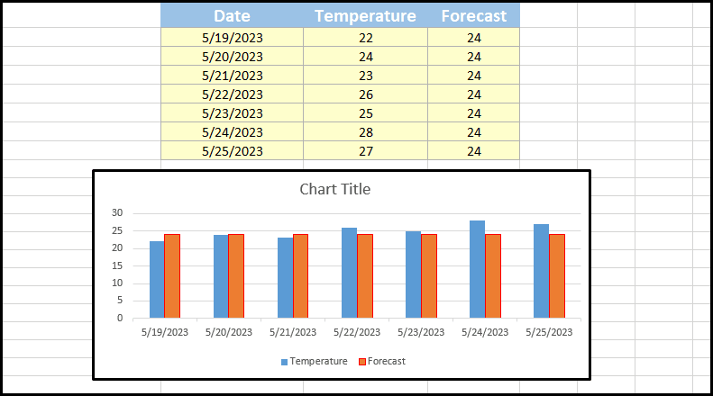
While working in Microsoft Excel, we often use charts to represent different types of data and information. Sometimes, we need to compare some values against a given benchmark or a standard value. We can use horizontal lines to compare the two series of data. A horizontal line can act as a reference or benchmark for comparison purposes. It provides a fixed value against which other data points or trends can be evaluated. For example, you might add a horizontal line to represent a target value, an average, temperature forecasts, etc.
There are different methods to add a horizontal line in different kinds of charts. We’ll discuss adding a horizontal line in a column chart and line char in this tutorial. Consider the following cases:
Case 1 – Adding a horizontal line in a column chart
We can add a horizontal line in the column chart by changing the series chart type of the quantity to “Scatter with straight lines and markers”, which is set as a standard. Consider the dataset that contains the temperature for seven days of the week and the temperature forecast for each day. The dataset is converted to a column chart. For comparing the temperature of each day with its forecast, we need to add a horizontal line that represents the forecast.
Step 1 – Select the standard quantity
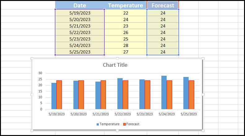
- Move your cursor to any bar of the standard quantity.
- Click on it and select it.
Step 2 – Change the series chart type
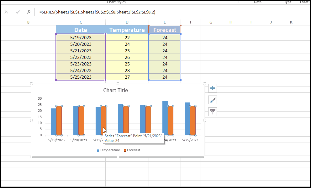
- After selecting the bar, press right-click.
- Click on “Change series chart type”.
- Change the chart type from “Clustered Column” to “Scatter with straight lines and markers”.
- Uncheck the “Secondary Axis” box.
- Click on OK.
Case 2 – Adding a horizontal line in linear graphs
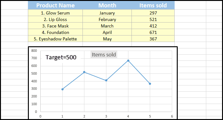
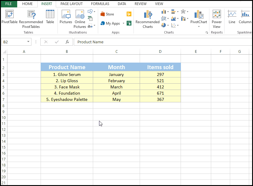
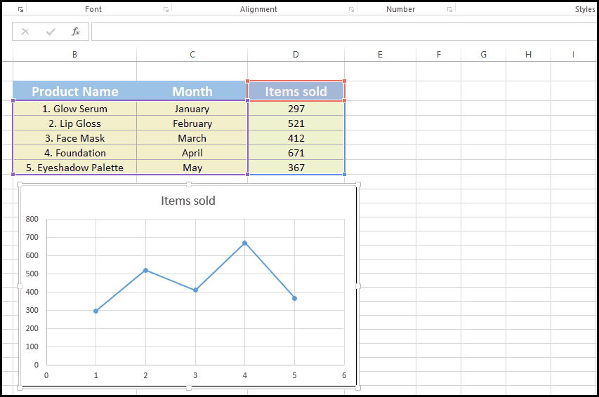
In the case of linear graphs, we can insert a horizontal line in the chart by adding a new series in the chart with X and Y values such that it forms a straight line. Consider the following dataset that contains the sales of different products of a cosmetic company over 5 months. We’ll add a horizontal line that will represent the target sales for each month. Afterward, we can do a clear comparison between sold items and target sales:
Step 1 – Select the dataset and generate a linear graph
- Press and drag your cursor to select the dataset.
- Go to the “Insert” column.
- Go to the “Charts” group.
- Click on “Scatter with straight lines and markers”.
Step 2 – Add a series of data
- Right-click on the chart area.
- Click on “Select Data”.
- Click on “Add”.
- In “Series X values”, write 0,6.
- The target in this data is 500, so write 500,500 in “Series Y values”.
- Click OK.


