
How to switch axis in an Excel spreadsheet
 By
SpreadCheaters
By
SpreadCheaters
You can watch a video tutorial here.
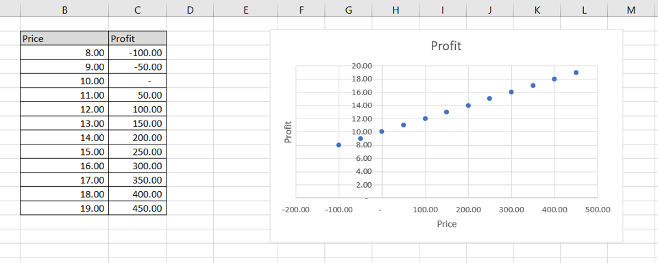
Graphs are great ways to visualize data and Excel has tools to build many types of graphs. You may need to create a graph to better represent some analysis you have done or to study trends and projections. By default, Excel does not add elements of the chart such as legends and titles when creating a chart. These can be added using the appropriate menu options. Having created a chart, you may want to switch the axes to make the data more presentable.
Step 1 – Select the chart
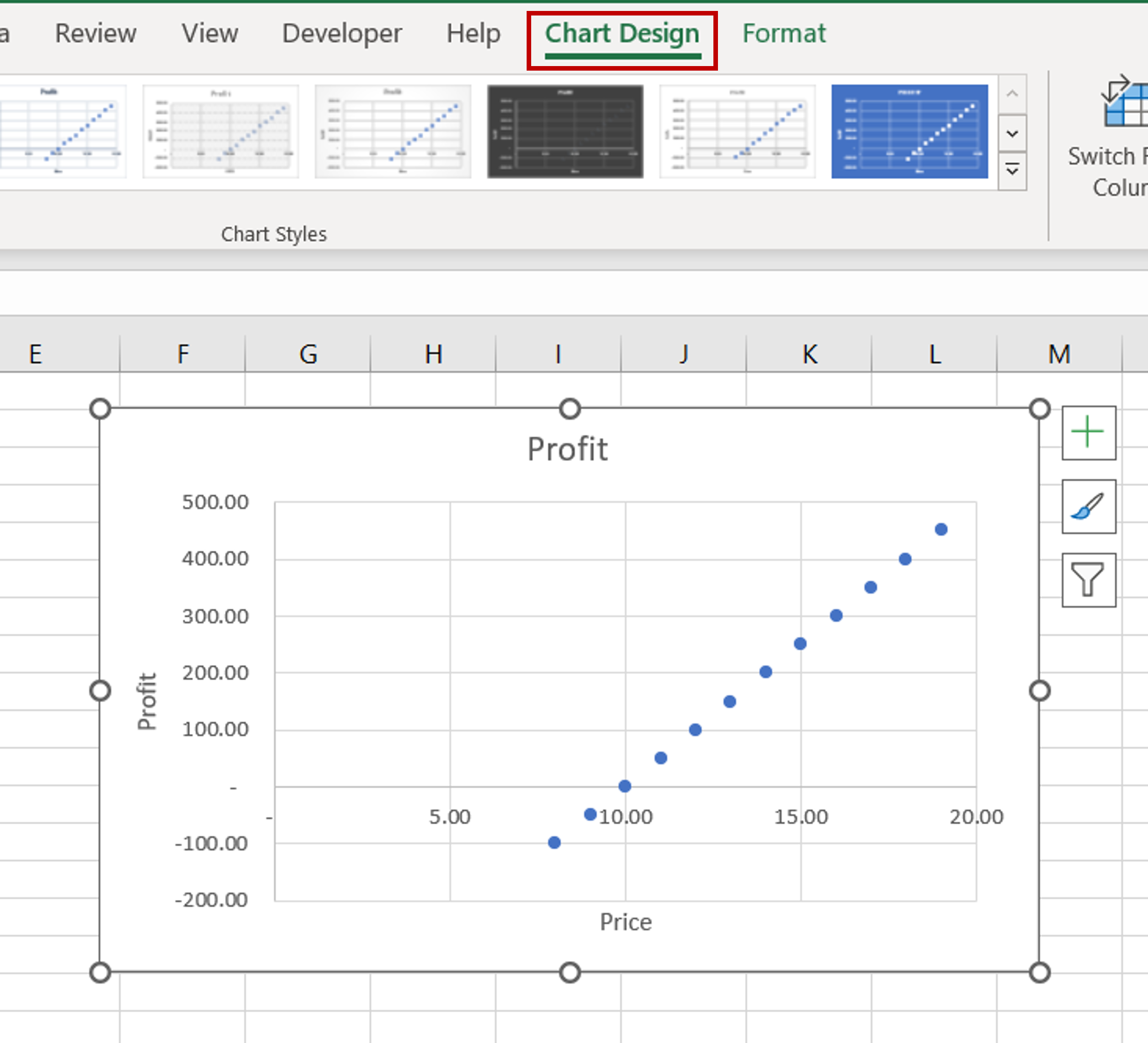
– Select the chart to bring up the Chart Design menu
Step 2 – Open the Select Data Source box
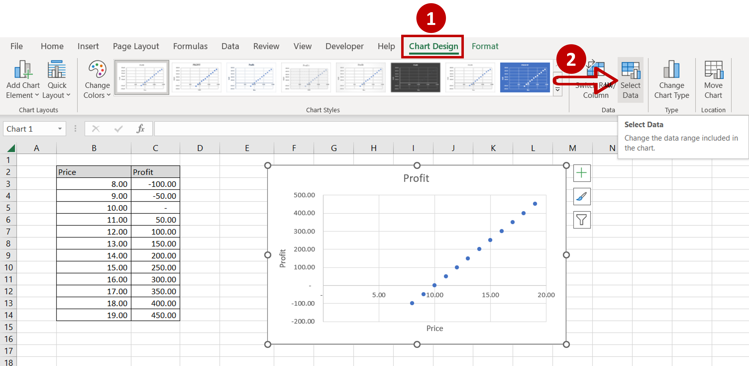
– Go to Chart Design > Data
– Click on the Select Data button
Step 3 – Open the Edit Series box
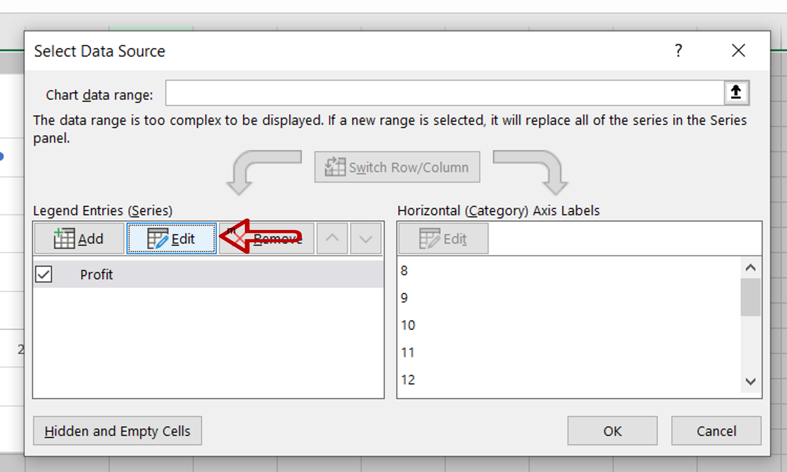
– Click on Edit
Step 4 – Change the series
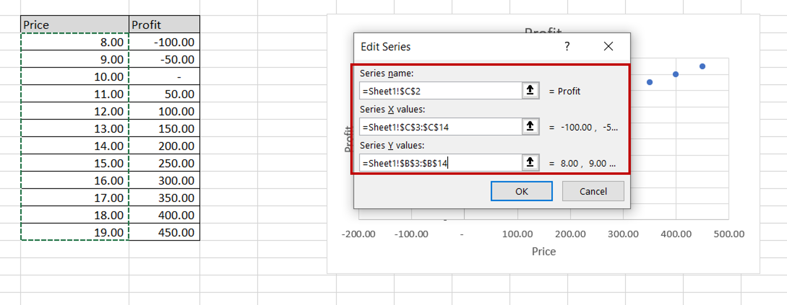
– Change the series definition so that the range of the ‘Profit’ column is under Series X values and the range of the ‘Price’ column is under Series Y values
– Press OK to close the Edit Series box
– Press OK to close the Select Data Source box
Step 5 – Change the axis titles
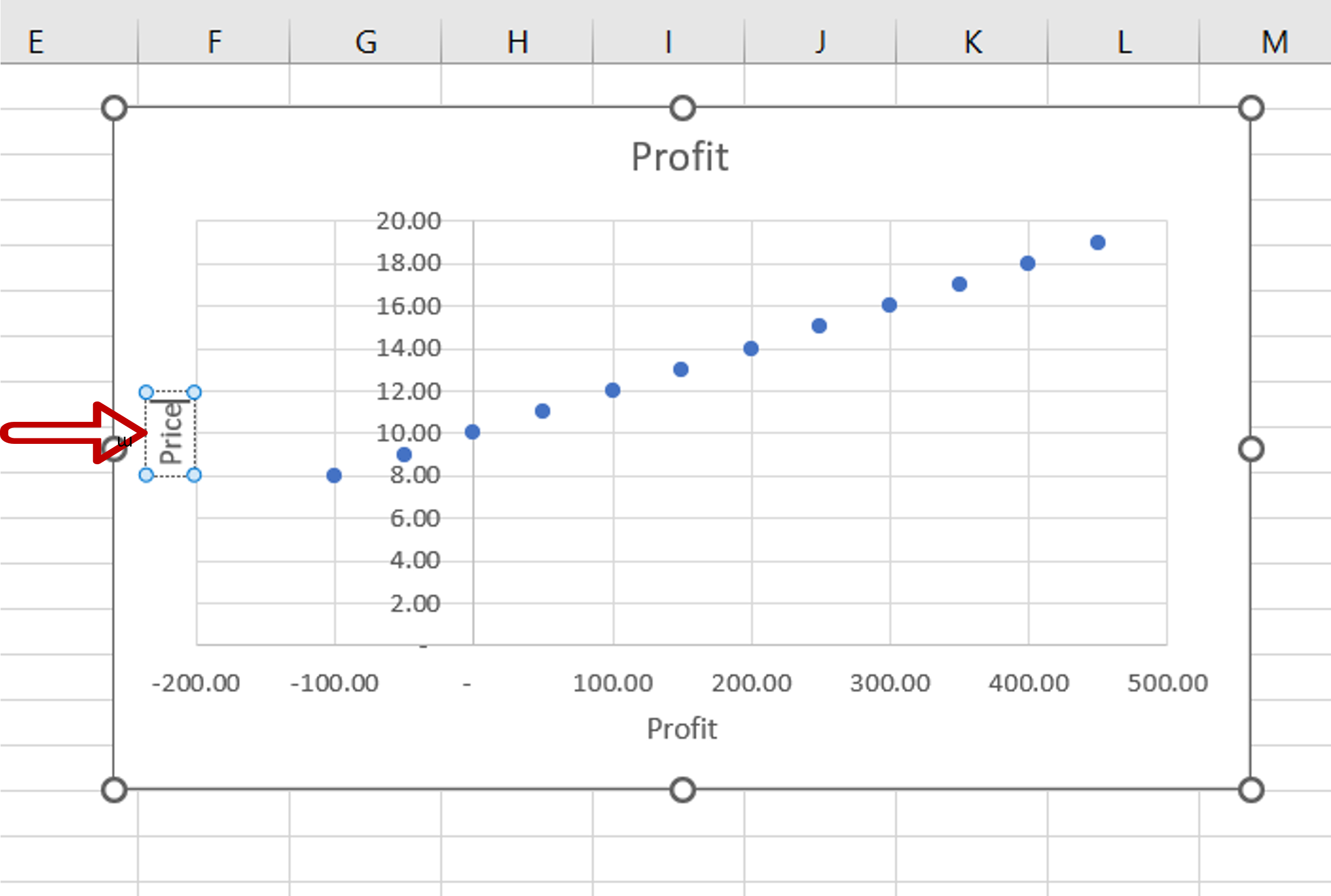
– Double-click the axis titles to change them
Step 6 – Check the result
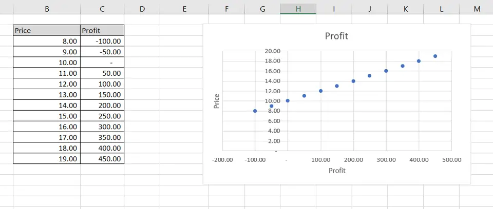
– The axes are switched


