
How to Superimpose Graphs in Excel
 By
SpreadCheaters
By
SpreadCheaters
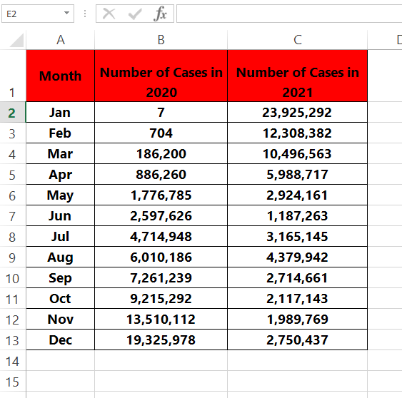
Here we have a dataset that contains data about COVID–19 cases in the years 2020 and 2021. We will superimpose both data for 2020 and 2021 by following the steps below. Let’s have a look at the dataset above first.

When creating charts or graphs in Excel, you may want to compare two or more sets of data to analyze trends and patterns. Superimposing graphs in Excel is a useful technique that allows you to display multiple data on the same chart, making it easier to compare and contrast them. In this tutorial, we will guide you through the steps to superimpose graphs in Excel.
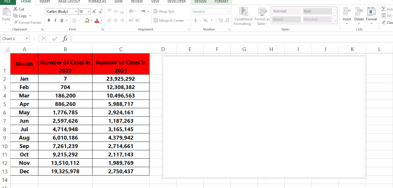
Step 1 – Plot a chart in the Sheet.
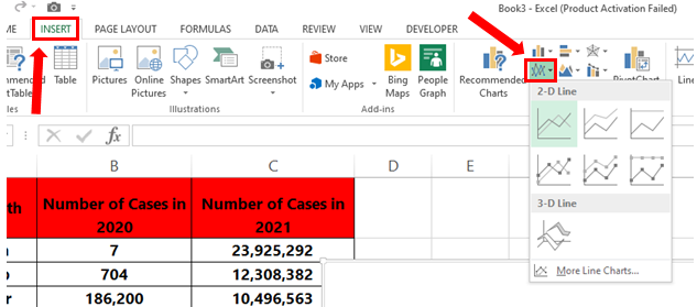
– Click on the cell where you want to add the chart.
– Go to the Insert tab in the Charts group and open the drop-down menu of the Line Chart.
– Choose any one of the available options for Line Charts.
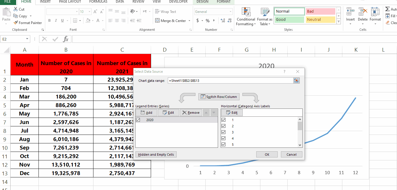
Step 2 – Add the first data to the chart.
– Right-click on the chart to open the context menu.
– Click on Select Data then the Select Data Source menu will appear.
– Click on Add under the Legend Entries (Series) heading.
– Under Series name type the name of the data (in our case 2020).
– Under Series value select the range of the cells you want the line plot of (in our case B2:B13).
– Click OK.
Step 3 – Add the second data to the chart.
– Click on Add under the Legend Entries (Series) heading.
– Under Series name type the name of the data (in our case 2020).
– Under Series value select the range of the cells you want the line plot of (in our case B2:B13).
– Click OK.


