
How to plot two data sets in Excel
 By
SpreadCheaters
By
SpreadCheaters
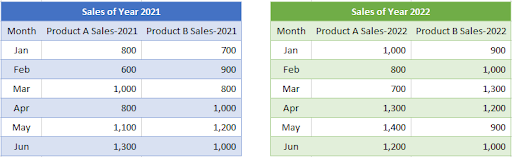
Let’s create a graph with the help of the following data sets.
Plotting two data sets in Excel is a powerful way to visually compare and analyze data. Whether you’re working with sales figures, scientific data, or any other type of numerical data, Excel’s graphing capabilities can help you spot trends, identify patterns, and make informed decisions. However, if you’re new to Excel or graphing, the process of plotting two data sets can seem daunting. But fear not! With a few simple steps, you can create a clear, easy-to-understand graph that showcases your data in the best possible light.
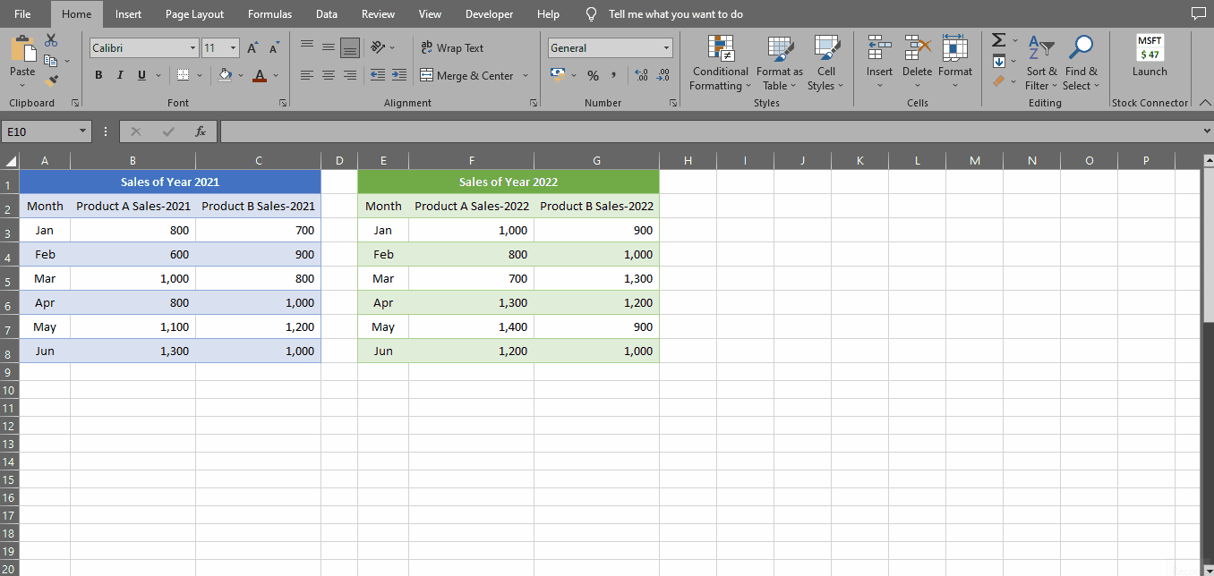
Step 1 – Go To Insert Tab
– Go to Insert Tab, under Charts group click on the Column or Bar Chart button & select Clustered Column Chart.
– A blank chart will be inserted on your sheet.
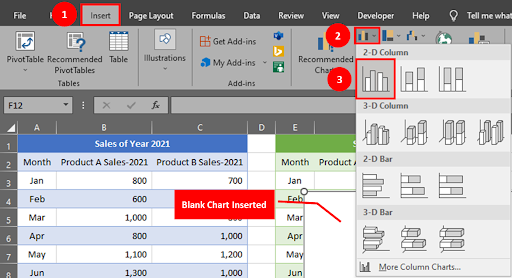
Step 2 – Go To Chart Design Tab
– Click on the blank chart, two new Tabs i.e Chart Design & Format will be activated.
– Go to the Chart Design Tab, under the Data group click the Select Data button.
– The Select Data Source window will appear on your screen.
Step 3 – Select Source Data
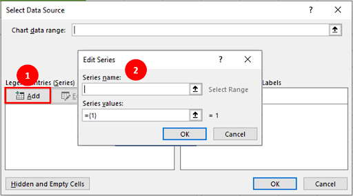
– Under Legend Entries (Series) click on the ADD button.
– Edit Series window will appear on your screen.
Step 4 – Add Series Name & Value
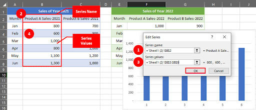
– To add the series name, place your cursor in the Series Name Tab & click on the Cell B2.
– For series value, place the cursor in the Series Value Tab & drag your mouse over values from January to June.
– Click the OK button.
Step 5 – Add More Entries
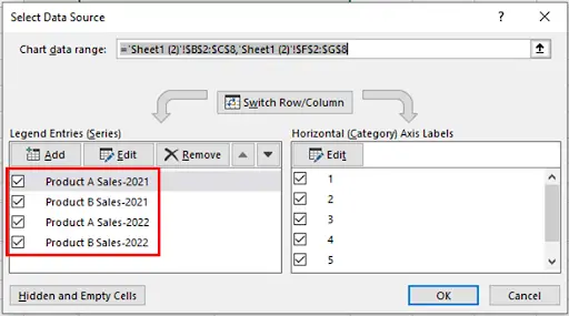
– Similarly by following step 4 add remaining data into your chart one by one.
Step 6 – Add Months
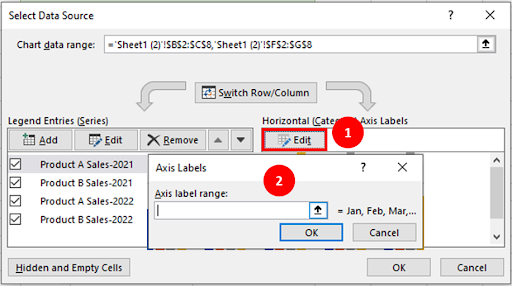
– Under Horizontal (Category) Axis Labels click the Edit button.
– Axis Label Screen will appear on your screen.
Step 7 – Select Months Data
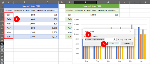
– Place your cursor in the Axis Label Range tab & drag mouse over the Months column.
– Click the OK button.
Step 8 – All Data Included
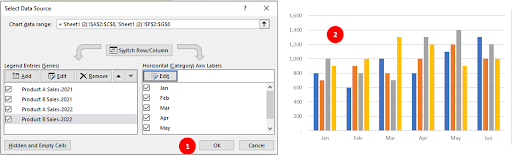
– When you add the Months data, you will be prompted back to Select Data Source Screen.
– Click the OK button.
– Your chart with two data sets is completed.
Step 9 – Add Chart Elements
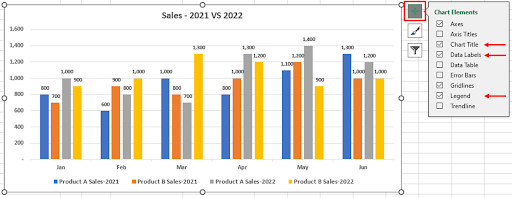
– Click on the Add Chart Element button, the chart element menu will be displayed.
– Check mark on your desired options, they will be added into your chart.
Step 10 – Graph With Two Data Sets Created

– By following the above steps, you can plot a simple yet attractive graph for your two different data sets.


