
How to plot points on a graph in Excel
 By
SpreadCheaters
By
SpreadCheaters
You can watch a video tutorial here.

Graphs are great ways to visualize data and Excel has tools to build many types of graphs. Excel also has a variety of formatting options and features that can be used to enhance visualizations. The type of graph you build depends on the data that you have. When you need to plot points on a graph, a scatter plot is a good choice for the type of graph. A scatter plot displays the relationship between 2 variables as this represents 2 dimensions i.e. the horizontal x-axis and the vertical y-axis.
Step 1 – Select the data for the chart
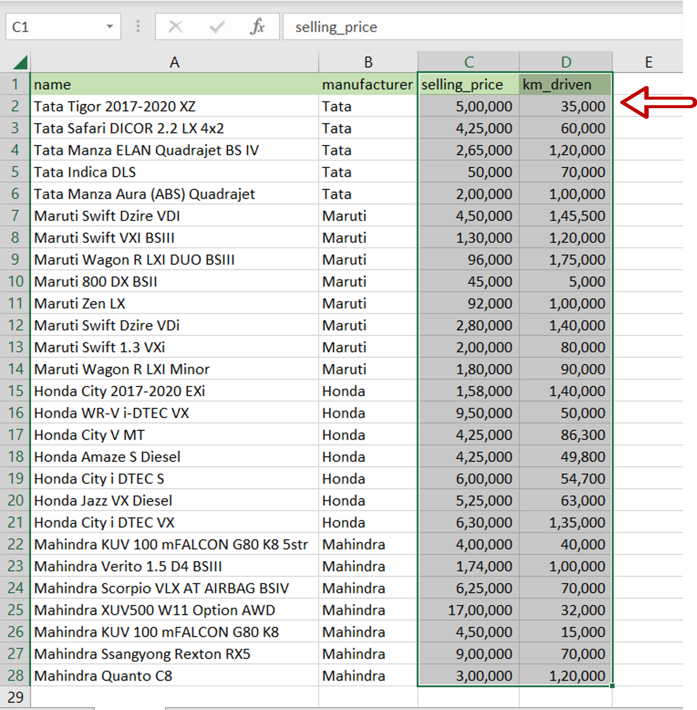
– Select the following columns:
>selling_price
>km_driven
Step 2 – Select the chart
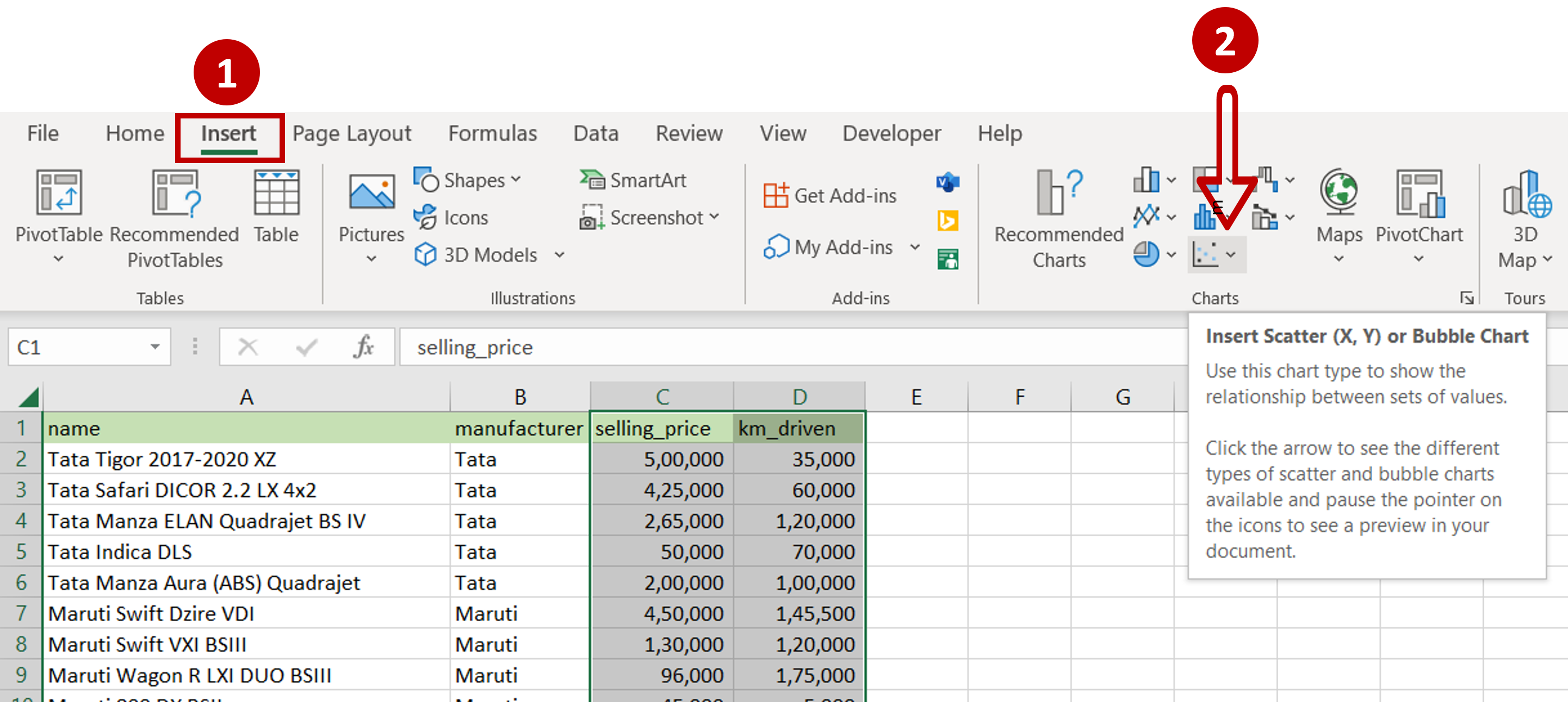
– Go to Insert > Charts
– Click on Insert Scatter (X,Y) or Bubble Chart
Step 3 – Choose the type of Scatter plot
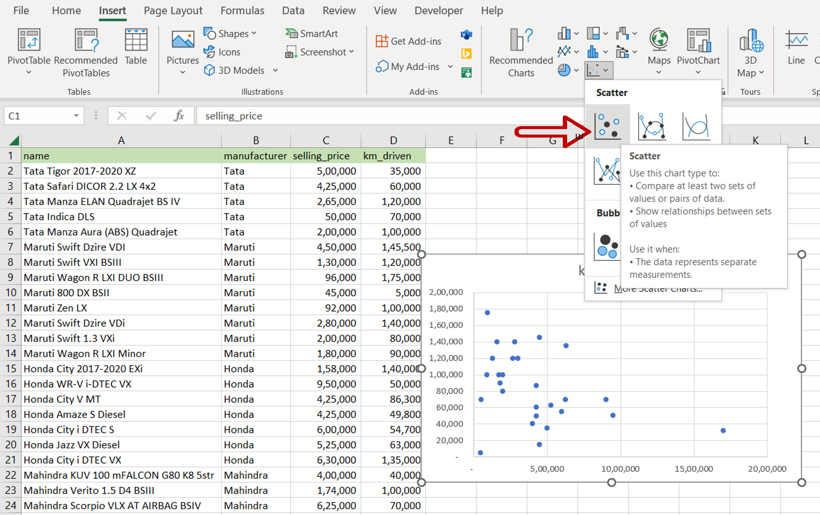
– Select the first Scatter option
Step 4 – Format the graph
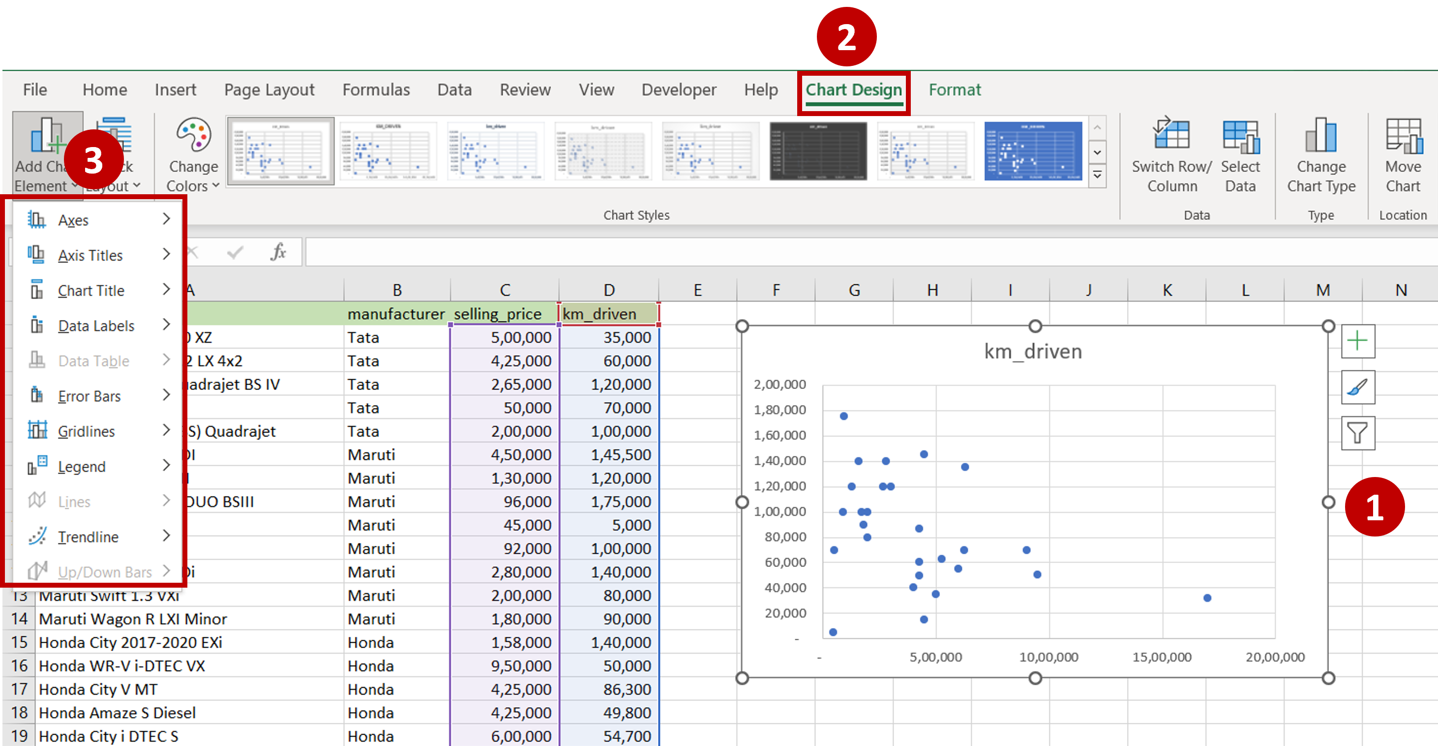
– Select the chart
– Go to Chart Design > Add Chart Element
– Choose whatever elements that need to be added to the chart to make it easy for the readers to understand e.g. Legend, Chart Title, Axis Title
Step 5 – View the Result
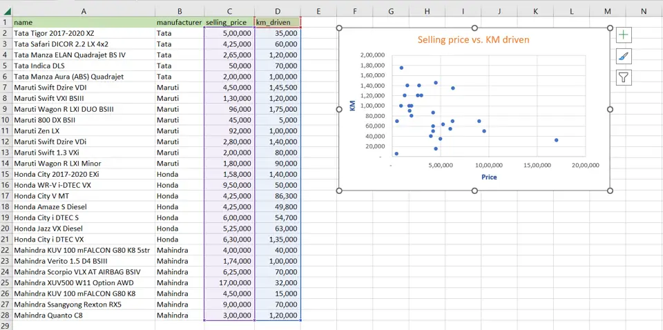
– The points are plotted on the graph


