
How to plot a normal distribution in Excel
 By
SpreadCheaters
By
SpreadCheaters
You can watch a video tutorial here.
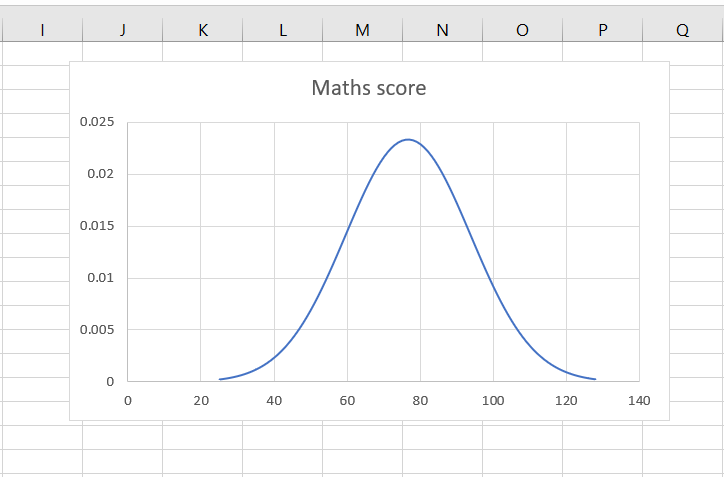
Graphs are great ways to visualize data and Excel has several tools for creating and formatting charts. The type of chart that you create depends on the dataset that you have. Using the charting tools in Excel, you can explore various types of charts and decide on the one that best suits the data that you are visualizing. When a normal distribution is plotted, it creates a bell curve.
In this example, we will create a normal distribution and then plot it to create a bell curve. The approach is as follows:
1. Find the mean and standard deviation of the dataset using the AVERAGE() and STDEV() functions
a. AVERAGE(): this returns the mean or average of a set of numbers
i. Syntax: AVERAGE(range or series of numbers)
b. STDEV.P(): this returns the standard deviation of a set of numbers
ii. Syntax: STDEV.P(range of numbers)
2. Define the lower and upper limits for the distribution
3. Create a normal distribution using the NORM.DIST() function
a. NORM.DIST(): this returns the normal distribution for the given mean and standard deviation
i. Syntax: NORM.DIST(number,mean,stdev, cumulative)
1. number: the number for which the distribution is to be computed
2. mean: the mean of the distribution
3. stdev: the standard deviation of the distribution
4. cumulative: a logical value that determines the form of the function
4. Plot the bell curve
Step 1 – Find the mean
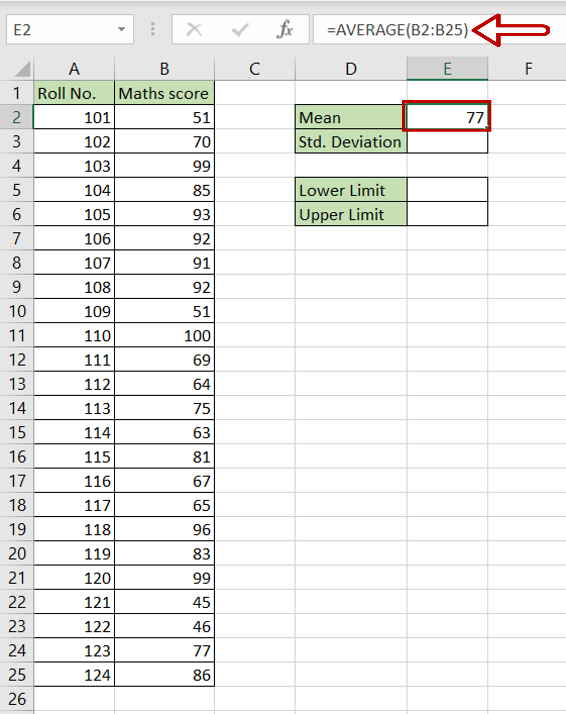
– Select the cell in which the value is to be displayed
– Type the formula using cell references:
=AVERAGE(range of Maths score)
– Press Enter
Step 2 – Find the standard deviation
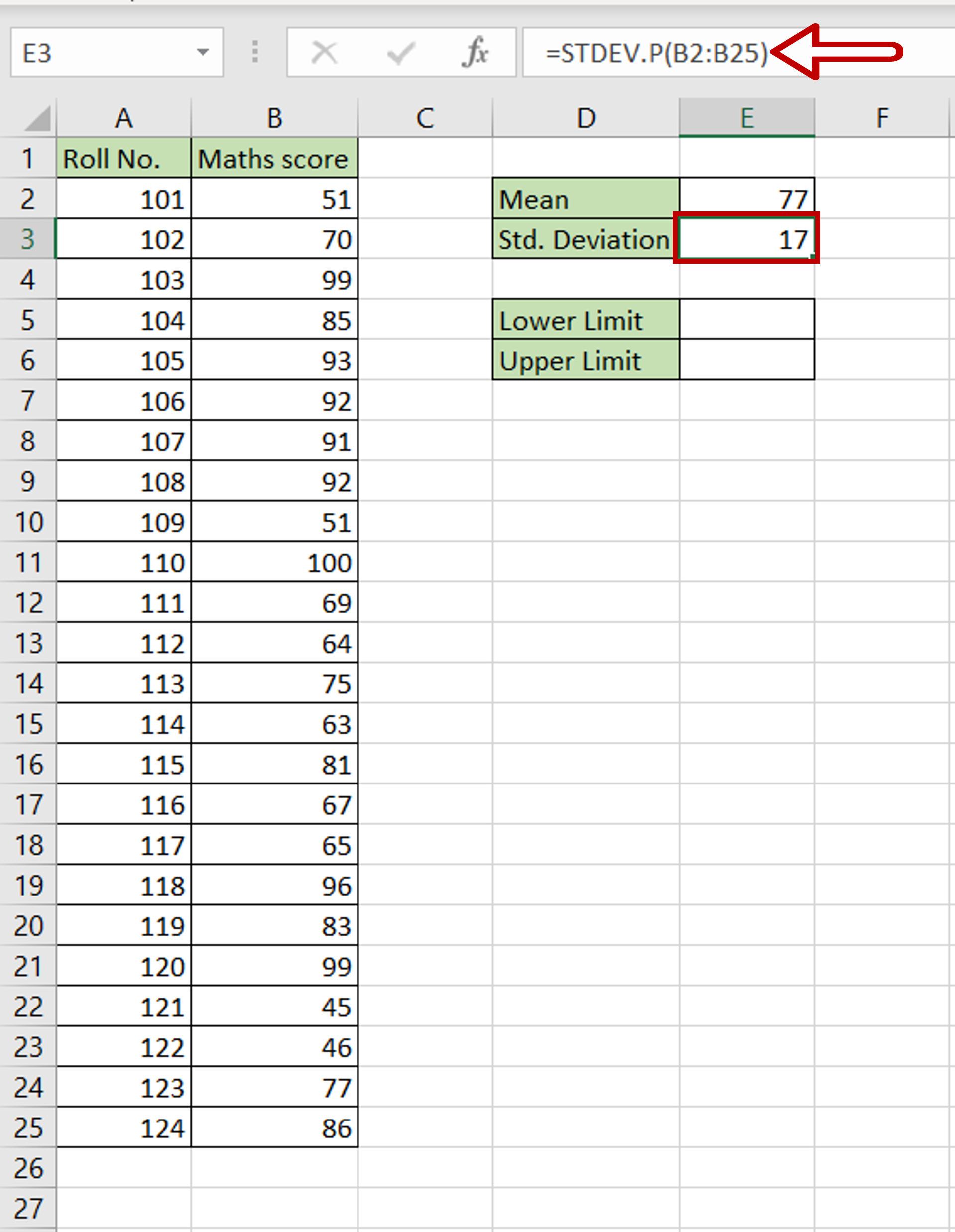
– Select the cell in which the value is to be displayed
– Type the formula using cell references:
=STDEV.P(range of Maths score)
– Press Enter
Step 3 – Find the lower limit
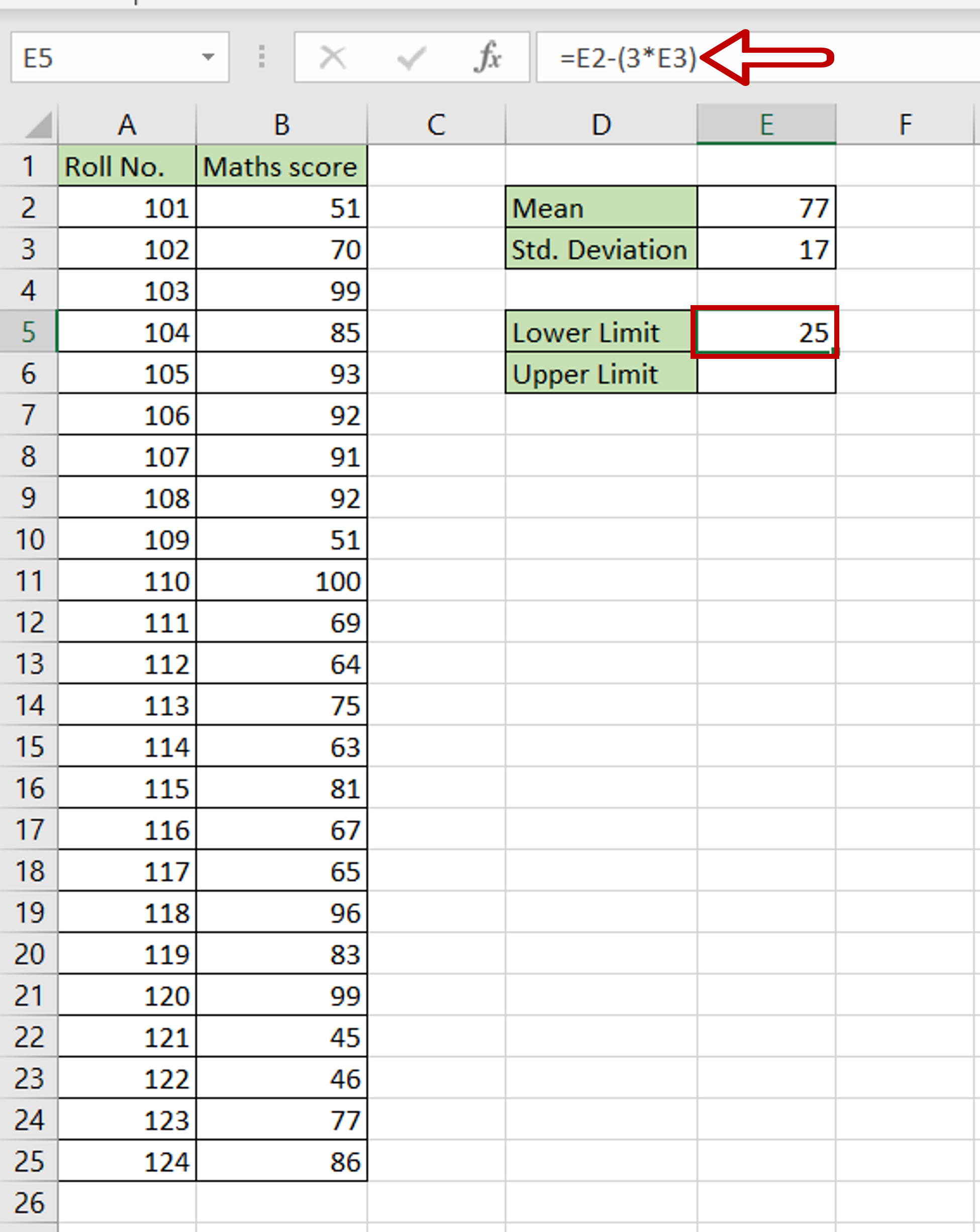
– Select the cell in which the lower limit is to be displayed
– Type the calculation using cell references:
=Mean – (3* Std. Deviation)
– Press Enter
Step 4 – Find the upper limit
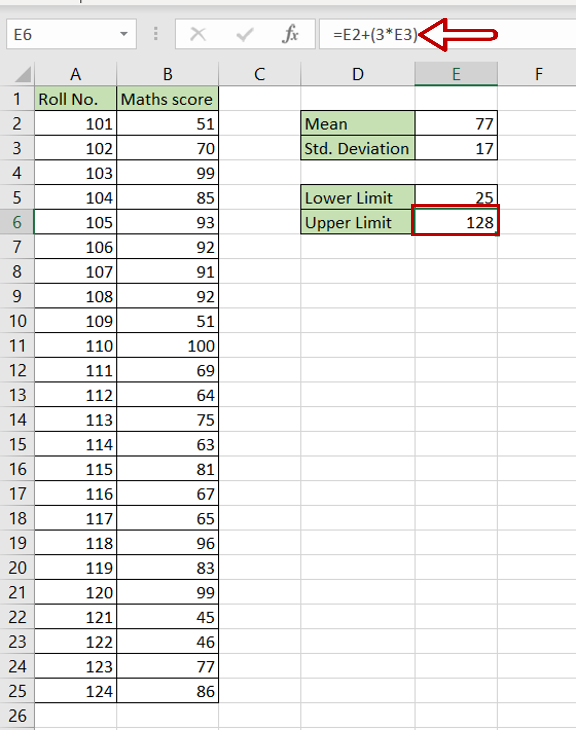
– Select the cell in which the upper limit is to be displayed
– Type the calculation using cell references:
=Mean + (3* Std. Deviation)
– Press Enter
Step 5 – Create the values
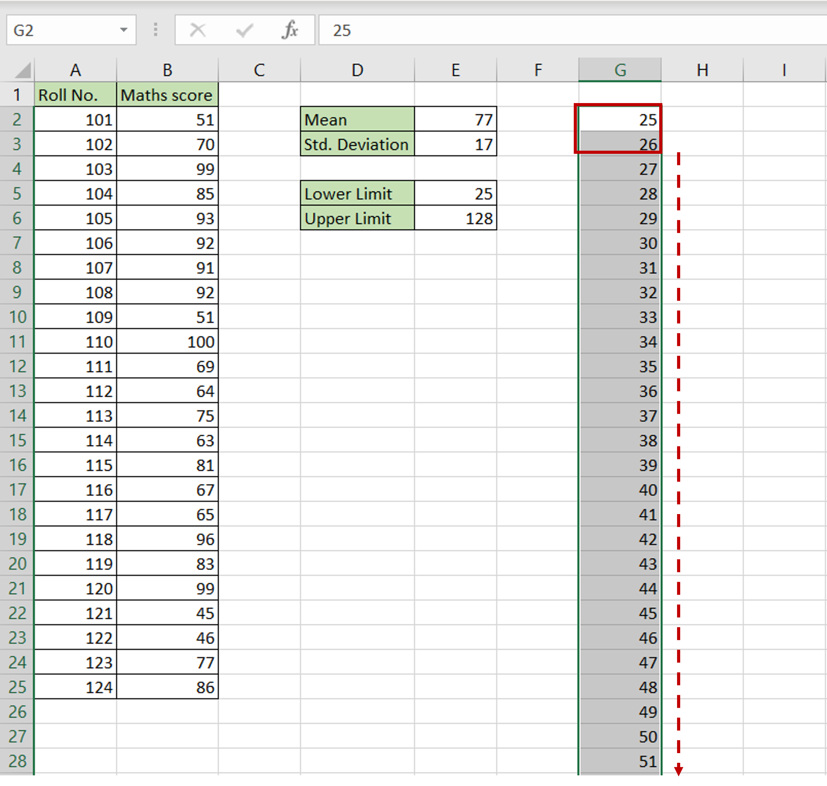
– Define the start of the series starting from the lower limit i.e. 25
– In the next row, type 26 as the next element in the series
– Select both cells and drag the fill handle down till the series reaches the upper limit i.e. 128
Step 6 – Create the normal distribution
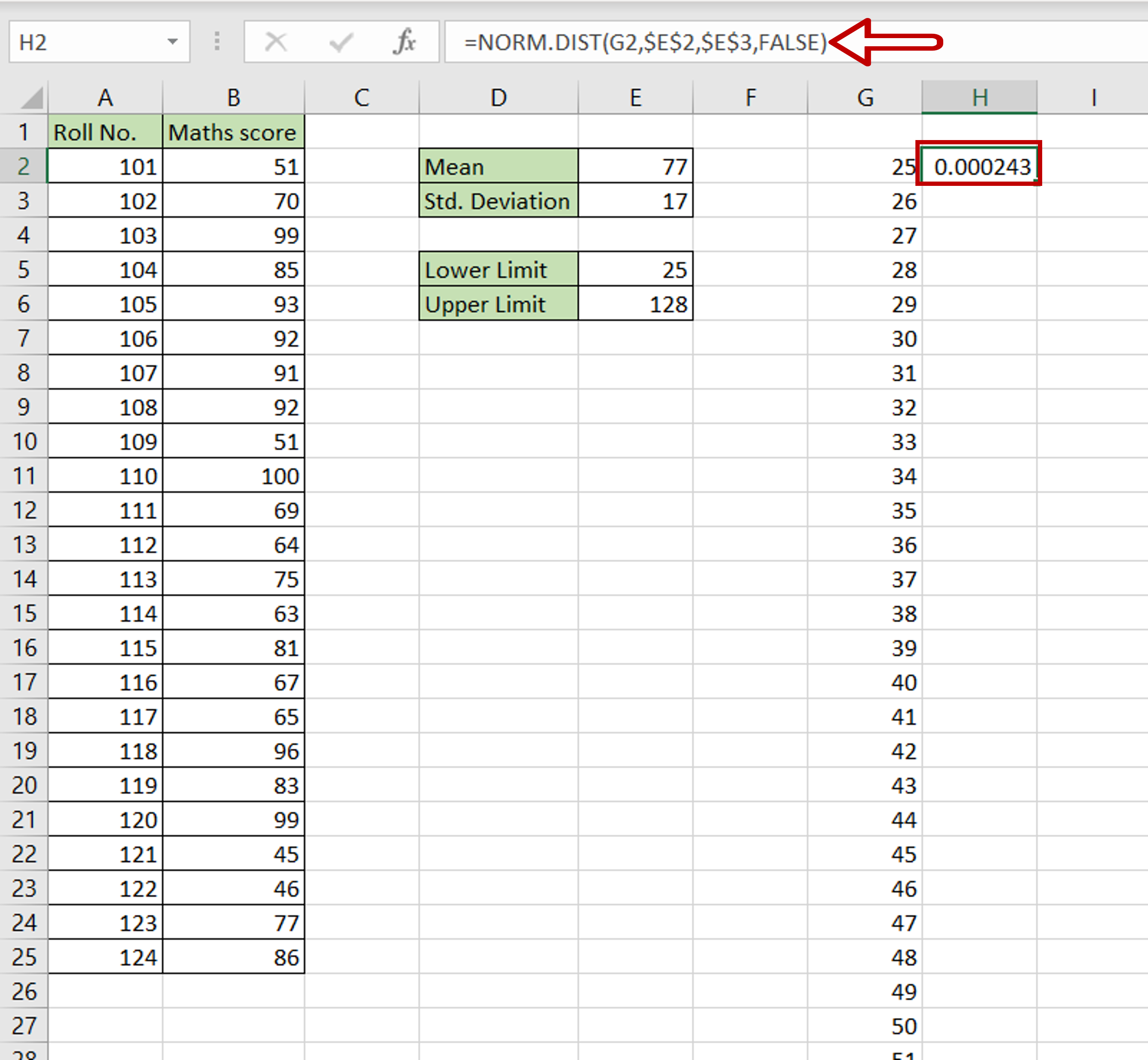
– Select the cell next to the first cell in the series
– Type the formula using cell references:
=NORM.DIST(number, $Mean$, $Std. Deviation$, FALSE)
– Press Enter
– Make the Mean and Std. Deviation constant by selecting the cell references and pressing F4
Step 7 – Copy the formula
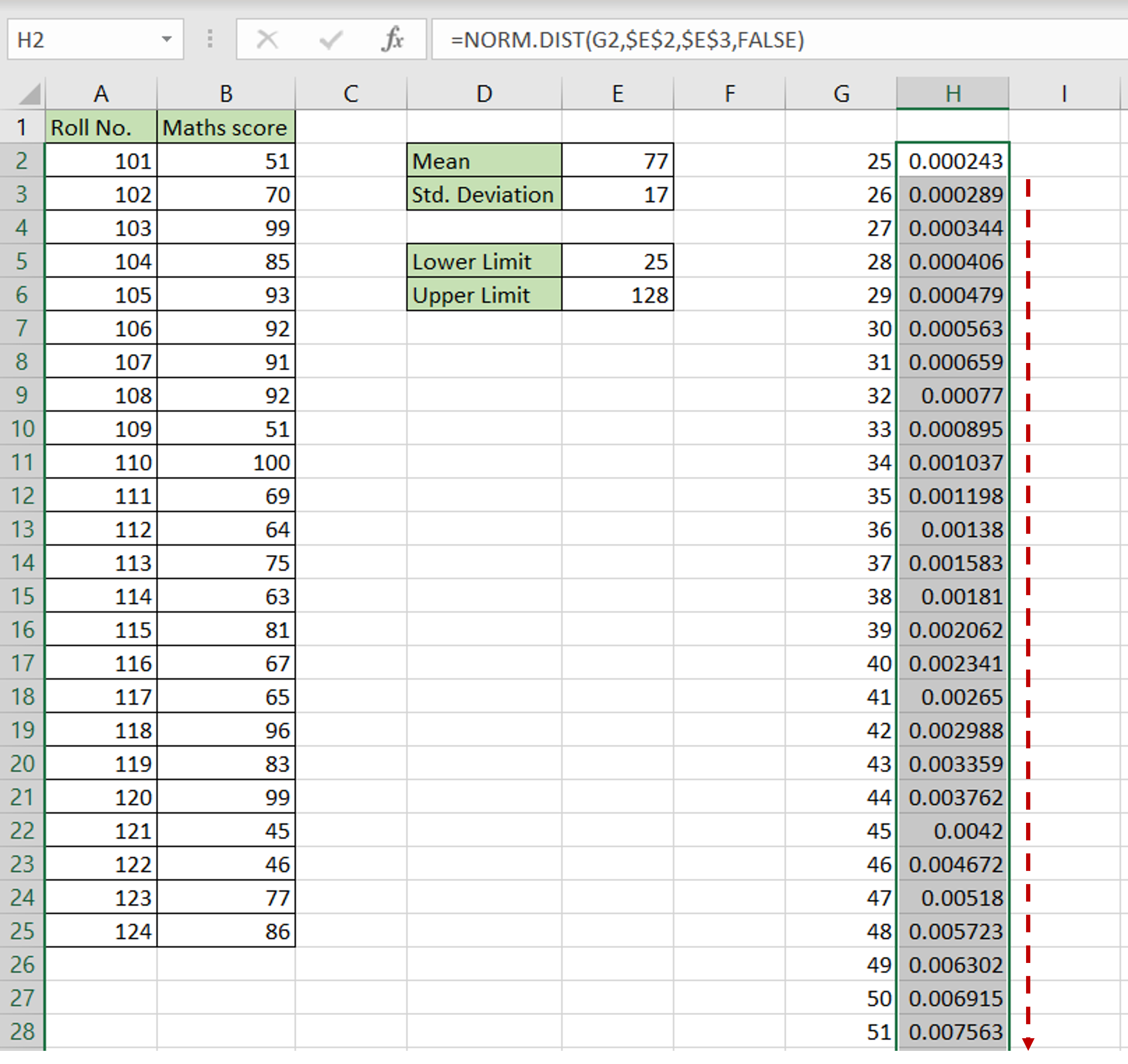
– Using the fill handle from the first cell, drag the formula to the remaining cells
OR
a) Select the cell with the formula and press Ctrl+C or choose Copy from the context menu (right-click)
b) Select the rest of the cells in the column and press Ctrl+V or choose Paste from the context menu (right-click)
Step 8 – Open the chart options
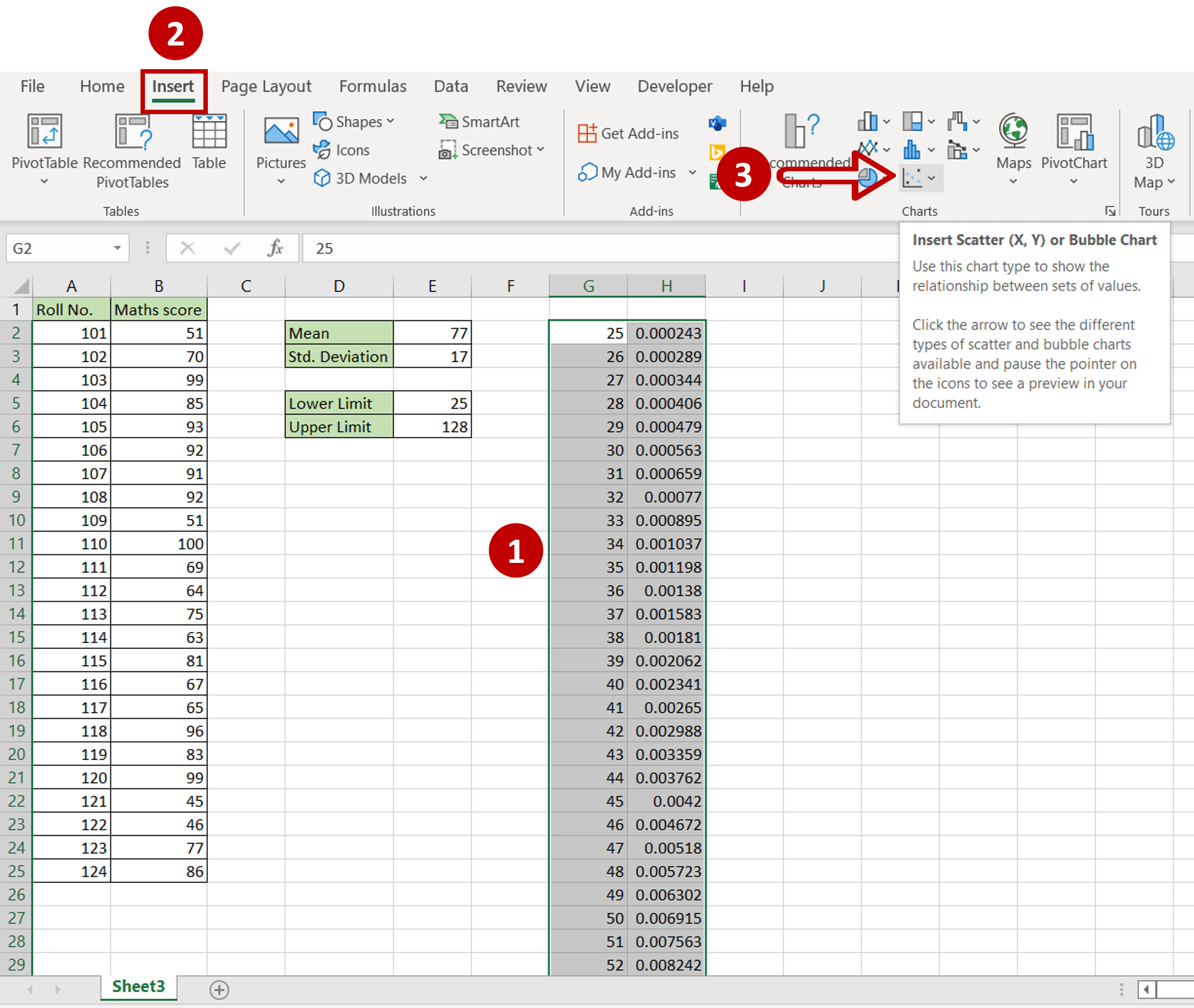
– Select the newly created data
– Go to Insert > Charts
– Expand the Insert Scatter (X,Y) or Bubble Chart dropdown
Step 9 – Choose the chart
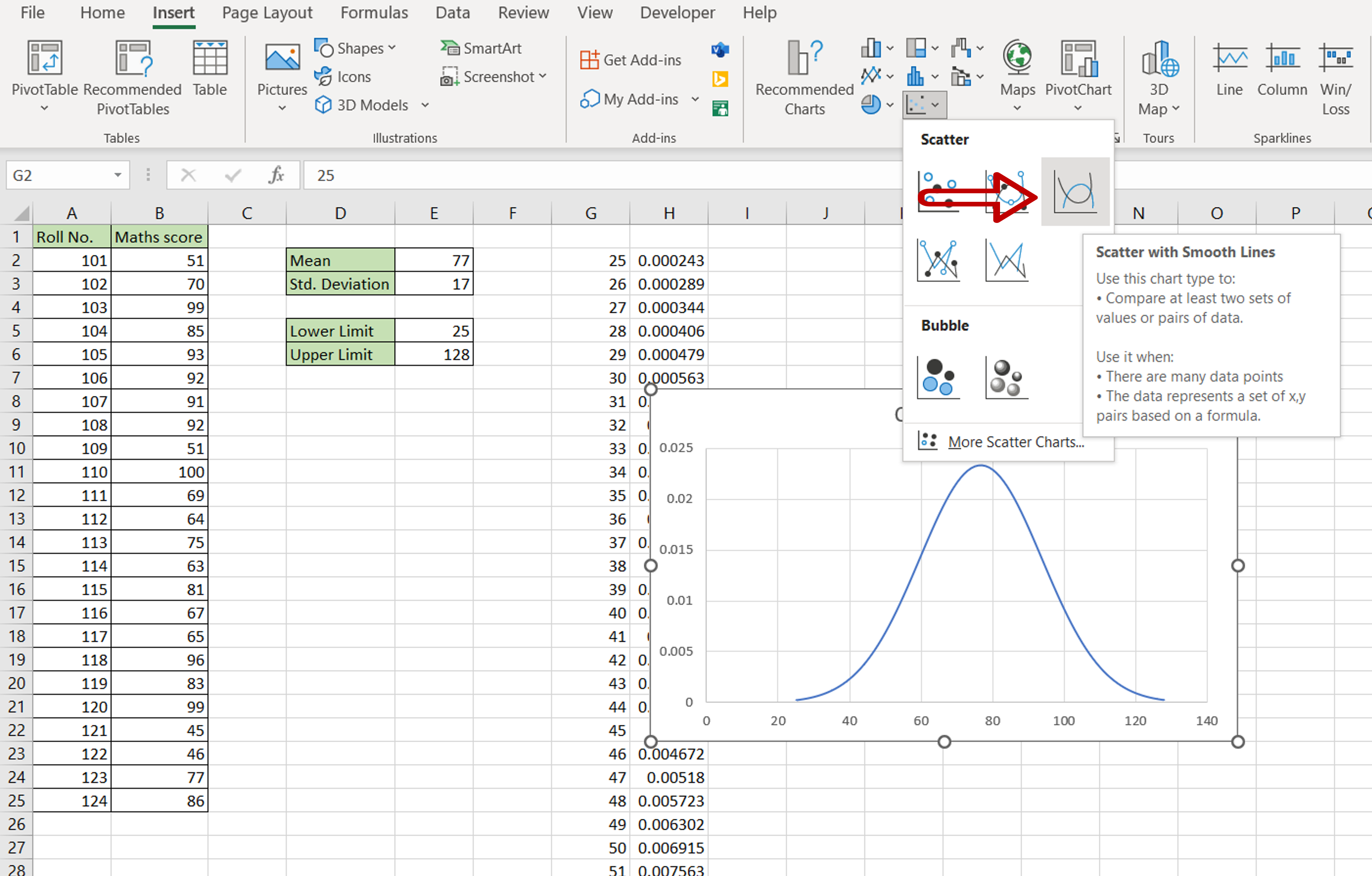
– Select Scatter with Smooth Lines
Step 10 –Format the chart
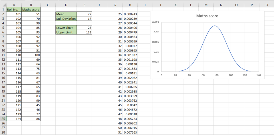
– Position the chart
– Change the title of the chart by clicking on the default title and editing it


