
How to perform trend analysis in Excel
 By
SpreadCheaters
By
SpreadCheaters
In this tutorial we will learn how to perform a simple linear trend analysis in excel. For this we will use the data from an experiment, where we are heating an object and noting the change in temperature over time. We’ll use the Excel Chart’s TrendLine option to perform the Trend Analysis. Following are the steps to guide you, how to use the TrendLine option.
Trend analysis in Excel is a technique used to analyze and identify patterns in data. This analysis helps to understand the direction and momentum of data points over a period of time. Excel provides several options for trendlines, including linear, logarithmic, exponential, polynomial, and power. Trend analysis in Excel is a powerful tool that helps to visualize and understand trends in data. It can be used to make informed decisions and identify patterns that would otherwise be difficult to detect.
Step 1 – Select the Range of cells
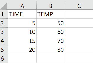
– Select the data for which you want to form Trend line
Step 2 – Click on Dialog launcher
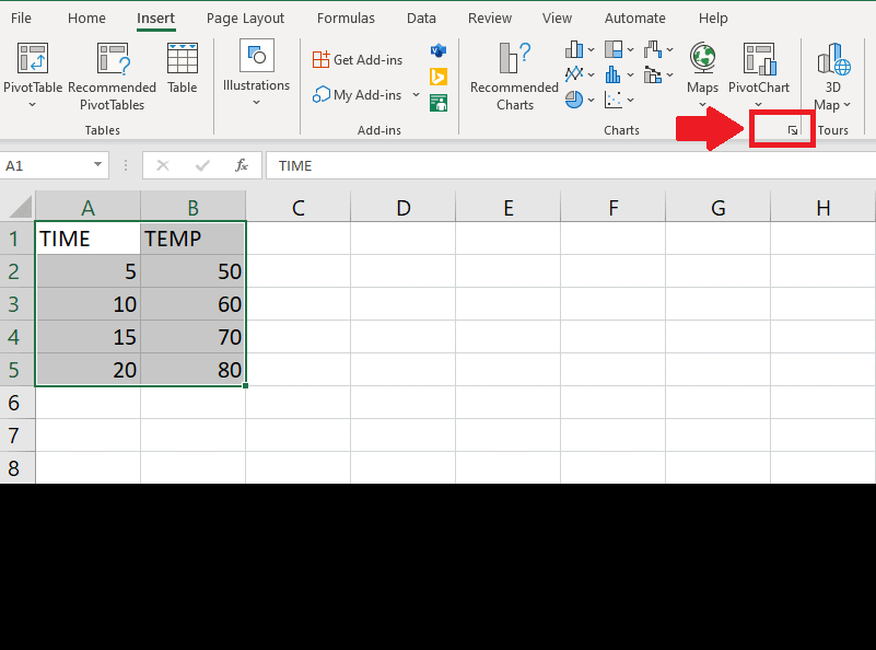
– Click on the Drag launcher of Charts from Insert tab and a dropdown menu will appear
Step 3 – Select the Chart
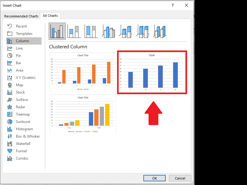
– From the drop down menu click on All Charts
– Click on Column
– After clicking column, Column charts will appear
– Select the second chart
– Click on OK to get the graph on sheet
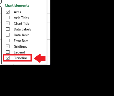
Step 4 – Click on Chart Elements option
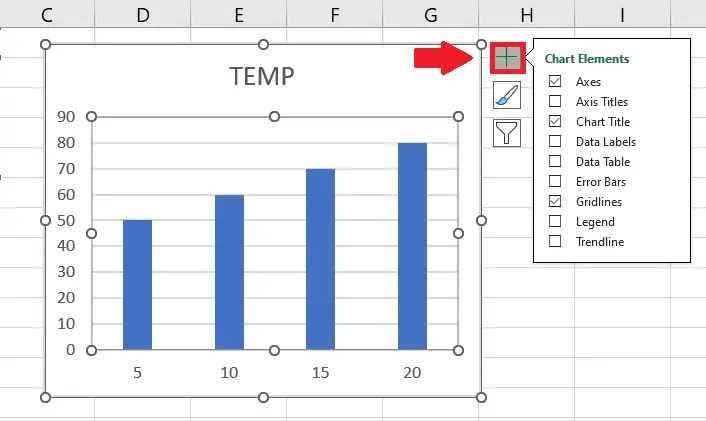
– Click on Chart Elements option at the top right of the graph and a dropdown menu will appear
Step 5 – Click on Trendline

– From the dropdown menu click on the Trendline option to get the required results. This trend line shows that the temperature is on the rise with the passage of time. This same technique can be used to perform complex trend analysis as well by choosing other trendline options e.g. Exponential, Logarithmic and Moving Point Average


