
How to overlay two graphs in Microsoft Excel
 By
SpreadCheaters
By
SpreadCheaters
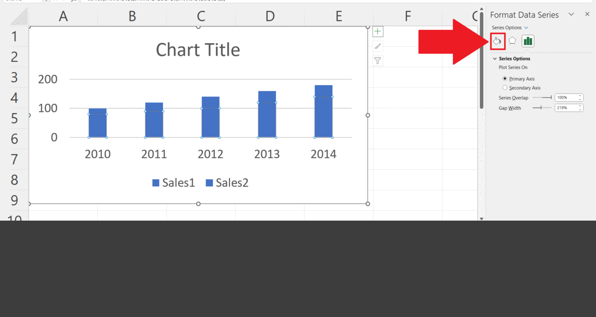
In this tutorial, we will learn how to overlay two graphs in Microsoft Excel. In Microsoft Excel, we can overlay two graphs by using the Series Overlap feature in the Format Data Series. Excel also enables users to customize the colour combinations of overlaid graphs two enhance visual appearance and effectiveness. Currently, we have a graph representing two sales figures in different years i.e. Sales1 and Sales2. We will overlay both graphs using Series Overlap.

Overlaying two graphs refers to the process of plotting two or more sets of data on the same graph, with the same x- and y-axis scales. This technique is often used in data visualization to compare and contrast different sets of data on the same chart.
Step 1 – Select the Series to be Overlaid
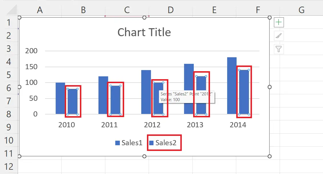
– Select one of the series which is to be overlaid on the other.
Step 2 – Right Click on the Series
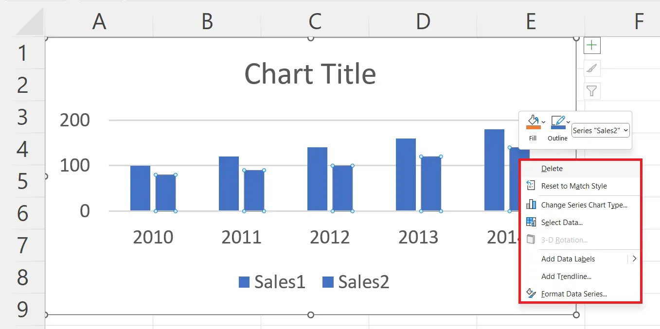
– Right click on the series.
– A context menu will appear.
Step 3 – Click on the “Format Data Series”
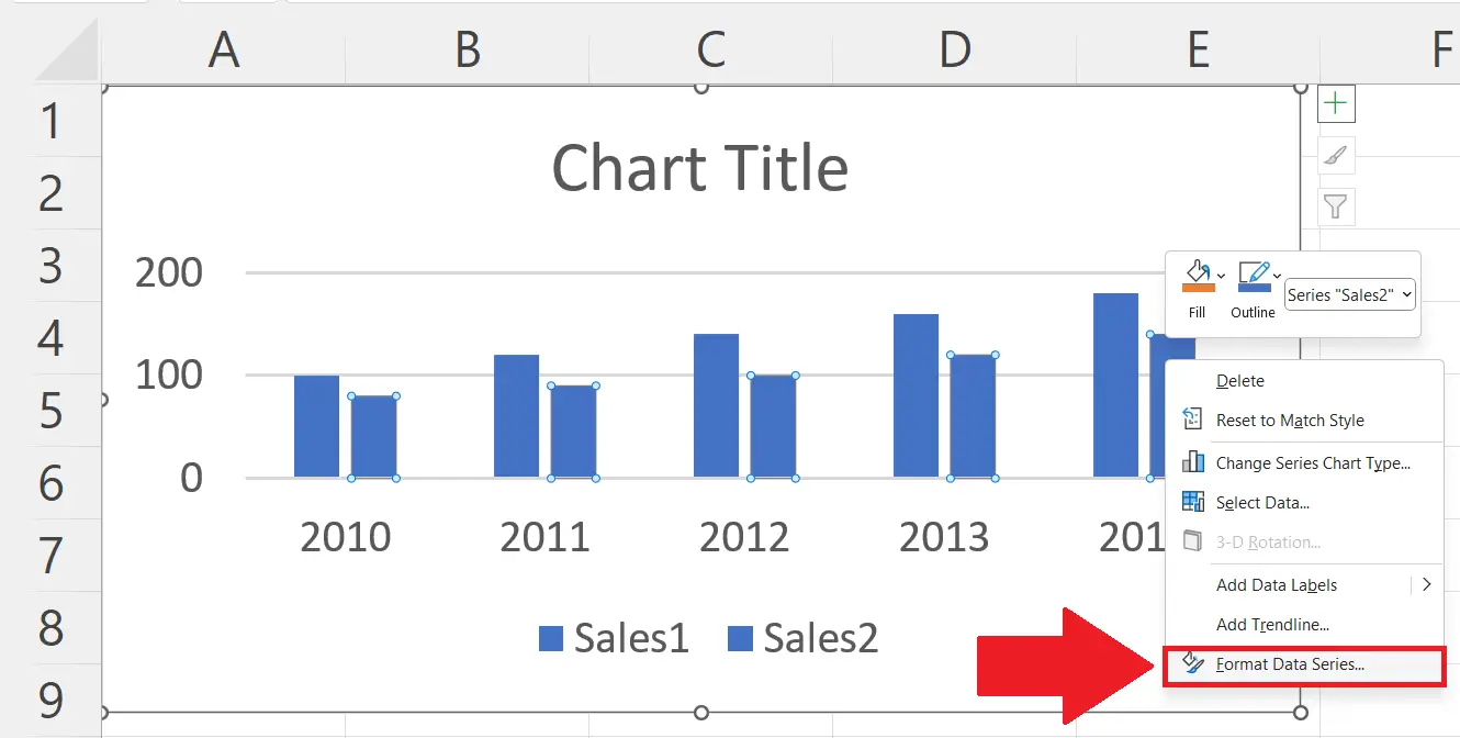
– Click on the “Format Data Series” option in the context menu.
– Format Data Series window will appear on the left.
Step 4 – Increase the Series Overlap value
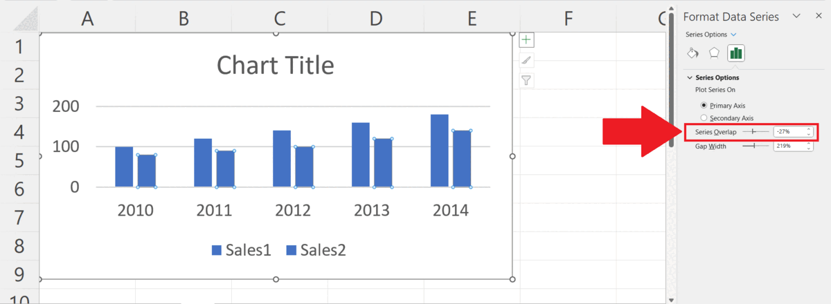
– Increase the Series Overlap value to 100%.
– Both series will be overlaid.
Step 5 – Change the Color of the Series
– Change the colour of the Series to differentiate it from the other series.
– Click on the Fill & Line icon.
– Change the series color in the Color option.


