
How to merge graphs in Excel
 By
SpreadCheaters
By
SpreadCheaters
Page last updated:
13/01/2023 |
Next review date:
13/01/2025
You can watch a video tutorial here.
Graphs are great ways to visualize data and Excel has several tools for creating and formatting charts. The type of chart that you create depends on the dataset that you have. Using the charting tools in Excel, you can explore various types of charts and decide on the one that best suits the data that you are visualizing. When you have graphs that are related to the same set of data you can merge them into a single graph to make the presentation of the information effective.
Option 1 – Copy and paste the charts
Step 1 – Copy one chart
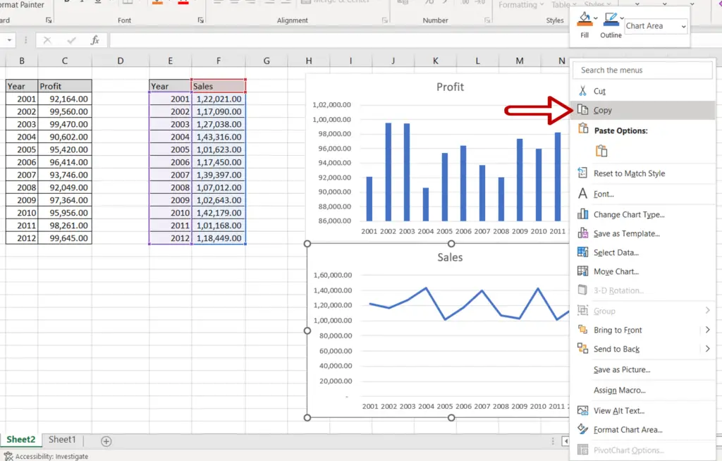
- Select one chart
- Press Ctrl+C or right-click and select Copy from the context menu
Step 2 – Paste the chart
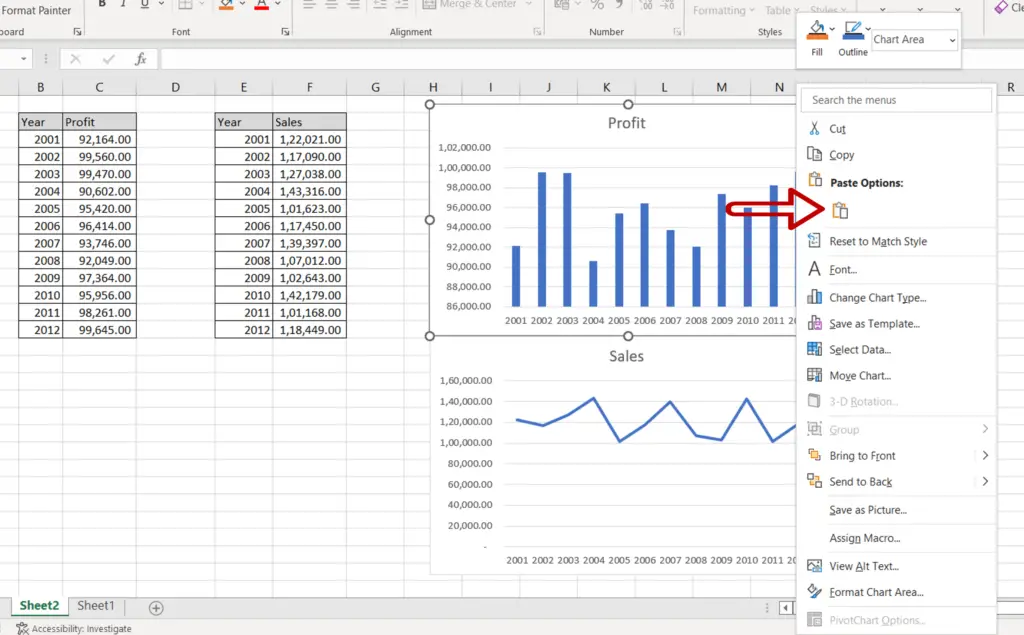
- Select the second chart
- Press Ctrl+V or right-click and select Paste from the context menu
Step 3 – Check the result
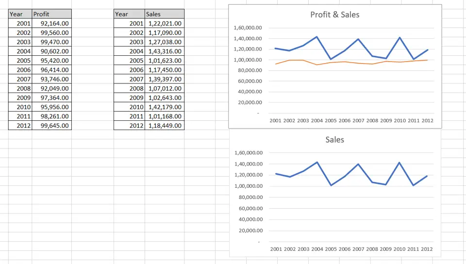
- The charts are merged
Step 4 – Design and Format the chart
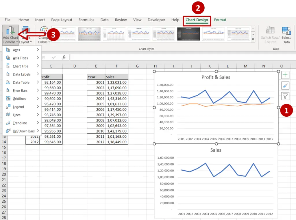
- Select the chart to summon the Chart Design and Format menus
- Add more elements to the chart such as the chart title, axis titles, and legend using the Chart Design menu
- Format the chart with the options on the Format menu
Option 2 – Create a combo chart
Step 1 – Open the Insert Chart box
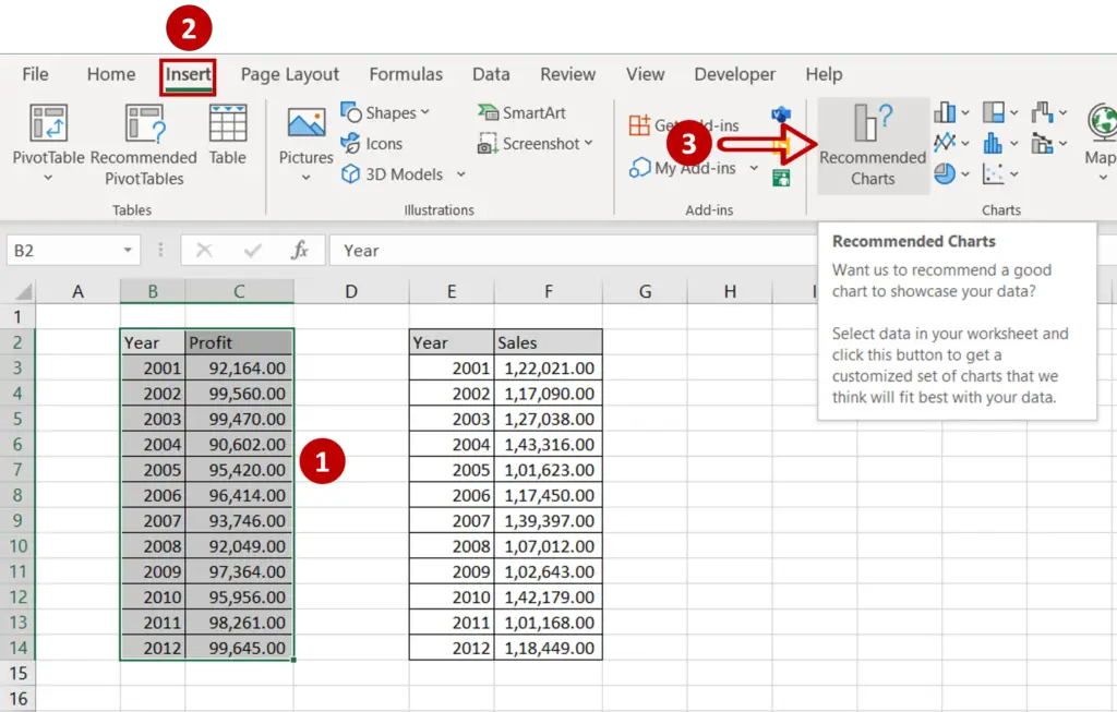
- Select the first set of data
- Go to Insert > Charts
- Click the Recommended Charts option
Step 2 – Choose the chart
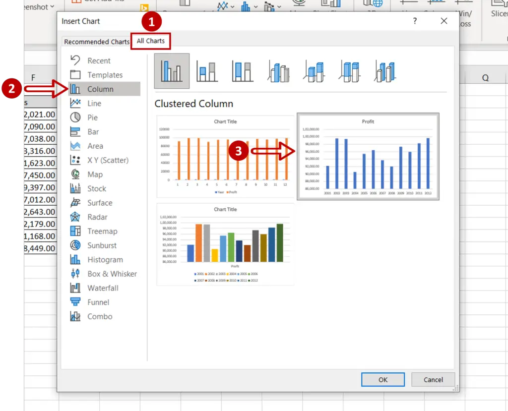
- Go to All Charts > Column
- Select the second chart
- Click OK
Step 3 – Open the Select Data Source box
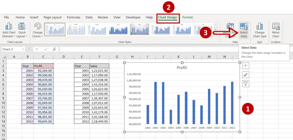
- Select the chart
- Go to Chart Design > Data
- Click on the Select Data option
Step 4 – Open the Edit Series box
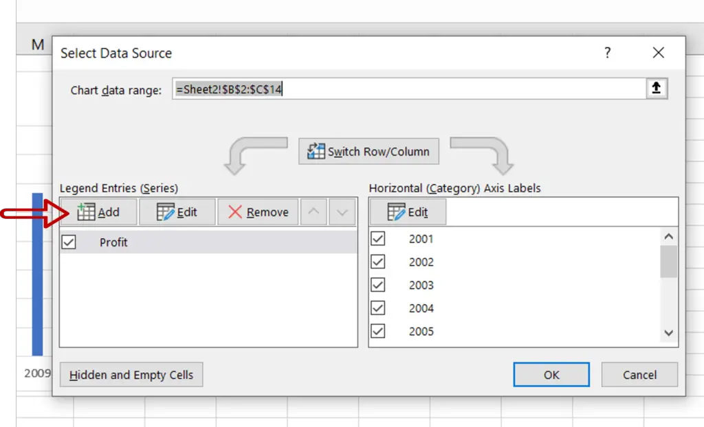
- Click the Add button
Step 5 – Add the second set of data
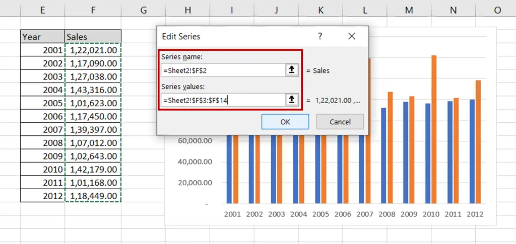
- For Series name, select the ‘Sales’ cell
- For Series values, select the range of the ‘Sales’ column
- Click OK
- Click OK in the Select Data Source box
Step 6 – Open the Change Chart Type box
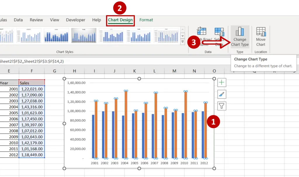
- Select the columns added for the ‘Sales’ data
- Go to Chart Design > Type
- Click on Change Chart Type
Step 7 – Choose the chart type
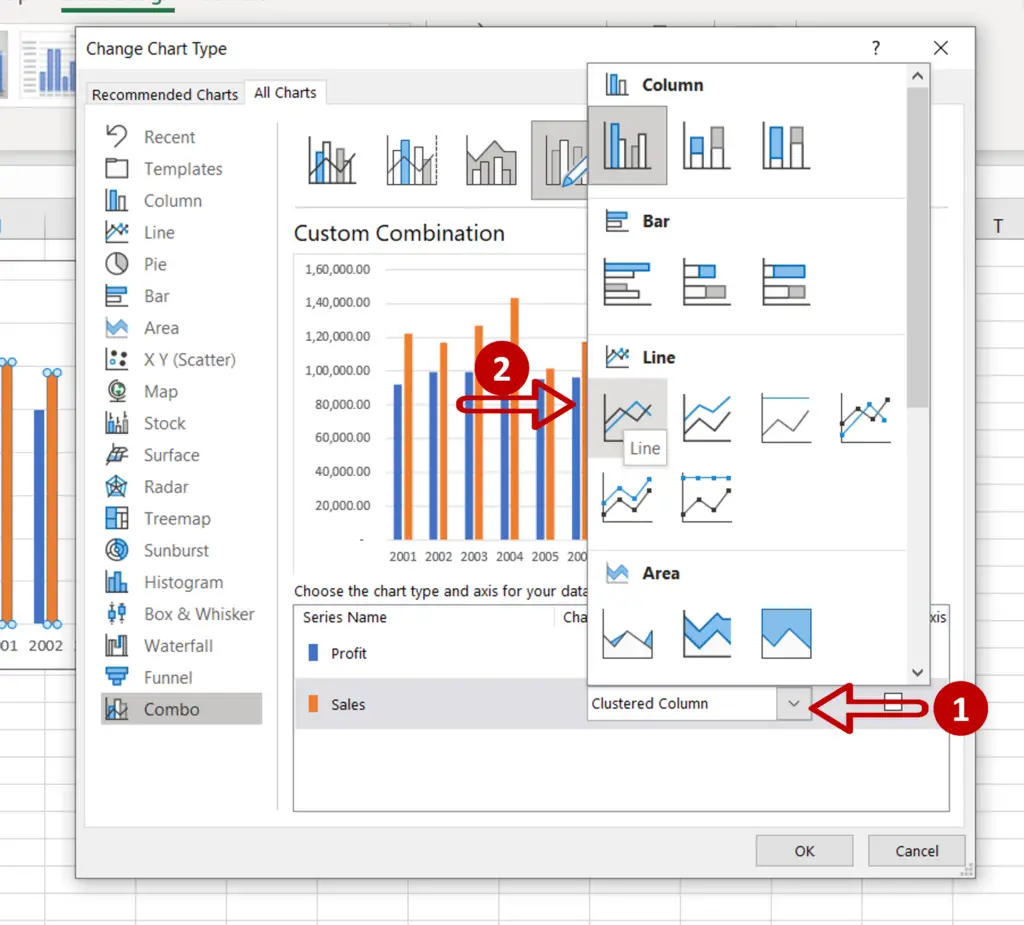
- Expand the menu for the chart type under the ‘Sales’ option
- Choose Line
- Click OK
Step 8 – Design and Format the chart
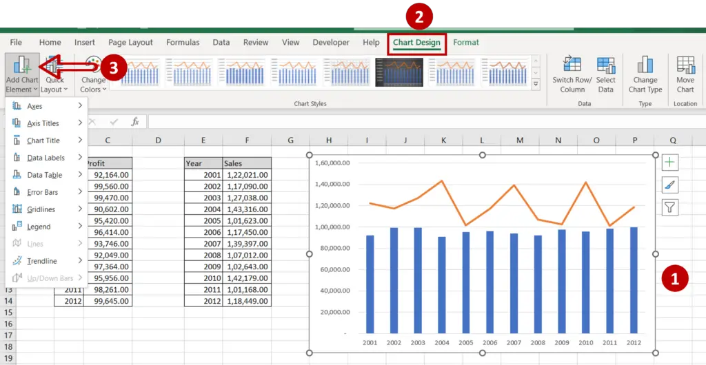
- Select the chart to summon the Chart Design and Format menus
- Add more elements to the chart such as the chart title, axis titles, and legend using the Chart Design menu
- Format the chart with the options on the Format menu


