How to make a Venn diagram in Excel
You can watch a video tutorial here.
A Venn diagram consists of overlapping circles that show the relationship between individual items or groups of items. Each circle represents an item and the intersection represents features that are common between the overlapping circles. Venn diagrams are useful tools when presenting a summary of information to an audience. You can use a Venn diagram to depict numbers or characteristics that are unique to each group and those that are different.

To create a Venn diagram in Excel, you can use an illustration from the SmartArt Suite. Using the graphic you can create circles and add text to the main circle. The text for the intersections is not part of the graphic and has to be added separately.
Step 1 – Open the Choose a SmartArt graphic dialog box
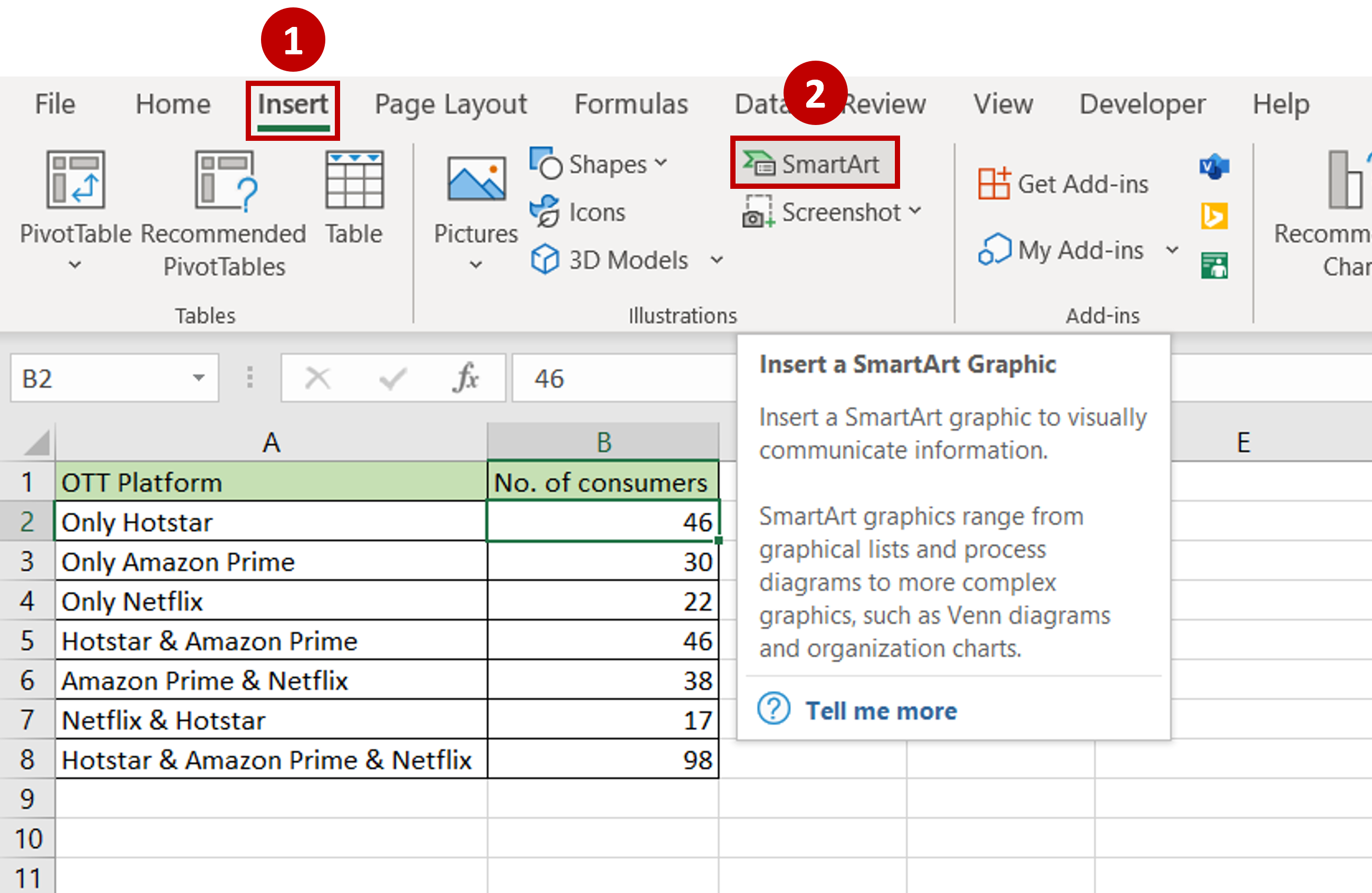
– Go to Insert > Illustrations
– Click the SmartArt button
Step 2 – Select the Venn diagram graphic
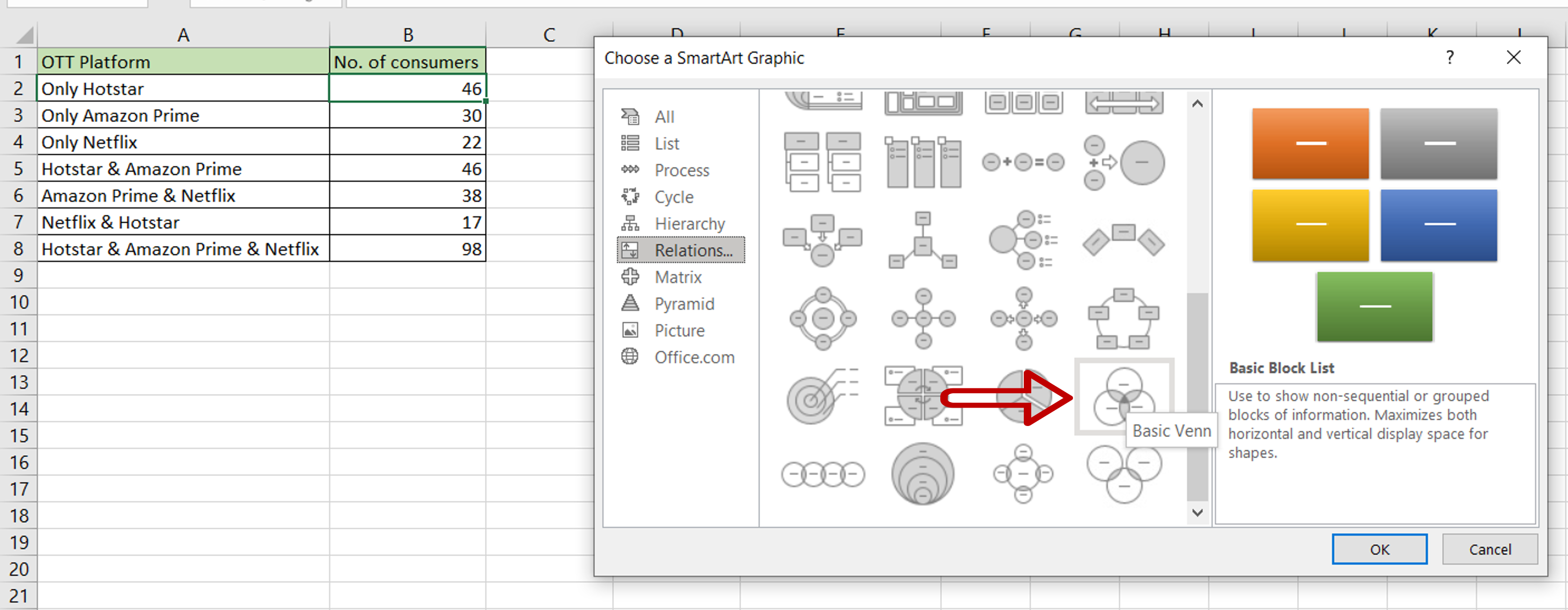
– Go to Relationship
– Choose Basic Venn
– Click OK
Step 3 – Open the text pane
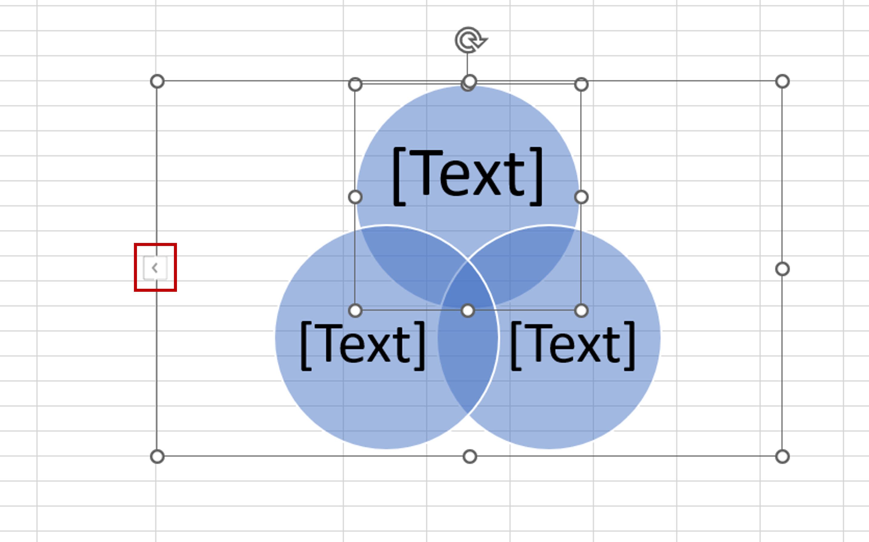
– In the chart that is inserted into the worksheet, click on the arrow on the left border
Step 4 – Add the names of the platforms
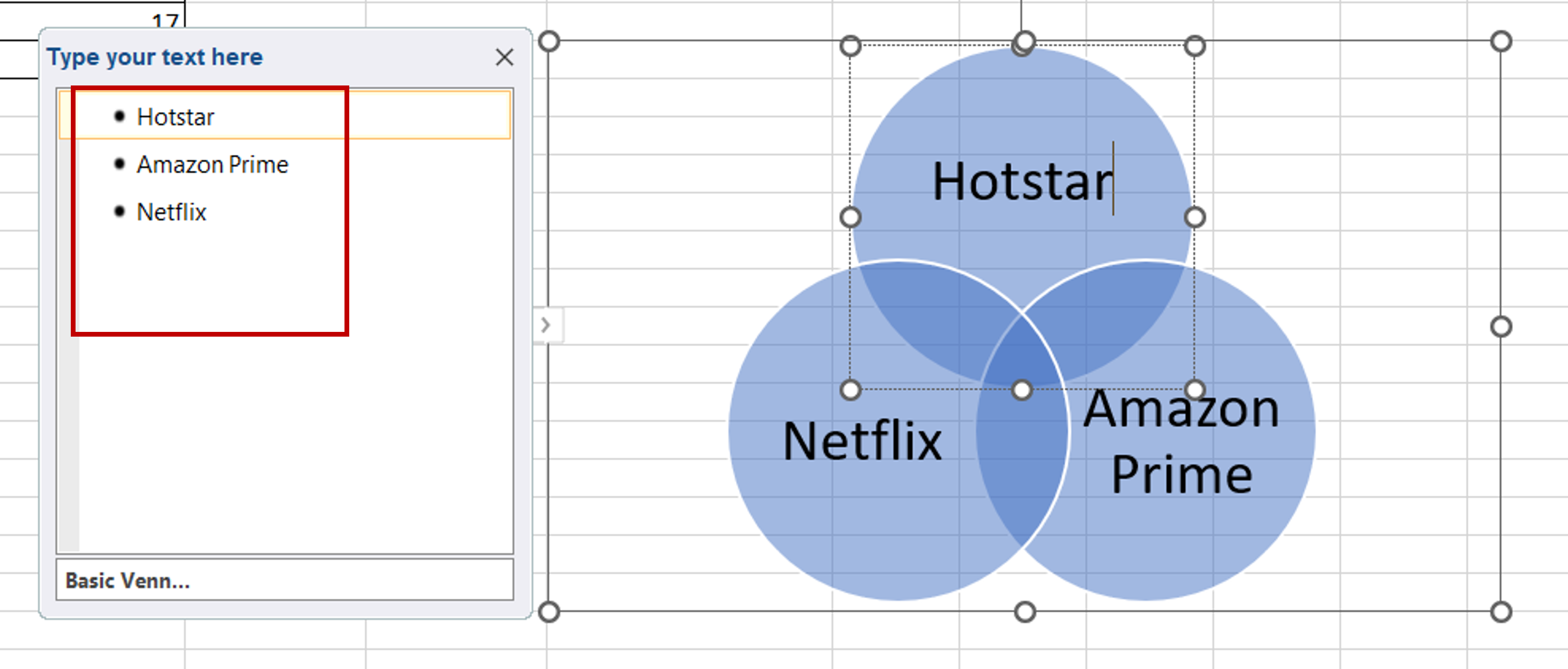
– In the text pane, add the names of the platforms
Step 5 – Add the numbers
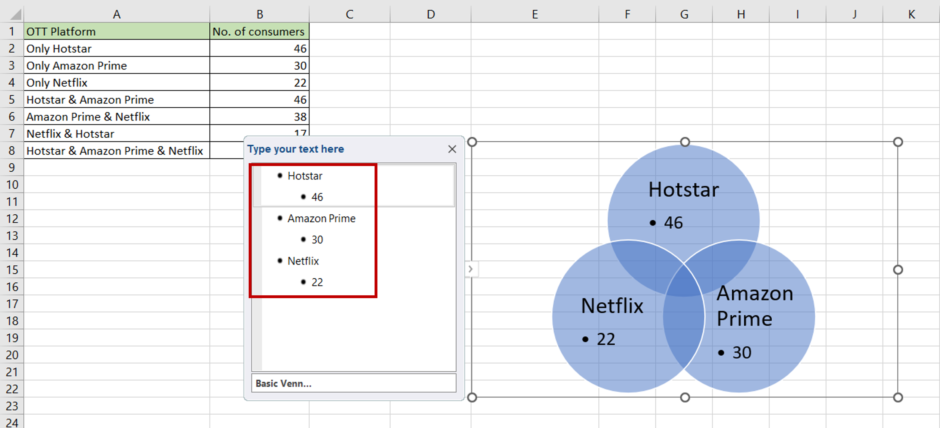
– Under the name of each platform, press TAB to indent to the next level
– Add the numbers of those who watch only that platform
Step 6 – Insert a text box
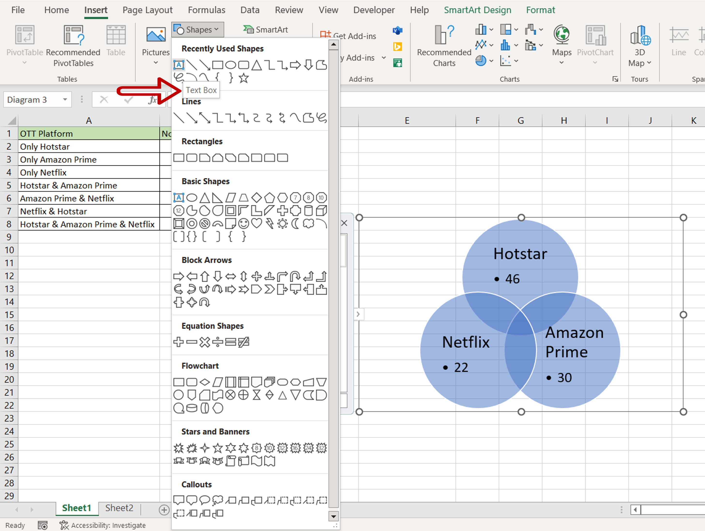
– Go to Insert > Illustrations
– Expand the Shapes drop-down
– Click on Text Box
Step 7 – Enter the number
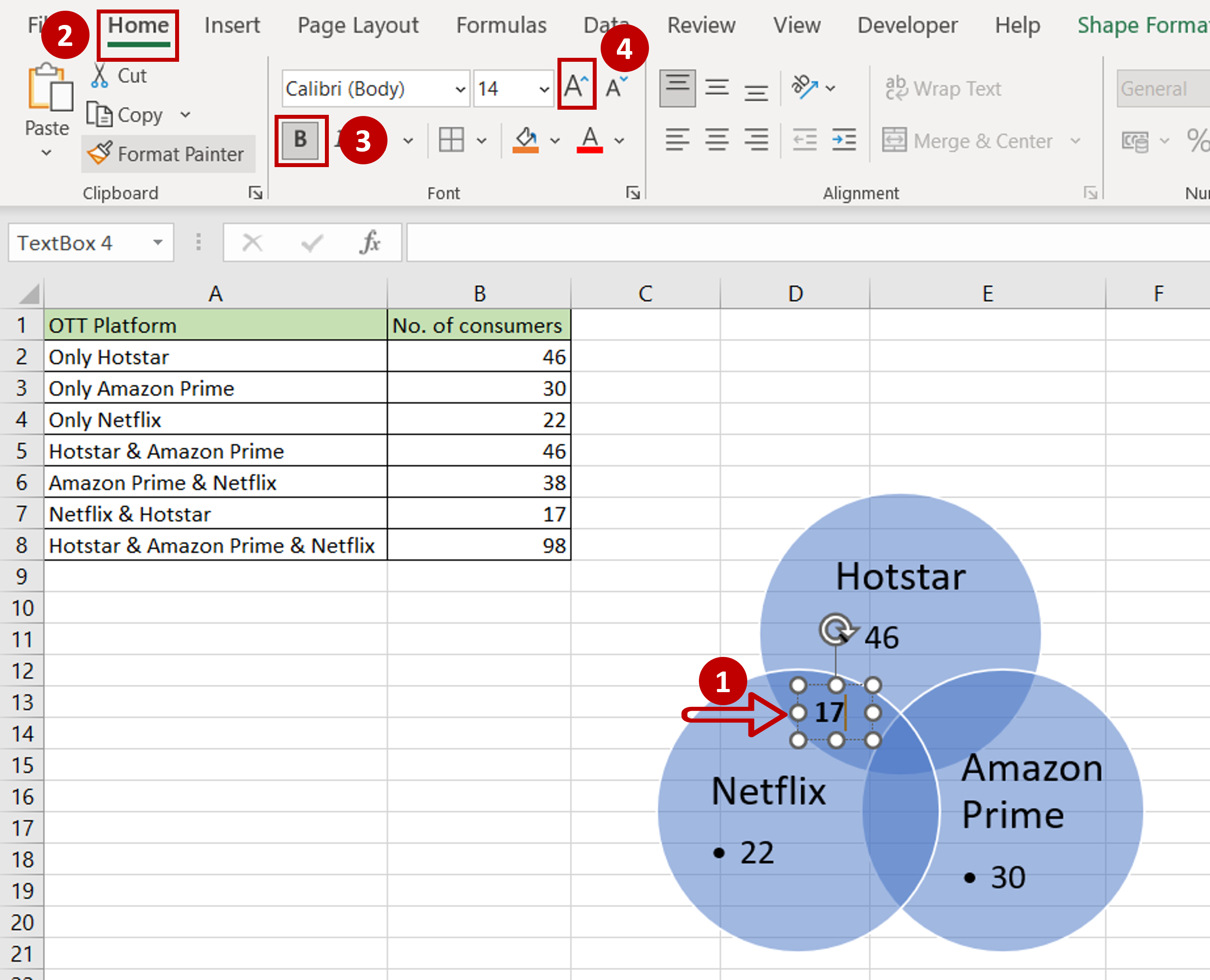
– Using the drawing tool, draw a text box at the intersection of ‘Hotstar’ and ‘Netflix’
– Enter the number of people who watch ‘Netflix & Hotstar’
– Use the options on the Home ribbon to format the number to make it bigger and bold
Step 8 – Copy and paste the text box
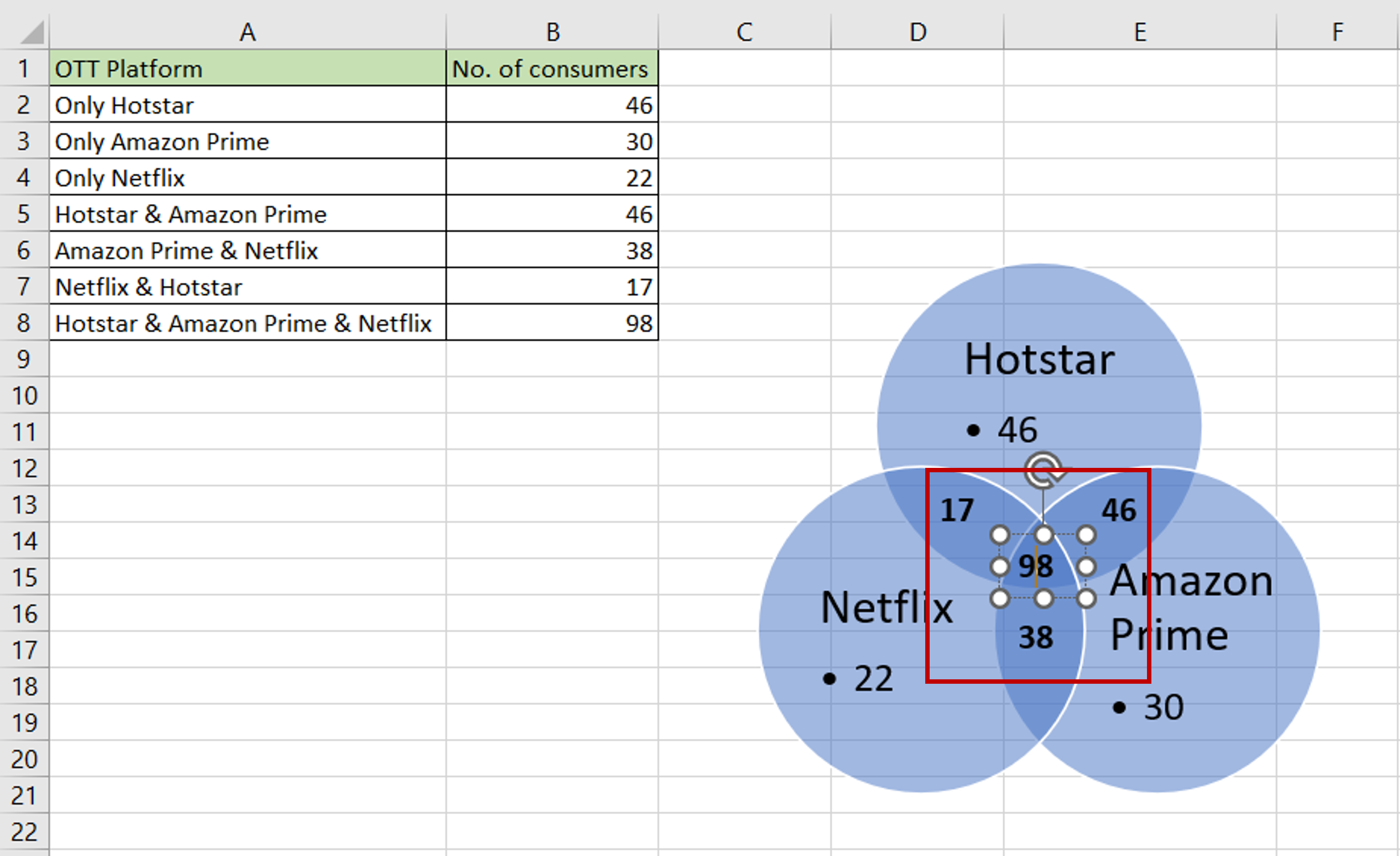
– Select the text box and press Ctrl+C
– Press Ctrl+V
– Move the text box to the next intersection
– Type the appropriate number
– Repeat the steps above until numbers have been added to all intersections
Step 9 – Check the result
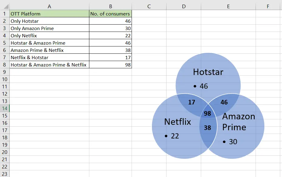
– The Venn diagram is created with all the numbers in place

