
How to make a time series graph in Excel
 By
SpreadCheaters
By
SpreadCheaters
You can watch a video tutorial here.
Graphs are great ways to visualize data and Excel has several tools for creating and formatting charts. The type of chart that you create depends on the dataset that you have. Using the charting tools in Excel, you can explore various types of charts and decide on the one that best suits the data that you are visualizing.
When you have time series data i.e. data collected across date or date and time, there are quite a few options for chart types. Bar, Column, and Line charts can be effectively used to display time series data. When there are many observations in the dataset, then usually line charts are a good choice. In this example, we will look at using a recommendation from Excel and also make a graph.
Option 1 – Use a recommended chart
Step 1 – Open the Insert Chart box
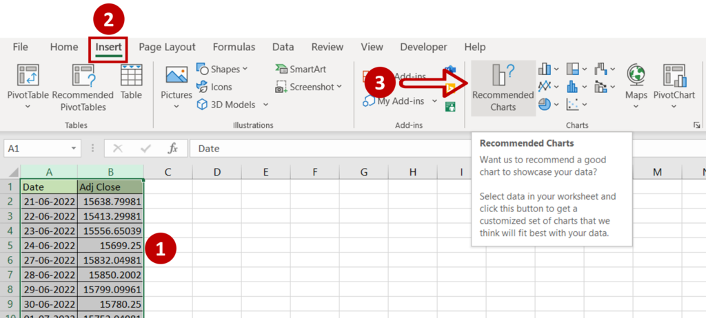
- Select the data on which the graph is to be prepared
- Go to Insert > Charts
- Click the Recommended Charts option
Step 2 – Choose the chart
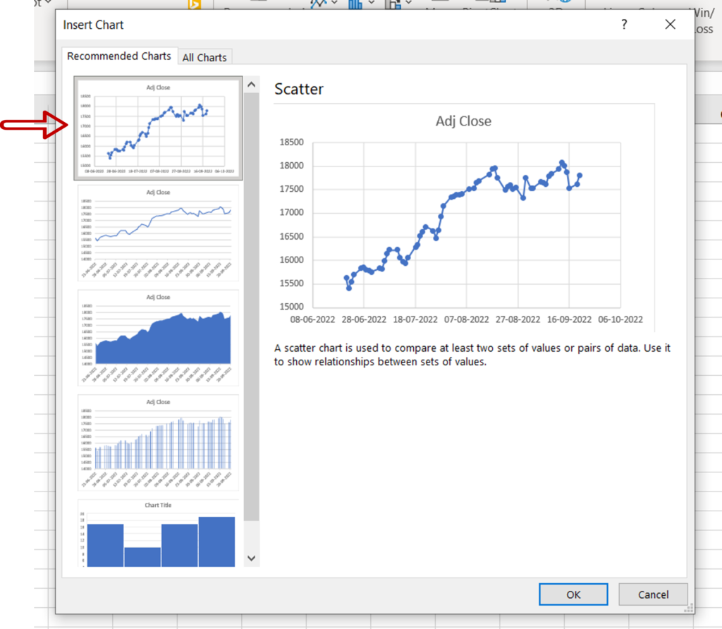
- Select the recommended Scatter plot
- Click OK
Step 3 – Design and format the chart
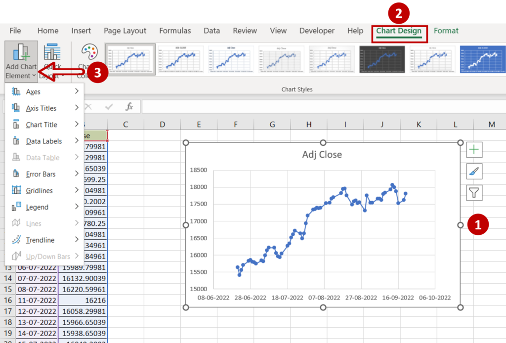
- Select the chart to summon the Chart Design and Format menus
- Add more elements to the chart such as the axis titles using the Chart Design menu
- Format the chart with the options on the Format menu
Step 4 – Check the result
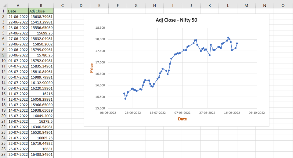
- The time series graph is created as a scatter plot with straight lines and markers
Option 2 – Make a graph
Step 1 – Open the Insert Chart box
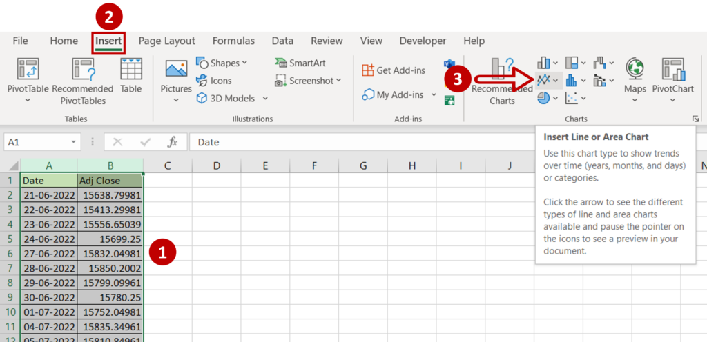
- Select the data on which the graph is to be prepared
- Go to Insert > Charts
- Expand the Insert Line or Area Chart menu
Step 2 – Choose the chart
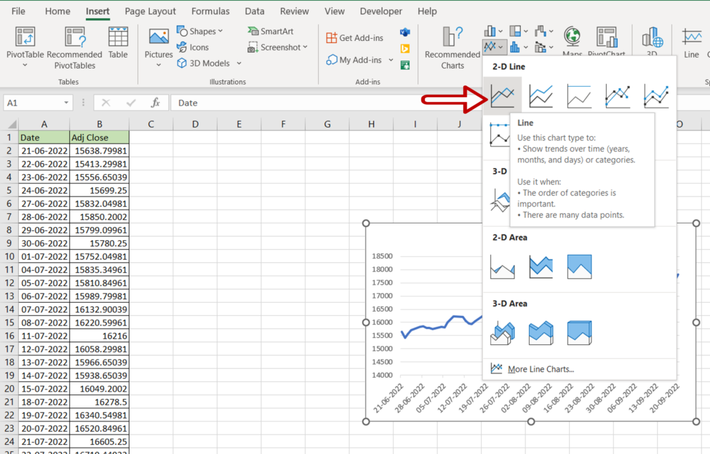
- Choose Line
Step 3 – Design and Format the chart
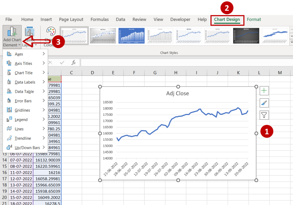
- Change the title of the chart by clicking on the default title and editing it
- Select the chart to summon the Chart Design and Format menus
- Add more elements to the chart such as the axis titles using the Chart Design menu
- Format the chart with the options on the Format menu
Step 4 – Check the result
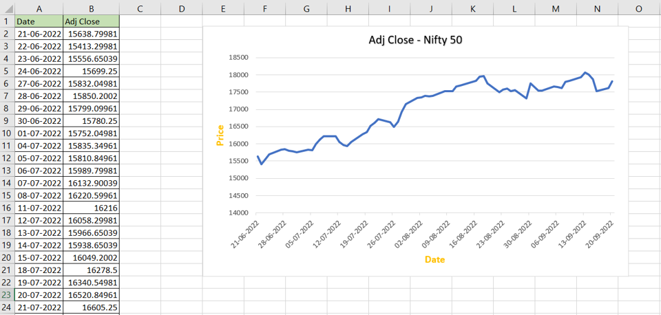
- The time series graph is created


