
How to make a semi-log plot in Excel
 By
SpreadCheaters
By
SpreadCheaters
You can watch a video tutorial here.
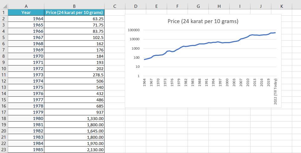
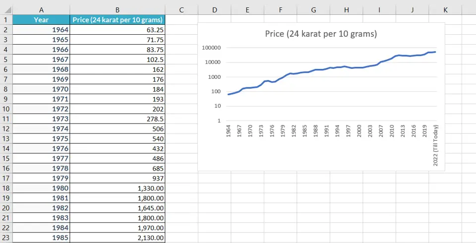
Graphs are great ways to visualize data and Excel has several tools for creating and formatting charts. The type of chart that you create depends on the dataset that you have. Using the charting tools in Excel, you can explore various types of charts and decide on the one that best suits the data that you are visualizing. For a semi-log plot in which the x-axis is linear and the y-axis is on a logarithmic scale, the line graph is best suited. In Excel, it is easy to convert a line graph into a semi-log plot.
Step 1 – Open the Insert Chart box
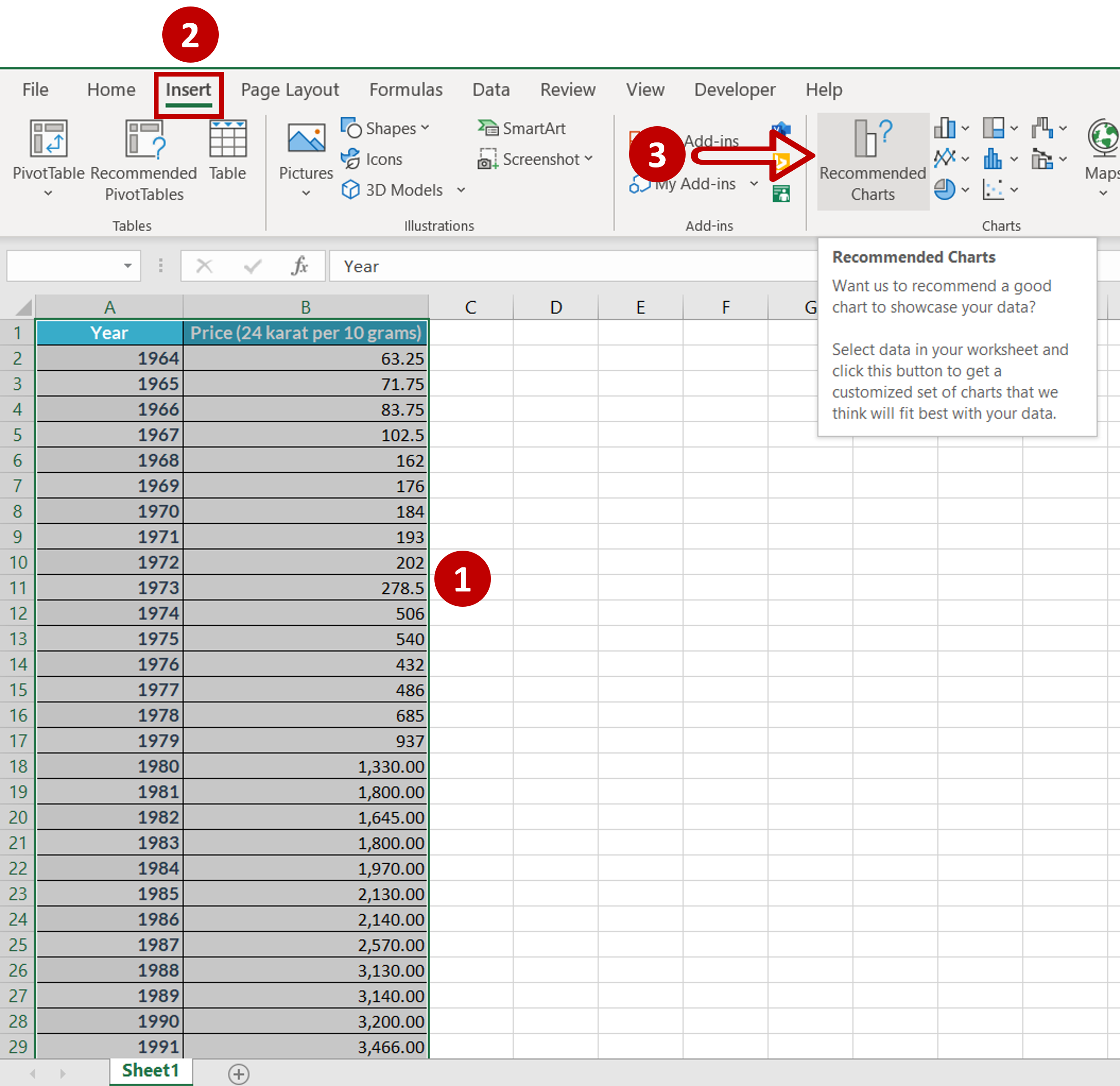
– Select the data
– Go to Insert > Charts
– Click the Recommended Charts option
Step 2 – Choose the chart
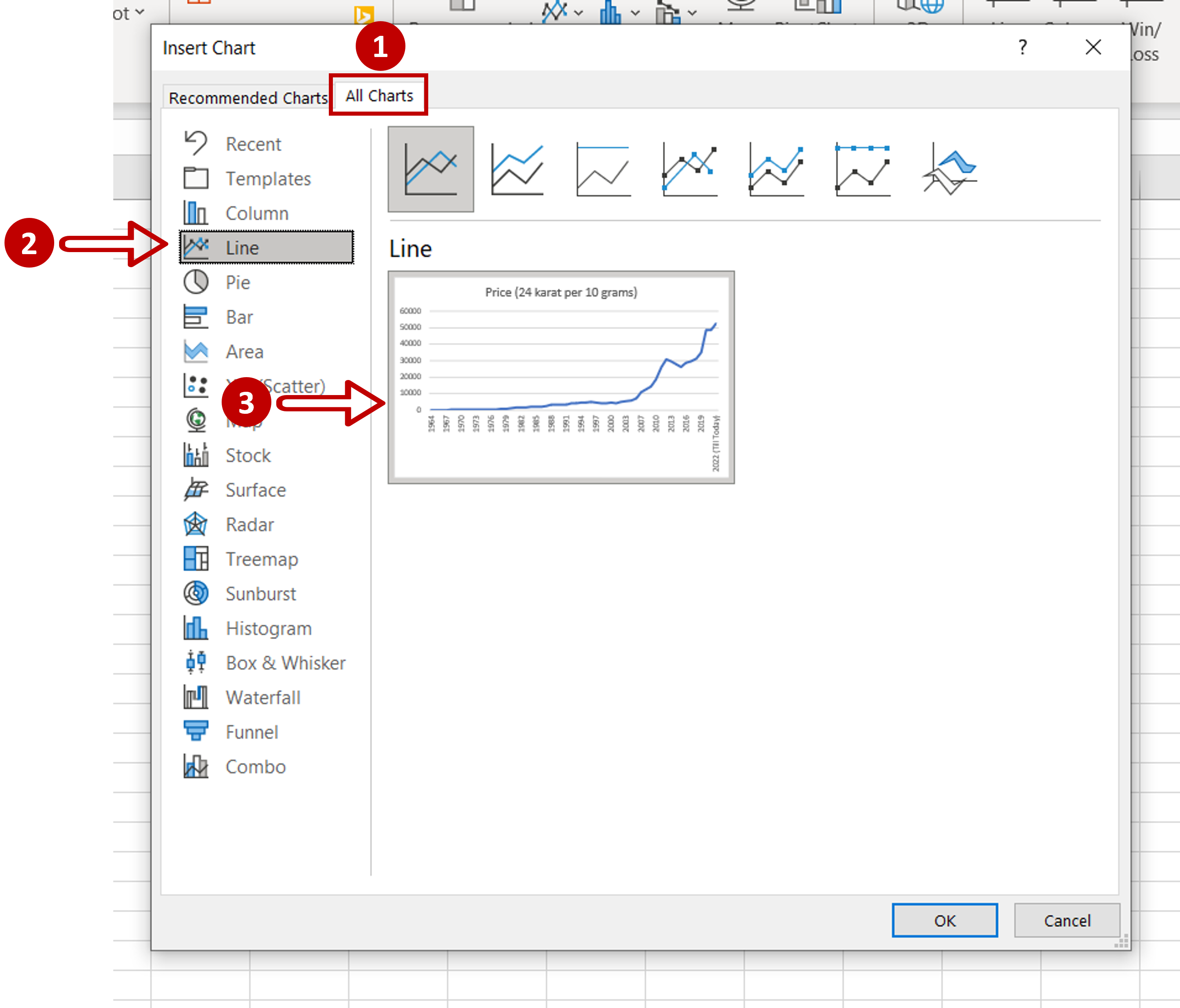
– Go to All Charts > Line
– Select the suggested chart
– Click OK
Step 3 – Open the Format Axis pane
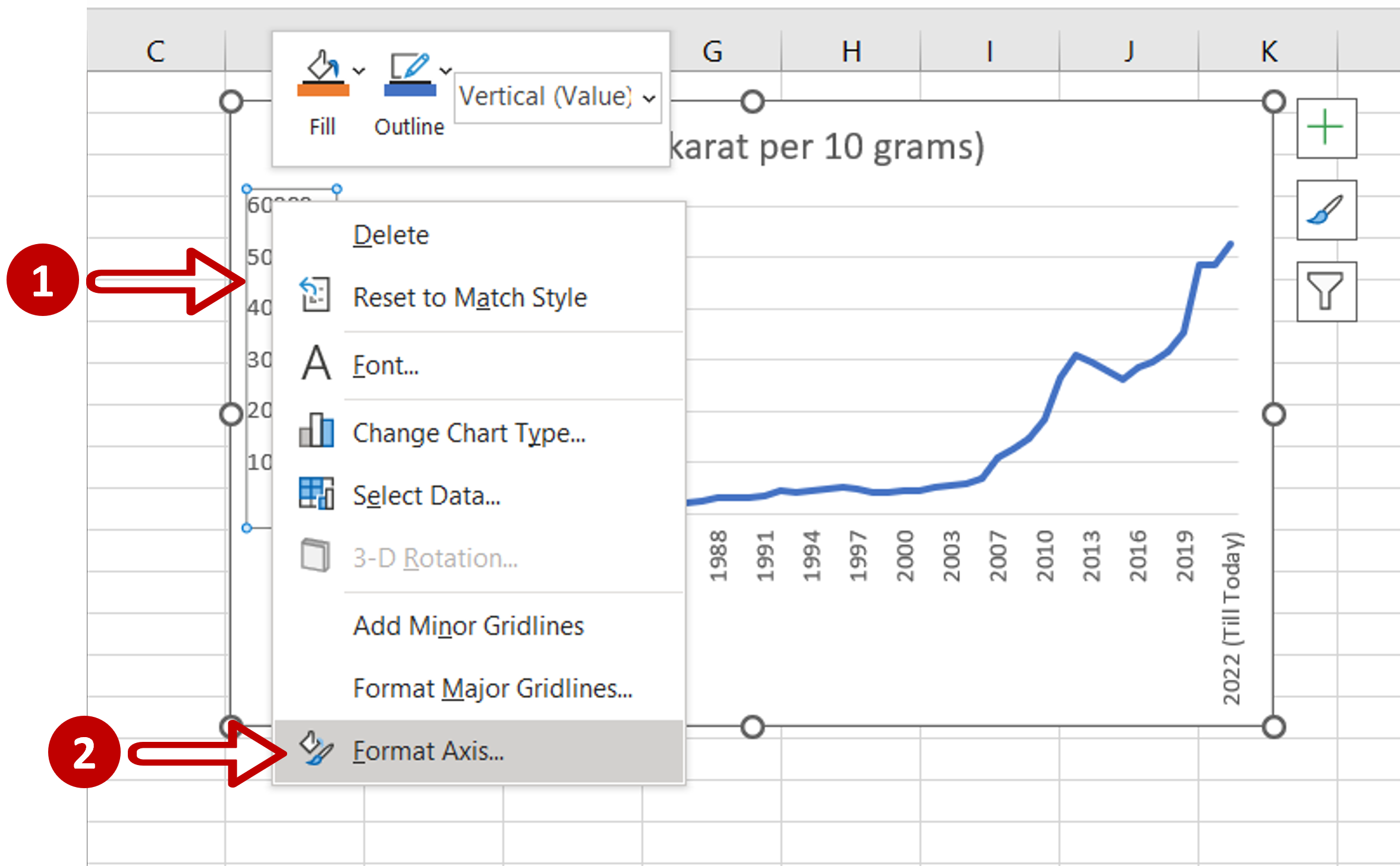
– Select Y-axis
– Right-click and select Format Axis from the context menu
Step 4 – Change the scale
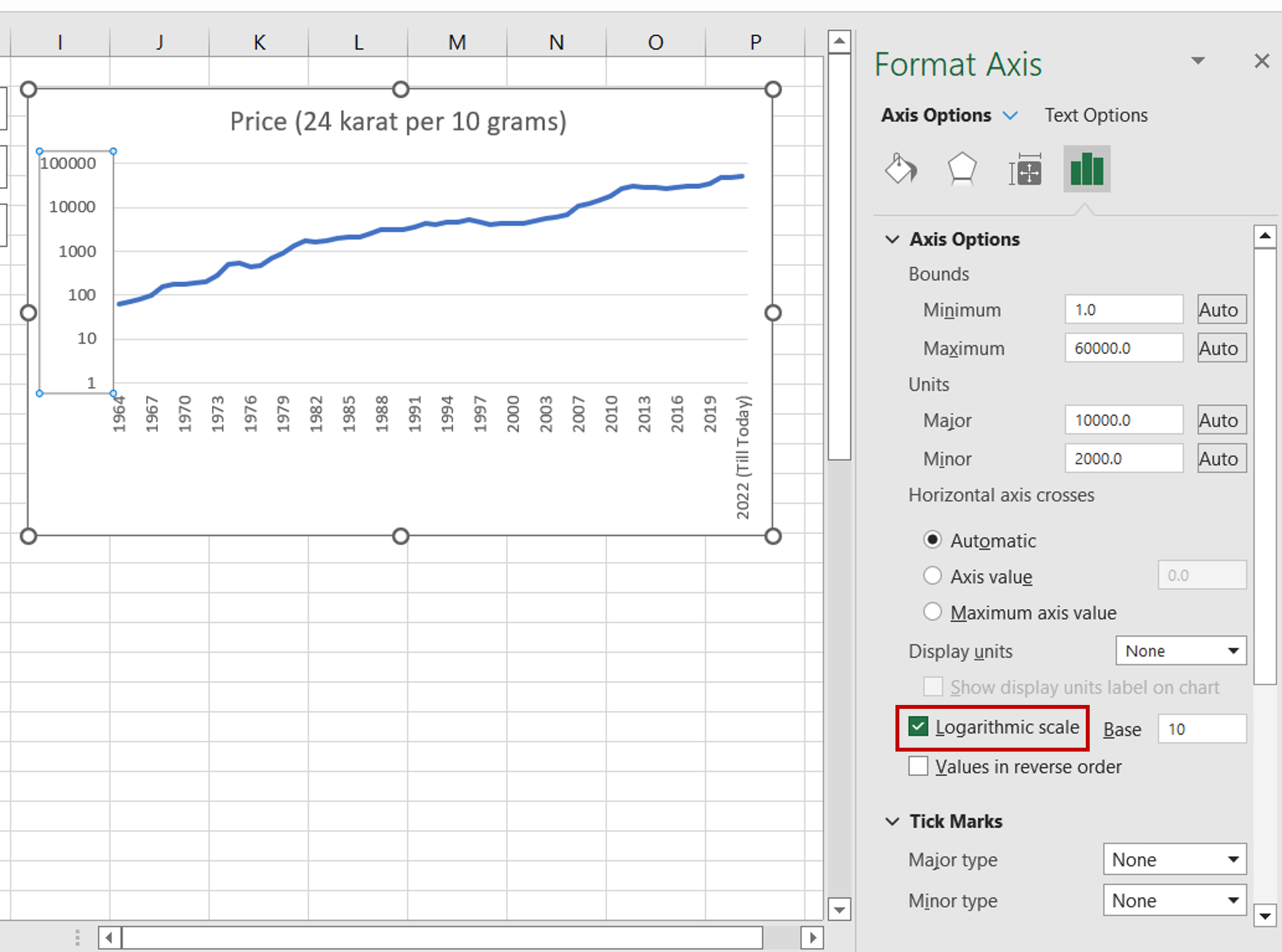
– Navigate to Axis Options
– Tick the Logarithmic scale box
Step 5 – Check the result
– The Y-axis is converted to a logarithmic scale
– The line changes accordingly


