
How to make a pie chart in Microsoft Excel with words
 By
SpreadCheaters
By
SpreadCheaters
Page last updated:
10/06/2023 |
Next review date:
10/06/2025
Making a pie chart in Excel with words typically refers to creating a visual representation of data in which each category is represented as a slice of a circle (the pie), and the size of each slice corresponds to the proportion of that category in the whole dataset.
In this tutorial, we will learn how to make a pie chart in Microsoft Excel with words. One way to create a pie chart in Excel with words is by utilizing the “Insert” tab to generate the chart, and subsequently incorporating labels in the form of words to each slice of the chart.
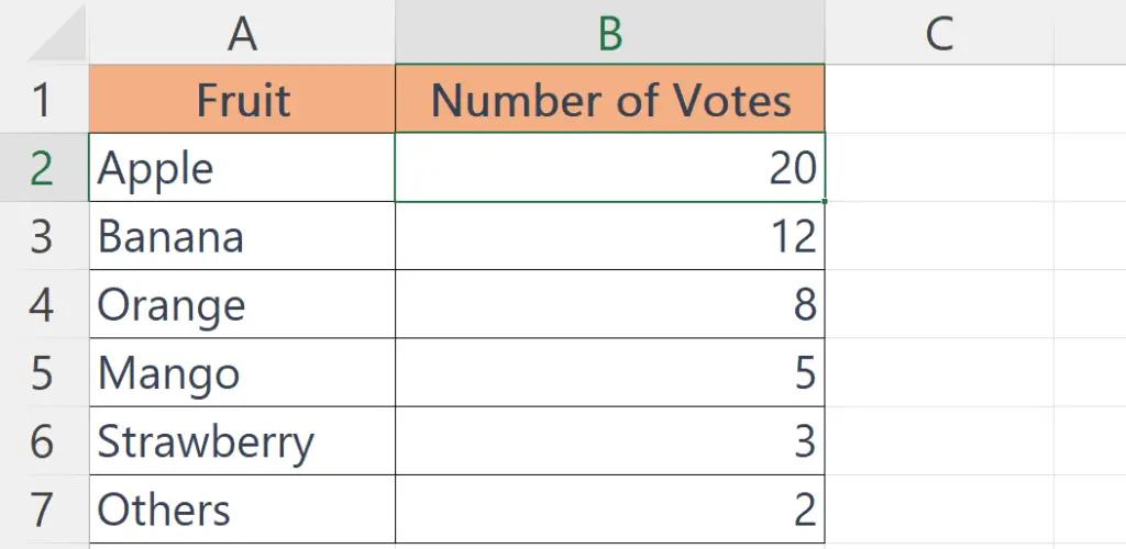
Suppose you are conducting a survey on people’s favorite fruits, and you have the following data:
Method 1: Utilizing the Chart Elements Green Plus Sign to Add Data Labels
Step 1 – Select the Data
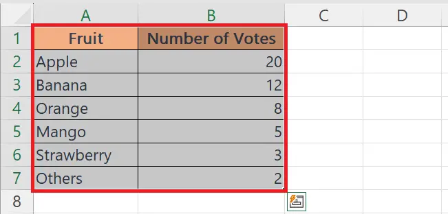
- Select the data set by highlighting the cells containing the Fruit and Number of Votes columns.
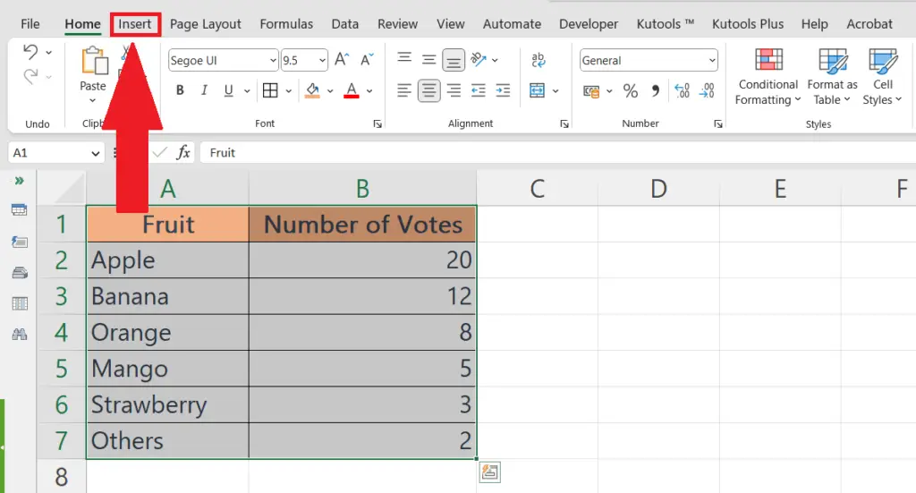
Step 2 – Perform a Click on the Insert Tab

- Perform a Click on the “Insert” tab in the top menu bar.
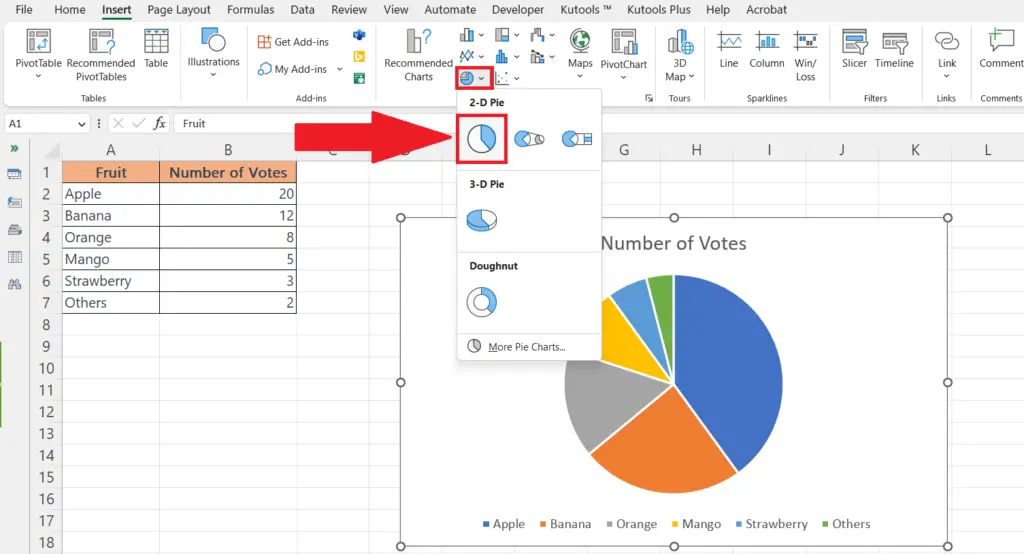
Step 3 – Make the Pie Chart
- In the “Charts” section of the ribbon, select “Pie Chart.”
- Choose the desired pie chart type by clicking on it.
Step 4 – Select the Chart and Perform a Click on the Chart Elements Plus Sign
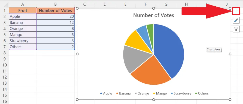
- Select the Chart, and the “Chart Elements” green plus sign will appear in the upper-right corner of the chart.
- Perform a click on the “Chart Elements” green plus sign.
Step 5 – Add Data Labels
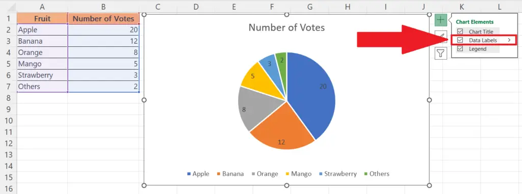
- Add Data Labels by checking the checkbox of the “Data Labels” option in the menu.
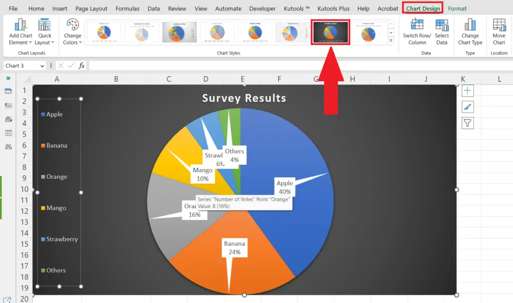
Step 6 – Format the Chart

- Format the chart as desired by changing the colors, font styles, and chart layout.
- Here we have selected a chart design from the “Chart Styles” section of the “Chart Design” tab.
Method 2: Utilizing the Chart Design Tab to Add Data Labels
Step 1 – Select the Data

- Select the data set by highlighting the cells containing the Fruit and Number of Votes columns.
Step 2 – Perform a Click on the Insert Tab
- Perform a Click on the “Insert” tab in the top menu bar.
Step 3 – Make the Pie Chart
- In the “Charts” section of the ribbon, select “Pie Chart.”
- Choose the desired pie chart type by clicking on it.
Step 4 – Select the Chart to Activate the Chart Design Tab
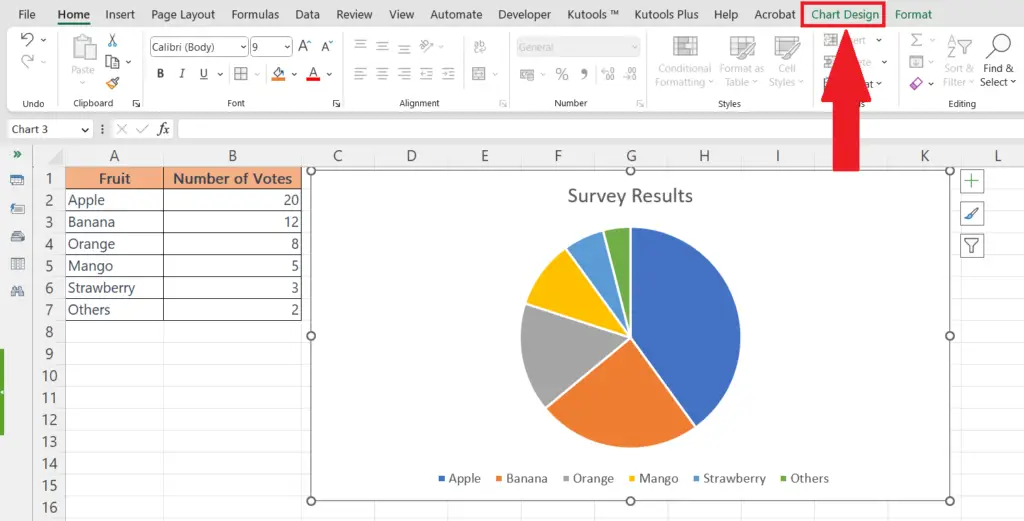
- Select the chart to activate the “Chart Design” tab.
Step 5 – Add Data Labels from the Chart Design Tab
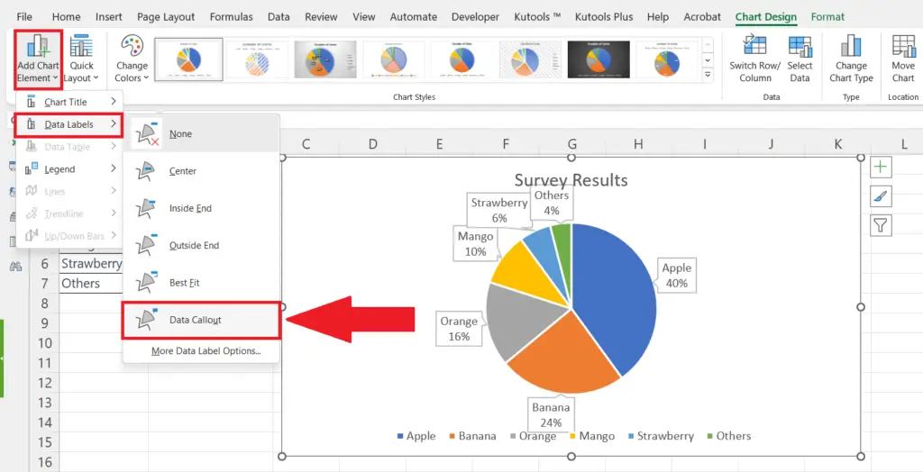
- Add Data Labels from the “Chart Design” tab by clicking on the “Add Chart Element”
Step 6 – Format the Chart
- Format the chart as desired by changing the colors, font styles, and chart layout.
- Here we have selected a chart design from the “Chart Styles” section of the “Chart Design” tab.


