
How to make a pie chart in Excel with multiple data
 By
SpreadCheaters
By
SpreadCheaters
You can watch a video tutorial here.
Graphs are great ways to visualize data and Excel has several tools for creating and formatting charts. The type of chart that you create depends on the dataset that you have. Using the charting tools in Excel, you can explore various types of charts and decide on the one that best suits the data that you are visualizing. Pie charts are best suited for data that represents different parts or percentages of a whole e.g. percentage-wise contribution of each branch to the monthly sales of a store.

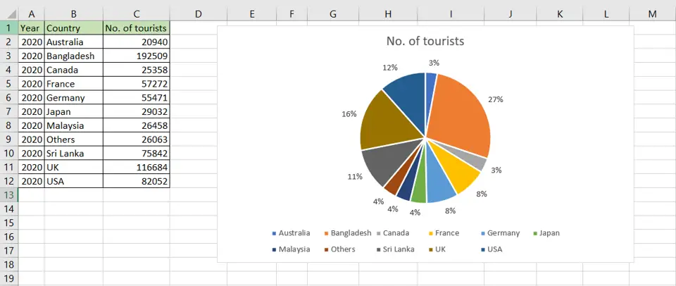
A pie chart is meaningful only when there are 2 series of data i.e. a data element and a number. If there are multiple data elements associated with the number, then it is recommended to reduce the data to only 2 series. It is not necessary to convert the numbers to percentages as Excel automatically adds up the numbers and uses the total to calculate percentages when creating the pie chart.
Step 1 – Open the Pie Chart menu
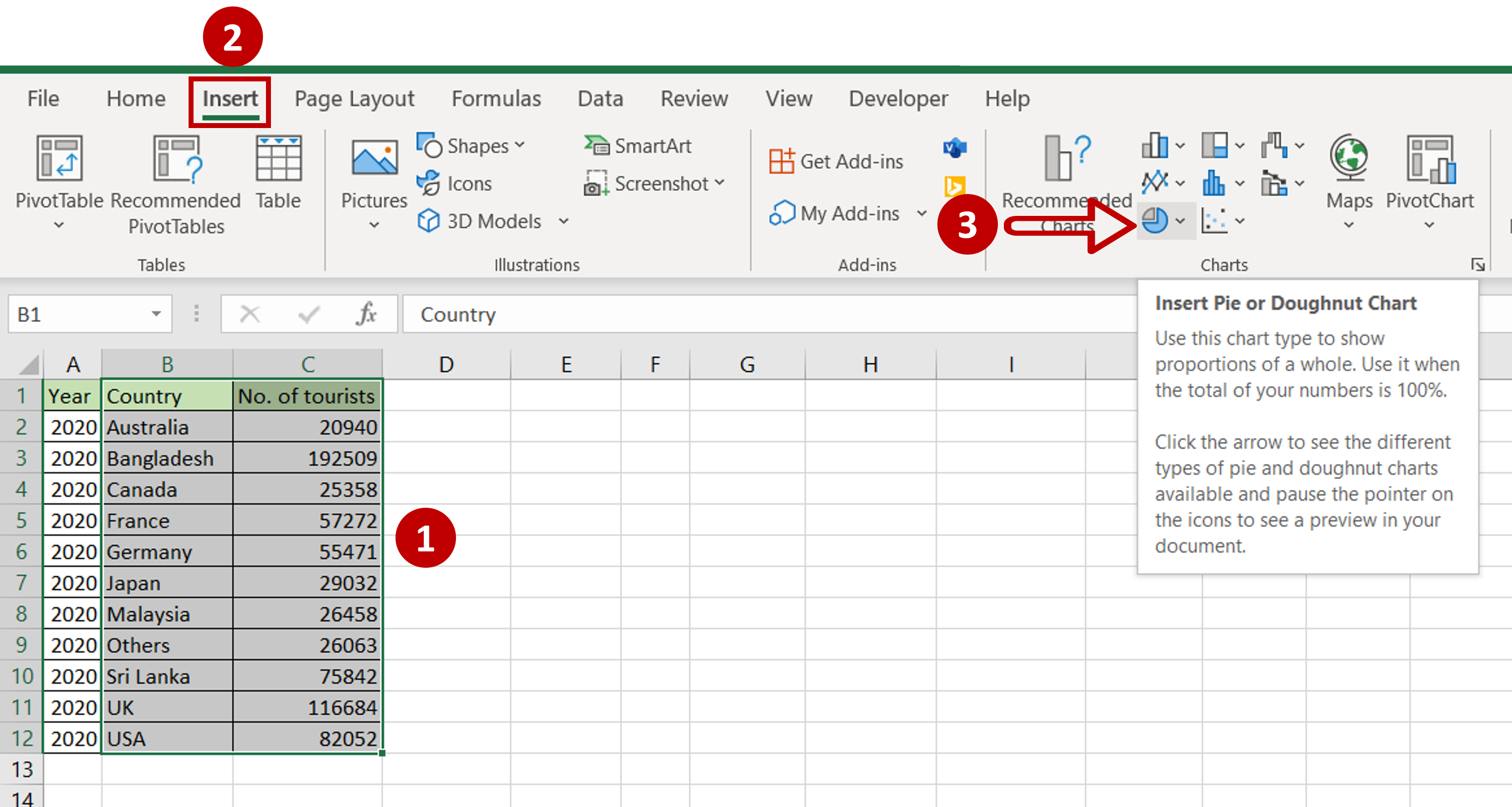
– Select the data on which the graph is to be prepared
– Go to Insert > Charts
– Expand the Insert Pie or Doughnut chart menu
Step 2 – Choose the chart
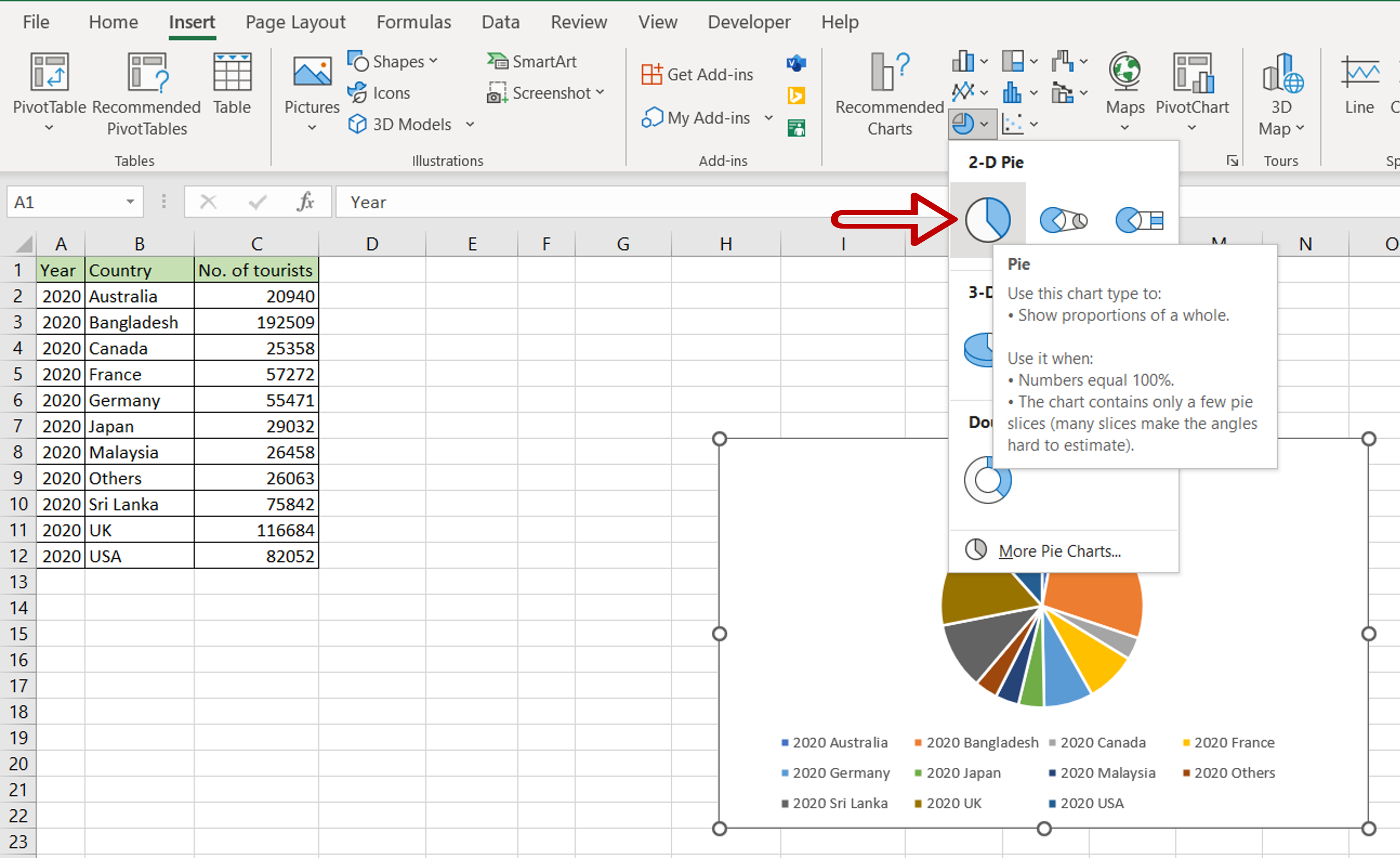
– Click on Pie
Step 3 – Open the Format Data Labels pane
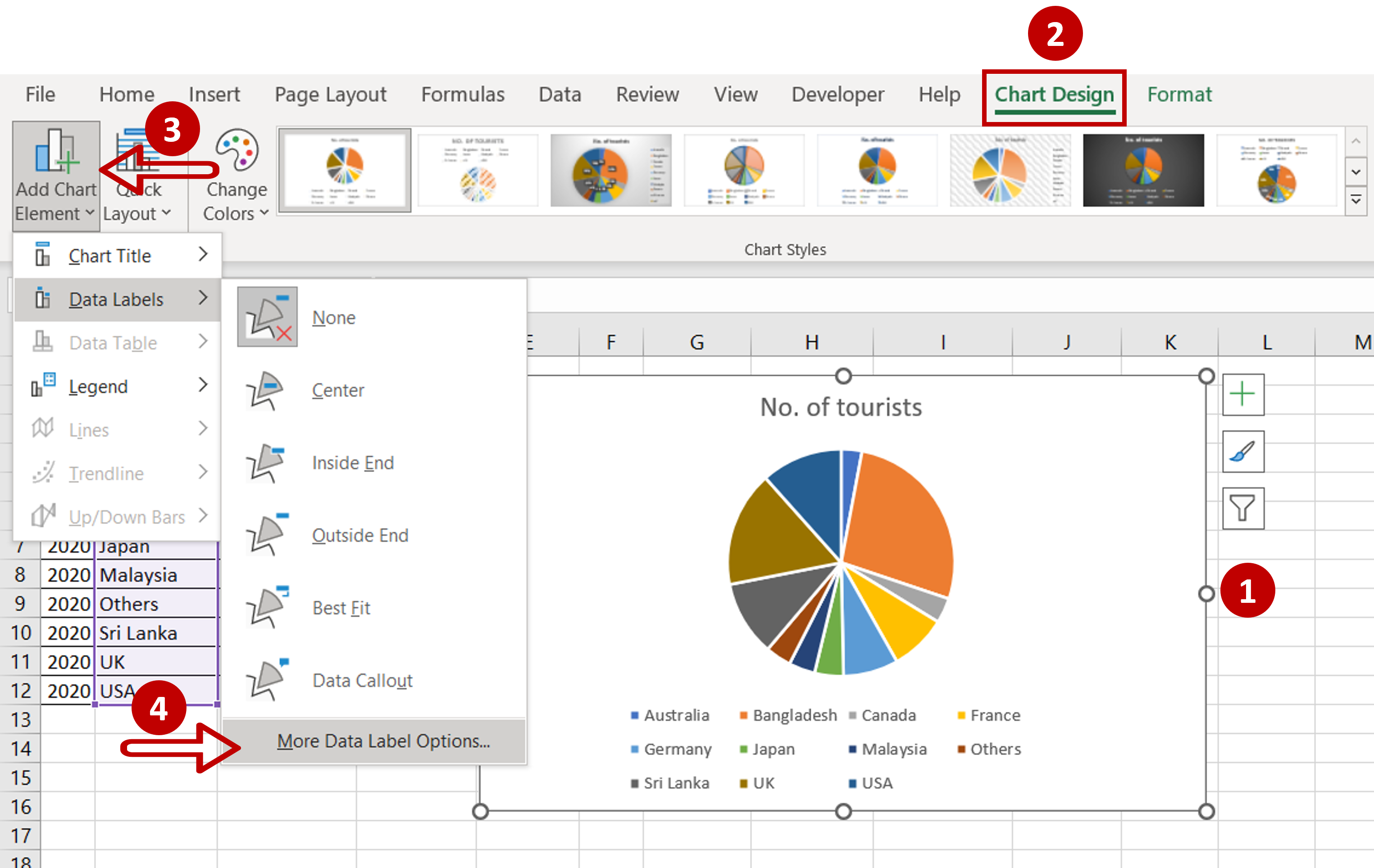
– Select the chart
– Go to Chart Design > Add Chart Element > Data Labels
– Select More Data Label Options
Step 4 – Format the data labels
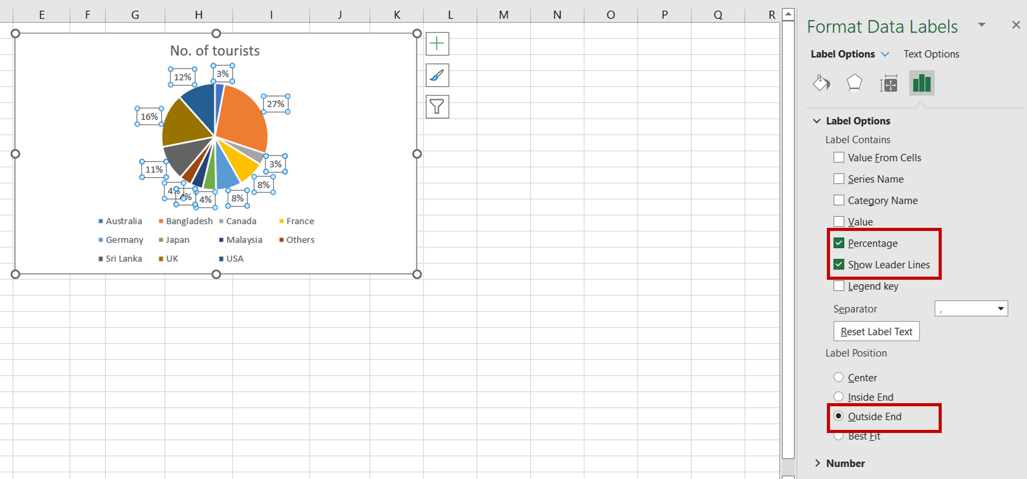
– Set the following:
>Label Contains
i. Percentage
ii. Show Leader Lines
>Label Position
i. Outside End
Step 5 – Check the result
– The pie chart is ready


