
How to make a line graph in excel with two sets of data
 By
SpreadCheaters
By
SpreadCheaters
Page last updated:
11/10/2022 |
Next review date:
11/10/2024
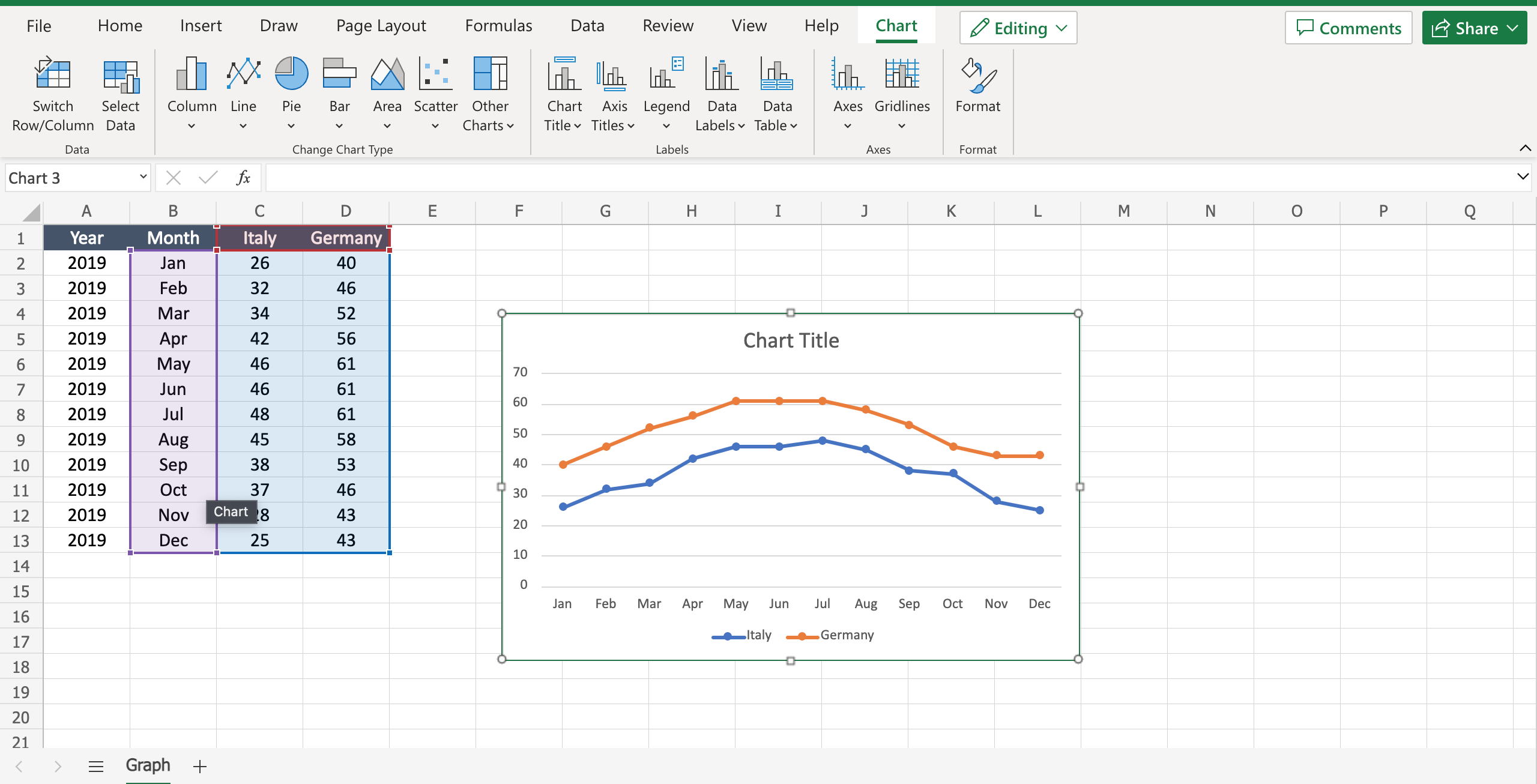
Sometimes it is important to graph multiple data in order to have a complete view and a comparison of the presented numbers. For example if you have to compare the sales trend in two different countries, putting the trends in the same graph will help you to have an immediate comparison. To make a line graph with two sets of data proceed as follows.
Step 1 – Select the data
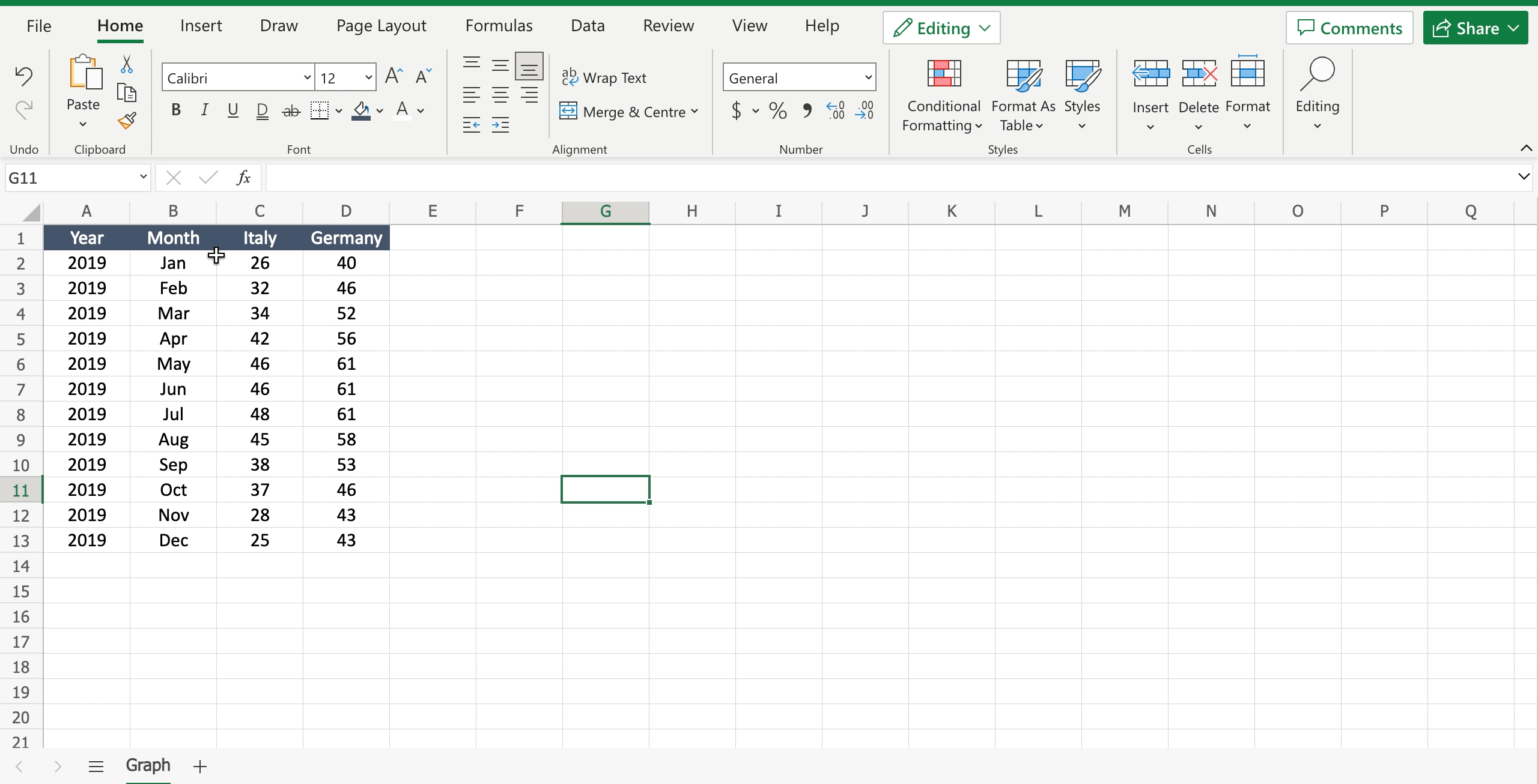
– Select the X values;
– Select the first set of data;
– Select the second set of data.
Step 2 – Add the Graph
– Navigate to the “insert” tab;
– Locate the “charts” area;
– Click on “line” to open the dialog menu with all the type of available graphs;
– Click on “line with markers” to add the graph.


