
How to make a double line graph in Excel
 By
SpreadCheaters
By
SpreadCheaters
You can watch a video tutorial here.
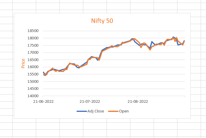
Graphs are great ways to visualize data and Excel has several tools for creating and formatting charts. The type of chart that you create depends on the dataset that you have. Using the charting tools in Excel, you can explore various types of charts and decide on the one that best suits the data that you are visualizing. A line graph is a popular way to depict time series data. When you have two related sets of data, you can plot both on the same chart to make a double line graph.
Step 1 – Select the data
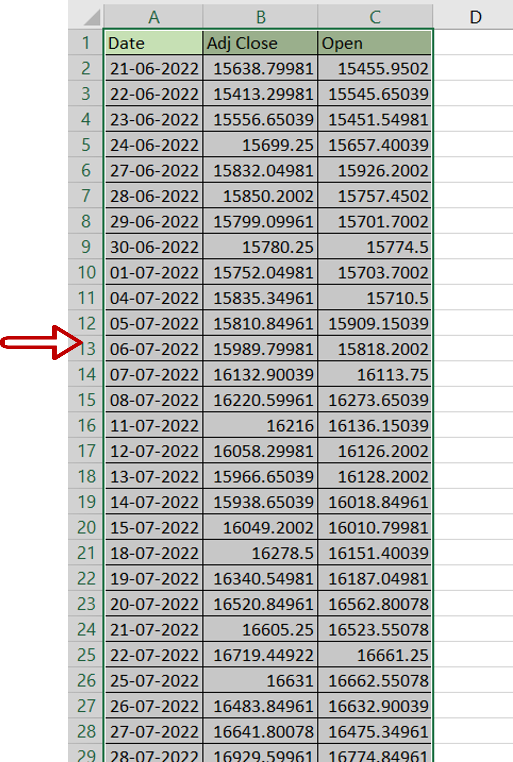
– Select the 3 columns of data
Step 2 – Insert the chart
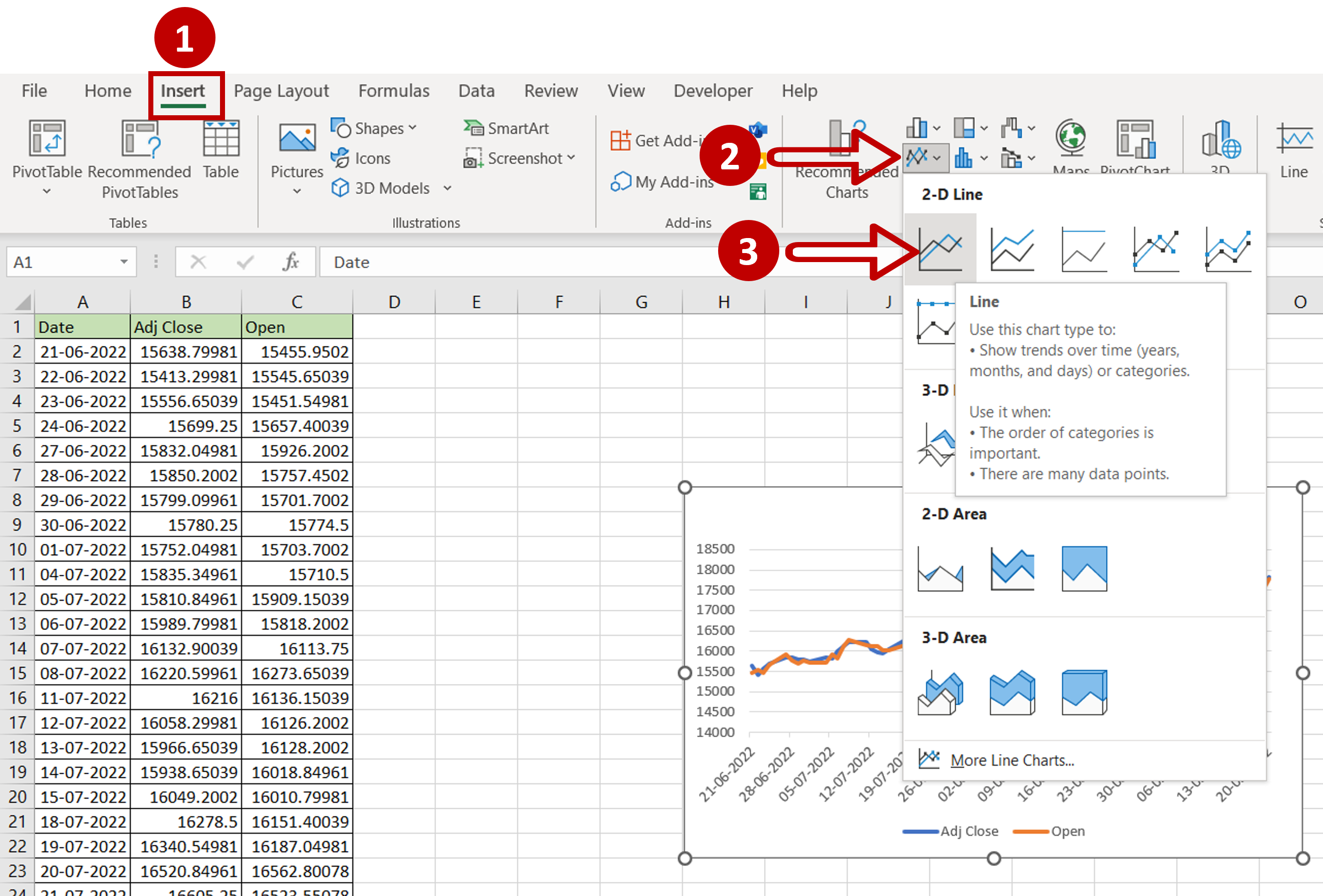
– Go to Insert > Charts
– Expand the Insert Line or Area Chart dropdown
– Choose the Line chart
Step 3 – Design and Format the chart
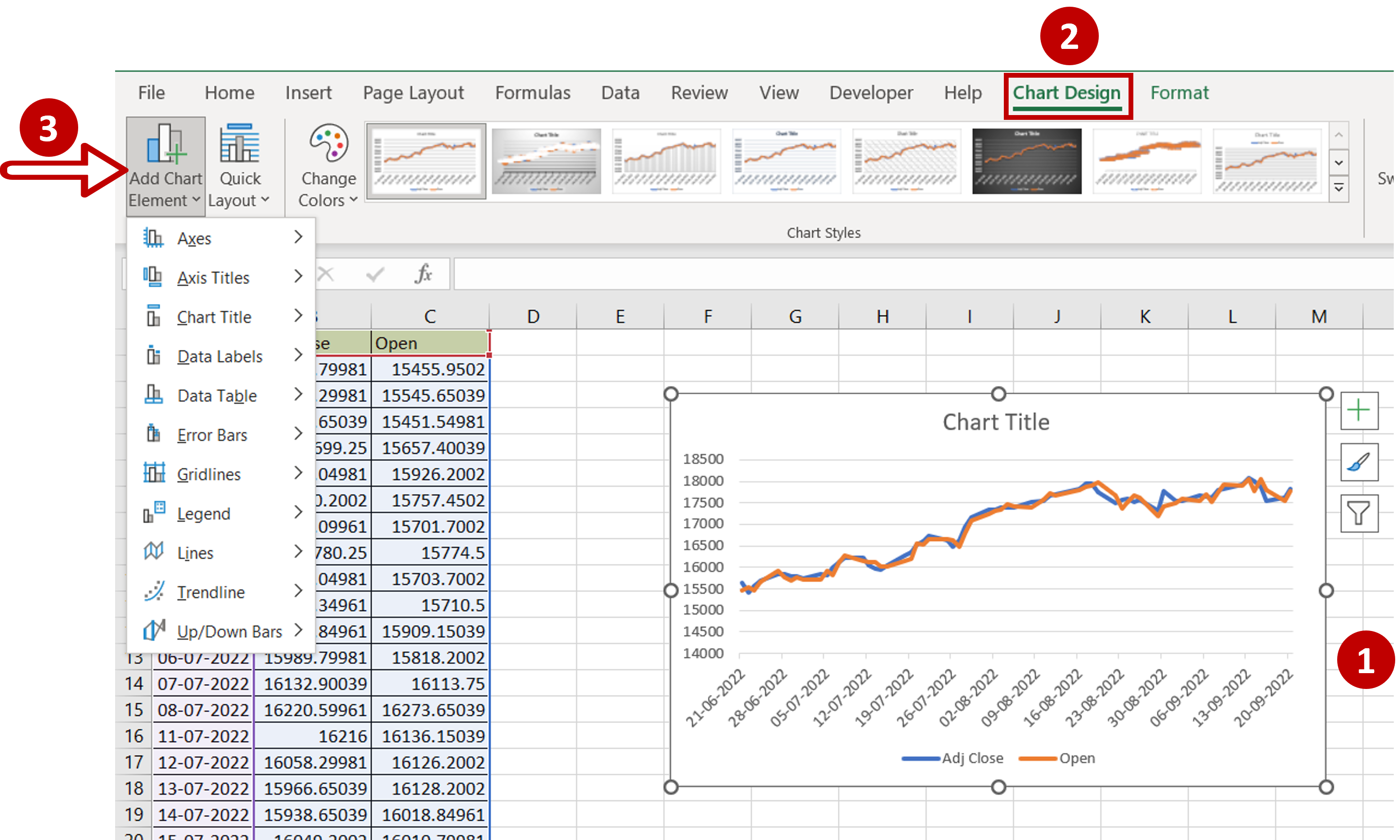
– Select the chart to summon the Chart Design and Format menus
– Add more elements to the chart such as the axis titles using the Chart Design menu
– Format the chart with the options on the Format menu


