
How to make a bar graph with 2 variables in Excel
 By
SpreadCheaters
By
SpreadCheaters
A bar graph is a visual representation that uses rectangular bars to compare data across categories. It provides clarity by displaying values as the height or length of the bars, allowing easy identification of differences and patterns. It is particularly useful for representing categorical data and helps viewers interpret and understand information quickly.
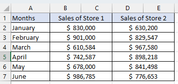
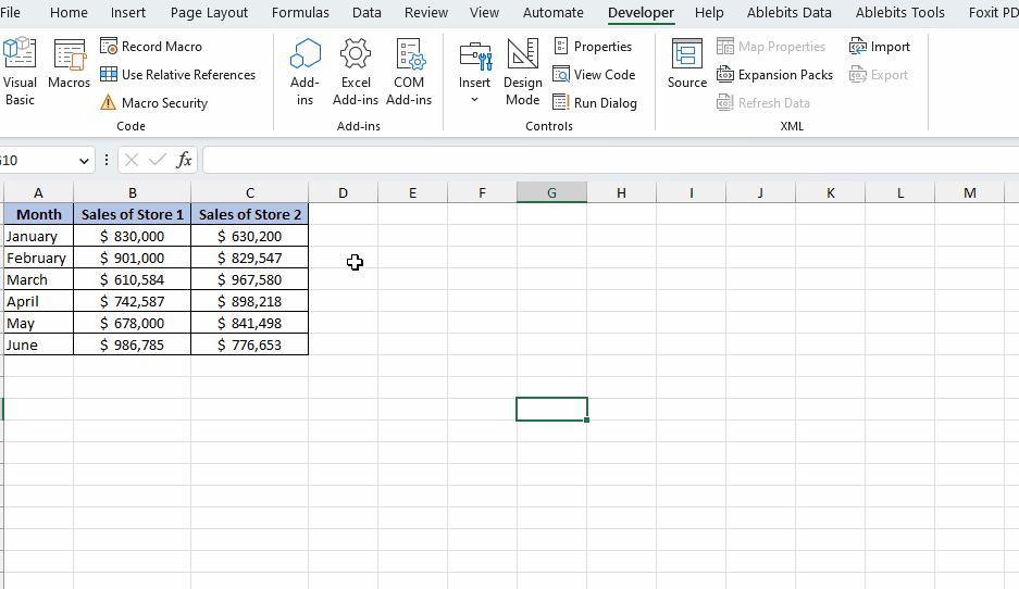
To make a bar graph consisting of 2 variables we have a data sheet which shows data regarding the sales of two stores, Store 1 and Store 2 in a 6 months period. This graph visually represents the sales data using rectangular bars, allowing for easy comparison between the two stores. By utilizing this graph, we can enhance the clarity and understanding of the sales performance for each store throughout the year.
Follow the simple steps below to learn how to make a bar graph using 2 variables:
Method 1 – Inserting a 2-variable bar graph by Insert tab
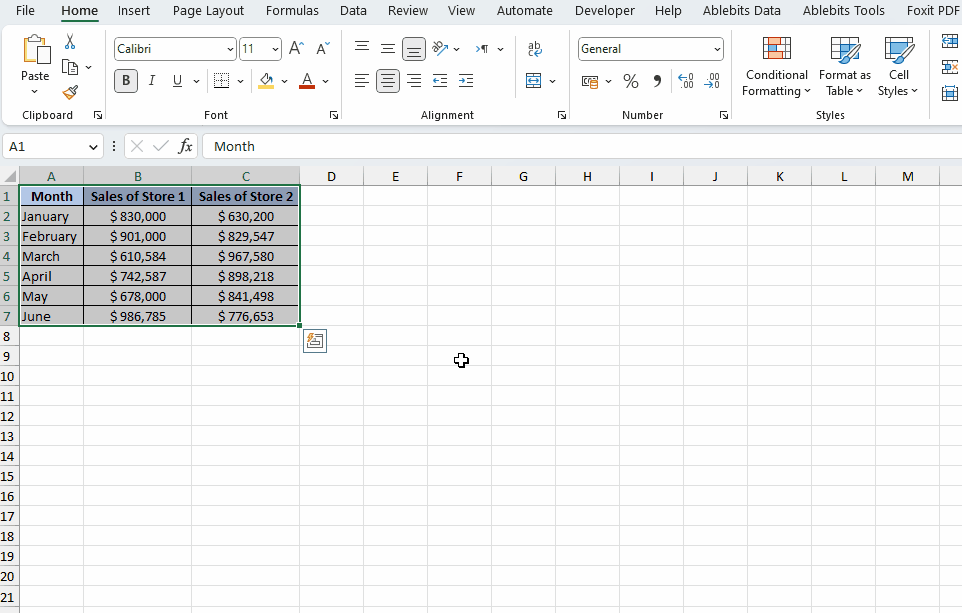
Step 1 – Selecting the required data
- Select the data which needs to be plotted on the graph.
Step 2 – Select the bar chart feature from the Insert tab
- In the toolbar select the Insert option.
- Then in the Ribbon of the Insert option you will see multiple chart options in the center of the Ribbon.
- Select the bar chart option.
- Click on it and you will see multiple chart options.
- Select the required bar graph, 2D or 3D.
Here we have selected a regular 2D bar graph as an example.
Method 2 – Making a 2-variable bar graph by using VBA code
Step 1 – Opening the VBA editor
- Go to the “Developer” tab on the Excel ribbon.
- Click on the “Visual Basic” button.
- You can also press “Alt + F11” on your keyboard. This shortcut will directly open the (VBA) editor.
- A window for the VBA editor will open.
Step 2 – Insert a new module
- In the VBA editor window, you will see the Project Explorer pane on the left-hand side. If it’s not visible, you can enable it by pressing “Ctrl + R” or going to the “View” menu and selecting “Project Explorer.”
- In Project Explorer, locate the workbook where you want to insert the module. Double-click on it to expand its contents.
- Right-click on the workbook name or any existing module, and from the context menu, select “Insert” and then “Module.
- A new module will be inserted into the workbook. It will appear as a separate module item under the workbook in the Project Explorer pane.
- Another method to insert a new module is by clicking on the Insert menu at the top
- Select the module option and a new module will appear separately under the workbook in the Project Explorer pane.
Step 3 – Writing the code
- Copy and paste the VBA code written at the end of the tutorial into the module.
- After writing the code close the VBA editor by clicking the “X” button or pressing “Alt + Q.
Step 4 – Running the macro
- Go to the “Developer” tab on the Excel ribbon and click on the “Macros” button in the “Code” group.
- Select the Macro.
- Click on Run. This will run the macro and a bar chart with 2 variables will be inserted as shown below.
VBA code to insert the 2 variable bar graph
Sub InsertTwoVariableBarGraph()
Dim wsData As Worksheet
Dim wsGraph As Worksheet
Dim rngData As Range
Dim chtGraph As ChartObject
Dim rngXValues As Range
Dim rngYValues1 As Range
Dim rngYValues2 As Range
‘ Set references to the data sheet and data range
Set wsData = ThisWorkbook.Sheets(“Sheet1”)
Set rngData = wsData.Range(“A1:C7”) ‘ Adjust the range as per your data
‘ Create a new sheet for the graph
Set wsGraph = ThisWorkbook.Sheets.Add(After:=ThisWorkbook.Sheets(ThisWorkbook.Sheets.Count))
wsGraph.Name = “Graph”
‘ Define the X and Y value ranges for the graph
Set rngXValues = rngData.Columns(1)
Set rngYValues1 = rngData.Columns(2)
Set rngYValues2 = rngData.Columns(3)
‘ Add a chart object to the new graph sheet
Set chtGraph = wsGraph.ChartObjects.Add(Left:=10, Top:=10, Width:=400, Height:=300)
‘ Set the source data for the chart
With chtGraph.Chart
.SetSourceData Source:=Union(rngXValues, rngYValues1, rngYValues2)
.ChartType = xlBarClustered
.SeriesCollection(1).Name = “Sales of Store 1”
.SeriesCollection(2).Name = “Sales of Store 2”
End With
End Sub


