
How to insert a 3D plot in Excel
 By
SpreadCheaters
By
SpreadCheaters
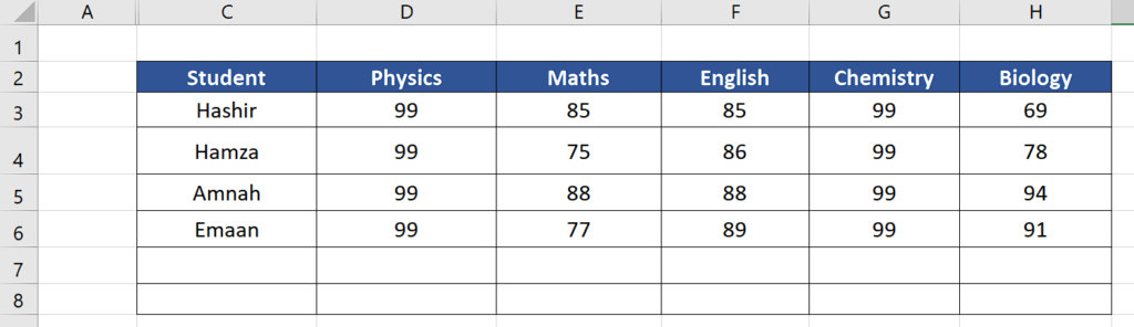
Let’s look at the dataset above for example, where you have a table with data of some students about their scores in various subjects. We’ll learn how to plot this data using a 3D column Chart by following the steps mentioned below.

3D plots in Excel can be used to visualize data in three dimensions. This can be useful for displaying data that has a third variable that you want to represent. For example, you might use a 3D plot to display the relationship between three variables in a scientific experiment, or to display the changes in a stock’s price over time on the x-axis, the stock’s volume on the y-axis, and the stock’s market cap on the z-axis. 3D plots can also be used to create more visually appealing charts and to better understand and analyze complex data sets.
Step 1 – Select the desired data
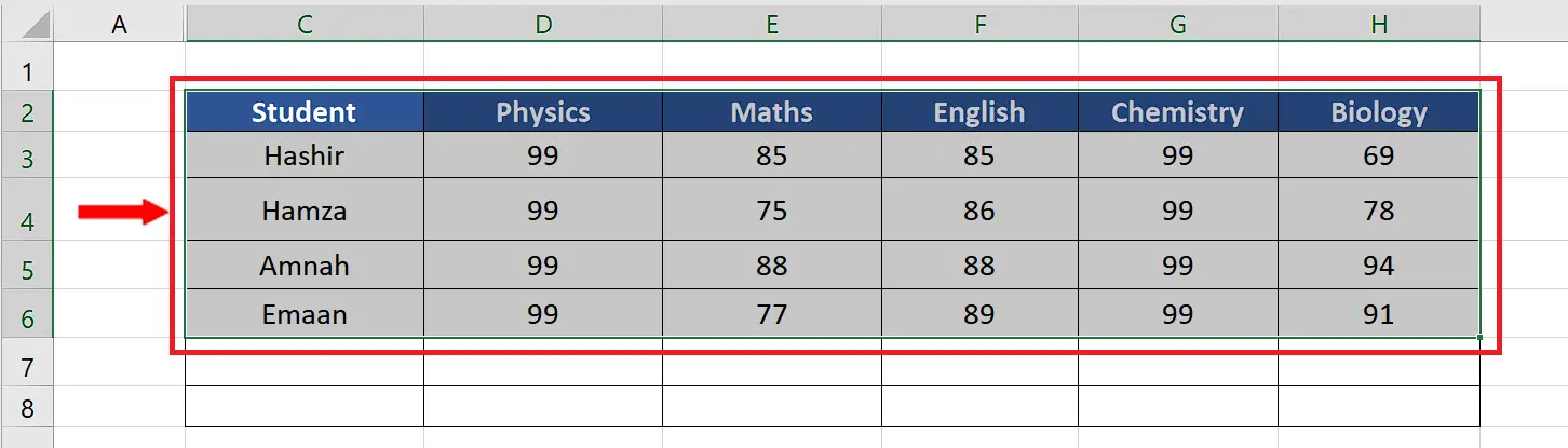
– Select all the data including the headers.
– This will help us in naming the axis data after plotting.
Step 2 – Insert the 3D plot
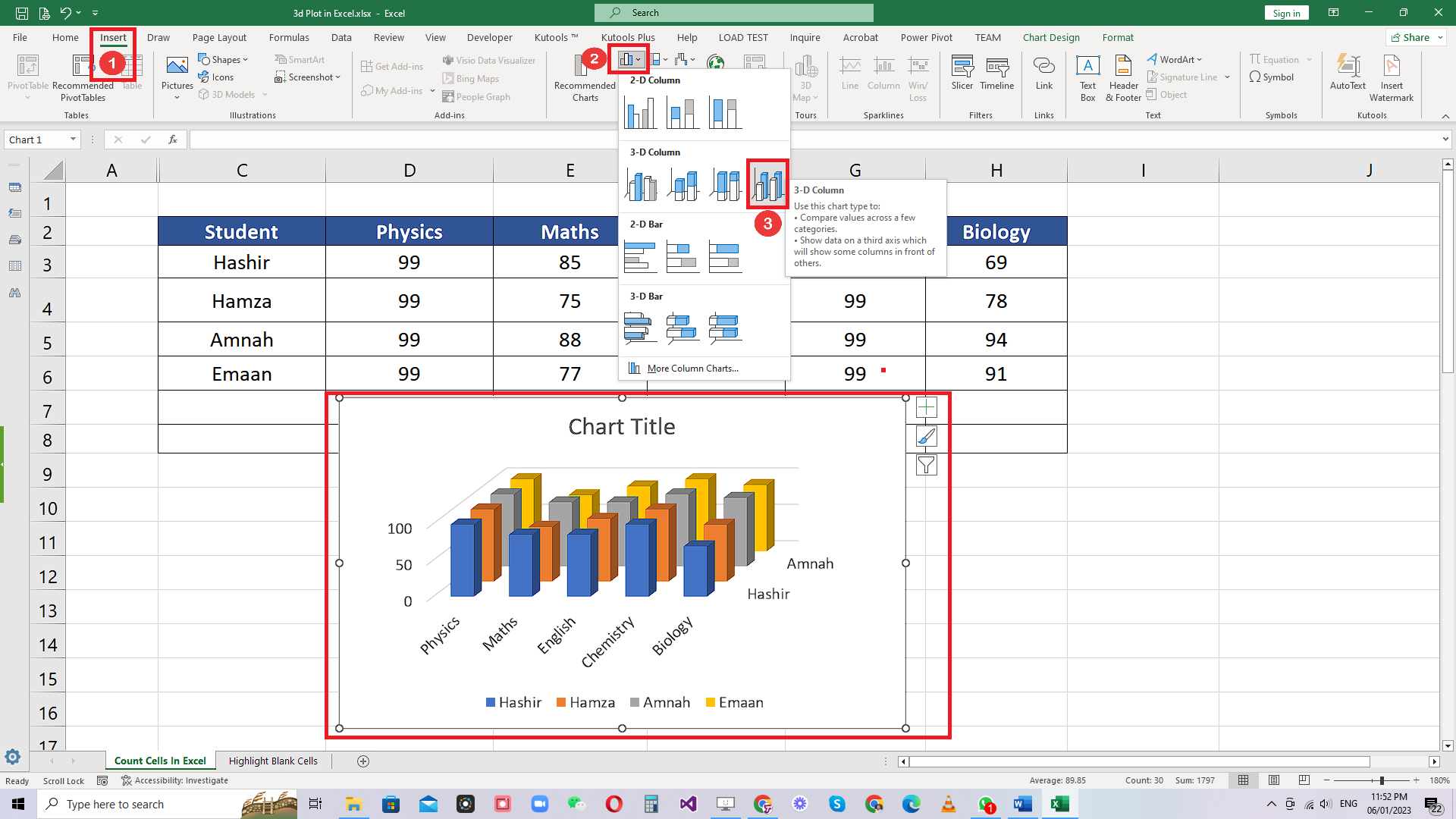
– On the list of main tabs, click on the Insert tab.
– In the charts group, locate the Bar Chart option and click on the dropdown.
– From the dropdown menu choose the 3-D Column option. This will automatically insert the 3-D chart in the sheet.
Step 3 – Change the Chart Design
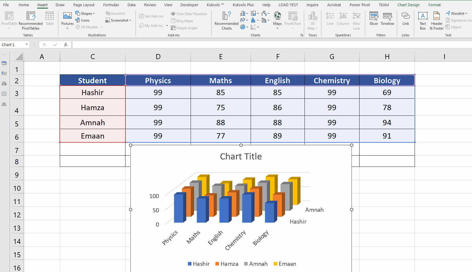
– You can change the chart design by clicking on the newly appeared Chart Design tab.
– Then in the chart styles group you will see various options for changing the chart style.
– You may select any style you like. We are going with the dark mode style in this tutorial as shown above.


