
How to insert a 3D pie chart in Excel
 By
SpreadCheaters
By
SpreadCheaters
You can watch a video tutorial here.

Graphs are great ways to visualize data and Excel has several tools for creating and formatting charts. The type of chart that you create depends on the dataset that you have. Using the charting tools in Excel, you can explore various types of charts and decide on the one that best suits the data that you are visualizing. Pie charts are best suited for data that represents different parts or percentages of a whole e.g. percentage-wise contribution of each branch to the monthly sales of a store. A 3D pie chart makes the pie chart stand out better.
Step 1 – Open the Pie Chart menu
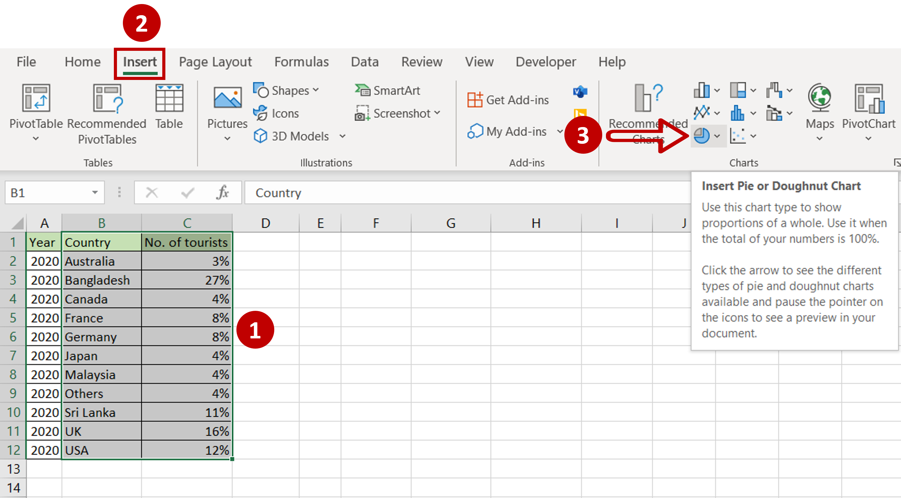
– Select the data on which the graph is to be prepared
– Go to Insert > Charts
– Expand the Insert Pie or Doughnut chart menu
Step 2 – Choose the chart
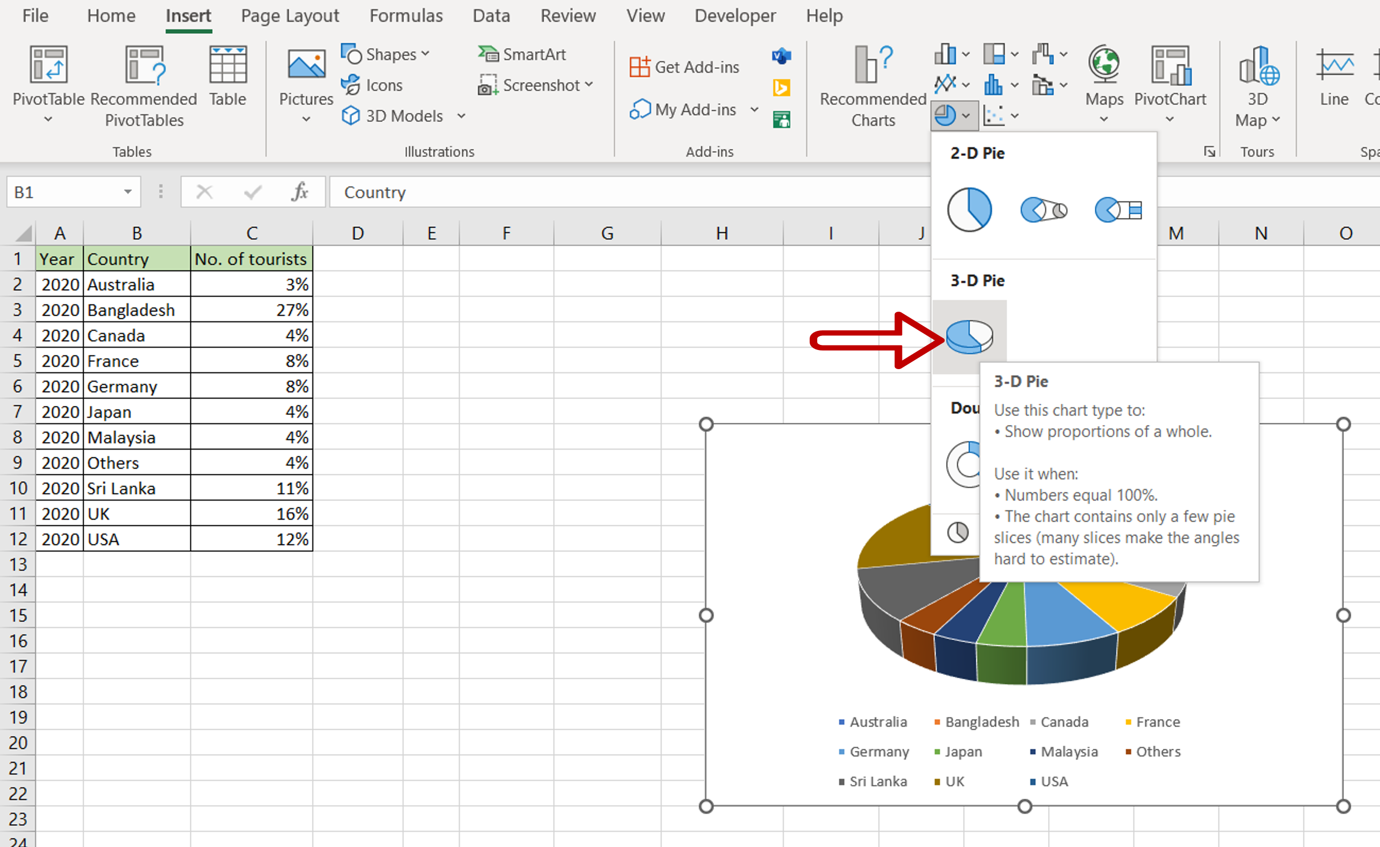
– Click on 3-D Pie
Step 3 – Position the Data Labels
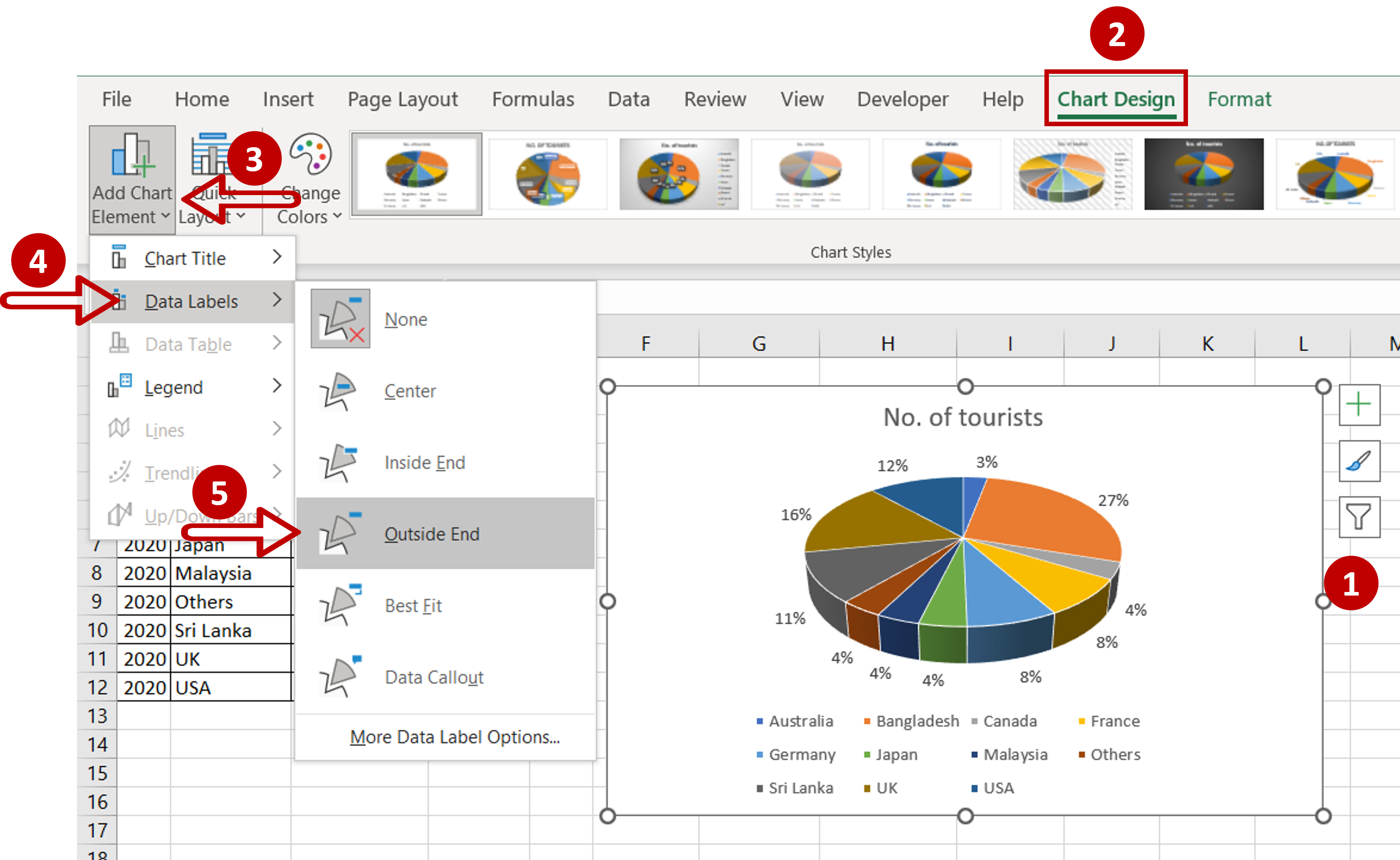
– Select the chart
– Go to Chart Design > Add Chart Element > Data Labels
– Select Outside End
Step 4– Check the result
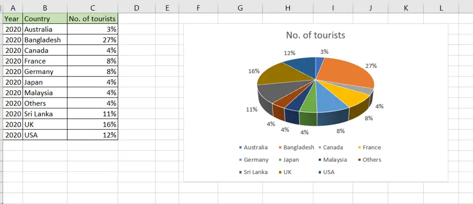
– The 3D pie chart is ready


