
How to graph two sets of data in Excel
 By
SpreadCheaters
By
SpreadCheaters
You can watch a video tutorial here.
Graphs are great ways to visualize data and Excel has several tools for creating and formatting charts. The type of chart that you create depends on the dataset that you have. Using the charting tools in Excel, you can explore various types of charts and decide on the one that best suits the data that you are visualizing.
Step 1 – Open the Insert Chart box
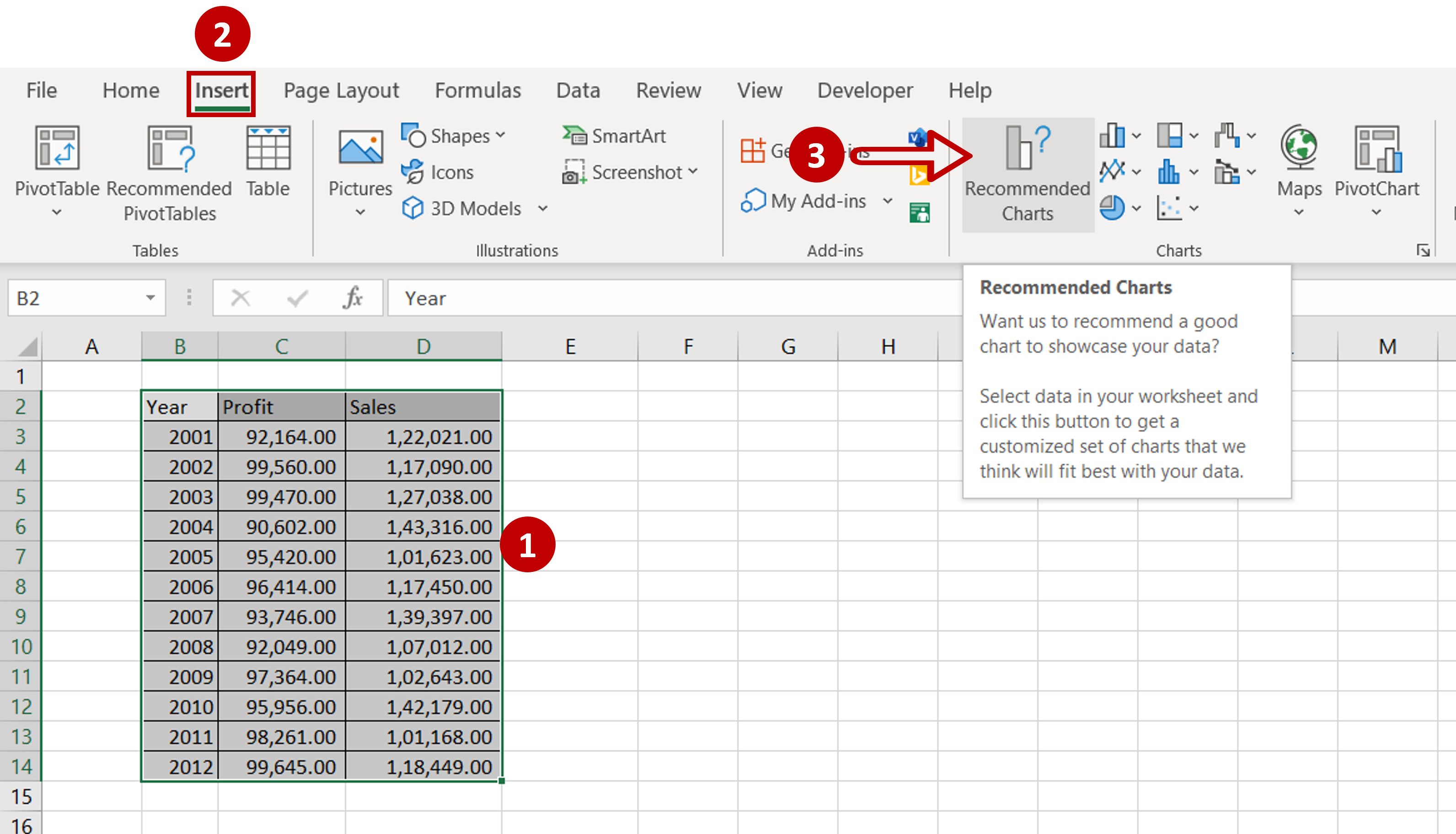
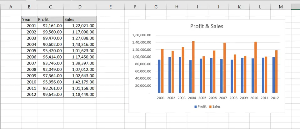
– Select the data on which the graph is to be prepared
– Go to Insert > Charts
– Click the Recommended Charts option
Step 2 – Choose the chart
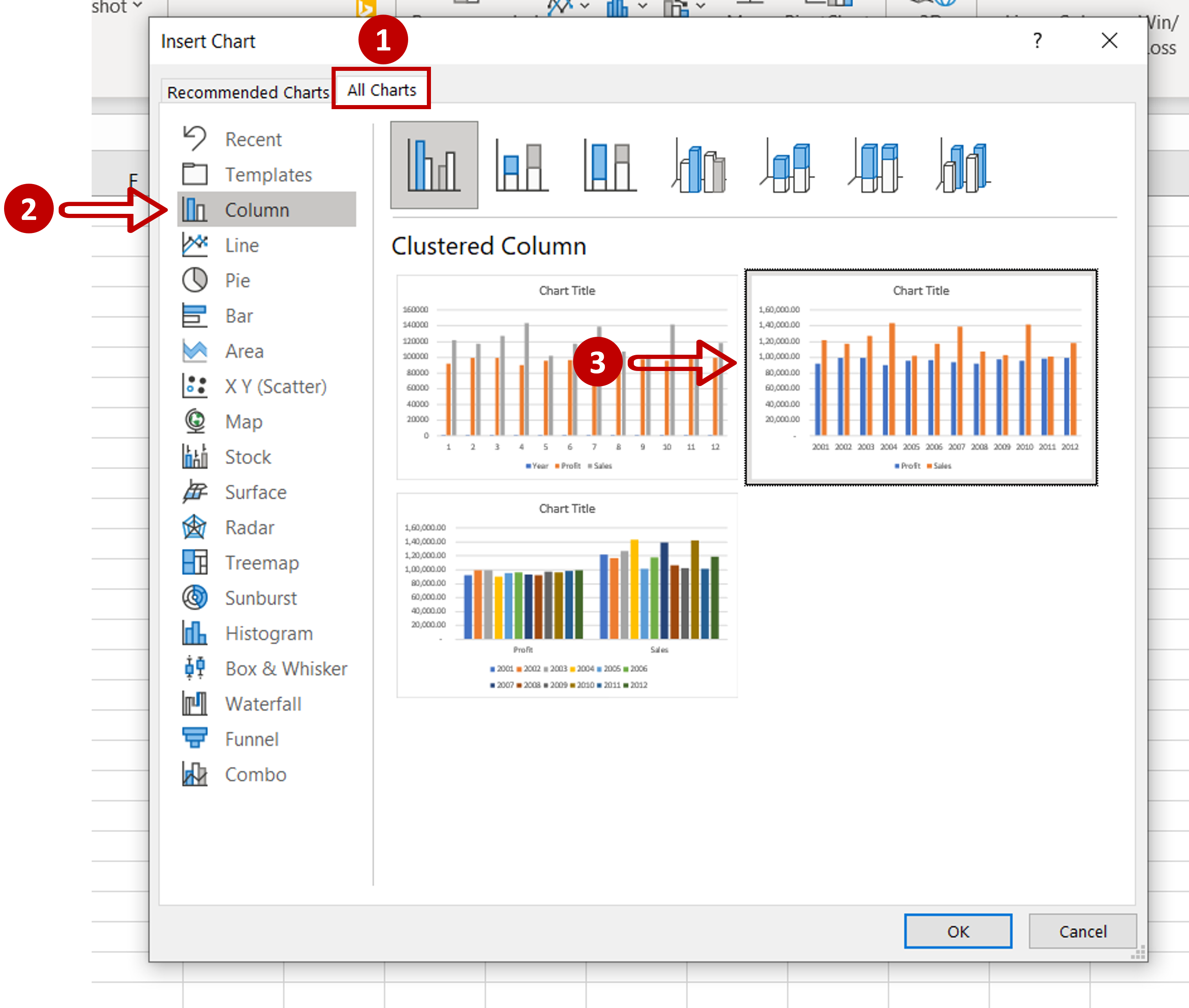
– Go to All Charts > Column
– Select the second chart
Step 3 – Check the result
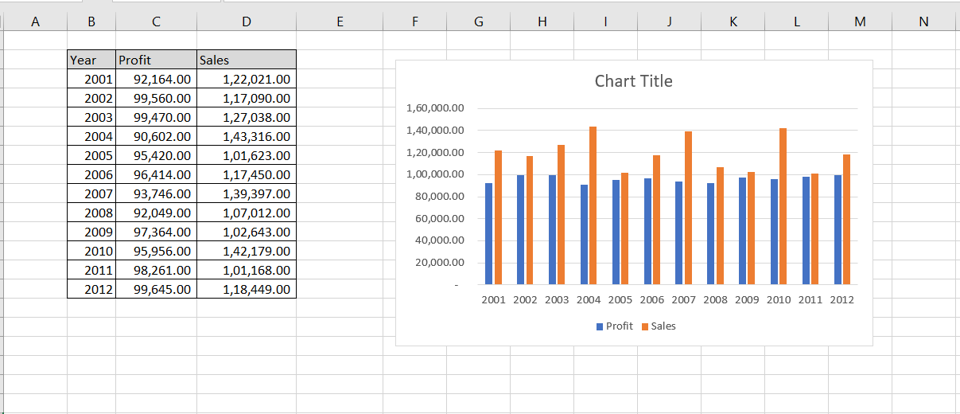
– The graph is created on two sets of data
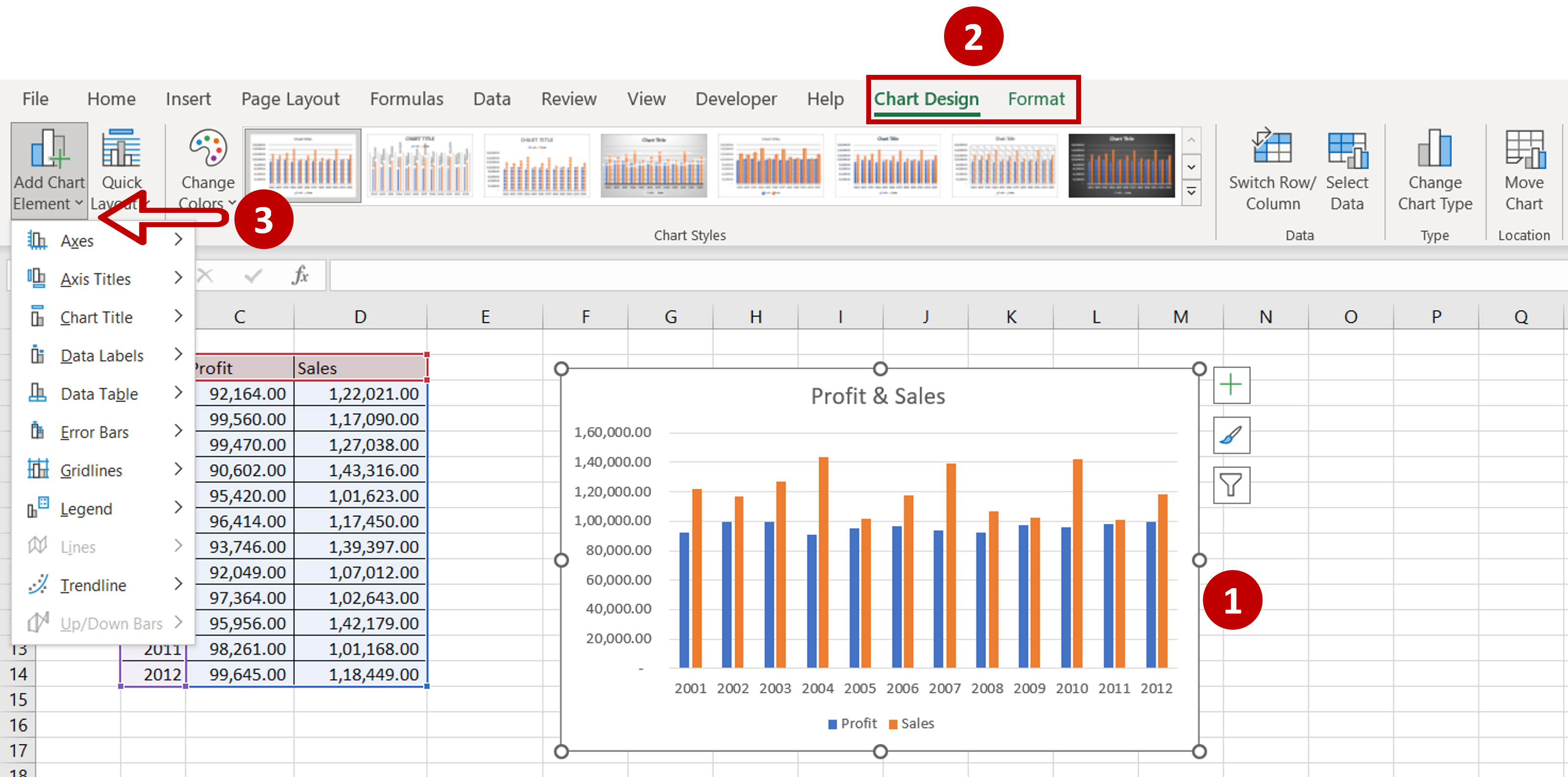
Step 4 – Design and Format the chart
– Change the title of the chart by clicking on the default title and editing it
– Select the chart to summon the Chart Design and Format menus
– Add more elements to the chart such as the axis titles, data labels, etc. using the Chart Design menu
– Format the chart with the options on the Format menu


